Blooper 37: Hits Sorted Uselessly
| < Day Day Up > |
Blooper 37: Hits Sorted Uselessly
In some website search functions, items either match the criteria or they don't; matching is not a matter of degree. For example, a real-estate website might offer a way to search for available homes by postal code. All homes for sale in the postal code area match the search criterion and so are included in the results, and all are equally relevant. Homes outside the indicated postal code area are not relevant and so aren't in the results.
For that sort of search function, found items should be ordered in a way that is useful to site users. Let's look at examples of website search results in which items are ordered in not-so-useful ways.
HauteAtHome.com, an online vendor of gourmet meals, provides a clear example of the blooper. When you click on a food category on this website, you effectively search its database of available dishes, with the category as the search criterion. The result is a table listing all the dishes in that category (Figure 5.31).
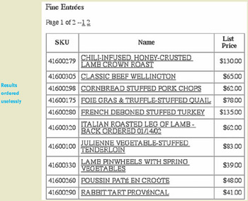
Figure 5.31: www.HauteAtHome.com (Jan. 2002) ”Fine Entree's results page lists items alphabetically , but by their decorous names . Lamb Crown Roast isn't under L, it's under C for "chili-infused."
How is the table ordered? Alphabetically, of course! That seems reasonable, except that the alphabetization is based on the full, ingredient-laden, haute-cuisine name of the dish instead of the main ingredient. Thus, Lamb Crown Roast is alphabetized under C, rather than L, because its full name is "Chili-Infused Honey-Crusted Lamb Crown Roast." Likewise, Stuffed Turkey is alphabetized under F, for "French Deboned Stuffed Turkey."
This makes dishes hard to find in the list if you have a specific main ingredient in mind, such as lamb. It also means dishes with the same main ingredient aren't listed together; they are scattered willy-nilly throughout the list.
For a more complex example of this blooper, let's look at the website of the Feldenkrais Guild. It has a "Find a Feldenkrais Practitioner" page, with a typical search form: data fields, a menu for choosing how the results will be sorted, and a button to start the search (Figure 5.32). The sorting options are as follows : by name, city, and zip code. So far, this is all good.
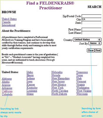
Figure 5.32: www.Feldenkrais.com (Oct. 2002) ”Page for finding a Feldenkrais practitioner includes two ways to search ” using the form at the upper right or clicking on a state at the bottom.
The page also has links for quickly listing all practitioners in a specific state. For example, clicking the California link is the same as typing "CA " into the form's City field and clicking Find. Except for one difference: The state links have no "Sort by" option. The results are always sorted by city. This is closer to the problem but isn't quite it.
The problem is that once the search results are listed, you can't change the order. There is no sort-order menu on the results page (Figure 5.33). You can go back to the Find page and specify a different order using the form, but if you use the state links again, the results order is always the same: by city.
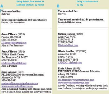
Figure 5.33: www.Feldenkrais.com (Oct. 2002) ”Results of a search for practitioners in California A ” by using a search form, by practitioner name and B ” by clicking on the California link, by city name.
This means that the state links are useful or not depending on why you are searching. If you are trying to find a practitioner near you, the links are useful because sorting by city is useful. On the other hand, if you have been referred to a specific practitioner in California and want to find how to contact him or her, a list of hundreds of practitioners sorted by city is nearly useless.
This design forces site users to plan ahead: to choose whether to use the form or the links depending on their purpose in searching. Requiring users to plan ahead is a very bad idea in websites or user interfaces in general. Users simply won't do it ”remember Steve Krug's main design guideline: "Don't make me think!" (Krug, 2000). In the case of the Feldenkrais website, that means people can easily end up with search results in the wrong order for their purpose.
Avoiding the Blooper
The issue is how to order found items that are equal in relevance to the search criteria. It is a blooper to order them in an arbitrary way that doesn't support users' goals.
One way to avoid the blooper is to determine ”by interviewing people typical of the site's intended users or by employing simple common sense ”what the most helpful order is and use that order. For example, it seems obvious that ordering dinner entrees by their full haute-cuisine names is not helpful, but ordering them by the name of their primary ingredient ”beef, chicken, lamb, pork, and so on ”would be. To show this, I reordered the HauteAtHome results table (Figure 5.34). In addition to reordering the entrees, I added a "Meat" column to the table to make the ordering criterion clearer.
This static solution works if one results order will satisfy everyone all the time. That may be true for websites like HauteAtHome.com, where there is really only one plausible use of the search results. It would not work, however, for websites like Feldenkrais.com, where there are multiple possible uses of the search results. For such websites, the solution is to let users specify the sort order, either before the search, after it, or both.
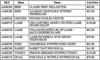
Figure 5.34: Improvement of HauteAtHome.com . ”Items are ordered more sensibly.
When search results are listed in tables, the best way to let users reorder the list is to make the column headers be links, which when clicked reorder the table according to that column (Figure 5.35).
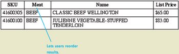
Figure 5.35: Improvement of HauteAtHome.com . Column headers are links that reorder the table by that column.
In most websites, search results are not listed in tables, but in lists. The Feldenkrais website is an example. In such a case, separate ordering controls ” buttons , links, menus ”can be added above the results list, as in my redesign of the Feldenkrais Search results page (Figure 5.36).
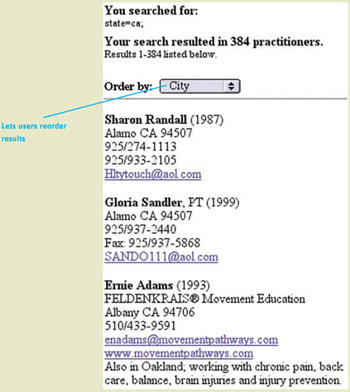
Figure 5.36: Improvement of Feldenkrais.com ”Menu is added to allow users to reorder the results.
| < Day Day Up > |
EAN: 2147483647
Pages: 128