Blooper 33: Hits Look Alike
| < Day Day Up > |
Blooper 33: Hits Look Alike
Imagine that you've just used a website's search function to find something. You typed search terms into a text box and are now looking at a list of matching items, often referred to as "hits." Think about how you evaluate the list of hits. Do you carefully read each item, scrutinizing every detail? Do you click on each item one by one? Of course not! You quickly scan the list, looking for "hits" that look promising .
Now imagine once again that you are an evil Web designer. You want to make it as difficult as possible for people to scan search results looking for promising items. How could you do that? Behold two important techniques of the evil designer!
-
Bury differences in a sea of similarity. Make all the hits look similar, so people have to carefully examine each one to see what it's about and how it differs from other items. For example, you could load each listed item with marketing hype or database output that is the same for every item. That'll slow them down!
-
Force them to click on items. The absolute best way to prevent people from scanning search results is to make the found items look exactly alike. Then the only way to check an item's relevance is to actually follow the link to wherever it goes, consuming the user 's valuable time while the browser fetches the page.
Many Web search functions use these "techniques" so well, they seem to have been designed by evil designers trying to make life difficult for visitors .
For example, in 1999, the search site Lycos.com returned a list of items that looked so similar that it was difficult to distinguish them or find the important information in each (Figure 5.19[A]). Since then, the problem of item similarity has been reduced (Figure 5.19[B]).
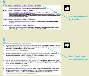
Figure 5.19: www.Lycos.com -Results of a search for "acoustic guitar." A- (early 1999) Hits look very similar, so it's hard to tell which ones are good. B - (Mar. 2002) Hits look more different, so it's easier to scan the list.
Turning to searching within websites , let's first examine results from a search at DigiGuide.com, an online television guide (Figure 5.20). It uses the first of the evil designer's techniques: burying differences in similarity. DigiGuide's search results increase the similarity of found items by starting every item with "DigiGuide: The Best TV Guide." Not only is marketing hype inappropriate here-we're already at the site-but repeating it for every item is beyond useless and beyond annoying; it reduces usability by increasing the similarity of items. In addition, the detailed text underneath each item starts with the item's position in the site's information hierarchy, which for search results is almost guaranteed to make items more similar.
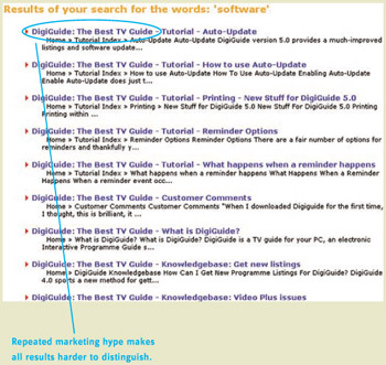
Figure 5.20: www.DigiGuide.com (Feb. 2002)-Results of a search for "software" begin each item with marketing text, making differences hard to see.
What about the second evil technique: making found items look so alike that the only way to check their relevance is to click on them? In late 2001, SiliconValley.com provided an example of that. Figure 5.21 shows the results of searching for articles about "usability."
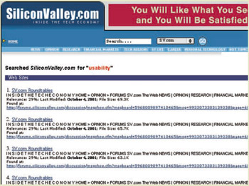
Figure 5.21: www.SiliconValley.com (Oct. 2001)-All "hits" look the same. Are they the same, or do they just look alike? Can't tell without clicking on them.
Given results such as these, a person could easily assume that a faulty search engine had returned several links to the same item (see also Blooper 34: Duplicate Hits, in this chapter, and Chapter 3, Blooper 17: Deceptive Duplicate Links). In fact, there is a difference between the returned items: their file size . However, that difference is hard to spot and not very useful for deciding which articles are relevant.
SiliconValley.com must have realized that this search facility was hurting its bottom line. In early 2002, the company replaced it with one that displays more reasonable results.
Avoiding the Blooper
How do we avoid letting the evil designer within us compromise our otherwise good intentions? Easy: just invert the evil designer's rules.
-
Show and stress important data. Minimize repetition between listed items. Most of each item should be information that lets people distinguish items from one another. The distinguishing data for each item should be emphasized . Additional information, if it must be shown, should be deemphasized. In information-theoretical terms, cut the visual noise and focus users' attention on the information in each item.
-
Minimize the need to click. Ideally, people should have to follow links for found items only to actually get the item (purchase, read). They should not have to follow links just to decide which item(s) they want.
Amazon.com provides an example of useful search results (Figure 5.22). The information shown for items allows quick discrimination between them. There is neither too much information nor too little.
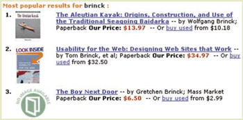
Figure 5.22: www.Amazon.com (Sept. 2002)-Search "hits" show and stress discriminating information. Users needn't try links to find relevant ones.
AltaVista shows good results for a full Web search (Figure 5.23). Excerpts from the content containing the search terms are shown, with the search terms highlighted. This help users quickly judge and compare the items' relevance. Additional hits from the same site are indented to help users see what comes from where. Repeated text-for example, the "Translate" link-is present but deemphasized.
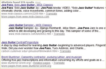
Figure 5.23: www.AltaVista.com (Oct. 2002)-Search "hits" highlight the search term in
| < Day Day Up > |
EAN: 2147483647
Pages: 128