Project: Letterhead
| We'll be creating letterhead in 11 easy steps: STEPS
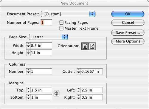
Step 1: Setting Up Your Document FormatLaunch InDesign, go to the File pull-down menu, and select New, Document. Fill out the New Document window, as indicated in Figure 4.2. Figure 4.2. Fill out the window as indicated. Don't worry about the number in the gutter field; there is no gutter with a one-column layout. Step 2: Getting Acquainted with the Control PaletteOrient yourself to the layout and check out the Control palette at the top of the window. You will be using the x,y coordinate to accurately position your elements. Your Control palette should look like Figure 4.3. Figure 4.3. You can test your palette skills by clicking in a Control palette field and using t he Tab key to tab to each field and pressing Return or Enter to activate the fields.Step 3: Importing Art FilesGo to the File pull-down menu and select Place. Navigate to your Chapter04\04Project_Files folder. Find the logo named DMLOGO.eps and double-click it to open it. An icon in the shape of a paintbrush appears. Click anywhere on the page; the logo is shown at its actual size on the page in a selected state (with a blue frame outline and anchor points). Step 4: Transforming Placed Art FilesThe logo will have to be scaled because it is too large to fit where we will be placing it. Because it is vector artwork, which is resolution independent, you can scale it without affecting its quality. However, caution should be exercised regarding strokes within the artwork because you might not want the strokes to scale. This is not the case with our logo, though. Make sure the logo is still selected and locate the X, Y fields in your Control palette (the first fields on the left side). Note
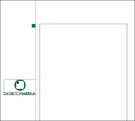
Make sure the proxy coordinate is set to the upper-left corner by clicking that dot. Note
Set the x coordinate to be .25 and the y coordinate to be 5. In the horizontal scale field, type 50% (proportional scaling is on by default and will automatically set the vertical scale equal to the horizontal scale). Note: If anamorphic scaling is required, unlock the proportional scale button next to the width and height fields and fill in the fields separately. See Figure 4.4 to identify the button directly to the right of your scale fields. Figure 4.4. Your coordinates and dimensions should look like this.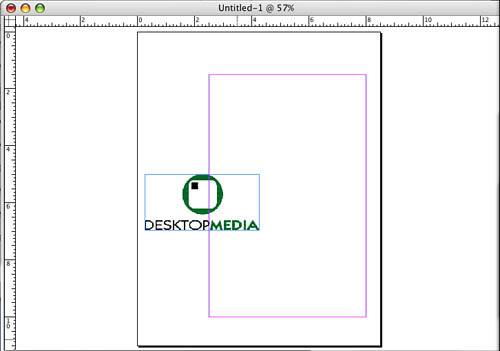 Tip
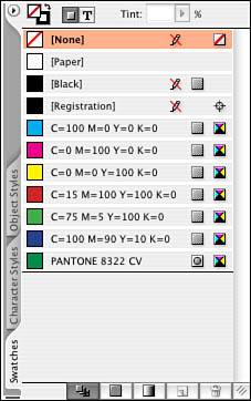
Let's take a look at the Swatches palette located under the Window pull-down menu. A new color has appeared in the palette, as shown in Figure 4.5. PMS 8322 was added to the Swatches palette when the logo was imported. Also notice that the icon to the right of the color has a dot or spot in it providing a visual indicator that you have imported a spot PANTONE color. If this color needs to be used again, perhaps in text on the letterhead, it can be used. In this way, color tags stay consistent throughout the document. A problem that plagues prepress occurs when two spot colors named similarly are used throughout the document, with one created in InDesign and a similar one brought in with line art from another product, such as Illustrator. This creates an extra separation upon output. Figure 4.5. This is how your Swatches palette should look with an imported color. Tip
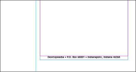
Step 5: Creating a Text ElementSelect the Text tool and position it on the bottom margin of your page so that the baseline of the I-beam lines up with the margin. Click and drag out a text box approximately the width of your bottom margin and deep enough to contain your footer, which will be the company contact information. Use your control palette to tweak the width to 5.5" and the height to .25". Use your x,y coordinate to position the text box to 2 1/2, 10. Step 6: Formatting TextSelect your company font from the Type pull-down menu, and set the size to 14 points. In my example I am using Trebuchet, but feel free to use any font you own. Type DesktopMedia • P.O. Box 68801 • Indianapolis, Indiana 46268, or feel free to use your own company information. After you type it, highlight the text and go to the Control palette. Make sure the Paragraph button is selected, and select Centered Alignment. With the text still highlighted, select the imported color from the Swatches palette. Use Figure 4.6 as a reference. Figure 4.6. Draw your text box across the bottom of your layout to fit your margins, and tweak the coordinates in your Control palette. Tip
If you want to slightly change the look of your text, try the following: Experiment with horizontal scaling (which affects the shape of the text) and tracking (which affects the space between all the letters in the highlighted line). For horizontal scaling, a number greater than 100 increases the scale and does not affect the vertical height of the characters. For tracking, a number greater than 0 adds space between the characters in 1/1000 of an em. Caution
Tip
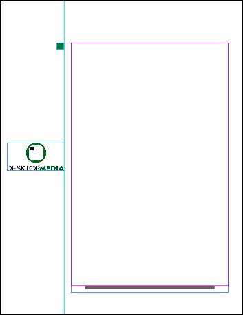
Step 7: Previewing Your Work with View CommandsDeselect the text and select View, Fit in Window. Review your work. It is helpful to turn off Frame Edges and Guides separately by going to the View pull-down menu. Or click the Preview button at the bottom of your Tool palette to turn off both Frame Edges and Guides at the same time. Click the Preview button when you need to see these visual boundaries again. Step 8: Drawing with ToolsLet's add one more graphical element to the letterhead. Select the Rectangle tool (not the Frame tool, no X should appear in the rectangle). Draw a square that is 1/4" (by holding down the Shift key while you are drawing, you can equally constrain the width and heightthis applies to all tools that draw). Tweak the dimensions of the square in the Control palette. Drag a ruler guide from your vertical ruler on the left side of your window and line it up with the right side of your logo. Drag the square over to the ruler so that the right side of the square lines up with the guide. You will feel a pull or a snap from the guide if Snap to Guides in the View pull-down menu is turned on. The x,y coordinate for the square should be 2,1.5. Step 9: Applying ColorWith the square still selected, let's add a color. Make sure your Swatches palette is displaying your swatches by name. To set this, click the triangle in the upper-right corner of your palette and select the view by Name. Make sure the Fill swatch in the upper-left corner of your palette is the active swatch (is on top) and click PMS 8322 in your swatch list. Your square should fill with color. If your square has a black stroke around it, click your Stroke swatch and click None in the Swatches palette. It should look like Figure 4.7. Figure 4.7. This is the square correctly colored and positioned. Step 10: Saving Your WorkLet's save our work. Go to the File pull-down menu and select Save As. Next, navigate to the folder in the 04Finished_Projects folder. Your finished layout should look like Figure 4.8. Figure 4.8. Your finished, saved layout. Step 11: Printing a Composite ProofLet's print a content proof. Go to the File pull-down menu and select Print. Choose the appropriate settings for the printer that is available to you. Then go to the File pull-down menu and select Print. Again select the appropriate settings for the printer available to you. Under the general tab, select one copy. On the Setup tab select 8.5" x 11" and Vertical Orientation. Leave the Scale alone. On the Marks and Bleed tab, turn off all the options. On the Output tab, if possible, print color composite output for your work; if not, select Grayscale. On the Graphics tab, the default settings should work. The remaining tabs can be ignored for now. Print and review your proof. Make any necessary adjustments, and then save your changes. Print it again, using Figure 4.9 as your guide. Figure 4.9. This is an example of how your print setting should look.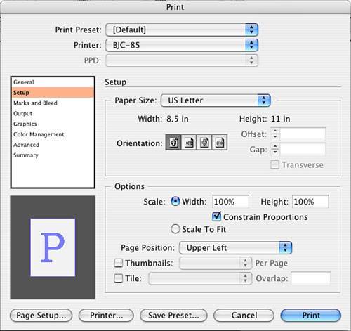 Close your file. |
EAN: 2147483647
Pages: 148