| Despite the variety and sophistication of Flash's text features, the seemingly simple and basic goal of having text appear clear and sharp can be difficult to achieve. The basis of this problem is the fact that computers display text in square pixels. This shape is especially unfortunate for displaying letters. Most letters are not blocky but are instead composed of graceful curves. But the only way computers can transmit the letterforms is to convert curves into pixels, and much is lost in that translation. Anti-aliasing is an attempt to regain some of the subtlety of curves in a pixel environment. With anti-aliasing, transitional pixels that are intermediate in color and tone are added between the type and the background, which results in smoother, although potentially fuzzy, letterforms. Say you have black text on a white background. Anti-aliasing adds some gray pixels around curved areas in the black letters, as shown in Figure 17.1. Figure 17.1. The letter on the right is anti-aliased, with gray pixels added on the curves to display smoother letters. 
Unfortunately, anti-aliasing can make text look fuzzy, particularly at small sizes, as you can see in Figure 17.2. Figure 17.2. Anti-aliasing works best with relatively large type sizes; otherwise , it makes text appear fuzzy. Notice how the top line here looks slightly grayed out or blurred. 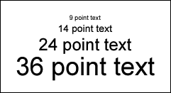
Enter bitmap fonts, also called pixel fonts. These fonts are designed without curves, specifically for computer display. Because they lack curves, there is no need to anti-alias. However, because these fonts are designed to the pixel, they must be used at the specific sizes for which they were designed and must be positioned precisely on whole pixels. Quality bitmap fonts are becoming more widely available, thanks in large part to the growing popularity of Flash. One of the best sources is www. miniml .com, which features a wide variety of bitmap typefaces , including fonts designed specifically for body text (copy) and headers, plus a serif font. Bitmap Font Resources Bitmap fonts are increasingly popular, and new ones are being introduced all the time. Here are some good sources: http://cgm.cs.mcgill.ca/~luc/pixel.html provides an exhaustive list of links to fonts ”a fantastic resource. http://www.miniml.com offers a large range of quality styles in multiple sizes. A few free fonts are available, or a 2004 Access Pass provides unlimited access to and use of fonts created in the calendar year for $100. http://www.fontsforflash.com/ offers a variety of fonts for sale. A few free fonts are offered ; you can purchase the rest individually. Their user guide offers some useful information on using pixel fonts in Flash: http://www.fontsforflash.com/userguide/ This site offers free pixel fonts: http://www.dsg4.com/04/extra/bitmap/index.html |
Using Snap to Pixels to Automatically Align Text Before you begin to type, make sure that Snap to Pixels is turned on (View, Snapping, Snap to Pixels) and all other types of snapping are off. This ensures that bitmap fonts align exactly to whole pixels and, when text is placed directly on the Main Timeline, prevents fuzziness . However, when text is embedded within symbols and then placed on the Main Timeline, pixel snapping does not guarantee sharp text.  | To learn more about preventing blurry fonts within instances of symbols, see the "Troubleshooting" section at the end of this chapter, page 377 . |
Alignment and Justification If you are using bitmap fonts, the default left alignment is the safest option. Right-alignment may also work. Centering and full justification are likely to force bitmap fonts into sub-pixel alignment (that is, alignment on fractional coordinates, as opposed to integer coordinates) so that they appear blurry. The greatest culprit is full justification, which stretches fonts onto sub-pixel coordinates even when Snap to Pixels is enabled. Turning Anti-Aliasing Off  | The Alias Text button on the Property inspector, a new option in Flash MX 2004, allows you to turn anti-aliasing off. (See Figure 17.3.) This sometimes makes text look crisper and more readable. For some serif fonts, such as Times Roman, it works best from font sizes 12 to 24. (At smaller sizes, fonts begin to blur. At larger sizes, they appear jaggy.) For some sans-serif fonts, Alias Text works well for smaller sizes. For example, Verdana size 10 is noticeably clearer with Alias Text selected. Alias Text may not work well below size 10, ensuring a continued role for bitmap fonts. |
Figure 17.3. Text field attributes. All the attributes shown here, with the exceptions of Selectable and Alias Text, are applicable only to input and dynamic text fields. 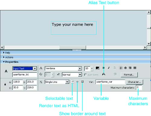
NOTE Serifs are little extra strokes at the end of the main vertical and horizontal strokes of some letters. Sans serif means "without serif." (See Figure 17.5.) Figure 17.5. Device fonts utilize system fonts that include serif, sans serif, and typewriter typefaces. 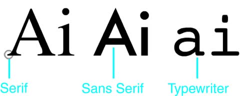
|