Section 5.6. Changing the Overall Color
I'm sometimes asked to create an image that has a particular mood. I might be asked to create a sepia-toned image that has an old-time feel, or a cold, gothic looking image made of blues and blacks. Whatever the overall look, images like this are called duotones , which means you are using one color and a black, for instance. You may actually create an image that has only one, two, three ( tritone ), or four ( quadtone ) colors; in fact, you are actually creating a CMYK image to appear as though you are using only one to four special colors. CMYK is typically used for this process, since people don't want to go to the expense of using special colors. Of course, you may not get the same color hue as with special colors, but you can probably get close enough to make your client happy.
5.6.1. Creating Duotones
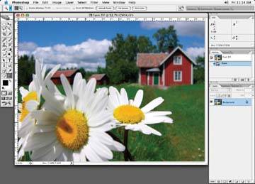
Let's imagine we've been asked to take the farmhouse in Figure 5-45 and make a sepia duotone out of it. For this technique, we'll basically apply a spot channel over a black and white image.
Figure 5-45. Our original farmhouse
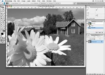
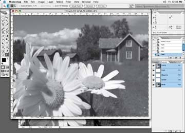
Start by converting the full-color image to grayscale (Image  Mode Grayscale), as shown in Figure 5-46.
Figure 5-46. Change the image to grayscale
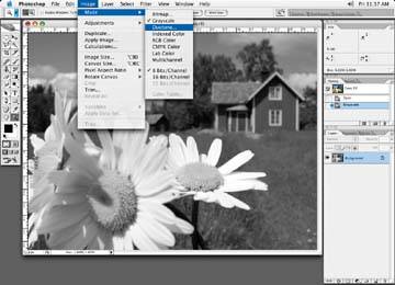
Next , select Image Mode Duotone, as shown in Figure 5-47.
Figure 5-47. Choose the Duotone function from the menu bar
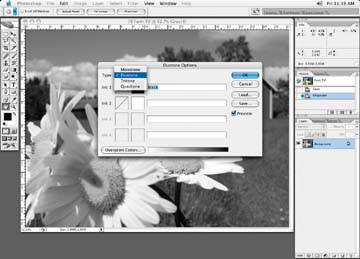
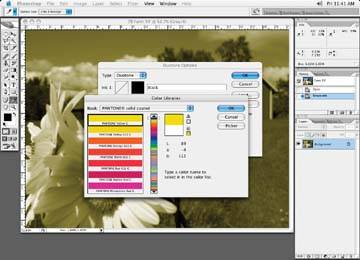
In the Duotone Options dialog box (Figure 5-48), select Duotone in the Type field. (Despite the name of the dialog box, this is where you'd choose tritones and quadtones, too.)
Figure 5-48. Choose the Duotone option in the Type field
The Ink 1 field should be set to black, as in Figure 5-49. Set the Ink 2 field to your desired color. In the case of Figure 5-50, we'll choose a yellow tone. Again, remember to be careful with the spot color name, as incorrect names may not print properly.
Figure 5-49. The Ink 1 field is set to black

Figure 5-50. Select the special color you wish to use, then click OK
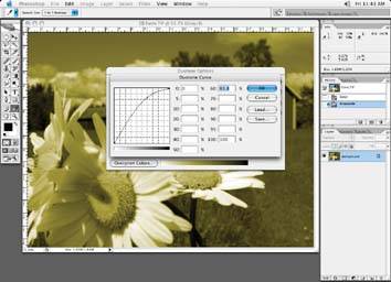
In the Duotone Options box, click on the Curve adjustment icon next to the left of the color box you just chose. This brings up a Duotone Curve dialog box, shown in Figure 5-51. Here, you can make a curve adjustment on the new color.
Figure 5-51. Click on the curve adjustment next to the special color you just chose if you wish to make any adjustments to the special color
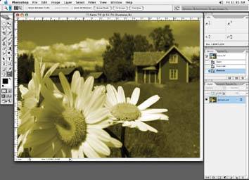
Save the final image as a .dcs2 file. The results of our farmhouse are shown Figure 5-52.
Figure 5-52. The final look of the duotone image
If you need to make further adjustments to your duotone file, you will have to go back to duotone mode to get the adjustment curves back. It's a little bit of a hassle, as you will notice that the only channel in your Channels palette is the duotone one.
If your want to see the two channels that make up your duotone, go to the menu bar and select Image Mode Multichannel. This will break up the duotone into two channels. Makes corrections a little easier!
There are a couple of things to keep in mind with the duotone mode. Some workflows do not support images supplied in the duotone mode. Check with your service provider or printer if you wish to supply your files as such. Also, with the duotone method, you will be limited to four spot colors, not that it is typical to have more than that!
| TIP Changing Duotone to CMYK |
| Occasionally, I'll be supplied with a duotone/tritone and the client would like to change it to a CMYK file, usually to save on printing costs. No magic here, a simple Image |
5.6.2. Creating Fake Duotones
You can also change overall color to create a "fake" duotone look in CMYK with the Image Adjustments Hue and Saturation command.
First, create a copy of your image and grayscale it. You don't have to change the image to a grayscale image to colorize it with the Hue and Saturation, but it seems to produce a better result. I have noticed that the image can lose detail in some areas when using a full-color image.
Make a selection of the grayscale image and paste it into the black channel of your CMYK image (Figure 5-53), and then delete all the other colors: cyan, magenta , and yellow.
Note: By all means, try a full-color image first, if you're looking to save time.
Figure 5-53. Paste the grayscale image into the black channel; delete all other channel information
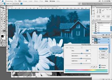
Next, select Image Adjustments Hue and Saturation. In the Hue and Saturation dialog box, starting with all sliders in the center positions , move the Hue slider around until you get the color you want, as in Figure 5-54.
Figure 5-54. Move the Hue slider and adjust until the desired color is achieved
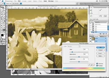
In this case, I've chosen a cold blue look for our farmhouse (Figure 5-55).
Figure 5-55. The final image
With this method of creating colored images, changing the image to different colors may knock out some of the channels to nothing, depending on the color you make it. Losing information in one particular channel may not be an issue for you, but just make sure you are aware of it.
If you desire information in all channels, you may have to go into another correction mode, like channel mix, to add information back into the file after a Hue and Saturation color change. Or change your image from its current CMYK mode to RGB, and then back to CMYK. This process will put information back into all channels, but at the possible expense of a slight color shift.
| TIP Printing Images with Spot Colors in Them |
| If you own a desktop inkjet printer, unfortunately you will not be able to see the results of your spot colors correctly. Most ink jets cannot simulate spot colors accurately and are limited to the inks in the printer. To recreate the spot colors correctly, you'll have to have your files output on a high-end proofing device or get a film-based proof made to create a final proof with the spot colors in it. One other thing to keep in mind is that printing an image with a spot color channel to a composite color printer will print the spot color at an opacity indicated by the solidity setting. So be careful of this. |
EAN: N/A
Pages: 83