Supporting Disabled Users and Specialist User Agents
| Web developers must increasingly consider the needs of users of non-graphical Web browsers, such as text-only browsers, Braille output devices, aural page readers, and other specialist user agents. There are also issues to consider such as the use of colors and small text for users who have less than perfect vision. Many governments require that their Web sites conform to certain accessibility guides: In the Unites States, Section 508 of the Rehabilitation Act covers this; in Canada, the Treasury Board sets standards; and in Australia, there is the Disability Discrimination Act. Many other countries also require adherence to certain standards.
The best place to start when investigating issues of accessibility for your Web sites is the W3C Web Accessibility Initiative (WAI). An introduction to the issues, guidelines and techniques, and details of the ways you can evaluate accessibility are available at http://www.w3.org/WAI/. General Techniques for Maximizing AccessibilityThe major issues for maximizing the accessibility of your Web pages and Web sites concern navigation to each page and within each page, exposing content so that all users can read and comprehend it, and supporting visitors who do not use the traditional input devices such as a mouse. Special user agents and other types of Web access software designed for users with different types of disabilities depend on Web pages implementing some or all of the features presented in this section that make pages more easily accessible. Navigation Accessibility FeaturesThese recommendations help users to navigate from one page to another, and within individual pages:
Identifying ElementsThese recommendations help users to identify individual elements within the page and make sense of the content if they cannot make use of the "default" view. For example, they can allow unsighted users to access an aural description of an image.
General RecommendationsThe following recommendations provide general assistance to disabled users and users of non-standard user agents:
Evaluating and Testing Your Pages and SitesVisual Studio contains features that allow you to check the accessibility of your Web pages. The Formatting toolbar contains a button that allows you to check the page against two of the common recommendations, the Web Content Accessibility Guidelines (WCAG) and Section 508 of the Rehabilitation Act (published by the United States Access Board). You can also display within the Error List window a checklist of topics that you should consider (see Figure 14.5). Figure 14.5. Checking a page for accessibility in Visual Studio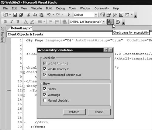
The Web Content Accessibility Guidelines are available from the W3C Web site at http://www.w3.org/TR/WAI-WEBCONTENT/. The Section 508 guidelines are at http://www.access-board.gov/508.htm. Figure 14.6 shows the results of running the accessibility check on the page you saw at the start of this chapter when looking at HTML validation. While there are no errors, there are warnings about connecting control labels (such as the "Enter your name" caption) with the controls to which they relate. There is also a general suggestion about grouping controls to make them easier to use in specialist user agents. Figure 14.6. The results of an accessibility check on a simple page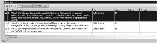 However, the best way to see how your pages and sites actually appear to disabled visitors and in alternative browsers is through testing them yourself. Try accessing your pages in a text-only browser such as Lynx. Also, try one of the "page reader" applications such as the IBM Home Page Reader. If you close your eyes or turn off your screen, can you navigate through your own site?
The W3C provides a list of over 30 browsers, specialist user agents, tools and add-ins for disabled users at http://www.w3.org/WAI/References/Browsing. There is also a useful list of tools and resources for testing your pages at http://www.w3.org/WAI/ER/existingtools.html. Accessibility Features in ASP.NET ControlsWhile the server controls provided with ASP.NET cannot provide all of the solutions for accessibility maximization (only good page design and implementation can do that), they do provide the following useful features:
Using Alternate Text and Long DescriptionsOther than text, the most common content on the Web is images. Most Web sites contain a large number of images, some that provide essential information, some that are just additional content, some that are there simply for decoration, and some that are used to control the spacing between elements or act as an alternative to standard list bullets and horizontal rules. To a visually impaired user with a text-only browser or page reader, all of these images just get in the way. Such a user cannot tell what the image is, if it is important, and what it contains. Therefore, you should always follow the guidelines given earlier by providing alternate content and information about the images themselves. This means using at least the alt attribute to identify and quantify the image. If it is a picture accompanying a description of, for example, a new type of spacecraft, it should carry an alt attribute that specifies something like "Photograph of the spacecraft during blast-off." Likewise, other types of non-accessible content should carry alternate text descriptors. While the user still cannot see the image, they at least know what it contains. However, what do you do about those non-contributing images such as bullets and horizontal rules? In this case, you should add the attribute alt="", which indicates that the user can ignore the image altogether. The problem is that, with ASP.NET server controls, setting a property to an empty string means that the control will not render the relevant attribute. The answer is to use the GenerateEmptyAlternateText property. Setting it to TRue causes the control to generate the alt="" attribute. Listing 14.4 shows a simple declaration of three Image controls. The first sets the AlternateText property (which generates the alt attribute) to an empty string. The second omits the AlternateText property but sets the GenerateEmptyAlternateText property to TRue. The third sets the AlternateText property to a suitable string and adds the DescriptionUrl property. This property generates the longdesc attribute, which in this case points to a separate page that describes the image. Listing 14.4. Declaring the Alt and Longdesc Attributes for an Image
Figure 14.7 shows the results of the code in Listing 14.4. You can see that in a normal graphical browser, they all look the sameonly the text placed after each one is different. However, if you place your mouse pointer over the last one, you see the alternate text appear. Figure 14.7. Using the alt and longdesc attributes for images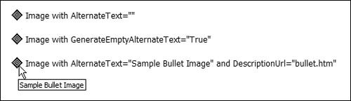 To see what difference the alt and longdesc attributes really make, you need to view the source of the rendered page in the browser (select Source from the View menu). The first image has no alt attribute, because setting it to an empty string removes it from the element: <img src="/books/1/268/1/html/2/bullet.gif" align="absmiddle" style="border-width:0px;" /> The second image has the empty alt attribute, as intended, created by setting the GenerateEmptyAlternateText property to true: <img src="/books/1/268/1/html/2/bullet.gif" alt="" align="absmiddle" style="border-width:0px;" /> The third image contains the alt attribute specified in Listing 14.4, plus the longdesc attribute. A specialist page reader or text browser can expose the URL declared in this attribute ("bullet.htm") as an optional link, or even fetch the content of the page and display it alongside the image or in some other suitable way: <img src="/books/1/268/1/html/2/bullet.gif" longdesc="bullet.htm" alt="Sample Bullet Image" align="absmiddle" style="border-width:0px;" /> The URL referenced in the longdesc attribute might be a sound file that describes the image, a link to another site that contains alternative content about the image, or a simple text file. In this example, the page bullet.htm is an HTML page thatwhen displayed in a normal Web browserlooks like Figure 14.8. A page reader or text browser will be able to present this as a text description of the image. Figure 14.8. The contents of the alternative description declared in the longdesc attribute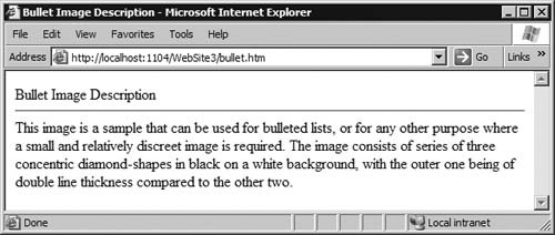 Implementing "D" Links and Alternative ContentYou saw in the previous section how you can expose extra information to users by adding the alt and longdesc attribute to images and by providing alternate content for other elements. One of the other accepted ways to indicate that alternate content is available is through a "D" or "description" link. This is simply a hyperlink that displays the letter "d" or "D" next to the item for which you provide extra information and navigates to a page or resource containing that information. The example you will see in a later section, An Example of an Accessible Page, shows a "D" link in use. While the link is usually visible to users of graphical browsers, you can hide it using the same approach you will see demonstrated for skip-to links in the next section. However, leaving it visible provides an indication to partially sighted or color-blind users, who may use a graphical browser with a large text size setting, so that they can see more information if they cannot completely comprehend the default content (for example, a chart using very fine or colored lines). Implementing "Skip-to" LinksUsers of graphical browsers, when faced with a complex Web Page, can generally tell quite easily which sections contain the content they want to view, and they can visually skip over other items such as menus, navigation bars, lists of links to other pages, and other non-relevant content. However, most specialist browsers or page readers present the content serially, starting at the top of the page and working through it. This means that the user may have to wade through the same non-relevant sections of content on every page load, including the menus, links, disclaimers, descriptions of the page heading images, and more. You can make it easier for these users in the following two ways:
Skip-to links are simply hyperlinks that are visible to page readers and text browsers, but may not be visible to users of graphical browsers (though Supporting Disabled Users and Specialist User Agents 571 they can be if you wish). The link points to an anchor element within the same page, located at the position of the corresponding content section. You can use more than one skip-to link in a page if this is appropriate, but you should limit the number to two or three for simplicity.
Some of the controls included in ASP.NET generate skip-to links, orto be more accurateskip-over links automatically. An example is the Menu control, which generates a link at the top of its output that allows users to skip over the control to an anchor located at the end of its output. Listing 14.5 shows two skip-to links and the corresponding anchor elements located just before the related sections of the page. In this case, a range of techniques including <font> elements and CSS styles hide the links in graphical browsers. The image used in the hyperlinks is a single-pixel transparent GIF file. Beware of using the CSS display and visible selectors, because these may cause some specialist browsers to fail to display the links. Listing 14.5. Skip-to Links for Aural Page Readers and Text-Only Browsers
An Example of an Accessible PageAs an example of both "D" links and skip-to links, and providing alternative views of information, Figure 14.9 shows a Web page that displays a graphical chart. This page contains skip-to links, which you cannot see in a normal browser but which are visible in other browsersas you will see later. Above the chart are option buttons that allow visitors to choose the viewing format for the information. By default, it is as a chart. Below the chart, you can see the "D" link that provides more information. Figure 14.9. An example page that displays a chart viewed in a graphical browser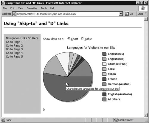 The example uses a separate class file that simply generates a DataSet containing the static information for this example by adding rows to a DataTable. A separate ASP.NET page creates the chart dynamically at runtime as a GIF image (you can see the text from the alt attribute in Figure 14.9). You will see how this page works in Chapter 15. Meanwhile, this chapter concentrates just on the accessibility features built into this example. Clicking the Table option button reloads the page, and this time the information displays as an HTML table generated by a GridView control (see Figure 14.10). Again, a "D" link appears below the table. Figure 14.10. The same information viewed as a table in a graphical browser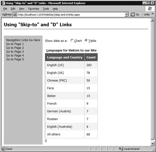 Listing 14.6 shows the main sections of the HTML for this page. The two option buttons each declare an AccessKey and contain the matching underlined letters in their captions. They use the auto-postback mechanism, so that making a selection automatically displays the chart or table. However, this will not work in browsers that do not support client-side script, and so a submit button (with the caption Go) is added within a <noscript> element. It will appear only if the browser does not support client-side scripting or if it is disabled. Listing 14.6. The Main Page That Displays a Chart or a Table
Following the option buttons is an ASP.NET PlaceHolder control. As you saw in Chapter 8, this control reserves a location within the control tree where you can insert other controls at runtime. After the PlaceHolder control is the GridView control that displays the HTML table. Finally, a Hyperlink control provides the "D" link to the page containing the alternative content. Notice that the code defines an AccessKey for both the GridView and the Hyperlink, so that they are easily accessible to users who do not or cannot use a normal mouse. To display the appropriate content, the Page_Load event handler, shown in Listing 14.7, detects the setting of the option buttons. If the Chart option is selected, the code creates a new Image control and sets the properties for the separate ASP.NET page that generates the GIF image of the chart, the value for the alt attribute, and the value for the longdesc attribute. Then it inserts the new Image into the PlaceHolder control. If the Table option is selected, the code uses the GetdemoDataSet method of the separate class file to fetch a DataSet and binds it to the GridView control to display the information as an HTML table. It also populates the caption for the table and sets the AccessKey. Because the GridView has its viewstate disabled (the declaration contains the attribute EnableViewState="False"), it contains no data and no caption unless reset by this code. This means that it disappears when reloading the page to show a chart. Listing 14.7. The Page_Load Event Handler for the Accessible Example Page
One other feature you can see in Listing 14.7 is that it attempts to provide the most appropriate information format automatically when the page first loads. The code in the Page_Load event handler uses the current Http-BrowserCapabilities instance (obtained from the Browser property of the current Request) to check if the current browser supports color. If it does not, or if does not support images at all, this property will be false and so the obvious course of action is to display a table and not a chart. Clicking the "D" link in this example opens the alternative content page, which contains just a text description of the values in the chart/table shown in the previous page (see Figure 14.11). A link at the bottom of this page takes the user back to the previous page. Figure 14.11. The alternative content page viewed in a graphical browser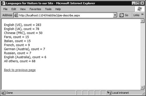 The code to create the alternative content for this page is simple, and (as you would expect) uses the same data source as the chart and table views. Listing 14.8 shows the Page_Load event handler for this page. It contains a relatively generic routine that iterates through the rows in the DataSet table and builds up a String containing the data. It then inserts this into a Label control on the page. The final line of code sets the NavigateUrl property of the Hyperlink on this page to the URL of the referring page so that clicking it takes the user back to the previous page. Listing 14.8. The Page_Load Event Handler in the Alternative Content Page
Viewing the Accessible Page Example in a Text-Only BrowserYou can get a good idea of how your pages appear in non-graphical user agents by using a text-only browser such as Lynx. This is a simple and light, easy-to-use text-only browser that runs under a variety of operating systems. Figure 14.12 shows the text-only view of the main example page you saw earlier in a graphical browser. Figure 14.12. The example page skip-to links in a text-only browser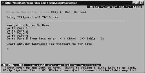 Here, you can clearly see the skip-to links at the very top of the page just below the page title (the different colors Lynx uses to indicate hyperlinks and controls, and the current input focus, are not visible in the monochrome screenshots here). Then there is the navigation section, followed by the two option buttons. Notice that the Table option is selected by default because Lynx does not support images and colors, and the Go button is visible because Lynx does not support client-side script. At the end of the page is the "D" link for displaying the alternative view of the information. Lynx can display simple HTML tables, so selecting the Go link displays the information in a usable format (see Figure 14.13). Meanwhile, selecting the "D" link displays the text-only equivalent of the alternative content page (see Figure 14.14). Figure 14.13. The table view of the data in a text-only browser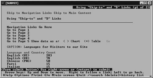 Figure 14.14. The alternative content page in a text-only browser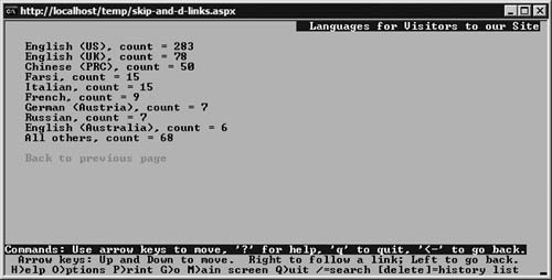
The home of the Lynx browser is http://lynx.browser.org/, and you can download a version for your operating system from http://lynx.isc.org/current/. Maximizing Accessibility for HTML TablesWhen a browser renders an HTML table, comprehending the information it contains is generally a matter of scanning the rows and columns and mentally relating them with the header descriptions for each row. Often the table is like a spreadsheet in design, where each cell value in the body relates to the description for the column and the row where it resides. For most users, this just involves looking at the header and the left-hand row to locate the desired descriptions and then scanning down and across to the cell where they meet. However, for users of nonvisual browsers and user agents, this is hard to do. Their browser will usually iterate through the table row by row, and it is easy to lose track of the header descriptions that relate to each cell in the row. To assist such users, HTML 4.0 includes the headers attribute for a table cell, which should be set to a list of the header cell ID values for the header and row description to which this cell relates. This way, the browser can extract the header and row descriptions as it iterates through the cells in each row and present them to the user in a suitable manner. In Chapter 8 (in the example of using the Table control), you saw one solutionthe use of the AssociatedHeaderCellID property of each cell in a table to link the cells with the relevant header cells. Listing 14.9 shows the HTML rendered to the browser to display the table. You can see the column and row <th> elements and the headers attributes on each <td> element, which relates the cells to the appropriate row and column headers. Listing 14.9. An HTML Table Containing Headers Attributes
Using Short-cut Keys, Tab Order, and Table CaptionsThe AssociatedHeaderCellID property you saw in the previous section only applies to the TableCell control. If you want to add headers attributes to the cells generated by a control such as the GridView, you must do so by handling events that occur as ASP.NET generates the rendered table. This example demonstrates this, the use of the associated Label controls and short-cut keys, and setting the tab order in a page. Figure 14.15 shows the rendered page for this example. You can see that the captions for the three text boxes and the grid have underlined letters that correspond to the short-cut keys that move the input focus to them. What you cannot see is that there is also a short-cut key (Alt+S) for the Show button. Figure 14.15. Demonstrating short-cut keys and GridView accessibility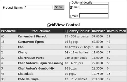
You cannot underline text in a standard Button control, because the HTML elements (the <u> and </u> tags) simply display as text on the button. However, if you use the HTML-style <button> element, you can force Internet Explorer to display an underlined button caption: <button runat="server"><u>S</u>how</button> The problem with this control is that it does not cause a postback, and so you must wire it up to a client-side function that calls the submit method of the form. If you experiment with this page, you will see that you can move the input focus to any text box or the grid using the short-cut keys. You can also tab through the controls, in which case the order is the Product Name text box followed by the grid, and then back up to the Name and Email text boxesan order different than the default tabbing order. Listing 14.10 shows the declarations of the Label, TextBox, and Button controls, each with the relevant AccessKey and TabIndex properties set. Notice the grouping of the optional controls within a Panel control. Specifying the GroupingText property causes this control to generate an HTML <fieldset> and nested <legend> element, which is the recommended way to clarify the layout of complex forms for specialist user agents to better understand the contents. Listing 14.10. The Declaration of the Label, TextBox, and Button Controls
Listing 14.11 shows the HTML that the code in Listing 14.10 generates. You can see the accesskey and tabindex attributes, and the title for the submit button (you can also add title attributes to text boxes by setting the Tooltip property of the TextBox control). Listing 14.11. The HTML Generated by the Label, TextBox, and Button Controls
The GridView control declaration for this example (see Listing 14.12) also contains some extra property settings that aid accessibility. The Caption property generates the caption above the grid, and the value used in this example causes underlining of the hotkey specified for the AccessKey property of the GridView (look back at Figure 14.15 to see the result). You can also see the TabIndex property set so that the grid gains the input focus before the two text boxes above it in the page. The declaration of each column is not relevant here, and so these are not visible in the listing. Listing 14.12. The Declaration of the GridView Control
Adding Accessible Headers to a GridView ControlNotice in Listing 14.12 that the RowHeaderColumn property is set to the name of the column in the source rowset that contains the most useful and descriptive value from each rowthe product descriptionand the UseAccessibleHeader property is set to true. These property settings will add some of the accessibility features to the generated grid. The RowHeaderColumn property causes ASP.NET to generate a <th> element rather than a <td> element for the cells in this column of each row, making them appear in bold text in a graphical browser. More importantly, it means that a page reader or non-graphical user agent can tell which column contains the information most useful in describing each row to the user. The UseAccessibleHeader property causes ASP.NET to add the scope attributes to each column and row header, specifying whether the heading or value in that cell applies to the row or the column in which it is located. However, these property settings do not provide the headers attributes in each cell like you saw with the Table control example in Chapter 8, but you can add them yourself using code. You can see in Listing 14.12 that the OnRowDataBound property specifies an event handler named AddHeadersAttr that runs as ASP.NET generates each row of the HTML table that represents the grid. Listing 14.13 shows this event handler in full. The code checks to see what type of row ASP.NET is creating. For a header row, it adds to each cell an id attribute that contains the text "ColumnHeader_" and the name of the column. For the rows that form the body of the table, the code iterates through the cells in the row checking each one to see if it is a row header (a <th> element represented in the control tree as a DataControlFieldHeaderCell control) or a normal data cell (a <td> element represented in the control tree as a DataControlFieldCell control). For row header cells, the code adds to the cell an id attribute containing the text "RowHeader_" and the value of the primary key of the row taken from the DataKeys collection of the GridView (the DataKeyNames property of the GridView control is set to the ProductID column, as shown in Listing 14.12). For data cells, the code generates a headers attribute on the cell that specifies the value of the id properties of the current column and row header cells. Listing 14.14 shows a section of the HTML generated by this example. You can see the accesskey and tabindex attributes on the <table> element, and the nested <caption> element with its underlined letter. In the first row of the table are the column header cells, each with the id set to the value added by the code in the AddHeadersAttr event handler, and the scope="col" attribute added by setting the RowHeaderColumn and UseAccessibleHeader properties. In the next row, the second cell is the row header (the product name) and again has an id attribute. The other four cells are data cells that contain the headers attribute with the appropriate column and row header id values. You can see from this how suitable page readers or text-only user agents can describe the cell to the user as they navigate through the table by reading out or displaying the contents of the column and row header cells. Listing 14.13. The Code to Add the Headers Attributes to the GridView Control
If the text of the column headings (the HeaderText property) is not descriptive enough of the contents of a column, or if you omit the text in a particular column header for aesthetic reasons, you can provide a more descriptive explanation of the contents of the column. The AccessibleHeaderText property of the various column objects (such as BoundField, HyperlinkField, and ButtonField) sets the abbr attribute for the corresponding <th> element in the column header row, which is available to specialist user agents but is not visible in a graphical browser. Listing 14.14. The HTML Generated by the Accessible GridView Control
|
EAN: 2147483647
Pages: 147