Chapter 5: Color, Backgrounds, and Borders
Working with text Properties
Text properties are those properties related to typography that are classified in the CSS specification under text rather than font. While font properties relate to how font glyphs are formatted, text properties tend to influence the way the text itself is arranged. Text properties help you manage a range of text features, as follows:
Indentation (text-indent) Indentation allows you to indent the first line of text within a block. Values may be fixed or a percentage and a negative value can be used within reason.
Alignment (text-align) Alignment allows you to align the content within a given box. You can use left, right, center, and justify.
| Note | Text alignment is based with respect to the element box rather than the browser window. The text-indent and text-align properties only apply to block-level elements. |
Decoration (text-decoration) The text-decoration property lets you add or suppress a variety of decorative elements including underlining, overlining, line-through (more familiar as strike-through to many readers), and blink. Yes, that’s right, you read it here—blink.
Letter and Word Spacing (letter-spacing; word-spacing) The letter-spacing property allows you to set the space between individual characters within a font. The length must be specific, not percentage based, and values may be negative. The length applied is applied in addition (or in subtraction) to the default spacing.
The word-spacing property describes the space between words. As with letter-spacing, the length must be specific, values may be negative, and the measurements are applied in addition or in subtraction to the default word spacing.
Text Transformation (text-transform) Text transformation allows you to control the way text is capitalized. You can make each word capitalized, put all words in upper case or lower case, or suppress capitals completely using this property.
White Space (white-space) White space manages the way space within the element’s box appears. You can have normal white spacing, where all extra spaces are collapsed (as in normal browser behavior), pre-formatted spacing, where the spacing within the element will take into account your space input, and nowrap, which suppresses line breaks.
An additional property important to discuss in this section of the chapter is line-height. This is the spacing between lines of text and relates directly to typography but is classified outside of the font and text properties. The property is discussed in the visual model of the CSS2 specification.
Indenting Text
To indent text using the text-indent property, follow these steps:
1.Choose a selector to which you’d like to add indentation. In this case, I used p. Add the declaration block:
p { } -
Add the text-indent property:
p { text-indent: } -
Add a value (in this case, I used a specific measurement unit, but you can use percentages, too):
p { text-indent: 15px; } -
Apply this rule to a document and see the results.
Figure 4.14 shows a series of paragraphs using the text-indent property.
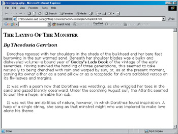
Figure 4.14: Using the text-indent property, you can indent the first line of text in each paragraph.
Text Alignment
To practice aligning text using CSS, follow these steps:
-
Begin with a series of selectors as follows:
p.left { } p.right { } p.center { } p.justify { } -
Add the text-align property to each:
p.left { text-align: } p.right { text-align: } p.center { text-align: } p.justify { text-align: } -
Add the appropriate values as follows:
p.left { text-align: left; } p.right { text-align: right; } p.center { text-align: center; } p.justify { text-align: justify; } -
Add this set of rules to a document with at least four paragraphs. In the document, you’ll need to add a class attribute, using one example of each class created here.
In Figure 4.15, you’ll see the way the paragraphs themselves are styled.
Figure 4.15: Using text-align with left, right, center, and justify values for the paragraphs within our sample
Decorating Text
Text decoration can be used for a number of reasons including editorial marks (such as with line-through) and unusual styling of text for decorative purposes. There are two properties within the decoration section of the CSS2 specs to manage text decoration, text-decoration and text-shadow. The text-decoration has plenty of browser support, but text-shadow is currently (and unfortunately) not supported. But, again, as with quite a few CSS properties you’ve learned in this book, they exist in the specifications and you should be aware of them.
The specific decorations values for text-decoration are as follows:
-
none (no decoration)
-
underline (line under text)
-
overline (line over text)
-
line-through (line through text)
-
blink
Tip The text-decoration property is extremely useful for turning off link underlining within an anchor. To do so, set text-decoration for anchors to a value of none.
The specific values for the text-shadow property are as follows:
-
color (defines the color of the shadow)
-
length (defines the length of aspects of the shadow)
You can use shadowing to create some unusual effects. A simple drop shadow using the default color for h1 (in this case, black) that is to the right by 5 pixels and down by 5 pixels could be created using the following CSS:
h1 { text-shadow: 5px 5px; } If you’d like to add a blur to your shadow, add a value measurement for the blur:
h1 { text-shadow: red 5px 5px 5px; } The preceding rule will create a red shadow that is 5 pixels right, 5 pixels down, and has a 5 pixel glow.
Using Letter and Word Spacing
Designers often want the opportunity to modify the spacing between characters within words, and between words themselves. CSS2 offers two properties that allow you to modify these aspects of text. The values available for each are normal and length, where the length is specified using a CSS measurement value.
Listing 4.4 shows the document from earlier in the chapter with letter and word spacing rules set in the style sheet.
Listing 4.4: WWW. Letter and Word Spacing in Action
<!DOCTYPE html PUBLIC "-//W3C//DTD XHTML 1.0 Transitional//EN" "http://www.w3.org/TR/xhtml1/DTD/xhtml1-transitional.dtd"> <html xmlns="http://www.w3.org/1999/xhtml"> <html> <head>  <title>css typography</title> <style type="text/css"> h1  {      font-family: Georgia, Times, serif;      font-size: 24px;      font-variant: small-caps; } h2  {      font-family: Georgia, Times, serif;      font-size: 20px;      font-style: italic; } h3  {      font-family: Georgia, Times, serif;      font-size: 18px; } p  {      font-family: Verdana, arial, helvetica, sans-serif;      font-size: 16px;      letter-spacing: 2px;      word-spacing: 10px;} strong  {       font-weight: 800; )</style> </head> <body> <h1>The Laying Of The Monster</h1> <h2>By Theodosia Garrison</h2> <p>Dorothea reposed with her shoulders in the shade of the bulkhead and
her bare feet burrowing in the sun-warmed sand. Beneath her shoulder blades
was a bulky and disheveled volume—a bound year of <strong>Godey’s Lady
Book</strong> of the vintage of the early seventies. Having survived the
handling of three generations, this seemed to take naturally to being
drenched with rain and warped by sun, or, as at the present moment, serving
its owner either as a sand-pillow or as a receptacle for divers scribbled
verses on its fly-leaves and margins.</p> <p>It was with a poem now that Dorothea was wrestling, as she wriggled her
toes in the sand and gazed blankly oceanward. Under the scorching August
sun, the Atlantic seemed to purr like a huge, amiable lion cub.  <p>It was not the amiabilities of nature, however, in which Dorothea found
inspiration. A harp of a single string, she sang as that minstrel might
who was implored to make love alone his theme.</p> </body>
</html>
Figure 4.16 shows the spacing in effect.
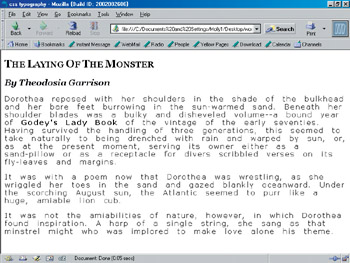
Figure 4.16: Letter and word spacing. Compare this to earlier examples of the same document without the spacing rules in place
| Note | Many CSS authors prefer to use ems for letter and word spacing because ems will allow the font to scale automatically when you make a change to the font’s size. |
Transforming Text
You can modify the way text is capitalized using the text-transform property.
Here’s a snippet that shows a selector and rule for a variety of available text-transform values:
h1 { text-transform: capitalize; } h2 { text-transform: uppercase; } h3 { text-transform: lowercase; } | Note | A value of none will ensure that no capitalization effects are applied. |
Figure 4.17 shows examples of how these transformations apply.
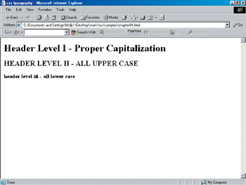
Figure 4.17: Using text-transform on headings to control capitalization.
Managing White Space
You can manage aspects of white space using the white-space property.
To mimic normal browser behavior where any additional white space between tags or characters is collapsed down to one space, use the normal property:
p { white-space: normal; } To prevent collapse of white space and preserve your line breaks, use the pre property:
p { white-space: pre; } Finally, you can suppress line breaks in text by using the nowrap property:
td.nowrap { white-space: nowrap; } Try out these properties and values within a document of your own, and look at the differences between values.
Working with Line Height
In typography, leading is the space between individual lines of text. The term comes from the days of typesetting, when lead was used to ensure the proper spacing between lines.
Normal leading is usually the same or very near to the size of the type being used. For example, when you have 12 pixel type, the leading is going to look very natural at 12 pixels, too.
To control leading with style sheets, you can use the line-height property. Its value is numeric, in whatever measurement you’re using:
p { font-family: Verdana, Arial, Helvetica, sans-serif; font-size: 16px; line-height: 22px; } To give you and idea of how line-height works, Listing 4.5 shows a document with inline line-height properties and values.
Listing 4.5: Working with line-height
<!DOCTYPE html PUBLIC "-//W3C//DTD XHTML 1.0 Transitional//EN" "http://www.w3.org/TR/xhtml1/DTD/xhtml1-transitional.dtd"> <html xmlns="http://www.w3.org/1999/xhtml"> <html> <title>css typography</title> <style type="text/css"> h1  {      font-family: Georgia, Times, serif;      font-size: 24px;      font-variant: small-caps; } h2  {      font-family: Georgia, Times, serif;      font-size: 20px;      font-style: italic; } h3  {      font-family: Georgia, Times, serif;      font-size: 18px; } p  {      font-family: Verdana, arial, helvetica, sans-serif;      font-size: 16px;      letter-spacing: 2px;      word-spacing: 10px;      line-height: 26px; } strong  {       font-weight: 800; ) </style> </head> <body> <h1>The Laying Of The Monster</h1> <h2>By Theodosia Garrison</h2> <p>Dorothea reposed with her shoulders in the shade of the bulkhead and
her bare feet burrowing in the sun-warmed sand. Beneath her shoulder blades
was a bulky and disheveled volume—a bound year of <strong>Godey’s Lady
Book</strong> of the vintage of the early seventies. Having survived the
handling of three generations, this seemed to take naturally to being
drenched with rain and warped by sun, or, as at the present moment, serving
its owner either as a sand-pillow or as a receptacle for divers scribbled
verses on its fly-leaves and margins.</p> <p>It was with a poem now that Dorothea was wrestling, as she wriggled her
toes in the sand and gazed blankly oceanward. Under the scorching August
sun, the Atlantic seemed to purr like a huge, amiable lion cub.  <p>It was not the amiabilities of nature, however, in which Dorothea found
inspiration. A harp of a single string, she sang as that minstrel might
who was implored to make love alone his theme.</p> </body>
</html>
Figure 4.18 shows a document using line-height values. Compare this figure to one of the earlier figures of the same document to see the difference.

Figure 4.18: Using line-height values
Just as with so many properties, font-related properties can be condensed into a shorthand form using the font property. Here’s an example:
p { font: italic bold small-caps 16px/22px Verdana, Arial, Helvetica, sans-serif; } Order is crucial when working with shorthand font properties. First comes style, then weight, then any variants. This is followed by font size and size value, followed by a slash (/) and the line height with its size value, followed by any font names you’d like to use.
EAN: 2147483647
Pages: 86