Anti-aliasing Type
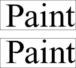
| You can choose to smooth the edges of, or anti-alias, your type, just as you can with image selections as discussed in Chapter 4, "Making Selections." In most cases, you'll be using Photoshop Elements to create fairly large, display-size text. For this reason, you'll normally want to anti-alias your text so that it doesn't appear to be jagged (Figure 9.36). Figure 9.36. You'll usually want to anti-alias your type, especially when using larger type sizes. This example shows 60-point type viewed at 200 percent.
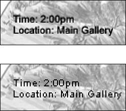
The exception is in cases where you are using smaller font sizes, such as 14 points or less, and are planning to use the image for onscreen viewing on the Web. At smaller sizes, anti-aliasing actually makes your text less readable, and the smoothing effect looks more like blurring (Figure 9.37). Also, in the process of anti-aliasing, many more colors are generated, and not all Web browsers support all of these colors, so some unwanted color artifacts may appear around the edges of your type. By default, anti-aliasing is turned on. Figure 9.37. When using type sizes of about 14 points or less, you may want to turn off anti-aliasing so that your text doesn't become blurry. This example shows 10-point type viewed at 200 percent.
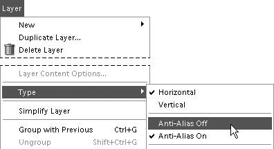
To turn anti-aliasing off and on
|
EAN: 2147483647
Pages: 178