Custom List Control
In Chapter 24, it was mentioned that you can derive a new list control from TCustomListBox, since the TCustomListBox is really the same thing as TListBox, except that the majority of the properties are protected or public.
The TCustomListBox component is the perfect ancestor for the TCharacterBox component that we are going to create because, among other things, the TCustomListBox doesn't publish the Items property. There is no need to enable the user to change or even access the Items property of the TCharacterBox component at design time, because the component's data is constant (it always has 96 items) and dynamically generated in the component's constructor (well, almost).
To create the basic skeleton of the TCharacterBox component, open your component package and select Component ® New VCL Component. On the New VCL Component dialog box, select the TCustomListBox component as the ancestor component, name the new component TCharacterBox, add it to your Tool Palette category, and save it to your component directory under ![]() CharacterBox.pas.
CharacterBox.pas.
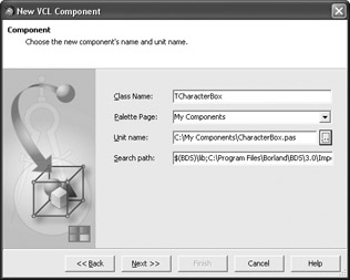
Figure 26-2: Creating the TCharacterBox component
The TCharacterBox is specific not only because it is derived from a "TCustomComponentName" class, but also because it surfaces data stored in a two-dimensional array declared in the implementation part of the unit. This array contains symbol descriptions (like "small letter a with tilde") and named entities (like "nbsp") that can be added to HTML/XHTML pages to display a particular symbol. In fact, valid named entities begin with an ampersand and end with a semicolon ( ), but this is not important in the array. We'll generate valid named entities when we copy the data from the array to the Items property of the list.
The following listing displays the entire CHARACTERS array used by the TCharaterBox component. The array is declared in the implementation part of the unit, beneath the reserved word implementation and above the implementation of the Register procedure.
Listing 26-1: The entire character list
const { Description | Named Entity } CHARACTERS: array[0..95, 1..2] of string = ( ('non-breaking space', 'nbsp'), ('inverted exclamation mark', 'iexcl'), ('cent sign', 'cent'), ('pound sign', 'pound'), ('currency sign', 'curren'), ('yen sign', 'yen'), ('broken bar', 'brvbar'), ('section sign', 'sect'), ('diaresis', 'uml'), ('copyright sign', 'copy'), ('feminine ordinal indicator', 'ordf'), ('left-pointing double angle quotation mark', 'laquo'), ('not sign', 'not'), ('soft hyphen', 'shy'), ('registered sign', 'reg'), ('macron', 'macr'), ('degree sign', 'deg'), ('plus-minus sign', 'plusmn'), ('superscript two', 'sup2'), ('superscript three', 'sup3'), ('acute accent', 'acute'), ('micro sign', 'micro'), ('pilcrow sign', 'para'), ('middle dot', 'middot'), ('cedilla', 'cedil'), ('superscript one', 'sup1'), ('masculine ordinal indicator', 'ordm'), ('right-pointing guillemet', 'raquo'), ('fraction one quarter', 'frac14'), ('fraction one half', 'frac12'), ('fraction three quarters', 'frac34'), ('inverted question mark', 'iquest'), ('capital letter A grave', 'Agrave'), ('capital letter A with acute', 'Aacute'), ('capital letter A with circumflex', 'Acirc'), ('capital letter A with tilde', 'Atilde'), ('capital letter A with diaresis', 'Auml'), ('capital letter A with ring above', 'Aring'), ('capital letter AE', 'AElig'), ('capital letter C with cedilla', 'Ccedil'), ('capital letter E with grave', 'Egrave'), ('capital letter E with acute', 'Eacute'), ('capital letter E with circumflex', 'Ecirc'), ('capital letter E with diaeresis', 'Euml'), ('capital letter I with grave', 'Igrave'), ('capital letter I with acute', 'Iacute'), ('capital letter I with circumflex', 'Icirc'), ('capital letter I with diaeresis', 'Iuml'), ('capital letter ETH', 'ETH'), ('capital letter N with tilde', 'Ntilde'), ('capital letter O with grave', 'Ograve'), ('capital letter O with acute', 'Oacute'), ('capital letter O with circumflex', 'Ocirc'), ('capital letter O with tilde', 'Otilde'), ('capital letter O with diaeresis', 'Ouml'), ('multiplication sign', 'times'), ('capital letter O with stroke', 'Oslash'), ('capital letter U with grave', 'Ugrave'), ('capital letter U with acute', 'Uacute'), ('capital letter U with circumflex', 'Ucirc'), ('capital letter U with diaeresis', 'Uuml'), ('capital letter Y with acute', 'Yacute'), ('capital letter THORN', 'THORN'), ('small letter sharp s', 'szlig'), ('small letter a with grave', 'agrave'), ('small letter a with acute', 'aacute'), ('small letter a with circumflex', 'acirc'), ('small letter a with tilde', 'atilde'), ('small letter a with diaeresis', 'auml'), ('small letter a with ring above', 'aring'), ('small letter ae', 'aelig'), ('small letter c with cedilla', 'ccedil'), ('small letter e with grave', 'egrave'), ('small letter e with acute', 'eacute'), ('small letter e with circumflex', 'ecirc'), ('small letter e with diaeresis', 'euml'), ('small letter i with grave', 'igrave'), ('small letter i with acute', 'iacute'), ('small letter i with circumflex', 'icirc'), ('small letter i with diaeresis', 'iuml'), ('small letter eth', 'eth'), ('small letter n with tilde', 'ntilde'), ('small letter o with grave', 'ograve'), ('small letter o with acute', 'oacute'), ('small letter o with circumflex', 'ocirc'), ('small letter o with tilde', 'otilde'), ('small letter o with diaeresis', 'ouml'), ('division sign', 'divide'), ('small letter o with stroke', 'oslash'), ('small letter u with grave', 'ugrave'), ('small letter u with acute', 'uacute'), ('small letter u with circumflex', 'ucirc'), ('small letter u with diaeresis', 'uuml'), ('small letter y with acute', 'yacute'), ('small letter thorn', 'thorn'), ('small letter y with diaeresis', 'yuml') ); // CHARACTERS Now that we have the data, we have to override the component's constructor in order to do two things: change the size of the items in the list and change the list's style. To display all relevant data (the symbol, its description, and its named entity), we have to set the ItemHeight property to 50 (you can set the ItemHeight property to whatever you want, but 50 gives good results and the rest of the code is based on the assumption that the ItemHeight is 50).
We also have to change the component's Style property. The Style property is an enumerated property of type TListBoxStyle, with the default value lbStandard, which results in a list that only displays strings and has items of the same height.
Here's the declaration of the TListBoxStyle type:
type TListBoxStyle = (lbStandard, lbOwnerDrawFixed, lbOwnerDrawVariable, lbVirtual, lbVirtualOwnerDraw);
To customize the drawing of the list's items, we are going to use the lbOwnerDrawFixed style. A list box with this style uses the ItemHeight property to determine the height of all items and it fires the OnDrawItem event for each item that has to be displayed. You can also use the lbOwnerDraw- Variable style if you want to have items of varying heights. A list box with the lbOwnerDrawVariable style fires the OnMeasureItem event first, which enables you to specify the height for an item. After the OnMeasureItem, the list box fires the OnDrawItem event to display the item.
Here's the component's constructor:
type TCharacterBox = class(TCustomListBox) private { Private declarations } protected { Protected declarations } public { Public declarations } constructor Create(AOwner: TComponent); override; published { Published declarations } end; implementation ... constructor TCharacterBox.Create (AOwner: TComponent); begin inherited Create (AOwner); Style := lbOwnerDrawFixed; ItemHeight := 50; end; Now we have to populate the Items property with the named entities from the CHARACTERS array. The problem with this part of the component development process is not how to do it, because you are now able to copy items from a string array to a string list blindfolded and half asleep:
{ generate and add named entities to the Items property } { named entities begin with & and end with ; => } Items.BeginUpdate; for cnt := 0 to 95 do Items.Add('&' + CHARACTERS[cnt, 2] + ';'); Items.EndUpdate; The problem is where to put this code, because you definitely can't put it in the component's constructor. If you try to access the Items property in the constructor, you'll break your component because the Items property isn't properly initialized at that point. If you access the Items property in the constructor, you'll be able the compile the component but you'll receive the
"Control " has no parent window" error when you try to drop the component on the Designer Surface (see Figure 26-3).
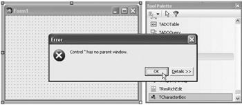
Figure 26-3: Trying to do things that can't be done in the constructor
There is a deceptively simple solution to the "Control " has no parent window" error. Simply typecast the constructor's AOwner parameter to TWinControl and assign the result to the component's Parent property:
constructor TCharacterBox.Create (AOwner: TComponent); var cnt: Integer; begin inherited Create (AOwner); Parent := TWinControl(AOwner); { ... } end; This simple assignment successfully solves the "no parent window" problem, but it creates another very serious problem: The IDE always sets the form as the component's parent, which means you can only add the component to the form and you cannot add your component to any other container control!
The following figure shows what happens when you try to drop the TCharacterBox component on a TPanel. Notice (in the Structure window) that the TButton component is properly added to the TPanel component and that the TCharacterBox component is, because of the parent assignment, erroneously added to the form.
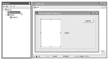
Figure 26-4: The IDE cannot properly create your component if you modify the Parent property in the constructor.
Note that you can move the component to a container control once you've added it to the Designer Surface, but this is by no means something that you can or should tolerate.
To properly initialize the component, we have to override the Loaded procedure and move the initialization code into that procedure. The Loaded procedure is perfect for this job because it is called when the component is fully loaded into memory to execute code that depends on other objects. You should override the Loaded method in the protected section of the component; there's no need to promote the method to the public section because it's of no use (possibly even harmful) to component users.
Here's the implementation of the Loaded method:
type TCharacterBox = class(TCustomListBox) private { Private declarations } protected { Protected declarations } procedure Loaded; override; public { Public declarations } constructor Create(AOwner: TComponent); override; published { Published declarations } end; ... constructor TCharacterBox.Create (AOwner: TComponent); begin inherited Create (AOwner); Style := lbOwnerDrawFixed; ItemHeight := 50; end; procedure TCharacterBox.Loaded; var cnt: Integer; begin inherited Loaded; { generate and add named entities to the Items property } { named entities begin with & and end with ; => } Items.BeginUpdate; for cnt := 0 to 95 do Items.Add('&' + CHARACTERS[cnt, 2] + ';'); Items.EndUpdate; end; Now that the initialization code resides in the Loaded method, we can successfully add the component to the appropriate control on the Designer Surface. The following figure shows what the TCharacterBox component should look like currently.
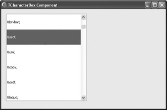
Figure 26-5: The TCharacterBox component still without custom drawing
Creating Array Properties
The TCharacterBox component should, for each item in the list, be able to return four different values: the symbol, the named entity, the numeric entity, and the symbol's description. The named entity part is already solved because we generated the named entities in the Loaded method and placed them in the Items property.
After named entities, the easiest value to return is the symbol's description. To enable the user to acquire a symbol's description, we need to create a simple public function that accepts the symbol's index and simply reads it from the CHARACTERS array:
type TCharacterBox = class(TCustomListBox) private { Private declarations } protected { Protected declarations } public { Public declarations } function GetDescription(CharIndex: Integer): string; published { Published declarations } end; ... function TCharacterBox.GetDescription(CharIndex: Integer): string; begin if (CharIndex >= 0) and (CharIndex <= 95) then Result := CHARACTERS[CharIndex][1] else Result := ''; end; We can now use this function to create the Descriptions array property. An array property is nothing more than a standard property that has a parameter list, which enables it to represent more complex items, like elements of an array or items in a list. The Descriptions property needs an index parameter to access a particular symbol in the CHARACTERS array and a read method that will read the character at the specified index from the CHARACTERS array. Since we've already created the read method, we only have to declare the property in the public section of the class (array properties cannot be declared in the published section):
property Descriptions[CharIndex: Integer]: string read GetDescription;
Now that we've created the public property that enables the user to access the stored descriptions, we should move the declaration of the GetDescription function to the protected section and mark it as virtual, because the GetDescription function should now only be a dedicated read method for the Descriptions property.
After creating the Descriptions property, write something like this so the user can now easily view the selected item's description:
procedure TForm1.Button1Click(Sender: TObject); begin with CharacterBox1 do MessageDlg(Descriptions[ItemIndex], mtInformation, [mbOK], 0); end;
Returning the symbol is also not very difficult. To create the desired symbol, you have to increase the symbol's array index by 160 and pass it to the standard Chr function. You do this because the symbols contained in the CHARACTERS array are ANSI characters. The non-breaking space character's index in the ANSI character table is 160, the inverted exclamation mark's index in the ANSI table is 161, and so on.
Here are both the Descriptions and the new Symbols array properties:
type TCharacterBox = class(TCustomListBox) private { Private declarations } protected { Protected declarations } function GetDescription(CharIndex: Integer): string; virtual; function GetSymbol(CharIndex: Integer): string; virtual; public { Public declarations } property Descriptions[CharIndex: Integer]: string read GetDescription; property Symbols[CharIndex: Integer]: string read GetSymbol; published { Published declarations } end; ... function TCharacterBox.GetDescription(CharIndex: Integer): string; begin if (CharIndex >= 0) and (CharIndex <= 95) then Result := CHARACTERS[CharIndex][1] else Result := ''; end; function TCharacterBox.GetSymbol(CharIndex: Integer): string; begin if (CharIndex >= 0) and (CharIndex <= 95) then Result := Chr(CharIndex + 160) else Result := ''; end; Finally, the last property to implement is the NumericEntities property, which should return a string formatted like this:   for the non-breaking space character, ¡ for the inverted exclamation mark character, and so on. Here's the implementation of the NumericEntities property:
protected { Protected declarations } function GetEntity(CharIndex: Integer): string; virtual; public { Public declarations } property NumericEntities[CharIndex: Integer]: string read GetEntity; end; ... function TCharacterBox.GetEntity(CharIndex: Integer): string; begin if (CharIndex >= 0) and (CharIndex <= 95) then Result := '&#' + IntToStr(CharIndex + 160) + ';' else Result := ''; end;
Sharing Property Access Methods
If you take a closer look at the Descriptions, Symbols, and NumericEntities properties and their read methods, you'll notice that they're almost identical, except for the return value. When you have several properties of the same type that use either read or write methods (or both), you can create a single read or write method that can be used by all properties.
To use such a method that can serve multiple properties, you must mark the properties with the index directive to give each property a unique index:
property PropertyName: DataType index IndexValue read Method write Method;
When you mark the properties with the index directive, you can no longer use your current read and/or write methods. You have to create another method with an additional index parameter that is used to determine which property called the method. This index parameter must be the last parameter in read methods.
The following listing contains the updated code of the TCharacterBox component. The GetEntityData method replaces all three functions that we created earlier. Its first parameter is the character index and its second parameter is the index of the property that called it.
Listing 26-2: The updated TCharacterBox component that shares a single read method among all three custom properties
unit CharacterBox; interface uses Windows, SysUtils, Classes, Controls, StdCtrls; { unique indexes of the three custom public properties } const ID_DESCRIPTION = 1; ID_NUMERIC = 2; ID_SYMBOL = 3; type TCharacterBox = class(TCustomListBox) private { Private declarations } protected { Protected declarations } function GetEntityData(Index, PropertyIndex: Integer): string; virtual; procedure Loaded; override; public { Public declarations } constructor Create(AOwner: TComponent); override; property Descriptions[CharIndex: Integer]: string index ID_DESCRIPTION read GetEntityData; property NumericEntities[CharIndex: Integer]: string index ID_NUMERIC read GetEntityData; property Symbols[CharIndex: Integer]: string index ID_SYMBOL read GetEntityData; published { Published declarations } end; implementation { Index is the the index of the character in the CHARACTERS array } { PropertyIndex is the index of the property that called the method } function TCharacterBox.GetEntityData(Index, PropertyIndex: Integer): string; begin if (Index >= 0) and (Index <= 95) then begin case PropertyIndex of ID_DESCRIPTION: Result := CHARACTERS[Index, 1]; ID_NUMERIC: Result := '&#' + IntToStr(Index + 160) + ';'; ID_SYMBOL: Result := Chr(Index + 160); end; end else Result := ''; end; end.
Default Array Properties
The default directive can be used with array properties to create a default array property. The advantage of a default array property is that you no longer have to type the property's name to access it. For instance, without marking the Descriptions property as the default property, you have to type the following line to access its first item:
TCharacterBoxObject.Descriptions[0]
But if you mark the Descriptions property with the default directive:
property Descriptions[CharIndex: Integer]: string index ID_DESCRIPTION read GetEntityData; default;
you'll be able to access the items in the Descriptions property by writing the index value in brackets immediately after the object's name:
TCharacterBoxObject[0]
Publishing Inherited Properties
Currently, the TCharacterBox component is not really usable in an application because most of its properties and all of its events are not displayed in the Object Inspector. To display such properties as Anchors and Align, and events like OnClick and OnDrawItem, you don't have to recreate them because they already exist in the TCustomListBox class. To display the currently protected properties and events of the TCustomListBox class, you only have to publish them by listing them in the published section of the class.
The following code shows how easy it is to publish inherited properties:
type TCharacterBox = class(TCustomListBox) published { Published declarations } property Style; property Align; property Anchors; property OnClick; property OnDrawItem; property OnMeasureItem; property OnMouseDown; property OnMouseMove; property OnMouseUp; end;
Drawing Items
Before overriding the DrawItem method to draw the items, add the Windows unit to the component's uses list. The Windows unit is required because the code in the DrawItem method uses the ANSI_CHARSET constant to change the font's character set. We must use ANSI_CHARSET in order to draw the correct symbols in the list. In order to use the TColor type and other graphics-related types and routines, you also have to add the Graphics unit to the uses list.
To display its items, an owner-drawn list box calls the DrawItem method and passes three parameters to it: the item's index, a TRect parameter with the item's coordinates, and a state parameter of type TOwnerDrawState that specifies the item's state (we only need the odSelected value that indicates the item is selected).
The DrawItem method is protected in the TCustomListBox class because the component user doesn't have to call the method directly. You should also override the DrawItem method in the protected section of the class.
Here's the declaration of the DrawItem method:
procedure DrawItem(Index: Integer; Rect: TRect; State: TOwnerDrawState);
To display three different strings (symbol, named entity, and description) at three different locations, the DrawItem method relies heavily on two API functions: DrawText to display the strings, and OffsetRect to update the coordinates of the display rectangle used by the DrawText function.
Here's the declaration of the OffsetRect function:
function OffsetRect(var lprc: TRect; dx, dy: Integer): BOOL; stdcall;
Besides the DrawText and OffsetRect API functions, the DrawItem method also uses the Canvas's DrawFocusRect method to erase the automatically drawn focus rectangle. DrawFocusRect can be used to display and to erase the focus rectangle because it uses the same xor trick we used in Chapter 22 to implement the rubber-banding effect.
Finally, here's how the TCharacterBox component displays its items:
-
Changes the character set of the Canvas's font to ANSI_CHARSET to correctly display the symbols
-
Fills the item's background with a color — standard window color if the item is even, 3D light color if the item is odd, or the standard highlight color if the item is selected
-
Draws the three strings
-
Calls the DrawFocusRect method to remove the automatically drawn focus rectangle
-
Finally, calls the inherited DrawItem method to enable the component to fire the OnDrawItem event but only if the user assigned an event handler to the OnDrawItem event (We have to see if there's an event handler present because the inherited DrawItem method performs its own drawing if there's no event handler.)
The following listing shows the entire DrawItem method.
Listing 26-3: The DrawItem method of the TCharacterBox component
type TCharacterBox = class(TCustomListBox) protected { Protected declarations } procedure DrawItem(Index: Integer; Rect: TRect; State: TOwnerDrawState); override; ... procedure TCharacterBox.DrawItem(Index: Integer; Rect: TRect; State: TOwnerDrawState); const ITEM_COLOR: array[Boolean] of TColor = (clWindow, cl3DLight); begin { we must use ANSI_CHARSET for valid symbol display } Canvas.Font.Charset := ANSI_CHARSET; if odSelected in State then begin { if the item is selected, use the system's highlight color for both the background and the text } Canvas.Brush.Color := clHighlight; Canvas.Font.Color := clHighlightText; end else Canvas.Brush.Color := ITEM_COLOR[Odd(Index)]; { fill the background with the selected Brush color } Canvas.FillRect(Rect); { draw the symbol, 10px towards the center, horizontally } Canvas.Font.Style := [fsBold]; Canvas.Font.Size := 18; OffsetRect(Rect, 10, 0); DrawText(Canvas.Handle, PChar(Symbols[Index]), -1, Rect, DT_LEFT or DT_VCENTER or DT_SINGLELINE); { draw the named entity center at the bottom of the item, call OffsetRect with x = -10 to restore x coordinate and with y = 32 to move the rect's top coordinate 32px down } Canvas.Font.Size := 8; OffsetRect(Rect, -10, 32); DrawText(Canvas.Handle, PChar('&' + Items[Index]), -1, Rect, DT_CENTER or DT_SINGLELINE); { draw the small description at the top of the item, by moving the rect back to the top, actually 4px lower } Canvas.Font.Size := 7; Canvas.Font.Style := []; OffsetRect(Rect, 0, -28); DrawText(Canvas.Handle, PChar(Descriptions[Index]), -1, Rect, DT_CENTER or DT_SINGLELINE); { restore original item rect to successfully remove the automatically drawn focus rect } OffsetRect(Rect, 0, -4); if odSelected in State then Canvas.DrawFocusRect(Rect); { call the inherited DrawItem method to fire the OnDrawItem event, but only if an event handler is assigned to it } if Assigned(OnDrawItem) then inherited DrawItem(Index, Rect, State); end; Figure 26-6 shows the final TCharacterBox component with and without an additional user-created OnDrawItem event handler.
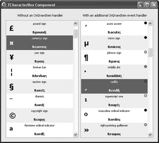
Figure 26-6: The TCharacterBox component
EAN: 2147483647
Pages: 212