Understanding Expression Web Template Style Sheets
Creating a "sandbox" Web site to play with based on one of Expression Web's Web site templates is a great way to practice tinkering with styles. (We tell you how to create a new Web site from one of the Expression Web templates in Chapter 1.)
In this section, we take you on a brief tour of the Web site template named Organization 4. Here's why: Sometimes a guided walk through an already completed CSS-based site is easier than learning CSS from the ground up.
The Organization 4 template uses two style sheets to define formatting, one of which is attached-or imported into-the other one, which is then attached to the content pages by way of a Dynamic Web Template. (See Chapter 11 for more information about Dynamic Web Templates.)
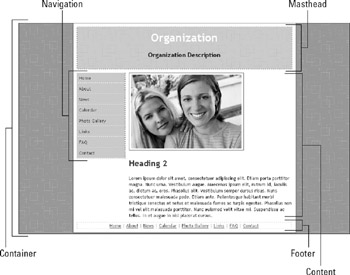
Figure 9-13 shows what the home page (default.htm) for this Web site template looks like in a browser.

Figure 9-13: The Organization 4 Expression Web template home page.
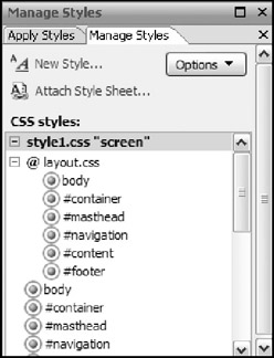
The Manage Styles task pane, shown in Figure 9-14, shows the two style sheets that format the content on the page-style1.css and layout.css-and lists all their style rules. The style rules contained in layout.css are listed first, slightly indented, indicating that these styles cascade into the style1.css style sheet.

Figure 9-14: The Manage Styles task pane.
| Tip | Although this two-style-sheet scenario is standard practice in the Expression Web templates, you don't have to use this setup in your Web sites. These two style sheets can easily be combined into one. Here's the advantage of using more than one style sheet: If you use style rules common to all Web sites you create, you can keep them in a separate style sheet file and then attach the file to the more specific Web site style sheet (in this case, style1. css). This strategy saves you the trouble of retyping these styles for each new Web site. |
The layout style sheet
First, take a look at the style rules in layout.css. This style sheet contains a style rule for the <body> element and for each of the five <div> elements that define the main areas of the page. (Figure 9-13 shows which part of the page each <div> element defines.) Each <div> tag contains an id value-container, masthead, navigation, content, footer-to identify it as a unique page element. If you look at the HTML code for the page, you see that the <div> tags look like this: <div id=“container”>, <div id=“mast-head”>, and so on.
body { margin: 0; padding: 0; border: 0; } #container { margin: 0; padding: 0; border: 0; } #masthead { margin: 0; padding: 0; border: 0; } #navigation { margin: 0; padding: 0; border: 0; } #content { margin: 0; padding: 0; border: 0; } #footer { margin: 0; padding: 0; border: 0; } Each of these styles is an ID-based style rule that sets the margins, padding, and border properties to 0 for all four sides of each unique <div> element. By default, browsers put a little space between page content and the edge of the browser window. Some browsers use padding, and some use margins. These style rules override browser settings so that only formatting specified by the style sheet apply to the page's content. They say to the browser, "If you have default margins set, I'm setting margins to 0; if you have padding values set, I'm setting those to 0, too. And while I'm at it, no borders either." After these styles get applied to the page's <div> elements, the content of each <div> extends all the way out to the edge without any space.
| TECHNICAL STUFF | The values in these style rules for the properties margin, padding, and border are good examples of CSS shorthand. The style declaration for margins could also be specified as margin: 0 0 0 0; or, even longer, margin-top: 0; margin-right: 0; margin-bottom: 0; margin-left: 0;. |
The formatting style sheet
Now look at the other style sheet this Web site uses-style1.css-which has the layout.css style sheet attached to it. The style rules in layout.css cascade into the style sheet style1.css:
@import url("layout.css"); The next style rule sets properties for the page's font family, font size, and background:
body { font-family: "Trebuchet MS", Arial, Helvetica, sans-serif; font-size: 0.8em; background-image: url("../images/background.gif"); background-repeat: repeat; background-attachment: scroll; } Text that isn't affected by a more specific style rule farther down in the style sheet appears in Trebuchet MS (or Arial or Helvetica or sans serif), scaled down a bit (0.8 em; see Chapter 8 for information on the value settings you can use in CSS). The background settings control the background pattern image (background.gif) and tell the browser to repeat it and let it scroll with the content.
Style rules for each <div> element
This part of the style sheet explanation requires a bit of math and a solid understanding of the CSS box model, which we explain in Chapter 8.
For this template, all the content of the page is nested inside a main <div> element named container (<div id=“container”>). (Refer to Figure 9-13.) All the other <div> elements (such as masthead and content) get some properties right from the start (such as width) from the style rules that are set for the container <div> element:
#container { width: 620px; margin: 0 auto; padding: 10px; border-right: 2px solid #725972; border-bottom: 2px solid #725972; border-left: 2px solid #725972; background-color: #fff; } The first property sets the width of the container's contents to 620 pixels. This layout is a fixed-width layout. None of the other <div> elements nested inside the container can be wider than 620 pixels, in order to fit inside the container <div>. The next property, margin: 0 auto, sets two values for margins: 0 sets top and bottom margins and auto sets right and left margins. Using auto as a value for the right and left margins centers the container in the browser window. The padding property inserts 10 pixels all the way around the container's content so that any element inside the container <div> has 10 pixels of breathing room between it and the container's borders.
Border sizes, style, and color are set for three sides (but not for the top because the container sits against the top of the browser window). The last property, background-color: #fff; sets the container's background to white. The container for the content now sits like a white place mat on top of the patterned tablecloth that is the page's background.
The next rule in the style sheet sets properties for the next <div> element, the masthead (<div id=“masthead”>), which holds the text Organization as a first-level heading and Organization Description as a third-level heading (refer to Figure 9-13):
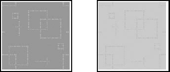
#masthead { text-align: center; width: 600px; padding: 10px; border: 1px dotted #725972; background-image: url("../images/masthead.gif"); background-repeat: repeat; background-attachment: scroll; } The two headings are centered (text-align: center). The masthead's content area is set to a width of 600 pixels. The next property, padding: 10px, ensures that the masthead content has 10 pixels of elbow room around all sides so that it doesn't butt up against the masthead's border. A dotted, 1-pixel, colored border around all sides of the masthead is specified, and the masthead has a repeated background image (masthead.gif) that scrolls with the mast-head, like the page background. The masthead image is the same pattern as the page background image; it's just a lighter color. Figure 9-15 shows both images, side by side. The page background image is on the left, and the mast-head image is on the right.

Figure 9-15: Page and masthead background images.
The next style rule sets properties for the navigation <div> element (<div id=“navigation”>), which contains the Web page's list of hyperlinks:
#navigation { position: relative; float: left; width: 139px; margin-top: 10px; margin-bottom: 10px; border-right: 1px dotted #725972; } The first two properties tell the navigation menu (<div id=“navigation”>) where to go inside the container <div>. The navigation <div> element's position is relative to its containing body, the container <div> (rather than fixed to a set place on the screen) and it floats to the left side. The navigation <div> element has a fixed width of 139 pixels plus a 1-pixel border (dotted, with a color specified) on the right, making the navigation <div> element 140 pixels wide. It also has top and bottom margins of 10 pixels each, so that the navigation <div> has 10 pixels of space between it and the element above it (the masthead) and 10 pixels of space between it and the element below it (the footer). None of these properties sets styles for the actual hyperlinks-just their containing element, the navigation <div>.
The next style rule controls the main content area of the page, the content <div> (<div id=“content”>):
#content { float: left; width: 470px; margin-top: 10px; margin-bottom: 10px; margin-left: 10px; } The content <div> also floats to the left, which places it next to the navigation <div>. The margin-left property inserts 10 pixels of space between the content <div> and the navigation <div>. The content <div> is 480 pixels wide (470 width + 10 margin-left = 480). Add that amount to the navigation width of 140 pixels, and you get 620 pixels, the same width as the masthead. (The masthead content area is 600 pixels wide plus 10 pixels on both the left and right sides: 600 + 10 + 10 = 620). The navigation and content elements align correctly underneath the masthead. Like the navigation <div>, the content <div> has top and bottom margins set to 10 pixels, to bump it down from the masthead and provide space between the content and the footer.
The next style rule sets properties for the last <div> element, the footer (<div id=“footer”>):
#footer { text-align: center; clear: both; width: 618px; border: 1px dotted #d8bfd8; } Footer text is center aligned, and the total width of the footer is 620 pixels (618 content + 2 pixels left and right borders). The property clear: both ensures that the footer always appears below the navigation and content elements that precede it. The property clear: both is often used after floated elements to ensure-absolutely and positively-that this element (the footer) always lands below the floated elements (in this case, the navigation and content).
Style rules for content inside the masthead
The next set of style rules get more specific about how the masthead should look. Notice that the author of the style sheet inserted a comment:
/* Masthead Styles */ #masthead h1 { color: #fff; } #masthead h3 { color: #402640; } These style rules both use contextual selectors, which set the text color for <h1> and <h3> elements, but only <h1> and <h3> elements inside the mast-head (<div id=“masthead”>).
Style rules for the navigation<div>
The next few style rules control the navigation element, which is an unordered list of hyperlinks. There are many different ways to use CSS properties to style lists into navigation menus of hyperlinks. This style sheet shows you one way and one style sheet author's preference. Every CSS author has a favorite set of properties to achieve the desired look. You will most likely run into other ways to get the same effect as the author of this style sheet, in books on CSS, in online list tutorials, and in classes that offer CSS instruction. Find the method that makes the most sense to you and gives you the results you want. Also understand that different browsers interpret CSS properties slightly differently, and some property settings appear in style rules to make elements behave correctly across multiple browsers.
Notice that the author inserted a helpful comment to let the user know which element these style rules target. Look at the first style rule:
/* Navigation Styles */ #navigation ul { list-style-type: none; width: 100%; display: block; margin: 0; padding: 0; } This style rule uses the contextual selector #navigation ul, which tells the browser to apply these style rules to the <ul> (unordered list) element, but only if it appears inside the navigation element (<div id=“navigation”>). If a <ul> shows up somewhere else in the page's content area, these styles don't affect it. The margin and padding properties (both set to 0) remove the default left indentation that browsers set for lists (some use the padding property others use margin), and set all margins and padding to 0 on all sides. The property list-style-type: none removes the bullets from each list item. The property width: 100% means that the list fills the containing element (the navigation <div>) entirely. And display: block ensures that the unordered list is treated as a block-level element.
Look at the next style rule, which controls each list item element (<li>)-in this case, each separate hyperlink:
#navigation li { display:block; margin: 0; padding: 0; border: 1px dotted #dfb8df; background-color: #dfb8df; } The style rule uses the contextual selector #navigation li to tell the browser that this rule set controls only the list items found in the navigation <div>. The property display: block is used again, to treat each list item as a block-level element. Margins and padding are set to 0 on all sides, and a 1-pixel dotted, lavender border appears around each list item. The background color for each list item is set to the same color.
The next set of rules set properties for the navigation-menu hyperlinks themselves:
#navigation a { color: #402640; text-decoration: none; display: block; padding: 5px; border-bottom: 1px dotted #fff; background-color: #dfb8df; } #navigation a:hover { color: #402640; text-decoration: none; background-color: #fff; } The first style rule sets general properties for all link states (but only those within the navigation <div> because it's a contextual selector, #navigation a). The color property sets the link text color; text-decoration: none removes the default underlining; and display: block treats each hyperlink as a block-level element. Making each hyperlink into a block-level element creates the possibility of setting properties (padding, borders, and margins) for the CSS box model. The padding: 5px property provides 5 pixels of space between the hyperlink text and the hyperlink border, to spread the list out a bit. Each hyperlink has a 1-pixel dotted white border on the bottom, and background-color is set to the same lavender color.
The second style rule uses a contextual selector and pseudo class, to target hyperlinks within the navigation <div>, but only in its hover state (when the visitor's cursor moves over it): #navigation a:hover. In this state, the hyperlink color changes to a dark purple color and the background color changes to white; text-decoration: none removes underlining. Any hyperlink state not targeted by a specific rule (active or visited, for example), use the properties set by the #navigation a style rule.
| Note | Some redundancies occur in these style rules for the navigation menu. One example is the text-decoration: none property in #navigation a:hover. Underlining for all navigation menu hyperlinks is already turned off in the style rule #navigation a. Why the redundancies? Our guess is that in order to help CSS beginners understand which properties control which formatting, the author of this style sheet repeated properties in a few rules. |
Style rules for the content <div>
Two styles are set for the content element. (Note the comment introducing this section of the style sheet.) This one sets the heading color for all headings in the content <div>:
/* Content Styles */ #content h1,h2,h3,h4,h5,h6 { color: #503750; } The style rule uses a contextual selector that affects all headings within the content <div> (<div id=“content”>). If you want to change the color of all headings in this element, you need to change only this color value.
The second content rule targets any pictures (<img>) inside the content <div>:
#content img { padding: 5px; border: 1px solid #402640; } It places 5 pixels of padding all the way around the picture and then places a solid, 1-pixel colored border around the picture. You can see the effects of this style rule's properties on the home page's picture (default.htm) in Figure 9-16.

Figure 9-16: The picture with 5 pixels for padding and a border around it.
Style rules for the footer <div>
The next set of style rules target content inside the footer <div> element (<div id=“footer”>). Note the comment that introduces these rules. The first style rule sets the text color for any paragraph elements inside the footer element, with the contextual selector #footer p:
/* Footer Styles */ #footer p { color: #808080; } The next style rule controls hyperlinks inside the footer element by setting the text color and specifying that they're underlined:
#footer a { color: #503750; text-decoration: underline; } This style rule specifies properties for hyperlinks in the footer element in their hover state, changing the color and removing the underline set by the previous style rule:
#footer a:hover { color: #402640; text-decoration: none; }
Setting other styles for page elements
The last four styles in this style sheet set styles for specific elements that aren't located in a particular <div> element. The first two rules set properties for page hyperlinks, such as the ones that would appear in the page's content text:
a { color: #402640; text-decoration: underline; } a:hover { color: #dfb8df; text-decoration: underline; } The first rule sets the color value and specifies underlining for all page hyperlinks. The second rule sets a different color for hyperlinks in their hover state (another redundancy-the text-decoration: underline property, which is already set by the a rule).
| REMEMBER | Hyperlinks that appear in the navigation and footer <div> elements have their own style rules that override these hyperlink properties. |
The last two styles are class-based style rules:
.style_bold { font-weight: bold; } .style_italic { font-style: italic; } You can use these style rules in place of the HTML tags <strong> and <em> by assigning a class attribute to a chunk of text using the <span> tag (<span class=“style_italic”>) or adding a class attribute to a whole paragraph (<p class=“style_italic”>) or heading (<h x class=“style_italic”>). Using these class-based styles rather than their HTML equivalents removes all formatting from your page's content and puts it in the style sheet.
EAN: 2147483647
Pages: 142