Creating .NET Components The .NET Framework allows you to create components in several different ways, including the following: -
Creation of a nonvisual component by deriving from the Component class, which belongs to the System.ComponentModel namespace. Nonvisual components provide resources or business logic without a displayed user interface. Examples of such components are the Timer and EventLog components. -
Creation of a control derived from the Control class or any of its derived classes. The Control class belongs to the System.Windows.Forms namespace. Such a control may include both user interface and business logic, inheriting basic keyboard and mouse user-input capabilities, as well as participation in the message loop in order to allow event handling. -
Creation of a composite control based on existing controls derived from the UserControl class or any of its derived classes. The UserControl class derives from the ContainerControl class, making its derived components capable of serving as containers for other controls. This allows for the rapid creation and deployment of custom modular components based on existing controls that work together. You can host controls in many different containers. This includes not only forms but also controls such as the Panel control and external applications such as Internet Explorer.  | Controls derived directly from the Control class do not automatically include rendering capabilities. When creating components derived from the Control class, you will need to override the Paint method with your own rendering logic. Controls derived from the UserControl class include an automatic rendering facility using their normal Paint properties. |
 | The templates mentioned in the following sections are not available in Visual Studio .NET Standard edition or in the SDK. You must have Visual Studio .NET Professional or higher to utilize these templates. You can still create components using the other versions, but you will not have the preconfigured templates. |
Creating Components Derived from the Component Class Some components provide functionality without requiring a visual representation. One example of this is the Timer component, which provides useful properties and events to its container without a displayed user interface.  | Derive a component directly from the Component class when it does not require a visual representation at runtime. |
You may create a component derived from the Component class by performing the following tasks : -
Open an instance of Visual Studio .NET and create a project based on the Visual Basic .NET Class Library template. -
Remove the automatically created file Class1.vb by right-clicking it and selecting Delete. -
Right-click the project name in the Solution Explorer and select Add, Add New Item to open the Add New Item dialog box (see Figure 4.1). Figure 4.1. The Add New Item dialog box showing the Component Class option selected. 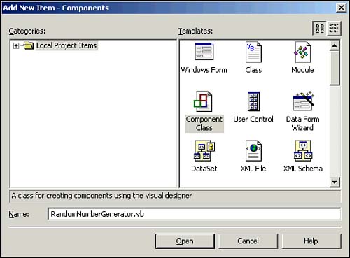 -
Select Component Class and provide it with a meaningful name ( RandomNumberGenerator.vb is used in Figure 4.1). Click Open to create the component. -
Switch to code view of the component and add your code just after the Component Designer's automatically generated code: ' Stores minValue and maxValue Private mminValue As Integer = 1 Private mmaxValue As Integer = 100 ' Get or set the minimum value for the random number Public Property MinValue() As Integer Get MinValue = mminValue End Get Set(ByVal Value As Integer) mminValue = Value End Set End Property ' Get or set the maximum value for the random number Public Property MaxValue() As Integer Get MaxValue = mmaxValue End Get Set(ByVal Value As Integer) mmaxValue = Value End Set End Property Public Function GetRandomNumber() As Integer Dim r As Random = New Random() GetRandomNumber = r.Next(MinValue, MaxValue) End Function -
If you want to use a graphic for the Toolbox icon for this control, you must first right-click the project's Reference node in the Solution Explorer and select Add Reference to open the Add Reference dialog box, where you can select the file System.Drawing.dll (see Figure 4.2). Figure 4.2. The Add Reference dialog box showing the System.Drawing.dll selected. 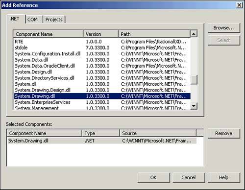 -
After adding the DLL reference to the project, you should insert a reference to the namespace that it contains at the top of the code: Imports System.Drawing -
You may then select any 16x16-pixel bitmap (BMP) file and add it to your project. Then, use the Properties window to set its Build Action property to Embedded Resources. | | You may use an existing Icon file (ICO) by renaming a copy of it to use the .bmp file extension and then adding the renamed copy to your project. |
-
Add an attribute just before the class declaration: <ToolboxBitmap(GetType(RandomNumberGenerator))> _ Public Class RandomNumberGenerator() After building this project, the DLL will include code for the new component. You may use the new component in your form by adding the component to the Toolbox. To do so, follow these steps: -
Right-click the Toolbox window and select Add Tab. Name the new tab My Components . -
Right-click the new tab in the Toolbox window and select Customize Toolbox. -
Select the .NET Framework Components tab in the Customize Toolbox dialog box. -
Click the Browse button. Browse to the RandomNumberGenerator.dll file and click Open. -
Click OK. Navigate to the new DLL. These steps will add the control to the Toolbox window (see Figure 4.3). Figure 4.3. The Toolbox window showing several custom components. 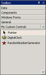 Adding this component to a form as RandomNumberGenerator1 and configuring its MinValue and MaxValue properties will allow you to use code similar to the following: lblResults.Text = String.Format("The next random number is: {0}", _ RandomNumberGenerator1.GetRandomNumber()) Deriving Components from the Control Class When you need a control that cannot easily be created using existing user interface controls, you can create a custom control derived directly from the Control class. There isn't a template provided for this purpose, so you first need to create a new control derived from the UserControl class and then modify it to extend from the Control class. | | Derive a component from the Control class when you want to provide custom code to render the component at runtime. |
You create a component derived from the Control class by performing the following steps: -
Open an instance of Visual Studio .NET and create a Control Library project based on the User Control template. -
Switch to the code view for the new control and change the class declaration so that its base class is Control rather than Systems.Windows.Forms.UserControl . You should also change the class name to something appropriate for your control, like this: Public Class DigitalClock Inherits Control | | When you change back to the design view after changing the class declaration to Control , you will notice that the gray borderless box used for creating controls is now gone. |
-
Place any constituent controls you'd like on the design view. As an example, place a Timer control named Timer1 on the design view. -
Add any required event handlers to the control, including code needed to support rendering the control on a Paint event and a call to the Paint event during a Resize event, as shown in the following code: Private Sub Timer1_Tick(ByVal sender As System.Object, _ ByVal e As System.EventArgs) Handles Timer1.Tick Invalidate() End Sub Private Sub DigitalClock_SizeChanged(ByVal sender As Object, _ ByVal e As System.EventArgs) Handles MyBase.SizeChanged Invalidate() End Sub Private Sub DigitalClock_Paint(ByVal sender As Object, _ ByVal e As System.Windows.Forms.PaintEventArgs) Handles MyBase.Paint Dim g As Graphics = e.Graphics Dim strTime As String = DateTime.Now.ToString("T") ' Get the current string size Dim sf As SizeF = g.MeasureString(strTime, Font) ' Get the scaling factor Dim scale As Double = Math.Min(ClientSize.Width / sf.Width, _ ClientSize.Height / sf.Height) ' Scale the font as per new control size Dim f As Font = New Font(Font.FontFamily, scale * Font.SizeInPoints) ' Get the string size for the scaled font size sf = g.MeasureString(strTime, Font) ' Find the position to draw the string Dim pos As PointF = New PointF((ClientSize.Width - sf.Width) / 2, _ (ClientSize.Height - sf.Height) / 2) ' Draw the time string g.DrawString(strTime, Font, New SolidBrush(ForeColor), pos) End Sub After this project is built, the project's DLL will include code for the new control, which may be added to your Toolbox, as detailed in the previous section. You can include this control on a form, and it will automatically render its contents to the form, as shown in Figure 4.4. Note that the control itself is borderless, so it blends into the form. Figure 4.4. A form displaying the custom DigitalClock control. 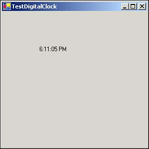 Components Derived from the UserControl Class Existing user interface controls may be combined to create a custom control derived from the UserControl class. When creating a control such as this, you may also wish to create custom event delegates that allow your form to trigger events occurring within your new control. The following subsections explain how to create a control derived from the UserControl class and how to add event responses to the newly created control. You can also use visual inheritance to base additional controls on a custom control. Creating a Control Derived from the UserControl Class You may create a component derived from the UserControl class by performing the following tasks: -
Open an instance of Visual Studio .NET and create a Control Library project based on the User Control template. Rename UserControl1.vb to ColorMixer.vb and change the class name to ColorMixer within the code view. -
Within the design view, add three TrackBar controls, naming them tbRed, tbGreen, and tbBlue. Change their Maximum property to 255, their Orientation property to Vertical, their TickFrequency property to 15, and their TickStyle property to Both. Figure 4.5 shows the design of this control. Figure 4.5. Three TrackBar controls arranged for the ColorMixer control. 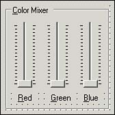 -
Within the code view, add a namespace reference at the top of the class: Imports System.ComponentModel -
Add code to create properties for the custom control and link them to properties of the included TrackBar controls: <Category("Color"), Description("Value of Red Color")> _ Public Property Red() As Integer Get Red = tbRed.Value End Get Set(ByVal Value As Integer) tbRed.Value = Value End Set End Property <Category("Color"), Description("Value of Green Color")> _ Public Property Green() As Integer Get Green = tbGreen.Value End Get Set(ByVal Value As Integer) tbGreen.Value = Value End Set End Property <Category("Color"), Description("Value of Blue Color")> _ Public Property Blue() As Integer Get Blue = tbBlue.Value End Get Set(ByVal Value As Integer) tbBlue.Value = Value End Set End Property After this project is built, the project's DLL will include code for the new control, which may be added to your Toolbox as detailed previously. After adding a reference to the project's DLL including the new control and then including this control on your form as ColorMixer1, you can access its value, as shown here: lblColorSample.BackColor = Color.FromArgb(ColorMixer1.Red, _ ColorMixer1.Green, ColorMixer1.Blue) | | Derive a component from the UserControl class when its runtime user interface can be built up from simpler controls. |
Adding Event Delegation to Custom Controls You may want to allow the manipulation of your custom control to trigger events external to the control itself. In the previous example, the resulting ColorMixer control class could be used to generate a color value based on the current settings of the contained TrackBar controls; however, a change to these settings could not automatically be reflected without the calling form requerying the value of the ColorMixer control. Events in Visual Basic .NET use the publisher-subscriber model, where the class that implements an event is called the publisher and other classes registering appropriate event handlers are called the subscribers . The publisher announces that other classes can subscribe to this event by attaching appropriate event handlers to the event. The publishing class will register all event handlers with itself and takes responsibility for invoking them all when the event occurs. | | An event handler is a method with a specific signature that the publisher class is capable of registering. By convention, most event handlers take two arguments. The first specifies the object on which the event occurred, and the second contains information related to the event; the second argument is an object of the type EventArgs or of a class derived from EventArgs . |
You can modify the ColorMixer control you created to accommodate event delegation by performing the following steps: -
Create a new blank project and copy ColorMixer.vb from your previous project (hold down the Ctrl key while dragging and dropping the control to copy it easily). Rename this copy and change all instances of ColorMixer within the code view to ColorMixerWithEvents . -
Within the code view, add the code to create a delegate and handle the event. Modify the ColorMixerWithEvents class to contain an additional child class ( ColorMixerEventArgs ) and event-handling code as follows : Public Class ColorMixerEventArgs Inherits EventArgs Public ReadOnly Red, Green, Blue As Integer Public Sub New(ByVal Red As Integer, ByVal Green As Integer, _ ByVal Blue As Integer) Me.Red = Red Me.Green = Green Me.Blue = Blue End Sub End Class ' Define the prototype of the callback method Public Delegate Sub ChangedEventHandler(ByVal sender As Object, _ ByVal args As ColorMixerEventArgs) ' Define the event Public Event Changed As ChangedEventHandler ' Notify the registered objects of the event Protected Sub OnChanged(ByVal e As ColorMixerEventArgs) RaiseEvent Changed(Me, e) End Sub Private Sub tbRed_ValueChanged(ByVal sender As Object, _ ByVal e As System.EventArgs) Handles tbRed.ValueChanged Dim args As ColorMixerEventArgs = _ New ColorMixerEventArgs(tbRed.Value, tbGreen.Value, tbBlue.Value) OnChanged(args) End Sub Private Sub tbGreen_ValueChanged(ByVal sender As Object, _ ByVal e As System.EventArgs) Handles tbGreen.ValueChanged Dim args As ColorMixerEventArgs = _ New ColorMixerEventArgs(tbRed.Value, tbGreen.Value, tbBlue.Value) OnChanged(args) End Sub Private Sub tbblue_ValueChanged(ByVal sender As Object, _ ByVal e As System.EventArgs) Handles tbBlue.ValueChanged Dim args As ColorMixerEventArgs = _ New ColorMixerEventArgs(tbRed.Value, tbGreen.Value, tbBlue.Value) OnChanged(args) End Sub -
Build the code, add its reference to a form, and then add an instance of the new control and accept the default name of ColorMixerEventArgs1. -
Add a GroupBox control to your form and place a Label control within it, named lblColorSample. -
Add code to handle the Changed event of the ColorMixerWithEvents1 control: Private Sub ColorMixerWithEvents1_Changed(ByVal sender As Object, _ ByVal args As StepByStep4_3.ColorMixerWithEvents.ColorMixerEventArgs) _ Handles ColorMixerWithEvents1.Changed lblColorSample.BackColor = _ Color.FromArgb(args.Red, args.Green, args.Blue) End Sub -
Set this form as the startup object for your project and run the project to see the results. Manipulating the track bars of the custom control causes the Label control's background color to change automatically. As this example shows, you need to perform several tasks to implement an event: -
Declare a class that inherits from the EventArgs class to contain any information that you want to pass back to event handlers. -
Declare a public Delegate that defines the method that handlers of your event will have to implement. -
Declare a method that raises the event. By convention, this method should be named OnEventName . -
When you wish to raise the event, call the On EventName method, passing an appropriate arguments class. Extending a Control Through Visual Inheritance A new component may be created that inherits all the qualities from an existing component, adding additional functionality as required. With regard to a form or other type of user interface component, this process is referred to as visual inheritance . You may create a new control that extends the ColorMixerWithEvents control created previously in this section to include a color sampler displaying the color and its Red, Green, and Blue values by performing the following: -
Create a new project named ColorMixerXProject based on the Windows Control Library template and delete the automatically created UserControl1.vb . -
Right-click the project and select Add, Add Inherited Control from the options, naming the new control ColorMixerX.vb and clicking the Open button to open the Inheritance Picker dialog box, as shown in Figure 4.6. Figure 4.6. The Inheritance Picker dialog box showing the ColorMixerWithEvents component selected. 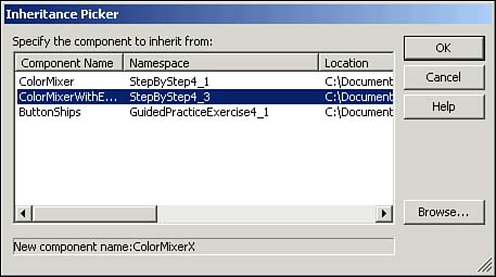 -
Select the desired parent component and click OK in order to return to the design view of the derived control, which displays all the features of the parent component. -
Add a GroupBox control that contains four Label controls, named lblSampler, lblRed, lblGreen, and lblBlue. Change the Text property of the GroupBox control to Sampler and change the Text property of the Label controls to an empty string. -
In the code view, add code to the control's constructor after the call to the InitializeComponent method: ' Set the initial display for the control lblSampler.BackColor = Color.FromArgb(Me.Red, Me.Green, Me.Blue) lblRed.Text = String.Format("R: {0}", Me.Red) lblGreen.Text = String.Format("G: {0}", Me.Green) lblBlue.Text = String.Format("B: {0}", Me.Blue) -
Add code to handle the Changed event of the control: Private Sub ColorMixerX_Changed(ByVal sender As Object, _ ByVal args As StepByStep4_3.ColorMixerWithEvents.ColorMixerEventArgs) _ Handles MyBase.Changed lblSampler.BackColor = Color.FromArgb(args.Red, args.Green, args.Blue) lblRed.Text = String.Format("R: {0}", args.Red) lblGreen.Text = String.Format("G: {0}", args.Green) lblBlue.Text = String.Format("B: {0}", args.Blue) End Sub After this project is built, the project's DLL will include code for the new control that may be added to your Toolbox, as detailed previously. The new control includes all the functionality of its parent as well as the new features. Hosting a Windows Control Inside Internet Explorer To this point, we have hosted all our controls within a Windows application presenting a Windows form. It is also possible to host a Windows control in Internet Explorer (IE). | | You must be running the IIS Web service in order to access HTML (or ASPX) documents. All examples use IIS 5.0, as shipped with Windows 2000, with a default folder location of C:\Inetpub\ wwwroot \ . The examples should also work with IIS 5.1 on Windows XP, although you may see minor differences in implementation. |
When a Windows control is hosted within IE, it is rendered as an object but does not require registration like an ActiveX component. The assembly containing the control should reside within the Global Assembly Cache (discussed later in this chapter) or in the same virtual directory as the calling HTML page. You may host the ColorMixerX control created previously in this section within Internet Explorer by completing the following tasks: -
Create a virtual directory on the web server and configure its permissions to allow Read and Run Scripts access only. -
Copy the assembly (discussed in the next section) into the virtual directory on the Web server. -
Create an HTML ( .htm ) document in the virtual directory and add this code (replacing the values for server, virtual directory, project filename, and project name to match your solution): <html> <body> <object id="colorMixerX1" classid="http://<server>/ <virtual directory>/<project file>.dll#<project>.ColorMixerX" height="300" width="300"> </object> </body> </html> The entire classid attribute should be on a single line in your file. -
Launch Internet Explorer and open the newly created Web page containing the call to your component, which will be opened in the IE browser window as shown in Figure 4.7. Figure 4.7. An example of the ColorMixerX control hosted within Internet Explorer. 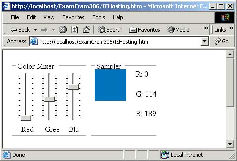 |
")