| Access provides a number of wizards for creating quick reports . A few of them were discussed in Chapter 9. Sometimes a report isn't as simple as a hard copy of your datayou can also print labels and display charts in a report. Don't worry, though, both reports are simple to create as long as you let an Access wizard do the work. Creating Label Reports A label report is a little different from most reports. For instance, you can print name tags, mailing labels, file labels, or even inventory labels for storage. The uses are limited only by your imaginationif the data's in a table, you can print a label for it. Note  | In Chapter 13, you learned how to format controls and use the Toolbox. You use the same techniques to add and modify controls in reports. If you've already read Chapter 13, you should be able to apply what you learned on your own. If you haven't, read the appropriate sections in that chapter and work through the exercises in a report instead of in a form. |
Let's use the Chart Wizard to print a mailing label for each catalog in your plants database. Do the following: -
Select Report from the Insert menu. -
In the New Report dialog box, select the Label Wizard , select Catalogs from the drop-down control, and then click OK . -
The wizard already knows all the dimensions for a number of labels. Most of the time, you can find your label listed among these options. For this example, select English and Sheet Feed from the Unit of Measure and Label Type sections, respectively. Then, select Avery from the Filter by Manufacturer drop-down control. Doing so limits the number of label choices. -
Select Product Number 5095 , as shown in Figure 14.6. Access has built-in information for many common label types from various manufacturers. If you don't find a suitable label, you can click the Customize button to enter your label's dimensions. Click Next to continue. Figure 14.6. Choose a label by its product name or dimensions. 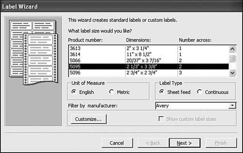 -
In the next window, you can specify fonts and other font attributes. Accept the default options by clicking Next without making any changes. -
Now you're ready to list the fields that contain the data you want to print on labels. You can also include literal characters . You'll add the catalog name and address fields as follows : Double-click Name in the Available Fields list to move it to the prototype label; then press Enter to move the insertion point to the next line. Double-click Address and press Enter . Double-click City , and then type a comma and space character. Next, double-click State , add a space, and then double-click ZIP to create the prototype shown in Figure 14.7. Click Next . Figure 14.7. Add labels to the Prototype label. 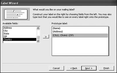 -
You can sort the labels by any field in the table. Select Name and click Next . -
The wizard assigns a default name to the label report in the final window. You can change it, but don't. Click Finish to generate the report shown in Figure 14.8. Figure 14.8. The wizard generated this label report. 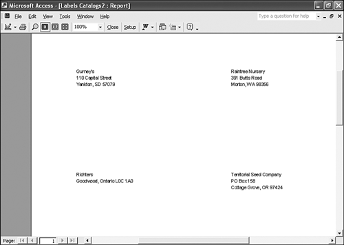 All that's left to do is to insert the label sheets and click Print! Displaying Charts in a Report The Chart Wizard embeds a chart in a report. The chart is actually an ActiveX controlAccess doesn't generate the chart. Access uses Microsoft Graph to generate the chart, which offers 20 chart formats. The embedded chart lets you change its results by moving chart components to change the orientation. Or, you can modify the default calculations. The following are two ways to add a chart to a report: Now, let's create a simple pie chart that denotes the plants ordered from each catalog. Usually, you base a graph on a query because the wizard can't handle more than one data source or calculate the necessary values. Begin with a query that counts the number of plants ordered from each catalog by following these steps: -
Select Query from the Insert menu, select Plants from the drop-down control, select Design View , and then click OK . -
Add the CatalogName and CommonName fields to the grid, in that order. -
Select Totals from the View menu on the Query Design toolbar. -
Change the Group By aggregate in the CommonName column to Count , as shown in Figure 14.9. Save the query as ChartQuery and close it. Figure 14.9. Generating a chart from this query. 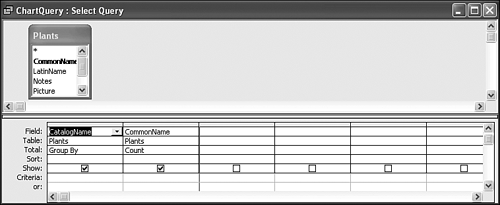 -
Click the Queries shortcut in the Database window and select ChartQuery . -
Select Report from the Insert menu and double-click Chart Wizard in the New Report dialog box. -
In the wizard's first window, move both fields to the Selected Fields list and then click Next . -
The next window displays 20 chart formats. Select the Pie Chart (the first option on the last row) and click Next . -
At this point, the wizard generates a sample chart based on the data, as shown in Figure 14.10. Don't be too concerned if the chart components don't display the correct proportions , but do check the axis controls to ensure the wizard is using the correct field(s). You want the pie chart to show the plants by catalog, so the wizard made the right choice by selecting the CountOfCommonName field. Don't change the wizard's choices; just click Next . Figure 14.10. You can alter the wizard's charting choices. 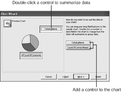 -
In the final window, name the report Chart and click Finish without changing any other options. The results are shown in Figure 14.11. You can see with a quick glance that half the plants have come from Wildseed Farms. Figure 14.11. The result chart shows the relationship, by count, of the plants from each catalog. 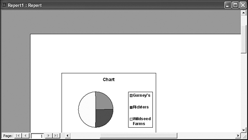 Note | | You can click the Preview Chart button in the upper-left corner to get a more accurate look at the chart. In addition, you can change the default structure by rearranging the controls or double-clicking a control and choosing a different mathematical function. |
Now let's add a dynamic chart to the CatalogsAndPlants report you created in Chapter 13. By dynamic , we mean the chart will reflect the values in each record. To create this chart, perform the following steps: -
Use the AutoReport: Tabular Wizard to create a quick report on the Plantings table. -
Click View on the Print Preview toolbar to open the new report in design view. -
Select the Photo control in the Detail section, and press Delete to remove it from the report. You'll use that spot to display the chart you're about to create. -
Select Chart from the Insert menu. -
Using the drag-and-drop method, insert a Chart control to fill the spot where the Photo control was. When you release the mouse, the wizard displays its first pane, which wants to know where the data for the chart's going to come from. Select the Plantings table and click Next . -
In the next pane, identify the values you want to chart. In this case, move the Bed and NumberPlanted fields to the Selected Fields list, and click Next . -
Select the Cylinder Column Chart the third option in the first rowand click Next . -
Click Next without making any changes in the next pane. You don't need to alter any of the wizard's choices. -
In the next pane, you can relate chart values to report values. The chart automatically relates the Bed fields. Add the NumberPlanted fields to the mix, as shown in Figure 14.12. Click Next . Figure 14.12. Relate chart values to report values. 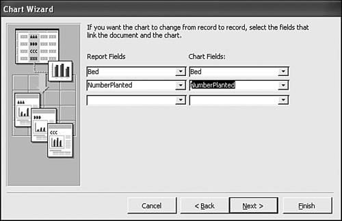 -
In the final pane, name the chart, such as Plantings . Click Finish . -
Click View on the Print Preview toolbar to see the results shown in Figure 14.13. As you can see, the axis values change from record to record. As is, this particular chart might not be effective, but you can see how easily you can chart individual values. Figure 14.13. The axis values reflect each record. 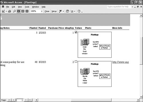  |