All Right, Already So What Is a Component Exactly?
|
|
All Right, Already!! So What Is a Component Exactly?
A component is a movie clip in Flash that has been prewired to generate some sort of functionality. As you will see later in the book, you begin generating a component by creating a standard movie clip. You then transform the movie clip into a component with a few relatively simple steps.
Components were introduced in Flash version 5 as smart clips. The name indicated a movie clip with smarts added to it. Macromedia changed the name from smart clips to components in Flash MX. If you see something referred to as a smart clip, you can treat it exactly as you would treat a component.
Smart clips developed in Flash 5 work perfectly well in Flash MX. Components that are programmed in Flash MX can be made to work in Flash 5. However, if you use code that was introduced in Flash MX in your components, they will not work in Flash 5.
So if a component is like a movie clip, how can you tell a component apart from a movie clip? The easiest way is by looking at its icon in the Flash Library. Figure 1.2 shows the library of a component called Link Scroller from Eyeland Studio's Flash Foundry (www.eyeland.com). The item highlighted, named "link scroller," is a component. Several other elements are visible in the library, all of which are actually used by the component and contained within the component.
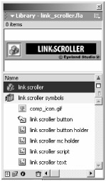
Figure 1.2: You can tell components apart from movie clips, buttons, graphic symbols, bitmap symbols, and audio symbols by their icons.
 |
Many of the components featured in this book are from Eyeland Studio's Flash Foundry product. Similar components can be found at www.eyeland.com or www.flashcomponents.com.
|
The default component icon is this:  . The standard movie clip icon is this:
  . If you see the default component icon, then you know you're dealing with a component.
However, Macromedia has provided several icons that you can use for components and has introduced the capability to create custom component icons. Any resource that displays one of the following icons will also be a component. Fortunately, both the alternative icons and custom icons are not used very frequently. Most components simply utilize the default component icon.
|
See Chapter 11 for information on how to create a custom icon for your components.
|
Identifying a Component on the Stage
When you see an item on the stage, it can be difficult to determine if it is a component or some other type of Flash resource (movie clip, button, graphic symbol, etc.). As with any Flash resource, if you are in doubt about what kind it is, you can always select it and look at the Properties panel. For example, Figure 1.3 shows the Properties panel for a movie clip. You can tell at a glance that the object is a movie clip because of its icon and its Movie Clip label.
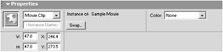
Figure 1.3: The Properties panel clearly indicates what type of object you have selected-in this case, a movie clip.
When a component is selected, the Properties panel can take on several appearances. Figure 1.4 shows the Properties panel for a component that comes with Flash MX. On the top left, you can see the default component icon and the Component label-both of which, of course, indicate that a component is selected. Notice the two tabs on the top right: Parameters and Properties.
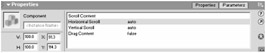
Figure 1.4: The Properties panel displays several indicators when you have selected a component.
The Parameters tab is displayed in Figure 1.4; this tab is only visible when a component is selected. Also, notice the area within the Properties panel that looks like a small database field. This is probably the most noticeable indication that a component is selected: these are the parameters for the component.
This area is referred to as the component user interface (UI). In Figure 1.4, this is the default user interface. Component parameters allow you to customize a component. If you think of a component as a sort of machine or engine that can be used to create something, then the component's user interface is like the machine's control panel (see Figure 1.5). The UI allows you to adjust specific characteristics for whatever the component is making.
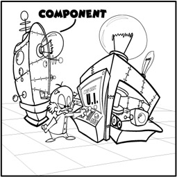
Figure 1.5: The component user interface is like a control panel on a machine.
So if a component is like a machine that makes a doohickey, then the component UI is like the machine's control panel that lets you tell the machine to make a red doohickey rather than a blue doohickey.
Figure 1.6 shows the Properties panel for a selected component with a different type of parameter user interface-in this case, a custom user interface. We will look at component UIs and parameters, including custom UIs, in detail in Chapter 2 (and, really, throughout this book).
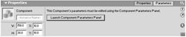
Figure 1.6: The Properties panel for a component with a custom user interface. You must click the Launch Component Parameters Panel button to view the custom UI
|
|
EAN: 2147483647
Pages: 111