Applied Layout Using Tables
| < Day Day Up > |
Now that we understand the basics of using tables for layout, we approach trying to lay pages out using only HTML/XHTML. Don't worry; creating relatively sophisticated layouts with tables doesn't have to be daunting. A little planning and the right tools can go a long way toward achieving a successful layout.
Centered Layout
Let's start first with a very simple design. In this case, we want to create a centered region with content that looks like a printed page on a background color . In this case, we could use a single cell table and set width, alignment, and padding to pull off the design quite easily, as shown here:
<!DOCTYPE html PUBLIC "-//W3C//DTD XHTML 1.0 Transitional//EN" "http://www.w3.org/TR/xhtml1/DTD/xhtml1-transitional.dtd"> <html xmlns="http://www.w3.org/1999/xhtml" lang="en"> <head> <title> Centered Table </title> <meta http-equiv="content-type" content="text/html; charset=ISO-8859-1" /> </head> <body bgcolor="navy"> <table width="80%" align="center" cellpadding="10"> <tr> <td bgcolor="white"> <h1 align="center"> Heading </h1> <hr width="80%" /> <p> Lorem ipsum dolor sit amet, consectetuer adipiscing elit. Nulla nulla. Ut vel magna eu velit tristique tempus. Nunc a wisi at ligula euismod tempus. Curabitur vestibulum viverra tellus. Phasellus vestibulum. Duis justo... </p> more content </td> </tr> </table> </body> </html>
A full rendering of the example is shown in Figure 7-5.
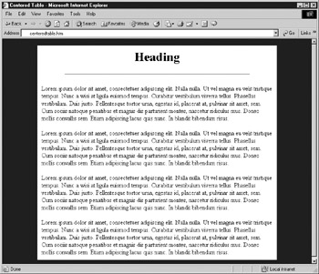
Figure 7-5: Centered page using a table
To expand upon the previous example, we might want to add in navigation and a site label across the top. That could be done easily with two extra rows of cells and appropriate use of the colspan attribute. However, it is not always wise to build complex tables when you can simply stack tables, as you can see in the following example, which is presented in Figure 7-6.
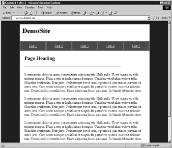
Figure 7-6: Centered layout variation
<!DOCTYPE html PUBLIC "-//W3C//DTD XHTML 1.0 Transitional//EN" "http://www.w3.org/TR/xhtml1/DTD/xhtml1-transitional.dtd"> <html xmlns="http://www.w3.org/1999/xhtml" lang="en"> <head> <title> Centered Table 2 </title> <meta http-equiv="content-type" content="text/html; charset=ISO-8859-1" /> </head> <body bgcolor="navy" link="white" alink="white" vlink="white"> <table width="80%" align="center" cellpadding="10" bgcolor="white"> <tr> <td colspan="5"><h1> DemoSite </h1></td> </tr> </table> <table width="80%" align="center" cellpadding="10" border="1" bgcolor="maroon"> <tr> <td align="center"><a href="#"> Link 1 </a></td> <td align="center"><a href="#"> Link 2 </a></td> <td align="center"><a href="#"> Link 3 </a></td> <td align="center"><a href="#"> Link 4 </a></td> <td align="center"><a href="#"> Link 5 </a></td> </tr> </table> <table width="80%" align="center" cellpadding="20" bgcolor="white"> <tr> <td colspan="5" bgcolor="white"> <h2> Page Heading </h2> <hr width="80%" align="left" /> <p> Lorem ipsum dolor sit amet, consectetuer adipiscing elit. Nulla nulla. Ut vel magna eu velit tristique tempus. Nunc a wisi at ligula euismod tempus. Curabitur vestibulum viverra tellus. Phasellus vestibulum. Duis justo. </p> more content </td> </tr> </table> </body> </html>
Top-Left-Bottom "TLB" Layout
A modification of the previous layout would provide for secondary navigation on the left of the content as well as backup navigation or extra information at the bottom of the page. This type of template is very commonly used on the Web and is often called a TLB design for "top-left-bottom." A simple example of a TLB template is shown here with a rendering in Figure 7-7.
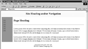
Figure 7-7: TLB template example
<!DOCTYPE html PUBLIC "-//W3C//DTD XHTML 1.0 Transitional//EN" "http://www.w3.org/TR/xhtml1/DTD/xhtml1-transitional.dtd"> <html xmlns="http://www.w3.org/1999/xhtml" lang="en"> <head> <title> TLB Template </title> <meta http-equiv="content-type" content="text/html; charset=ISO-8859-1" /> </head> <body bgcolor="#ffffff"> <!--BEGIN: Label or primary nav table --> <table width="100%" border="0" cellspacing="0" cellpadding="0"> <tr> <td width="100%" bgcolor="yellow"> <h2 align="center"> Site Heading and/or Navigation </h2> </td> </tr> </table> <!--END: Label of primary nav table--> <!--BEGIN: Secondary nav and content --> <table width="100%" border="0" cellspacing="0" cellpadding="0"> <tr> <td width="10" bgcolor="red"> </td> <td width="90" valign="top" bgcolor="red"> <br /> <a href="#"> Link </a><br /> <a href="#"> Link </a><br /> <a href="#"> Link </a><br /> <a href="#"> Link </a><br /> <a href="#"> Link </a><br /> <a href="#"> Link </a><br /> </td> <td width="10" bgcolor="white"> </td> <td> <br /> <h2> Page Heading </h2> <hr /> <p> Lorem ipsum dolor sit amet, consectetuer adipiscing elit, sed diam nonummy nibh euismod tincidunt ut laoreet dolore magna aliquam erat volutpat. Ut wisi enim ad minim veniam, quis nostrud exerci tation ullamcorper suscipit lobortis nisl ut aliquip ex ea commodo consequat. </p> more content </td> <td width="10" bgcolor="white"> </td> </tr> </table> <!-- END: secondary nav and content --> <!--BEGIN: footer navigation and legal--> <div align="center"> <br /> <font size="-2"> <a href="#"> Link </a> <a href="#"> Link </a> <a href="#"> Link </a> <a href="#"> Link </a> <a href="#"> Link </a> <a href="#"> Link </a> </font> <br /><em>© 2003 DemoCompany Inc. </em> </div> <!-- END: footer nav --> </body> </html>
Stretchable Table Layouts
Another common design is one that stretches to fit the available screen region. The so-called fluid or stretchable design requires that some cells be set with values and others not, to be elastic in response to available screen width. Stretchable designs are particularly common in three-column layouts, as shown in this example:
<!DOCTYPE html PUBLIC "-//W3C//DTD XHTML 1.0 Transitional//EN" "http://www.w3.org/TR/xhtml1/DTD/xhtml1-transitional.dtd"> <html xmlns="http://www.w3.org/1999/xhtml" lang="en"> <head> <title> Stretch Template </title> <meta http-equiv="content-type" content="text/html; charset=ISO-8859-1" /> </head> <body bgcolor="#006699"> <table border="0" width="100%" cellspacing="0" cellpadding="15"> <tr> <!-- just a gap --> <td width="20" bgcolor="#006699"> </td> <!-- navigation column fixed size --> <td width="150" bgcolor="#ffcc00" valign="top"> <h3 align="center"> Navigation </h3> <a href="#"> Link </a><br /> <a href="#"> Link </a><br /> <a href="#"> Link </a><br /> <a href="#"> Link </a><br /> </td> <!-- just a gap --> <td width="20" bgcolor="#ffffff"> </td> <!-- content region variable size --> <td bgcolor="#ffffff" valign="top"> <h2 align="center"> Stretch Demo </h2> <hr /> <p> Content goes here. Content goes here. Content goes here. Content goes here. Content goes here. Content goes here. Content goes here. Content goes here. Content goes here. </p> </td> <!--right column fixed size--> <td width="100" bgcolor="#ffcc00"> Right column text here </td> <!--right margin gap--> <td width="20" bgcolor="#006699"> </td> </tr> </table> </body> </html>
The rendering of the stretchable design shown in Figure 7-8 demonstrates one downside of the approach. Without enough content, a stretchable table layout might look rather empty on a very large monitor.
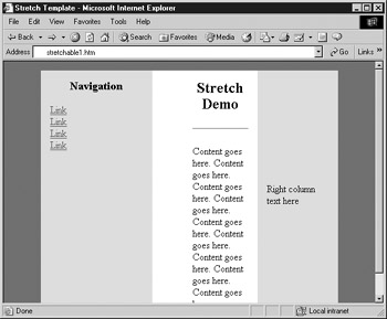
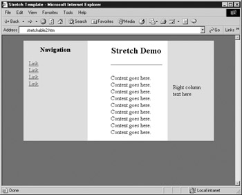
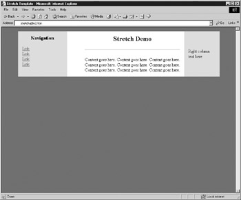
Figure 7-8: Stretchable design in action
| Tip | While a stretchable or fluid design does fit to whatever screen the user wants, it can be rather limiting. Creating stretch points limits the design to simple colors or patterns because the relative areas are elastic and would distort an image placed there. |
Complex Table Layouts
It is also possible to apply tables to layouts in a more complicated fashion. Layouts combining text and images can be created using large graphics that incorporate text, but this approach produces pages that are slow to download. The code example that follows shows a more complicated layout that breaks up an image and reassembles it like a jigsaw puzzle, using a table as an invisible "frame" to hold it in place. Note that anchors have not been applied to the graphic links in this code (widgets.gif, and so on) in order to simplify the code example.
<!DOCTYPE html PUBLIC "-//W3C//DTD XHTML 1.0 Transitional//EN" "http://www.w3.org/TR/xhtml1/DTD/xhtml1-transitional.dtd"> <html xmlns="http://www.w3.org/1999/xhtml" lang="en"> <head> <title> Demo Company, Inc. Home Page </title> <meta http-equiv="content-type" content="text/html; charset=ISO-8859-1" /> </head> <body> <table border="0" cellpadding="0" cellspacing="0" width="570"> <tr> <td> <img src="roof.gif" alt="" border="0" height="45" width="124" /> </td> <td colspan="4"> <img src="logo.gif" alt="DemoCompany Inc" border="0" height="45" width="446" /> </td> </tr> <tr> <td valign="top" rowspan="7" width="124"> <img src="building.gif" alt="DemoCompany Building" border="0" height="248" width="124" /> </td> <td rowspan="7" valign="top" width="185"> <img src="headline.gif" alt="We make widgets!" border="0" height="45" width="185" /> And now, thanks to our merger with Massive Industries, we are now the world's largest manufacturer of Gadgets ™ and other useless products. <br /><br /> To learn more about our products or our growing monopoly, click on any of the links to the right. </td> <td rowspan="3" width="68" valign="top"> <img src="curve.gif" alt="" border="0" height="108" width="68" /> </td> <td colspan="2" width="193" valign="top"> <img src="blank.gif" alt="" border="0" height="35" width="193" /> </td> </tr> <tr> <td colspan="2" width="193" valign="top"> <img src="widgets.gif" alt="widgets" border="0" height="35" width="193" /> </td> </tr> <tr> <td colspan="2" width="193" valign="top"> <img src="gadgets.gif" alt="gadgets" border="0" height="38" width="193" /> </td> </tr> <tr> <td colspan="2" rowspan="4" width="136" valign="top"> <img src="gear.gif" alt="" border="0" height="140" width="136" /> </td> <td valign="top" width="125"> <img src="sales.gif" alt="sales" border="0" height="29" width="125" /> </td> </tr> <tr> <td valign="top" width="125"> <img src="about.gif" alt="about" border="0" height="36" width="125" /> </td> </tr> <tr> <td valign="top" width="125"> <img src="history.gif" alt="history" border="0" height="35" width="125" /> </td> </tr> <tr> <td valign="top" width="125"> <img src="map.gif" alt="map" border="0" height="40" width="125" /> </td> </tr> <tr> <td colspan="2" width="309"> </td> <td width="68"> </td> <td width="68"> </td> <td valign="top" width="125"> <img src="lowcurve.gif" alt="" border="0" height="31" width="125" /> </td> </tr> </table> </body> </html>
When creating a layout like this, it is very important to set the cellpadding and cellspacing attributes to . Table cell widths should correspond to the width of the image inside the cell, and the width of the table should be the sum of the cells in a table row. It also is important to include the height and width attributes of the images used. Figure 7-9 shows a browser rendering of this layout, with an overlay to show where the image is broken up.
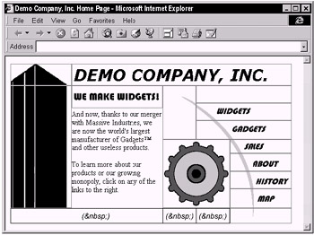
Figure 7-9: Rendering of layout with "jigsaw"
While the images in the preceding example are all GIFs, JPEGs could also be used. "Photographic" areas of an image should be saved as JPEGs while areas with limited color, such as simple text, should be saved as GIFs. By saving each area in the appropriate format, it is possible to reduce the overall file size and optimize performance. (This is discussed in more detail in Chapter 5.)
Graphic tools such as Adobe PhotoShop or Macromedia's Fireworks enable Web designers to create a single image layout design, beginning with a file such as a large image that is then sliced up to create an HTML/XHTML layout using a table and pieces of the image converted into GIF and/or JPEG files, as appropriate. The use of such a program is shown in Figure 7-10.
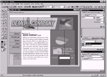
Figure 7-10: Slicing visual composite to make a template
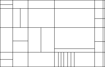
Graphic programs such as Fireworks will not only create markup but even special "shim" images to maintain cell widths and heights throughout the table. Although these tools are certainly very convenient in layout preparation, they often produce overly complicated tables, laden with wildly varying colspan and rowspan attributes, as suggested by the following grid:
Some designers also might generate similar table layouts on their own. Whether using a graphics tool or building such layouts by hand, it is always useful to step back and consider a simpler approach. Consider a basic layout like this:
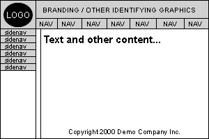
Although it certainly would be possible to create a single table to hold all of the graphic and text elements of this design, it might be simpler to think of the layout as a layer cake, as shown here:
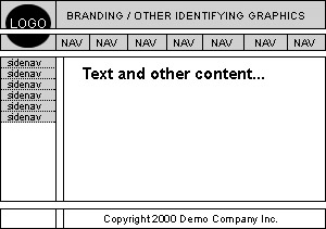
The row featuring the navigation buttons could be one table, and the part of the layout featuring the side navigation could be another one. Whereas the copyright information at the bottom could be included in a cell with the colspan attribute, it too could be split off into its own table, simply to keep different parts of the page separate. As long as the tables are all the same width, each has column widths that add up properly to the overall table width, and do not have <br /> tags or any other elements between them, they should stack up perfectly .
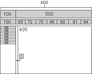
Table Tips
As you saw in the last section, tables can get quite complicated quickly. Here are a few useful rules to make things go smoother when creating layouts with tables.
-
Consider using indentation or multiple returns between table rows and cells for easy readability. This is particularly useful if you are hand editing and the extra white space can always be removed before page delivery.
-
Always use these three basic attributes with the table element: border , cellpadding , and cellspacing . Even if you don't want any of these things, set them to zero; border is useful for checking your work, and browsers generally throw in a little bit of unwanted cellpadding and cellspacing if those attributes are not present.
-
Always use the closing tags for every element; this will prevent browser display problems and maintain XHTML compatibility as well.
-
Make certain that column widths, as defined by <th> or <td> cells, add up to the overall defined width of the table. Faulty addition has ruined more than a few seemingly perfect tables.
-
Don't forget that use of the colspan or rowspan attributes in one row will require the removal of some table cells in other rows in the table.
-
Certain Microsoft-created attributes, such as bordercolor , bordercolordark , and bordercolorlight , are not suitable for cross-browser usage. Avoid them unless designing for an IE-only environment such as an intranet.
-
Try to simplify layouts; don't go crazy with excessive rowspan and colspan usage when you can stack tables much more simply. It might help to visualize the layout as a layer cake, with a separate table as each layer.
-
Don't nest tables deeply. Besides making things overly complicated, you may actually reduce page rendering speed.
-
Always comment complex tables so they will make sense to you later. When commenting, at the very least, it is handy to indicate the beginning and end of any table.
<!-- begin top nav table --> ... table elements ... <!-- end top nav table -->
If you are nesting tables, be certain to mark them as such.
<!-- begin nested table 1 --> ... table elements ... <!-- end nested table 1 -->
Use comments to any extent you desire , from comments noting the start of new table rows to comments explaining the purpose of a table cell. As long as your comments are meaningful, it won't hurt to add a few kilobytes to your document size in the interest of good coding practice, and you can always strip these comments out before page delivery.
| < Day Day Up > |
EAN: 2147483647
Pages: 252