Controlling Frame Margins, Borders, and Scrolling
| The problem with the nine-frame arrangement in Figure 16.3 is that it looks ugly and serves no practical purpose with all those annoying scrollbars. We can fix that. The ugly parts are the gray dividers between the frames, which completely ruin the effect of surrounding the center frame with nicely designed graphics. There also isn't enough room in the top and bottom frames to display the graphics without scrollbars. Fortunately, there are HTML commands to get rid of the frame dividers, make more space in small frames by reducing the size of the margins, and force frames not to have scrollbars.
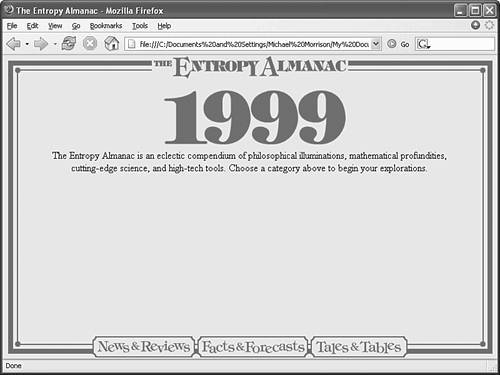
Before you read about these HTML magic tricks, take a look at the dramatic results they can achieve. Figure 16.5 is another version of the nine-frame window displaying the same web pages shown in Figure 16.3. Obviously, Figure 16.5 looks much nicer! In Listing 16.5, you can see the anti-ugliness medication I gave to the frameset you saw in Figure 16.3. Listing 16.5. Nine Separate Web Pages Displayed in Nine Frames<?xml version="1.0" encoding="UTF-8"?> <!DOCTYPE html PUBLIC "-//W3C//DTD XHTML 1.0 Frameset//EN" "http://www.w3.org/TR/xhtml1/DTD/xhtml1-frameset.dtd"> <html xmlns="http://www.w3.org/1999/xhtml" xml:lang="en"> <head> <title>The Entropy Almanac</title> </head> <frameset rows="43,*,43" border="0"> <frameset cols="43,*,43"> <frame src="/books/4/158/1/html/2/ctoplft.html" name="toplft" scrolling="no" frameborder="0" /> <frame src="/books/4/158/1/html/2/bordtop.html" name="top" scrolling="no" frameborder="0" marginheight="1" /> <frame src="/books/4/158/1/html/2/ctoprgt.html" name="toprgt" scrolling="no" frameborder="0" /> </frameset> <frameset cols="43,*,43"> <frame src="/books/4/158/1/html/2/bordlft.html" name="left" scrolling="no" frameborder="0" /> <frame src="/books/4/158/1/html/2/main.html" name="main" frameborder="0" /> <frame src="/books/4/158/1/html/2/bordrgt.html" name="right" scrolling="no" frameborder="0" /> </frameset> <frameset cols="43,*,43"> <frame src="/books/4/158/1/html/2/cbtmlft.html" name="btmlft" scrolling="no" frameborder="0" /> <frame src="/books/4/158/1/html/2/bordbtm.html" name="btm" scrolling="no" frameborder="0" marginheight="1" /> <frame src="/books/4/158/1/html/2/cbtmrgt.html" name="btmrgt" scrolling="no" frameborder="0" /> </frameset> </frameset> </html> Figure 16.5. This is the page whose code is shown in Listing 16.5. By adding some attributes to the <frame /> tags, I was able to make the frames look much nicer.
In addition to the id and name attributes, the <frame /> tag can take the following special frame-related attributes:
marginwidth and marginheight are pretty self-explanatory, but it's worth taking a close look at each of the other attributes. Normally, any frame that isn't big enough to hold all of its contents will have its own scrollbar(s). The top and bottom frames you saw earlier in Figure 16.3 are examples. If you don't want a particular frame to ever display scrollbars, you can put scrolling="no" in the <frame> tag. Conversely, scrolling="yes" forces both horizontal and vertical scrollbars to appear, whether or not they are needed.
People viewing your frames can ordinarily resize them by grabbing the frame borders with the mouse and dragging them around. If you don't want anyone messing with the size of a frame, put noresize="noresize" in the <frame /> tag. Frames are flexible enough to allow you to control the size of frame borders or eliminate borders altogether. This makes a frame document look just like a regular web page, with no ugly lines breaking it up. Just put a frameborder="0" attribute in every single <frame /> tagnot just in the <frameset> tags. When used together with custom graphics, borderless frames can allow you to create sites that are easier to navigate and more pleasant to visit. For example, when someone visits the site shown in Figure 16.5 and clicks one of the navigation choices in the bottom frame, the page he chose comes up in the middle frame quickly because the title graphic, navigation buttons, and border graphics all remain in place. The frames also automatically adapt to changes in the size of the browser window, so the nice "picture frame" effect looks just as good at 1,024x768 resolution and higher resolutions as it does at 800x600.
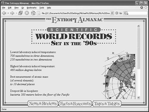
Figure 16.6 shows the result of clicking the Facts & Forecasts link in the screen shown in Figure 16.5. Note that the middle frame gets its own scrollbar whenever the contents are too big to fit in the frame. Figure 16.6. Clicking a link at the top of the screen shown in Figure 16.5 brings up a new page in the middle frame, without redrawing any of the other frames.
|
EAN: 2147483647
Pages: 345