The Whole Scoop on Positioning
| I already mentioned that relative positioning is the default type of positioning used by HTML. You can think of relative positioning as being akin to laying out checkers on a checkerboard: The checkers are arranged from left to right, and when you get to the edge of the board you move on to the next row. Elements that are styled with the block value for the display style property are automatically placed on a new row, whereas inline elements are placed on the same row immediately next to the element preceding them. As an example, <p> and <div> tags are considered block elements, whereas the <span> tag is considered an inline element.
The other type of positioning supported by CSS is known as absolute positioning because it allows you to set the exact position of HTML content on a page. Although absolute positioning gives you the freedom to spell out exactly where an element is to appear, the position is still relative to any parent elements that appear on the page. In other words, absolute positioning allows you to specify the exact location of an element's rectangular area with respect to its parent's area, which is very different from relative positioning. As with most things in life, with freedom comes responsibility. And with the freedom of placing elements anywhere you want on a page, you can run into the problem of overlap, which is when an element takes up space used by another element. There is nothing stopping you from specifying the absolute locations of elements such that they overlap. In this case, CSS relies on the z-index of each element to determine which element is on the top and which is on the bottom. You'll learn more about the z-index of elements later in the hour. For now, let's take a look at exactly how you control whether a style rule uses relative or absolute positioning. The type of positioning (relative or absolute) used by a particular style rule is determined by the position property, which is capable of having one of the following two values: relative or absolute. After specifying the type of positioning, you then provide the specific position using the following properties:
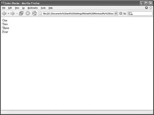
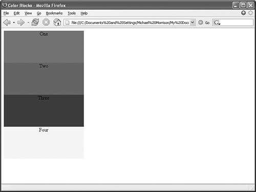
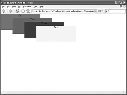
You might think that these position properties make sense only for absolute positioning, but they actually apply to both types of positioning. Under relative positioning, the position of an element is specified as an offset relative to the original position of the element. So if you set the left property of an element to 25px, the left side of the element will be shifted over 25 pixels from its original (relative) position. An absolute position, on the other hand, is specified relative to the parent of the element to which the style is applied. So if you set the left property of an element to 25px under absolute positioning, the left side of the element will appear 25 pixels to the right of the parent element's left edge. On the other hand, using the right property with the same value would position the element so that its right side is 25 pixels to the right of the parent's right edge. You might understand this positioning stuff better by looking at an example. Check out the code in Listing 14.1 for a very simple web page. Listing 14.1. A Very Simple Web Page That Relies on an External Style Sheet for Its Content Layout<?xml version="1.0" encoding="UTF-8"?> <!DOCTYPE html PUBLIC "-//W3C//DTD XHTML 1.1//EN" "http://www.w3.org/TR/xhtml11/DTD/xhtml11.dtd"> <html xmlns="http://www.w3.org/1999/xhtml" xml:lang="en"> <head> <title>Color Blocks</title> <link rel="stylesheet" type="text/css" href="colors_rel.css" /> </head> <body> <div >One</div> <div >Two</div> <div >Three</div> <div >Four</div> </body> </html> Admittedly, this page isn't all that interesting, but it's a good way to demonstrate the difference between relative and absolute positioning. Notice in the code that there are several div elements, each with a different style class, and therefore a different style rule. Before applying a style sheet to this page, take a look at it in Figure 14.1. Figure 14.1. The Color Blocks web page is far beyond boring without the help of any style sheets. I know, this is an extremely unimpressive page. In fact, it demonstrates perfectly how much style sheets impact otherwise-boring content, as you're about to see. Listing 14.2 contains a style sheet for this page that uses relative positioning to arrange the content as colored squares. Listing 14.2. Using Relative Positioning in the colors_rel.css Style Sheet div { position:relative; width:250px; height:100px; border:10px single black; color:black; text-align:center; } div.one { background-color:red; } div.two { background-color:green; } div.three { background-color:blue; } div.four { background-color:yellow; } This code first sets the position style property for the div element to relative. Because the remaining style rules are inherited from the div style rule, they inherit its relative positioning. In fact, the only difference between the other style rules is that they have different background colors. Figure 14.2 shows the Color Blocks page as it is displayed in Firefox using this relative positioning style sheet. Figure 14.2. The Color Blocks web page is displayed using a style sheet with relative positioning. Notice in the figure that the div elements are displayed one after the next, which is what you would expect with relative positioning. To make things more interesting, you can change the positioning to absolute and explicitly specify the placement of the colors. Listing 14.3 contains a modified style sheet for the Color Blocks page that uses absolute positioning to arrange the colors. Listing 14.3. Using Absolute Positioning in the colors_abs.css Style Sheet div { position:absolute; width:250px; height:100px; border:10px single black; color:black; text-align:center; } div.one { background-color:red; left:0px; top:0px; } div.two { background-color:green; left:75px; top:25px; } div.three { background-color:blue; left:150px; top:50px; } div.four { background-color:yellow; left:225px; top:75px; } This style sheet sets the position property to absolute, which is necessary in order for the style sheet to use absolute positioning. Additionally, the left and top properties are set for each of the inherited div style rules. However, the position of each of these rules is set so that the elements are displayed overlapping each other, as shown in Figure 14.3. Figure 14.3. The Color Blocks web page is displayed using a style sheet with absolute positioning. This figure shows how absolute positioning allows you to place elements exactly where you want them. It also reveals how easy it is to arrange elements so that they overlap each other. You might be curious as to how a web browser knows which elements to draw on top when they overlap. Read on to find out! |
EAN: 2147483647
Pages: 345