Recipe 3.14. Rounding Corners with Fixed-Width Columns
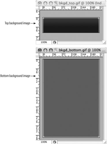
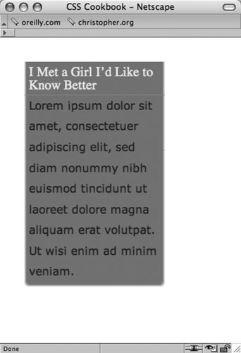
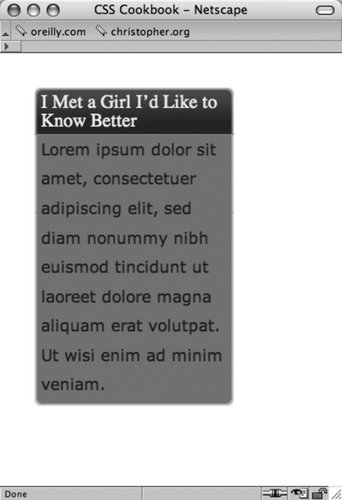
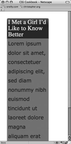
ProblemYou want to create rounded corners on columns that set with fixed-width columns. SolutionCreate two background images with one image containing the top corners and the other image containing the bottom corners (Figure 3-28). Wrap a div element around the content that's within the column: <div > <h2> I Met a Girl I’d Like to Know Better </h2> <p>Lorem ipsum dolor sit amet, consectetuer adipiscing elit, sed diam nonummy nibh euismod tincidunt ut laoreet dolore magna aliquam erat volutpat. Ut wisi enim ad minim veniam.</p> </div> Figure 3-28. One image for the top corners and another for the bottom corners Place the bottom background image in the div element (see Figure 3-29): #box { width: 214px; background-image: url(bkgd_bottom.gif); background-position: bottom; background-repeat: no-repeat; } Figure 3-29. A background image is placed at the bottom of the column Then place the top background image in the h2 element (see Figure 3-30): h2 { background-image: url(bkgd_top.gif); backgroung-position: left top; background-repeat: no-repeat; padding: 7px 7px 3px 7px; margin: 0; border-bottom: 1px solid #999; font-size: 1.3em; font-weight: normal; color: #eee; } Figure 3-30. A background image is placed at the top of the column DiscussionTo compensate for different text sizes like the ones in Figure 3-31, make the background images extend for longer than just the space specified in the design. For example, the images used in this solution are 600 pixels tall, however it's not unheard of to have the lengths of the graphics to be more than 1,000 pixels to insure a page's design maintains its integrity with extreme font sizing. Figure 3-31. As the text enlarges, the design keeps its integrity By fixing the width of the column to a length unit like pixels, it's possible to place an image containing two corners in one image. With column widths that change when the user resizes the browser, however, the fixed-width solution falls apart. See AlsoRecipes 3.15, 3.16, and 3.17 for rounding corners with flexible widths. |
EAN: 2147483647
Pages: 235