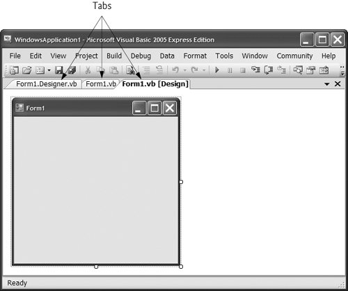
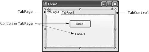
14.11. TabControl Control The TabControl control creates tabbed windows, such as the ones we have seen in Visual Studio (Fig. 14.32). Tabs allow you to organize more complex GUIs. TabControls contain TabPage objects on which you can place controls, similar to Panels and GroupBoxes. Figure 14.33 depicts a sample TabControl. Figure 14.32. Tabbed windows in Visual Studio. 
Figure 14.33. TabControl with TabPages example. 
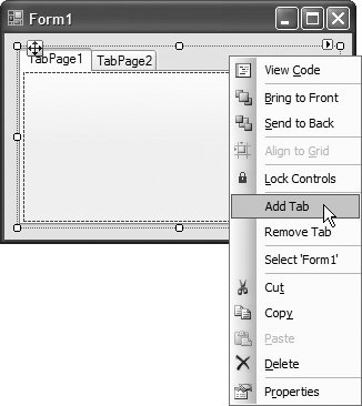
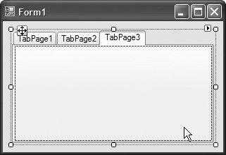
You can add TabControls visually by dragging and dropping them onto a Form in Design mode. To add TabPages in Design mode, right click the TabControl and select Add Tab (Fig. 14.34). Alternatively, click the TabPages property in the Properties window, and add tabs in the dialog that appears. To change a tab label, set the Text property of the TabPage. Note that clicking the tabs selects the TabControl to select the TabPage, click the control area underneath the tabs. You can add controls to the TabPage by dragging and dropping items from the ToolBox. To view different TabPages (in Design mode or when the program is running), simply click the appropriate tab. When a TabPage is clicked at execution time, it generates a Click event. To create the event handler for this event, double click the body of a TabPage in Design mode. Common properties and a common event of TabControls are described in Fig. 14.35. Figure 14.34. TabPages added to a TabControl.  
Figure 14.35. TabControl properties and an event.TabControl properties and an even | Description |
|---|
Common Properties | ImageList | Specifies images to be displayed on tabs. | ItemSize | Specifies the tab size. | Multiline | Indicates whether multiple rows oftabs can be displayed. | SelectedIndex | Index of the selected TabPage. | SelectedTab | The selected TabPage. | TabCount | Returnsthe number of tab pages. | TabPages | Collection of TabPages withinthe TabControl. | Common Event | SlectedIndexChanged | Generated when SelectedIndex changes (i.e., another TabPage is selected). |
You can add controls to a TabPage object and add TabPages to a TabControl object programmatically, with statements like myTabPage.Controls.Add(myControl) myTabControl.Controls.Add(myTabPage)
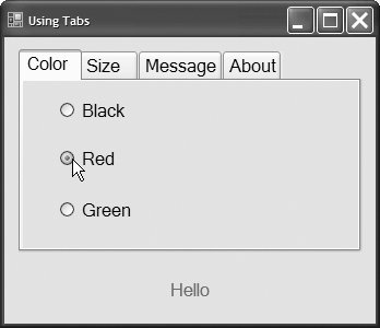
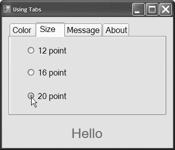
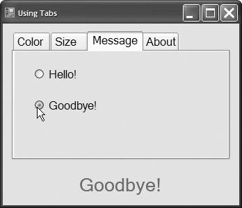
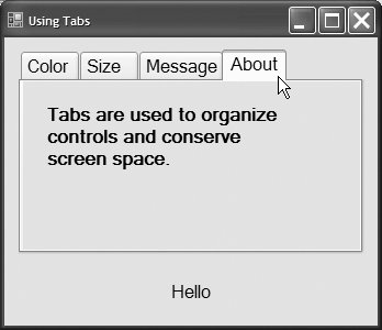
These statements call method Add of the Controls collection. The first statement adds a control to TabPage myTabPage, and the second statement adds myTabPage to TabControl myTabControl. Alternatively, you can use method AddRange to add an array of controls or TabPages to a TabPage or TabControl, respectively. Class FrmUsingTabs (Fig. 14.36) uses a TabControl to display various options related to the text on a label (Color, Size and Message). The last TabPage displays an About message, which describes how TabControls are used. Figure 14.36. TabControl used to display various font settings. 1 ' Fig. 14.36: FrmUsingTabs.vb 2 ' Using TabControl to display various font settings. 3 Public Class FrmUsingTabs 4 ' event handler for Black RadioButton 5 Private Sub radBlack_CheckedChanged(ByVal sender As System.Object, _ 6 ByVal e As System.EventArgs) Handles radBlack.CheckedChanged 7 8 lblDisplay.ForeColor = Color.Black ' change font color to black 9 End Sub ' radBlack_CheckedChanged 10 11 ' event handler for Red RadioButton 12 Private Sub radRed_CheckedChanged(ByVal sender As System.Object, _ 13 ByVal e As System.EventArgs) Handles radRed.CheckedChanged 14 15 lblDisplay.ForeColor = Color.Red ' change font color to red 16 End Sub ' radRed_CheckedChanged 17 18 ' event handler for Green RadioButton 19 Private Sub radGreen_CheckedChanged(ByVal sender As System.Object, _ 20 ByVal e As System.EventArgs) Handles radGreen.CheckedChanged 21 22 lblDisplay.ForeColor = Color.Green ' change font color to green 23 End Sub ' radGreen_CheckedChanged 24 25 ' event handler for 12 point RadioButton 26 Private Sub radSize12_CheckedChanged(ByVal sender As System.Object, _ 27 ByVal e As System.EventArgs) Handles radSize12.CheckedChanged 28 ' change font size to 12 29 lblDisplay.Font = New Font(lblDisplay.Font.Name, 12 ) 30 End Sub ' radSize12_CheckedChanged 31 32 ' event handler for 16 point RadioButton 33 Private Sub radSize16_CheckedChanged(ByVal sender As System.Object, _ 34 ByVal e As System.EventArgs) Handles radSize16.CheckedChanged 35 ' change font size to 16 36 lblDisplay.Font = New Font(lblDisplay.Font.Name, 16 ) 37 End Sub ' radSize16_CheckedChanged 38 39 ' event handler for 20 point RadioButton 40 Private Sub radSize20_CheckedChanged(ByVal sender As System.Object, _ 41 ByVal e As System.EventArgs) Handles radSize20.CheckedChanged 42 ' change font size to 20 43 lblDisplay.Font = New Font(lblDisplay.Font.Name, 20) 44 End Sub ' radSize20_CheckedChanged 45 46 ' event handler for Hello! RadioButton 47 Private Sub radHello_CheckedChanged(ByVal sender As System.Object, _ 48 ByVal e As System.EventArgs) Handles radHello.CheckedChanged 49 50 lblDisplay.Text = "Hello!" ' change text to Hello! 51 End Sub ' radHello_CheckedChanged 52 53 ' event handler for Goodbye! RadioButton 54 Private Sub radGoodbye_CheckedChanged(ByVal sender As System.Object, _ 55 ByVal e As System.EventArgs) Handles radGoodbye.CheckedChanged 56 57 lblDisplay.Text = "Goodbye!" ' change text to Goodbye! 58 End Sub ' radGoodbye_CheckedChanged 59 End Class ' FrmUsingTabs
(a) 
(b) 
(c) 
(d)  |
The TabControl tbcTextOptions and the TabPages tbpColor, tbpSize, tbpMessage and tbpAbout are created in the designer (as described previously). The tbpColor contains three RadioButtons for the colors black (radBlack), red (radRed) and green (radGreen). This TabPage is displayed in Fig. 14.36(a). The CheckChanged event handler for each RadioButton updates the color of the text in lblDisplay (lines 8, 15 and 22). The tbpSize (Fig. 14.36(b)) has three RadioButtons, corresponding to font sizes 12 (radSize12), 16 (radSize16) and 20 (radSize20), which change the font size of lblDisplaylines 29, 36 and 43, respectively. The tbpMessage (Fig. 14.36(c)) contains two RadioButtons for the messages Hello! (radHello) and Goodbye! (radGoodbye). The two RadioButtons determine the text on lblDisplay (lines 50 and 57, respectively). The tbpAbout (Fig. 14.36(d)) contains a Label (lblMessage) describing the purpose of TabControls. Software Engineering Observation 14.3  | A TabPage can act as a container for a single logical group of RadioButtons, enforcing their mutual exclusivity. To place multiple RadioButton groups inside a single TabPage, group the RadioButtons within Panels or GroupBoxes and attach these containers to the TabPage. |
|
