Section 13.4. Control Properties and Layout
13.4. Control Properties and LayoutThis section overviews properties that are common to many controls. Controls derive from class Control (namespace System.Windows.Forms). Figure 13.11 lists some of class Control's properties and methods. The properties shown here can be set for many controls. For example, the Text property specifies the text that appears on a control. The location of this text varies depending on the control. In a Windows Form, the text appears in the title bar, but the text of a Button appears on its face.
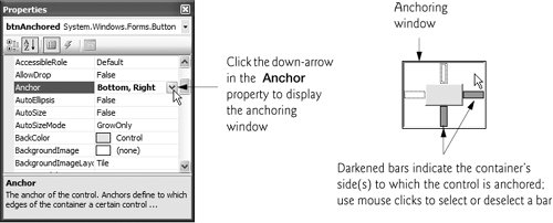
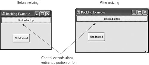
The Focus method transfers the focus to a control and makes it the active control. When you press the Tab key in an executing Windows application, controls receive the focus in the order specified by their TabIndex property. This property is set by Visual Studio based on the order in which controls are added to a Form, but you can modify this property to change the tabbing order. TabIndex is helpful for users who enter information in many controls, such as a set of TextBoxes that represent a user's name, address and telephone number. The user can enter information, then quickly select the next control by pressing the Tab key. The Enabled property indicates whether the user can interact with a control to generate an event. If a control is disabled, it is often because an option is unavailable to the user at that time. For example, text editor applications often disable the "paste" command until the user copies some text. In most cases, a disabled control's text appears in gray (rather than in black). You can also hide a control from the user without disabling the control by setting the Visible property to False or by calling method Hide. In each case, the control still exists but is not visible on the Form. You can use anchoring and docking to specify the layout of controls inside a container (such as a Form). Anchoring causes controls to remain at a fixed distance from the sides of the container even when the container is resized. Anchoring enhances the user experience. For example, if the user expects a control to appear in a certain corner of the application, anchoring ensures that the control will always be in that cornereven if the user resizes the Form. Docking attaches a control to a container such that the control stretches across an entire side. For example, a button docked to the top of a container stretches across the entire top of that container regardless of the container's width. When parent containers are resized, anchored controls are moved (and possibly resized) so that the distance from the sides to which they are anchored does not vary. By default, most controls are anchored to the top-left corner of the Form. To see the effects of anchoring a control, create a simple Windows application that contains two Buttons. Anchor one control to the right and bottom sides by setting the Anchor property as shown in Fig. 13.12. Leave the other control unanchored. Execute the application and enlarge the Form. Note that the Button anchored to the bottom-right corner is always the same distance from the Form's bottom-right corner (Fig. 13.13), but that the other control stays its original distance from the top-left corner of the Form. Figure 13.12. Manipulating the Anchor property of a control. Figure 13.13. Anchoring demonstration. Sometimes, it is desirable for a control to span an entire side of the Form, even when the Form is resized. For example, a control such as a status bar typically should remain at the bottom of the Form. Docking allows a control to span an entire side (left, right, top or bottom) of its parent container or to fill the entire container. When the parent control is resized, the docked control resizes as well. In Fig. 13.14, a Button is docked at the top of the Form (spanning the top portion). When the Form is resized, the Button is resized to the Form's new width. Forms have a Padding property that specifies the distance between the docked controls and the Form edges. This property specifies four values (one for each side), and each value is set to 0 by default. Some common control-layout properties are summarized in Fig. 13.15. Figure 13.14. Docking a Button to the top of a Form.
The Anchor and Dock properties of a Control are set with respect to the Control's parent container, which could be a Form or another parent container (such as a Panel; discussed in Section 13.6). The minimum and maximum Form (or other Control) sizes can be set via properties MinimumSize and MaximumSize, respectively. Both are of type Size, which has properties Width and Height to specify the size of the Form. Properties MinimumSize and MaximumSize allow you to design the GUI layout for a given size range. The user cannot make a Form smaller than the size specified by property MinimumSize and cannot make a Form larger than the size specified by property MaximumSize. To set a Form to a fixed size (where the Form cannot be resized by the user), set its minimum and maximum sizes to the same values or set its FormBorderStyle property to FixedSingle. Look-and-Feel Observation 13.2
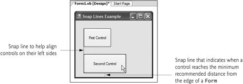
Using Visual Studio To Edit a GUI's LayoutVisual Studio provides tools that help you with GUI layout. You may have noticed when dragging a control across a Form, that blue lines (known as snap lines) appear to help you position the control with respect to other controls (Fig. 13.16) and the Form's edges. This new feature of Visual Studio 2005 makes the control you are dragging appear to "snap into place" alongside other controls. Visual Studio also provides the Format menu, which contains several options for modifying your GUI's layout. The Format menu does not appear in the IDE unless you select a control (or set of controls) in design view. When you select multiple controls, you can use the Format menu's Align submenu to align the controls. The Format menu also enables you to modify the amount of space between controls or to center a control on the Form. Figure 13.16. Snap lines in Visual Studio 2005. | ||||||||||||||||||||||||||||||||||||||||||||||||
EAN: 2147483647
Pages: 435