Evolution of the Toolbar
After people started to regard the toolbar as something more than just an accelerator for the menu, its growth potential became more apparent. Designers began to see that there was no reason other than habit to restrict the controls on toolbars to butcons. Soon designers began to invent new idioms expressly for the toolbar. With the advent of these new constructions, the toolbar truly came into its own as a primary control device, separate from—and in many cases superior to—drop-down menus.
After the butcon, the next control to find a home on the toolbar was the combobox, as in Word's Style, Font, and Font Size controls. It is perfectly natural that these selectors be on the toolbar. They offer the same functionality as those on the drop-down menu, but they also show the current style, font and font size as a property of the current selection. The idiom delivers more information in return for less effort by the user.
After comboboxes were admitted onto the toolbar, the precedent was set, and all kinds of idioms appeared, as we have already discussed in Chapter 26. Some of these toolbar idioms are shown in Figure 29-2.
![]()
Figure 29-2: The development of the toolbar soon led to an extension of its purpose. It evolved from a mere repository of imperative command buttons to a place where controls could indicate the state of the currently selected item. This is a more object-oriented concept, and it makes our software more powerful. The toolbar has become the place for control innovation, far beyond what we have come to expect from dialog boxes. This image shows part of a toolbar from Microsoft PowerPoint XP. You can see the toolbar drag control, comboboxes, and latching butcons, retaining a state after the user releases the mouse button (see Chapter 26).
State-indicating toolbar controls
This variety of controls contributed to a broadening use of the toolbar. When it first appeared, it was merely a place for fast access to frequently used functions. As it developed, controls on it began to reflect the state of the program's data. Instead of a butcon that simply changed a word from plain to italic text, the butcon now began to indicate—by its state—whether the currently selected text was already italicized. The butcon not only controlled the application of the style, but it represented the status of the selection with respect to the style. This is a significant move towards a more object-oriented presentation of data, where the system tunes itself to the object that you have selected.
Menus on toolbars
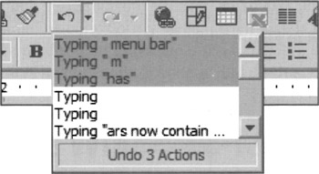
As the variety of controls on the toolbar grows, we find ourselves in the ironic position of adding drop-down menus to it. The Word toolbar shown in Figure 29-3 shows the Undo drop-down. It is ironic that such a very menu-like idiom should migrate onto the toolbar. Immediate Undo certainly belongs on the menu, but does the associated pull-down that shows the history of past actions belong there, too? There isn't a clear answer. It is good that the historical list is positioned next to the Undo butcon because it makes it easy to find, but the toolbar is the place for frequently used functions. How frequently would one need to access the list? Ultimately, it comes down to pixels. As Microsoft implemented it, the pixel consumption is small enough to justify the idiom. What should be evident, though, is that the modern toolbar is pushing the old-fashioned menu bar further into the background as a secondary command vector.

Figure 29-3: Toolbars now contain drop-down lists. This example is from the Undo control in Word 2000. Irony of ironies, the drop-down menu has migrated onto the toolbar, which began as a refutation of the old-fashioned drop-down menu bar!
Movable toolbars
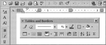
Microsoft has done more to develop the toolbar as a user interface idiom than any other software publisher. This is reflected in the quality of its products. In its Office suite, all the toolbars are very customizable. Each program has a standard battery of toolbars that the user can choose to be visible or invisible. If they are visible, they can be dynamically positioned in one of five locations. They can be attached—referred to as docked—to any of the four sides of the program's main window. You click the mouse anywhere in the interstices between butcons on the toolbar and drag it to any point near an edge and release. The toolbar attaches itself permanently to that side, top or bottom. If you drag the toolbar away from the edge, it configures itself as a floating toolbar, complete with mini-title bar, as shown in Figure 29-4.

Figure 29-4: Toolbars can be docked horizontally (top), vertically (left), and dragged off the toolbar to form a free-floating palette. It's almost always preferable to use dockable palettes like these, rather than forcing users to perform windows management on undockable palettes. Complex palettes may not be able to organize themselves into toolbar-like strips, but should still be dockable against the sides of the sovereign window.
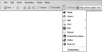
Allowing users to move toolbars around also provided the possibility for users to obscure parts of toolbars with other toolbars. Microsoft handily addresses this problem with an expansion combutcon or drop-down menu that appears only when a toolbar is partly obscured, and provides access to hidden items via a drop-down menu, as shown in Figure 29-5.

Figure 29-5: Microsoft's clever way of allowing users to overlap toolbars, but still get at all their functions. This provides a very lightweight kind of customization; power users would more likely perform full toolbar customization to address similar needs via the Customize .. item at the bottom of the drop-down menu.
Customizable toolbars
Microsoft has clearly seen the dilemma that arises because toolbars represent the frequently used functions for all users, but those functions are different for each user. Microsoft apparently arrived at this solution: Ship the program with the best guess at what typical users' daily-use controls are, and let the others customize. This solution has been diluted somewhat, however, by the addition of non-daily use functions. For example, the Word toolbar's default butcon suite contains functions that certainly are not frequently used. Controls like Insert Autotext or Insert Excel Spreadsheet seem more like feature checklist items than practical, daily options for the majority of users. Although they may be useful at times, most users do not frequently use them.
Word gives more advanced users the ability to customize and configure the toolbars to their hearts' content. There is a certain danger in providing this level of customizability to the toolbars, as it is possible for a reckless user to create a really unrecognizable and unusable toolbar. However, it takes some effort to totally wreck things. People generally won't invest much effort into creating something that is ugly and hard to use. More likely, they will make just a few custom changes and enter them one at a time over the course of months or years. Microsoft has extended the idiom so that you can create your own completely new, completely custom toolbars. The feature is certainly overkill for normal users, but IT managers might use it to create a "corporate" look.
Microsoft's custom toolbar facility does exhibit an astounding attention to detail. You have the ability to drag butcons sideways a fraction of an inch to create a small gap between them. This allows you to create "groups" of butcons with nice visual separations. Some butcons are mutually exclusive, so grouping them is very appropriate. You can also select whether the butcons are large or small in size. This is a nice compensation for the disparity between common screen resolutions, ranging from 640x480 to 1600x1200 or more. Fixed-size butcons can be either unreadably small or obnoxiously large if their size is not adjustable. You have the option to force butcons to be rendered in grayscale instead of color. Finally, you can turn ToolTips off, although the authors can't imagine why anyone would do this.
|
|
EAN: N/A
Pages: 263