| You already know how to add images to your interfaces, as icons and image buttons in forms. By taking advantage of the ImageButton object class, defined in ImageButtonClass.js, you can take those images to the next level of sophistication, adding multiple states like normal, selected, highlighted, and disabled. You can create graphic toggles, radio buttons, and push buttons, and have them behave on cue, with just a little scripting setup. Specifications Creating a scriptable ImageButton involves linking to the ImageButtonClass.js file, creating and correctly naming the desired button graphics, and adding an ImageButton constructor statement to the code of your extension file. The ImageButton Element in the Interface A selection of standard interface icons can be found in Configuration/ Shared/MM/Images. Whether you use those graphics or create your own, you must follow certain naming conventions for the multiple states of a button image to work properly. All images must be stored in the same folder so that their pathnames are identical. Their filenames must also be built from a basename with specific alterations (see Table 10.2 in the next section). Not all states need be present, although the constructor statement for the image button object should specify which states exist. Place the graphics in your layout using either the <img> tag or <input type="image"> . Each image must be given a name so that you can refer to that name when attaching the ImageButton object to the image. Scripting an ImageButton Element Before you can add an ImageButton element to an extension file, you must link to ImageButtonClass.js. Add the following script tag to the <head> section: <script src="../Shared/Common/Scripts/ImageButtonClass.js"></script> Depending on where in the Configuration folder your extension file is stored, the relative path in this <script> tag will vary. After that, like ListControl elements, each ImageButton must be added to the main <script> tag in two stages: -
Declare a global variable to hold the button, like this: var IBTN_thisBtn; -
In the initializeUI() function, use a constructor statement to create a new ImageButton from the global variable, referring to the name you have given the image. The syntax for this statement looks like this: IBTN_thisBtn=new ImageButton( theObjName , theVarName , theStateMask , theIsToggle , theIsRadio , theInitialValue , theIsDisabled ) The name of the new ImageButton must be the same as the global variable created in the previous step. The constructor has seven possible arguments, but only the first is required. Table 10.2 lists the specifications for each of these parameters. Here are some sample button constructor statements: IBTN_minusBtn = new ImageButton("minusBtn","IBTN_minusBtn","sSd",false,false,false,true); IBTN_rightAlignBtn = new ImageButton("rightAlignBtn"); Table 10.2. Specifications for the ImageButton Constructor Statement | Parameter | Description [(R)= Required] | | theObjectName | The name attribute of the <img> this button is built on. (R) | | theVarName | The variable name that will be used to refer to the object. If this parameter isn't present, the name defaults to 'IBTN_<objName>' . This is used to hook up the necessary events to the class. | | theStateMask | The list of image types available for this button. The possible image types are sShHdD where s stands for standard, h stands for highlight, and d stands for disabled. Capitals indicate the selected state. Construct this parameter from the following mask types (each shown with its corresponding required filename addition): s basename .ext S basename _sel.ext h basename _hlt.ext H basename _sel_hlt.ext d basename _dis.ext D basename _sel_dis.ext | | theIsToggle | Indicates that this image button should operate as a toggle switch, versus a push button. Defaults to true . | | theIsRadio | Indicates that this image button should operate like a radio button. Defaults to false . | | theInitialValue | Indicates which state the image button should start in; true indicates selected. Defaults to false , or unselected . | | theIsDisabled | Indicates whether the image button should start in the disabled state or not. Defaults to false . | Controlling the ImageButton After the image has been instantiated using the constructor, you'll have access to all the properties and methods shown in Tables 10.3 and 10.4, each of which swaps the image source for an appropriately named alternate image as needed. You'll also be able to use the onMouseUp event handler with the image itself to execute code statements. Table 10.3. ImageButton Properties | Syntax | Value | Description | | button.initialValue | True/false | The starting value of the image button | | button.value | True/false | The current value of the image button | | button.startDisabled | True/false | The starting disabled value | | button.disabled | True/false | The current disabled state of the button | | button.isToggle | True/false | If true , the button functions as a toggle ( otherwise , the button is a pushbutton) | | button.isRadio | True/false | If true , the button operates as a radio button | Table 10.4. ImageButton Methods | Syntax | Description | | button.reset() | Resets the button to its initial state | | button.enable() | Enables the button if it is disabled | | button.disable() | Disables the button if it is enabled | | setDisabled( isDisabled ) | Sets the disabled state of the button | | setValue( value ) | Sets the value of the button | | setIsToggle( isToggle ) | Sets the button to be a toggle or pushbutton | ImageButton Practice The main benefit of setting your extensions' images up as ImageButton elements is that you can swap one image for another as needed: creating enabled and disabled states, toggled on and off states, and so forth. In this practice session, we'll experiment with a simple but useful toggle image. Task 1: Build a basic command file containing an image -
In your text editor, create a new file. Save it in the Commands folder as Imagebutton Practice.htm, and enter the following framework code: <html> <head> <title>ImageButton Practice</title> <script language="JavaScript"> function myCommand(){ //command statements go here } function commandButtons() { return new Array("Apply","myCommand()","Close","window.close()"); } </script> </head> <body> <form name="myForm"> </form> </body> </html> -
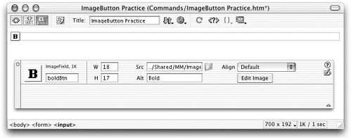
An ImageButton requires an image. For this task, you'll use bold.gif, which is what the image Dreamweaver uses to indicate bold text (see Figure 10.8). Add the following code to your command file's <form> : <input type="image" name="boldBtn" src="../Shared/MM/Images/bold.gif"> Figure 10.8. Adding the bold.gif image to the practice file, as seen in Dreamweaver Design view.  This inserts the shared image file bold.gif into the layout as a form element and gives it the name boldBtn . -
Just to make sure everything's working properly, try out your command. Choosing Commands > ImageButton Practice should open a simple dialog box like the one shown in Figure 10.9. Of course, so far the button is only a static graphicclicking on it doesn't toggle it between selected and deselected states, as you'd expect it to. Adding that effect comes next. Figure 10.9. The bold button in the ImageButton Practice dialog box.  Task 2: Create an ImageButton script object and attach it to the image Now that you have an image, your next job is to make the image scriptable by connecting it to an ImageButton. -
Start by linking your command file to the file that defined the ImageButton class of objects. Add the following <script> tag to your <head> section (new code shown in bold): <head> <title>ImageButton Practice</title> <script src="../Shared/Common/Scripts/ImageButtonClass.js"></script> <script language="JavaScript"> -
Add a global variable to the main <script> section, like this (new code is in bold): <script language="JavaScript"> var IBTN_boldBtn; function myCommand() { //command statements here } etc -
Next, add an initializeUI() function, containing a constructor statement for the ImageButton: function initializeUI() { IBTN_boldBtn = new ImageButton("boldBtn","IBTN_boldBtn","sSd"); } If you compare the parameters in this constructor to the specifications in Table 10.2, you'll see that this ImageButton consists of three states ( sSd ): normal, selected, and disabled. Its lack of optional parameters means that it is a toggle and that it will initially display in is normal state (not selected or disabled). -
The initializeUI() function must be called onLoad , so add the following code to your <body> tag: <body onLoad="initializeUI()" > There you go! The bold.gif graphic is now functioning as an ImageButton in the layout. -
Try it out. Reload extensions and choose the ImageButton Practice command to access your dialog box. In the dialog box, click the Bold button a few times even with no additional scripting work on your part, it's already toggling on and off, just as it should. Pretty nice! Task 3: Use scripting to change the button state The on/off toggle effect happens automatically, but that doesn't mean you can't use extra scripting to control your button's appearance. What if, for instance, you want the button to display differently depending on whether the user has something bold selected? What if you want the button to display its deselected state if the user doesn't have text selected? In this task, you'll get a chance to add this functionality . -
To see how easy it is to disable the button, add the following code to the myCommand() function: function myCommand() { IBTN_boldBtn.disable(); } As specified in your commandButtons() function, this function will execute when the user clicks the Apply button. Try the command and see! When the ImageButton Practice dialog box opens, the image shows in its normal state. Click Apply, and it switches to a grayed-out version of itself. -
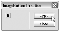
Now turn the button to its selected state. Revise myCommand() like this: function myCommand() { IBTN_boldBtn.setValue(true); } How does setting the button's value change its state? The value is a true/false toggle. If it's true, the button is selected; if it's false, the button is deselected. Try it and see. When you click Apply and trigger myCommand() to execute, the result should look like Figure 10.10 . Figure 10.10. The ImageButton Practice dialog box, with the button displaying as selected.  -
Now that you know how to disable and select the button through scripting, getting it to function more like a true bold buttondisplaying differently depending on user selectionis just a matter of adding a little DOM-detection to the mix. To see how this can work, add the following (very crude) function framework to your <script> tag: function amIBold() { //access the currently selected object //is the selected object text? //if so, is it bold? select the button //if not, disable the button } Can you see the logic that's outlined here? If the currently selected object is text and is bold, the button should be set to its selected state. If the object is not text, the button should be set to its disabled state. If the object is text that isn't bold, the button should remain in its normal state. -
After you understand the logic, fill in the framework, like this (new code is in bold): function amIBold() { //access the currently selected object var myDOM=dw.getDocumentDOM(); var myObject=myDOM.getSelectedNode(); //is the selected object text? if (myObject.nodeType==3) { //if so, is it bold? select the button if (myObject.parentNode.tagName=="B" myObject.parentNode.tagName=="STRONG") { IBTN_boldBtn.setValue(true); } //if not, disable the button }else{ IBTN_boldBtn.disable(); } } -
To get this function to execute when the dialog box opens, call it from your initializeUI() function (new code is in bold): function initializeUI() { IBTN_boldBtn=new ImageButton("boldBtn","IBTN_boldBtn","sSd"); amIBold(); } -
To test your bold button's functionality, reload Dreamweaver extensions and create a new document. In the document, insert a table (any size or shape of table will do). In one of the table cells , enter the following sentence : This is a test of the bold button in my practice command. Select the table. Choose your command. When the dialog box appears, the bold button is disabled! That's because the table isn't a text object. Select the word practice . Choose your command. The bold button is in its normal state. That's because you have text selected, but not bold text. Select your entire sentence and make it bold. Then select the word practice and choose the command again. The bold button is selected! That's because your selected word is inside a <b> or <strong> tag. -
Challenge: Note that this is a pretty crude bit of coding you've done here, suitable only as a starting point for true bold-detecting. What happens, for instance, if you select the entire sentence, after it's bold? When you choose the command, the bold button appears as disabled because the selected object is a tag ( <b> or <strong> ), not text. What happens if you select an entire paragraph or heading that is bold? Again, the button shows as disabled, because the selected object is <p> , <h1> , or some other tag. Expanding the amIBold() function to accommodate all circumstances is a good exercise in DOM-scripting. Are you up to the challenge ? tip Don't try a complex bit of DOM work like this without first investigating all the helper functions that are available in Shared/Common/Scripts/ dwscript.js and other shared files.
|
