Stop Getting Up to Speed and Speed Things Up
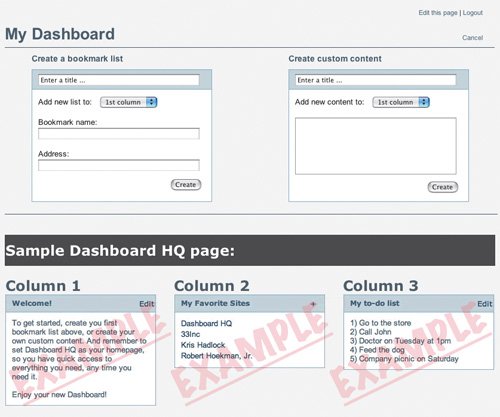
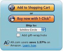
| Once beginners become intermediates, they don't want to keep tripping over up-to-speed aids. Not all the tools that help get people moving forward need to stick around for the long haul. Beginner tools can actually interfere with intermediate users in the long run by making them feel disrespected. They're not beginners anymore, so it's time to stop getting users up to speed and start speeding things up. First, we can get rid of the up-to-speed aids. Welcome screens, for example, in addition to providing an option to be hidden, can be designed with rules about how and when they appear. For a relatively simple application intended for frequent use, for example, a welcome screen can be set to disappear automatically after the user has logged in and used the application a few times. This is roughly equivalent to telling a friend you've taught him everything he needs to know and he should try to fly on his own for a while. (Of course, there should be an easy way to get the screen back should the user feel a little lost without it.) Once a user is comfortable with an application, the welcome screen becomes an obstacle that gets in the way of other, more important features, but strangely, odds are the user won't even notice it's gone. Blank-slate filler help should also disappear. In most cases, a blank slate doesn't stay blank for long, so your filler might only show up for a few minutes, if even that long, as a user learns what to do in the application. But hey, if it helped a user get moving, it's done its job. Time to go. Once some of these aids are out of the way, we can also do some small things to speed up task completion for users. Making software adapt to users is not always the simplest thing to do, but it's well worth it. An application that seems to get smarter the more a user interacts with it stands a good chance of making her even more pleased with the tool as she goes along. For example, continuing with the example of a stock photography site from earlier chapters, the image library the user builds up while browsing through thousands of images can feature a way to categorize the images he adds to the library. After he has created categories and decides to add a new image to the library, a menu can be offered that enables him to assign the image to a category he's already created. This menu can be set to remain hidden until categories have been created. It can also assign images to a General category by default so the user doesn't have to make this decision every time he adds a new image. A search engine application can offer a way for users to save their searches and run them again on repeat visits. Google does this via its Search History feature and it's definitely a time-saver. Provided you have a Google account (which is free), a Search History link appears in the upper-right corner next to the My Account link. Any searches you run are stored by Google and presented on the Search History page, which lists your previous searches in order of date, complete with a date-chooser widget so you can filter the list. Simply click the search term to run the search again. This record of your searches is a great way to avoid having to actually remember anything. Isn't technology great? Reuse the Welcome Screen as a Notification SystemNot all up-to-speed aids have to go away permanently once a user is comfortable with an application. After users can move fluidly through your application, those old sacrificial lambs can come out to play once in a while with a new purpose. A welcome screen, for example, can be set to reappear when a new and important feature is added to the interface, so users are guided toward its use and shown how to get started with it. In this way, welcome screens can be reused as a notification system for new features and anything else that comes up that might be really important. Blank-slate fillers can also return anytime a user's page is emptied out (hopefully not as a result of some serious damage to a database on your part). The bookmark manager Dashboard HQ (described earlier) does this whenever a user's page is void of content. If the user has no bookmark lists or other content displayed, a screen shot of a sample page is shown, and the Add Content pane is opened by default so users can again start adding new content to the page. Anytime a user's Dashboard HQ page is empty, the blank-slate filler shows examples of the types of content users can add to it.  Dashboard HQ's blank-slate filler initially shows up for new users who have not yet had a chance to add content to the page, but we figure that if an existing user has no content, he's probably not visited the page in quite a while after having removed all the previous content, and might need a reminder about what he can do with his page, so we show the screen shot again. (You can learn more about Dashboard HQ at www.dashboardhq.com.) Use One-Click InterfacesAmazon does something that really helps users get things done quickly. It provides a patented one-click system that enables users who have already stored their billing and shipping information with a way to make a purchase in a single click. Amazon's mystical, magical one-click button. So easy it's crazy to switch to another online bookseller. Clearly, this works to Amazon's advantage. First, it makes it really simple for repeat customers to buy more stuff. Second, it increases what is known as the "cost of switching." That is, the cost of switching to another online bookseller is slightly higher as a result of having such an easy way to purchase items. Users moving to a new bookseller have to create new accounts and enter all the billing and shipping info from scratch. Later on, users will likely have to continue entering the information with every purchase, because Amazon is the only one with the one-click system. Amazon's system is patented, but nothing says we can't apply similar techniques to our own interfaces. We can at least get it down to two clicks. One to click through to the shipping cart, where the user is shown the billing information he has stored currently, and the second click to make the purchase. Amazon even extends this functionality to email campaigns. Recently, I received an email advertisement from Amazon about a specific booknot a list of books, just onethat was related to a topic I searched through a couple of weeks or so ago. The email told me about the book and offered a button by which I could purchase it. I clicked the button. The purchase was so easy that I completely forgot about it until just a few minutes ago when I received another email to let me know the book has been shipped. Not only was the purchase process made faster, it was catered entirely to me because Amazon knows what I want based on my prior visits and adapts what it sends to my in-box to show me things I'll likely want to buy. Amazon really has this efficiency thing down pat. You can bet I won't be switching to another bookseller any time soon. Google Page Creator offers a smart way to speed things up as well. Once the user has chosen a template and layout for her site, any new page she creates uses the same template. Users are not forced to remember which template they chose previously. They are simply given what is most likely to be the template they would choose if the choice was offered. Users can, of course, use a different template for each page if they so choose, but since this is not likely to be desired, Google makes a smart decision for the user and gives her the same template. This little technique promotes good practices (it's good for a site to maintain a consistent look and feel) and makes it very easy for users to generate quality work. Use Design Patterns to Make Things FamiliarA big part of what makes an obvious design is the element of familiarity. When we learn how one application works, we can quickly apply what we've learned when working with other applications. Google, Yahoo, and MSN all handle pagination in search results pages with the same type of interaction. Each one features a series of links (in the form of page numbers) for jumping from one page to the next, and each includes a Next link for walking through the search results in a linear path. This is a design pattern. Expanding this definition, design patterns are common solutions to common problems. In the case of search engines, pagination is a common issue in the various applications. Each chose to use the same patternthe pagination patternbut each chose to do it a little differently from the others. Patterns are frameworks for designs, not specific rules, so they leave a lot of room for creativity and innovation (innovation, in fact, is often an extension of existing patterns). Each search engine uses page numbers as links, and each one includes a Next link, but each looks different from the others. They don't actually need to look the same. It's only important that each user who visits each site can quickly understand how it handles navigation through multiple pages of search results. Since the pagination functionality is so effective, many sites have implemented their own variations on the design, elevating it to the status of design pattern. In My Yahoo, the design patterns used to handle all of the editing within a page were unfamiliar to me at first, but since signing up, the patterns have appeared in a number of Web applications, and I've been able to move from one to the other with little effort because each one is leveraging the experiences I've had with previous applications. This familiarity makes new applications easier to learn, explore, and master. Design patterns tend to emerge when the pattern in question proves itself to be effective over time. When it works on one site, others emulate it, and when it succeeds across many sites, everyone else starts to use the design. Before you know it, the pattern can be seen all over the Web. Design patterns help users learn new applications quickly by allowing them to parlay their previous experience from other sites to the new application, and for this reason, patterns can be immensely helpful when attempting to design the obvious. The major lesson to learn here is that when you're designing a new application, you should pay attention to what patterns are used by similar or related applications and try to leverage them in your own. The growing use of these patterns will tear down many of the barriers users face when trying to learn a new application, allowing them to learn yours more quickly. This book is not about design patternsit's more about the conceptual, application-level patterns that make Web software greatbut there is a book all about design patterns called Designing Interfaces, by Jennifer Tidwell, that can provide a wonderful base of information about patterns and serve as an ongoing reference for when you get stuck on a design problem and need a good standard to rely on. I highly recommend you check it out. You know, after you finish up Designing the Obvious. |
EAN: 2147483647
Pages: 81
