Working with Pie Charts Pie charts work a bit differently than the other charts in Keynote. Because a pie chart doesn't have an X-axis and a Y-axis, Keynote charts only the first data set in the Chart Data Editor. If the data series are in rows in the Chart Data Editor, only the first column will be charted. If the data series are in columns in the Chart Data Editor, only the first row will be charted. A single pie chart represents a single data set, and each wedge in the pie chart represents one element of that set. If there are other data sets in the Chart Data Editor, and you switch the chart type to a pie chart, the excess data sets will not disappear, but they will not be used, either. Because pie charts are different, the Chart Inspector changes to reflect those differences. For example, because a pie chart does not have more than one axis, the items in the Axis tab of the Chart Inspector are disabled, and different options appear in the Series tab of the Chart Inspector. Keynote allows you to manipulate the individual wedges of a pie chart separately. You can select a wedge and manually drag it away from the main body of the pie chart for effect, or you can use a slider in the Chart Inspector to "explode" a wedge of the chart if you like, separating it from the rest of the chart by a specified percentage. You can also rotate an entire pie chart, to show off a particular part.  Tip Tip
To select pie wedges | 1. | Select the chart.
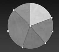
| | 2. | Click to select a single wedge. or Hold down the Command key and click to select multiple noncontiguous wedges ( Figure 8.33 ).  or Hold down the Shift key as you select the first and last wedges in a range. All wedges in between will be selected. or Press  to select all of the wedges. | To explode a pie chart | 1. | Select one or more pie wedges.
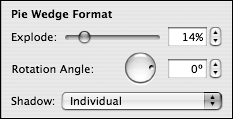
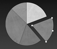
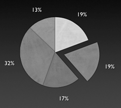
| | 2. | In the Pie Wedge Format section of the Series tab of the Chart Inspector, use the Explode wedge slider to move the selected wedge or wedges away from the rest of the pie ( Figure 8.34 ).  The selected wedges separate from the pie ( Figure 8.35 ).  | To rotate a pie chart | 1. | Select one or more pie wedges.
| | 2. | In the Pie Wedge Format section of the Series tab of the Chart Inspector, use the Rotation Angle wheel control to change the angle of the pie, or type a new angle into the rotation angle field.
The entire pie chart rotates around its center.
| To show values in pie wedges | 1. | Select the chart.
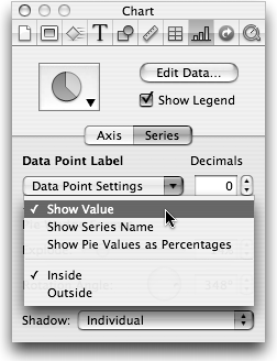
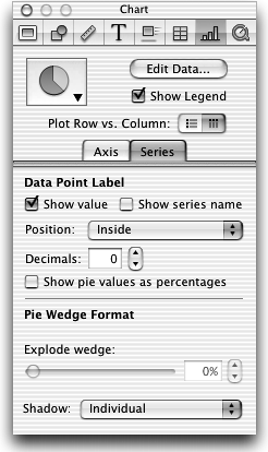
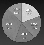
| | 2. | In the Data Point Label section of the Series tab of the Chart Inspector, select Show Value from the pop-up menu ( Figure 8.36 ).  This turns on the value labels for each data point in the chart ( Figure 8.37 ).  | | 3. | From the same pop-up menu, choose whether you want the data point label to appear inside the pie, or outside of it ( Figure 8.38 ).  | | 4. | If desired, select Show Series Name from the pop-up menu ( Figure 8.39 ).  The series name will appear inside or outside the pie, depending on what you chose in step 3. | | 5. | If you want to show decimals in your data point values, type a number in the Decimals field.
| | 6. | If you want to (and with a pie chart you usually will), select Show Pie Values as Percentages from the pop-up menu.
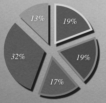
| | 7. | Set the shadow effect on wedges with the Shadow pop-up menu ( Figure 8.40 ).  Your choices are None (no shadows), Group (allows you to use the Graphic Inspector to apply shadowing or opacity changes to the entire pie chart), or Individual (allows you to use the Graphic Inspector to apply shadowing or opacity changes to one or more wedges). |  Tips Tips -
You can select and set font styles for each data point label separately. This allows you to do things like increase the font size and change the color of the label inside an exploded wedge, further highlighting that wedge. -
You can also set the shadow and opacity of data point labels in the Graphic Inspector. -
Pie charts can make fun photo cutouts ( Figure 8.41 ). Apply image fills to the individual wedges in the Graphic Inspector. 
|
 Tip
Tip 