Web Parts
ASP.NET contains a group of server controls known as Web Parts, which are designed to enable users to personalize Web pages. You may have seen this in action in, for example, SharePoint-based Web sites and the MSN home page http://www.msn.com/. When you use Web Parts, the resultant functionality is as follows:
-
Users are presented with a default page layout that you supply. This layout consists of a number of component Web Parts, each of which has a title and content.
-
Users can change the position of the Web Parts on a page.
-
Users can customize the appearance of Web Parts on a page or remove them from the page completely.
-
Users can be supplied with a catalog of Web Parts that they can add to the page.
-
Users can export Web Parts from a page, and then import them on a different page or site.
-
Connections can exist between Web Parts. For example, the content displayed in a Web Part could be a graphical representation of the content displayed in another Web Part.
-
Any changes that users make persist between site visits.
ASP.NET supplies a complete framework for implanting Web Parts functionality, including management and editing controls.
The use of Web Parts is a complex topic, and this section will not describe all available functionality or list all the properties and methods that the Web Part components supply. However, you will see enough to get a flavor of Web Parts and to understand the basic functionality that is possible.
Web Parts Application Components
The Web Parts section of the toolbox contains 13 controls, as shown in Figure 33-18 (note that Pointer is not a control).

Figure 33-18
These controls are described in the following table. The table also introduces some of the key concepts for Web Parts pages.
| Control | Description |
|---|---|
| WebPartManager | Every page that uses Web Parts must have one (and only one) instance of the WebPartManager control. You can place it on a master page if you wish. This control is responsible for the majority of Web Parts functionality, which it supplies without much intervention. You may not need to do much more than place it on a Web page, depending on the functionality you require. For more advanced functionality, you can use the large number of properties and events that this control exposes. |
| ProxyWebPartManager | If you place the WebPartManager control on a master page, it can be difficult to configure it on individual pages - and impossible to do so declaratively. This is particularly relevant for the definition of static connections between Web Parts. The ProxyWebPartManager control enables you to define static connections declaratively on a Web page, which circumvents the problem of not being able to have two WebPartManager controls on the same page. |
| WebPartZone | The WebPartZone control is used to define a region of a page that can contain Web Parts. You will typically use more than one of these controls on a page. For example, you might use three of them in a three-column layout on a page. Users can move Web Parts between WebPartZone regions or reposition them within a single WebPartZone. |
| CatalogZone | The CatalogZone control enables users to add Web Parts to a page. This control contains controls that derive from CatalogPart, of which three are supplied for you - the next three entries in this table describe these controls. Whether the CatalogZone control and the controls it contains are visible depends on the current display mode set by WebPartManager. |
| DeclarativeCatalogPart | The DeclarativeCatalogPart control enables you to define Web Part controls inline. These controls will then be available to the user through the CatalogZone control. |
| PageCatalogPart | Users can remove (close) Web Parts that are displayed on a page. In order to retrieve them, the PageCatalogPart control provides a list of closed Web Parts that can be replaced on the page. |
| ImportCatalogPart | The ImportCatalogPart control enables Web Parts that have been exported from a page to be imported to another page through the CatalogPart interface. |
| EditorZone | The EditorZone control contains controls that enable users to edit various aspects of Web Part display and behavior, depending on what controls it contains. It can contain controls that derive from EditorPart, including the four that are listed in the next four rows of this table. As with CatalogZone, the display of this control depends on the current display mode. |
| AppearanceEditorPart | This control enables users to modify the look and size of Web Part controls, as well as to hide them. |
| BehaviorEditorPart | This control enables users to configure the behavior of Web Parts by using a variety of properties that control, for example, whether a Web Part can be closed or what URL the title of a Web Part links to. |
| LayoutEditorPart | This control enables users to change layout properties of a Web Part, such as what zone it is contained in and whether it is displayed in a minimized state. |
| PropertyGridEditorPart | This is the most general Web Part editor control and enables you to define properties that can be edited for custom Web Part controls. Users can then edit these properties. |
| ConnectionsZone | This control enables users to create connections between Web Parts that expose connection functionality. Unlike CatalogZone and EditorZone, there are no controls to place inside this control. The user interface that this control generates depends on the controls on the page that are available for connections. The visibility of this control is dependant on the display mode. |
You may notice that this list of controls does not include any specific Web Part controls. This is because you create these yourself. Any control that you put into a WebPartZone region automatically becomes a Web Part - including (most importantly) user controls. By using user controls, you can group together other controls to provide the user interface and functionality of a Web Part control.
Web Parts Example
To illustrate the functionality of Web Parts, you can look at the example in the downloadable code for this chapter, PCSWebParts. This example uses the same security database as the PCSAuthenticationDemo example. It has two users with usernames of User and Administrator and passwords of Pa$$w0rd. You can log in as a user, manipulate the Web Parts on the page, log out, log in as the other user, and manipulate the Web Parts in a completely different way. The personalization for both users is retained between site visits.
Once you have logged in to the site, the initial display (with User logged in) is as shown in Figure 33-19.
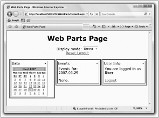
Figure 33-19
This page contains the following controls:
-
A WebPartManager control (which doesn’t have a visual component).
-
Three WebPartZone controls.
-
Three Web Parts (Date, Events, and User Info), one in each WebPartZone. Two of the Web Parts are connected by a static connection - if you change the date in Date, then the date displayed in Events updates.
-
A drop-down list for changing the display mode. This list doesn’t contain all the possible display modes, just the available ones. The available modes are obtained from the WebPartManager control, as you will see shortly. The modes listed are:
-
Browse - This mode is the default and allows you to view and use Web Parts. In this mode, each Web Part can be minimized or closed by using the drop-down menu accessible in the top right of each Web Part.
-
Design - In this mode you can reposition Web Parts.
-
Edit - In this mode you can edit Web Part properties. An additional item in the drop-down menu for each Web Part becomes available: Edit.
-
Catalog - In this mode you can add new Web Parts to the page.
-
-
A link to reset the Web Part layout to the default (for the current user only).
-
An EditorZone control (only visible in Edit mode).
-
A CatalogZone control (only visible in Catalog mode).
-
One additional Web Part in the catalog that you can add to the page.
Each of the Web Parts is defined in a user control.
To illustrate how layout can be changed, use the drop-down list to change the display mode to Design. You will notice that each WebPartZone is then labeled with an ID value (LeftZone, CenterZone, and RightZone, respectively). You will also be able to move Web Parts simply by dragging their title - and will even see visual feedback as you drag. This is illustrated in Figure 33-20, which shows the Date Web Part being moved.
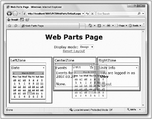
Figure 33-20
Next, try adding a new Web Part from the catalog. Change the display mode to Catalog, and you will notice that the CatalogZone becomes visible at the bottom of the page. Click the Declarative Catalog link, and you will be able to add a Links control to the page, as shown in Figure 33-21.
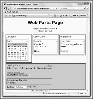
Figure 33-21
Notice that there is also a Page Catalog link here. If you close a Web Part by using the drop-down menu for the part, then you will find it here - it’s not completely deleted, merely hidden.
Next, change the display mode to Edit and then select the Edit item from the drop-down list for a Web Part, as shown in Figure 33-22.
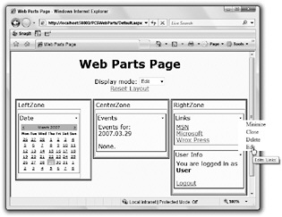
Figure 33-22
When you select this menu option, you will open the EditorZone control. In the example, this control contains an AppearanceEditorPart control, as shown in Figure 33-23.
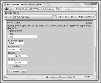
Figure 33-23
You can edit and apply property values for Web Parts by using this interface.
After making changes, confirm that they are stored for the user by logging off and logging in as a different user, and then switching back to the first user.
Now, you might think that this functionality requires quite a lot of code. In fact, the code in this example is remarkably simple. Look at the code for the Web Parts page. The <form> element starts with a WebPartManager control:
<form runat="server"> <asp:WebPartManager runat="server" OnDisplayModeChanged="WebPartManager1_DisplayModeChanged"> <StaticConnections> <asp:WebPartConnection ConsumerConnectionPoint Consumer ProviderConnectionPoint Provider /> </StaticConnections> </asp:WebPartManager> There is an event handler for the DisplayModeChanged event of this control, which is used to show or hide the editor <div> at the bottom of the page. There is also a specification for a static connection between the Date and Events Web Parts. This is achieved by defining named endpoints for the connection in the two user controls for these Web Parts and referring to those endpoints here. You will see the code for this shortly.
Next, the title, display mode changer, and reset link are defined:
<div > <h1>Web Parts Page</h1> Display mode: <asp:DropDownList runat="server" AutoPostBack="True" OnSelectedIndexChanged="displayMode_SelectedIndexChanged" /> <br /> <asp:LinkButton runat="server" Text="Reset Layout" OnClick="resetButton_Click" /> <br /> <br /> The display mode drop-down list is populated in the Page_Load() event handler, by using the WebPartManager1.SupportedDisplayModes property. The reset button uses the WebPartManager1 .Personalization.ResetPersonalizationState() method to reset the personalization state for the current user.
Next come the three WebPartZone controls, each of which contains a user control that is loaded as a Web Part:
<div > <div > <asp:WebPartZone runat="server"> <ZoneTemplate> <uc1:DateSelectorControl runat="server" title="Date" /> </ZoneTemplate> </asp:WebPartZone> </div> <div > <asp:WebPartZone runat="server"> <ZoneTemplate> <uc2:EventListControl runat="server" title="Events" /> </ZoneTemplate> </asp:WebPartZone> </div> <div > <asp:WebPartZone runat="server"> <ZoneTemplate> <uc4:UserInfo runat="server" title="User Info" /> </ZoneTemplate> </asp:WebPartZone> </div> And finally you have the EditorZone and CatalogZone controls, containing an AppearanceEditor control and PageCatalogPart and DeclarativeCatalogPart controls, respectively:
<asp:PlaceHolder runat="server" Visible="false"> <div > <asp:EditorZone runat="server"> <ZoneTemplate> <asp:AppearanceEditorPart runat="server" /> </ZoneTemplate> </asp:EditorZone> <asp:CatalogZone runat="server"> <ZoneTemplate> <asp:PageCatalogPart runat="server" /> <asp:DeclarativeCatalogPart runat="server"> <WebPartsTemplate> <uc3:LinksControl runat="server" title="Links" /> </WebPartsTemplate> </asp:DeclarativeCatalogPart> </ZoneTemplate> </asp:CatalogZone> </div> </asp:PlaceHolder> </div> </div> </form> The DeclarativeCatalogPart control contains a fourth user control, which is the Links control that users can add to the page.
The code for the Web Parts is equally simple. The Links Web part, for example, simply contains the following code:
<%@ Control Language="C#" AutoEventWireup="true" CodeFile="LinksControl.ascx.cs" Inherits="LinksControl" %> <a href="http://www.msn.com/">MSN</a> <br /> <a href="http://www.microsoft.com/">Microsoft</a> <br /> <a href="http://www.wrox.com/">Wrox Press</a> No additional markup is required to make this user control work as a Web Part. The only point to note here is that the <uc3:LinksControl> element for the user control has a title attribute - even though the user control doesn’t have a Title property. This attribute is used by the DeclarativeCatalogPart control to infer a title to display for the Web part (which you can edit at runtime with the AppearanceEditorPart).
The connection between the Date and Events controls is achieved by passing an interface reference from DateSelectorControl to EventListControl (the two user control classes used by these Web Parts):
public interface IDateProvider { SelectedDatesCollection SelectedDates { get; } } DateSelectorControl supports this interface, and so can pass an instance of IDateProvider by using this. The reference is passed by an endpoint method in DateSelectorControl, which is decorated with the ConnectionProvider attribute:
[ConnectionProvider("Date Provider", "DateProvider")] public IDateProvider ProvideDate() { return this; } This is all that is required to mark a Web Part as a provider control. You can then reference the provider by its endpoint ID, in this case DateProvider.
To consume a provider, you use the ConnectionConsumer attribute to decorate a consumer method in EventListControl:
[ConnectionConsumer("Date Consumer", "DateConsumer")] public void GetDate(IDateProvider provider) { this.provider = provider; IsConnected = true; SetDateLabel(); } This method stores a reference to the IDateProvider interface passed, sets a flag, and changes the label text in the control.
There is not a lot more to look at in this example. There are a few minor cosmetic sections of code, and details for the event handlers in Page_Load(), but nothing that you really need to see here. You can investigate further by examining the downloadable code for this chapter.
There is, however, a whole lot more to Web Parts than this. The Web Parts framework is extremely powerful and richly featured, and whole books are devoted to the subject. Hopefully, though, this section has enabled you to get an insight into Web Parts and has demystified some of their functionality.