| As mentioned in the previous section, the addition of form objects to your web page begins with the addition of a form. You can think of the form as the container for its form objects. When the user clicks the Submit button, the entire form, along with all the form objects in the form, are sent for processing. In fact, the form contains numerous properties that tell the browser where and how the form will be sent for processing when the Submit button is clicked. Before we jump too far ahead of ourselves however, let's add a simple form to a web page. To do this, follow these instructions: 1. | Open the helpdesk.htm page located in the root of the project folder. For the most part, the design has already been created for you. For now, we're simply concerned with adding a form and form objects so that our fictitious Dorknozzle employees can submit helpdesk tickets (requests for help).
| 2. | As a change of pace, we'll use the Forms category in the Insert bar to work with forms and form objects. If your Insert bar is not open, choose Window, Insert. When the Insert bar opens, switch to the Forms category.
| 3. | Place your cursor in the third cell of the Content table (in the second cell underneath the existing HelpDesk subheader image).
| 4. | Click the Form icon in the Insert bar to add a new form to your helpdesk.htm page. As you can see in Figure 9.3, the form is indicated by the red dashed box. Because a form is considered an invisible element, you can choose to display it or hide it by enabling or disabling the Invisible Elements option in the Visual Aids menu in the Document bar.
Figure 9.3. The form is added to the page and is evident by the red dashed box. 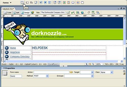
|
Also notice that the form changes the Properties Inspector. These properties include: Form name: Enter a value into this text box to uniquely identify your form. Although this value isn't required, it's highly recommended that you add a value to uniquely identify your form, especially when working with client-side scripting languages such as JavaScript (covered with more detail in the next chapter). We'll leave our form name as the default form1. Action: Enter the path to the page that will process this form when the user submits the form. Although I'll save the long-winded explanations for Part V, for now, know that every form's submission requires some sort of data collection endpoint. That endpoint is generally a database, text file, XML file, or even a straight email to a recipient. To get the form into that data collection mechanism, an intermediary file (containing functions with code) must process the form and perform the insertion into the data collection mechanism. For this chapter, that page has been created for you. The path, and the value you'll want to enter into this text box is http://www.dreamweaverunleashed.com/scripts/helpdesk.asp. Target: Select one of the four options from this menu to associate the action with a particular link target. We'll leave ours blank. Class: When working with CSS, select a class from this menu to set the overall style of the form. We'll leave ours blank. Method: Select one of the two options from this menu to set how the form should be sent to the intermediary file for processing. Two options are available from this menu: POST and GET. POST, which is the Dreamweaver and browser default, embeds the form within HTTP headers, essentially unseen by anyone. Nine times out of ten, you'll use POST in your development efforts because it's a much more secure alternative to GET. However, you can use GET to send the contents of all form elements within the form, appended as parameters within the URL of the page. This is beneficial when working with searches: the user can bookmark a recent search because the submitted search value is appended to the URL of the page. As you can see in Figure 9.4, eBay uses GET when submitting searches for processing. This allows the user to later bookmark popular searches. Figure 9.4. Use GET with search forms to allow users to bookmark recent searches. 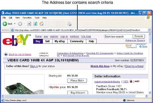
Searches are about all you want to use the GET method for. Because of the potential security vulnerability and the fact that URL strings are limited to 8192 characters, longer forms, especially those containing sensitive data such as usernames, passwords, and credit card information should be sent using POST. We'll leave our form's method set to POST. NOTE Even POST isn't entirely secure. When using POST, form data is embedded into the HTTP headersit is not encrypted. An attacker can still compromise sensitive information using an HTPP packet sniffer. For this reason, sensitive data should always be transmitted using a secure connection (SSL).
Enctype: Choose an option from this menu to specify the MIME encoding type of the data submitted to the server for processing. By default, forms are sent using the application/x-www-form-urlencode type but it's not uncommon to use the multipart/form-data type, especially when uploading files using the File Field form object (see Part V for details). We'll leave this menu as is.
Now that you have an idea about how forms are inserted into the page, let's divert our attention to inserting form objects into the form. The form objects you can insert in Dreamweaver include the following: Text Fields, Password Fields, and Textareas Check Boxes Radio Buttons and Radio Groups Lists and Menus Buttons File Fields Image Fields Hidden Fields Jump Menus
Text Fields, Password Fields, and Textareas Arguably the most widely used form object is the Text Field. Because the Text Field is so versatile, it's the perfect option when you need to create a plain text box, a password text box, or a multiline text box where users can enter large amounts of information. To see the Text Field in action, follow these steps: 1. | Place your cursor in the form and insert a new table by choosing the Table option from the Insert menu. Give the new table 9 rows, 2 columns, a width of 460 pixels, and a border thickness, cell padding, and cell spacing of 0 pixels. We'll use this table to cleanly position text labels and form objects on the page.
| 2. | In the first three cells of the first column, add the text Employee Name:, Station ID:, and Problem Description: respectively.
| 3. | Place your cursor in the first cell in the second column and insert a new Text Field form object by clicking the Text Field icon in the Insert bar. The new Text Field appears, similar to Figure 9.5.
Figure 9.5. Add a new Text Field form object to the first cell in the second column of the table. 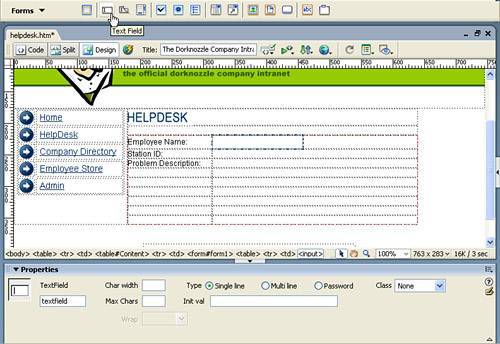
|
NOTE After you click to insert the Text Field, by default, Dreamweaver displays accessibility options as they relate to form objects. If you don't want to work with Accessibility features at this point, you can turn off this dialog by navigating to the Preferences window (available from the Edit menu), choosing the Accessibility category, and disabling the Form Objects check box. More information on accessibility can be found in Appendix A, "Accessibility."
Selecting the Text Field in the cell changes the Properties Inspector to a text field-based Properties Inspector. This view exposes the following customizable properties: TextField name: Enter a value in this text box to uniquely identify the Text Field form object on the page. Although setting a value for this field isn't required, truthfully, there isn't much you can do if you don't set a value here. The application that processes our form must reference a specific Text Field by its unique name in order to grab the value it contains. For our page, we'll name this Text Field object name to correspond with the text label in the same row. Char width: Enter a value in this text box to set the width in characters for the Text Field form object. Leaving this field blank sets the default value which is 20. We'll leave ours blank. Max Chars/Num Lines: Enter a value in this text box to set the maximum number of characters that this Text Field form object will accept. This is an excellent value to set when you want to limit a zip code Text Field to 5 characters or an age Text Field to 3 characters max. When working with the Multi-line type of Text Field, the Max Chars text box becomes a Num Lines text box, and you'd set a value in this text box to set the height in character lines for the Multi-line Text Field. We'll leave ours blank, which defaults to no limit. Type: Single line: Choose this radio button to set the Text Field type to a standard single-line Text Field. Type: Multi line: Choose this radio button to set the Text Field type to a multi-line Text Field. You'll use this type when inserting the Problem Description Text Field later in this section. This Text Field type works great for collecting large amounts of data. It also allows the user to perform simple formats such as spaces and line breaks within the Text Field. Type: Password: Choose this radio button to set the Text Field type to a password Text Field. Any text entered in a Text Field that's been assigned the Password type shows as asterisks. Class: When working with CSS, select a class from this menu to set the overall style of the Text Field form object. We'll leave ours blank. Init val: Enter a value in this text box when you want a note or initial value to display in the Text Field form object when the form page is first loaded in the browser. Wrap: Available when the Multi-line type is selected, the Wrap menu provides options for setting how text in the Multi-line Text Field should wrap as the user types. Options include Default, Off, Virtual, and Physical. Selecting Off or Default prevents text from wrapping to the next line. When the user's input exceeds the right boundary of the text area, text scrolls toward the left. Users must press Return or Enter to move the insertion point to the next line in the text area. Selecting Virtual sets word wrap in the text area. When the user's input exceeds the right boundary of the text area, text wraps to the next line automatically. When data is submitted for processing, word wrap isn't applied to the data; data is submitted as one long string. Selecting Physical sets word wrap in the text area, as well as to the data when it is submitted for processing.
Now that you have an understanding of the properties associated with Text Fields, let's add a second Text Field form object to handle the collection of the employee's station ID: Place your cursor in the second cell in the second column and click the Text Field icon in the Insert bar. The Text Field form object is inserted into the cell. This time, name your Text Field stationid and set the Max Chars property to 3. We'll assume that everyone in our fictitious company has a three-digit station ID. Finally, we'll add our third Text Field form object using the Textarea icon in the Insert bar. NOTE The Textarea form object is simply a quick way of inserting a Text Field that has the Multi-line type preselected.
Selecting the Textarea icon inserts a new Multi-line Text Field form object in the cell, similar to Figure 9.6. Figure 9.6. Insert a new Multi-line Text Field onto the page. 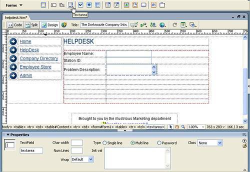
For the Multi-line Text Field object, enter the name description, a Char Width of 30, Num Lines of 2, Wrap of Physical, and set the Init Val to the text Enter your problem here. Checkboxes Check boxes, like the ones that appear in the Properties Inspector, allow you to enable or disable selections within forms. More importantly, check boxes allow you to select multiple options from a group of options. For instance, in our HelpDesk example, we'll ask the user to check all company-owned equipment that the user has in their possession. Because a user could potentially have a computer, a cell phone, a PDA, and so on, we'll want to allow the user to select multiple items by enabling multiple check boxes. If the user only has one item, fine. But at the very least, we want to provide them with the opportunity to select multiple items. Collecting as much information as possible from the employee will help the support technician better troubleshoot the employee's problem. To add and work with Checkbox form objects in Dreamweaver, follow these steps: 1. | Place your cursor in the fourth cell of the first column and enter the text Equipment:.
| 2. | Place your cursor in the fourth cell of the second column and click the Checkbox icon in the Insert bar to add a new Checkbox form object to the table's cell.
| 3. | Place your cursor to the right of the check box and enter the text Computer.
| 4. | Repeat steps 2 and 3 three more times, entering a Checkbox form object and adding the text Laptop, Cell Phone, and PDA. When you finish, the page should resemble Figure 9.7.
Figure 9.7. Add three more Checkbox form objects, complete with text. 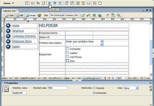
|
Notice that selecting a Checkbox form object exposes a set of customizable properties in the Properties Inspector: CheckBox name: Enter the unique name of the Checkbox form object in this text box. In most cases, you'll want to enter the same name for all Checkbox form objects related to a specific group. Because we have four Checkbox objects that relate to equipment, we'll name them all equipment. This arrangement allows the application that will process this form to iterate through the Checkbox group and return a list of checked values, covered next. Checked value: The value you enter here is the value that is sent to the server for processing. For our Checkbox objects, we'll want to enter the values Computer, Laptop, Cell Phone, and PDA respectively. Initial state: You can set the state of the Checkbox form object to either checked or unchecked when the form loads for the first time. Because we'll assume that everyone has a computer, select that Checkbox form object in the Document window and change the Initial State value in the Properties Inspector to Checked. Set all others to Unchecked. Class: When working with CSS, select a class from this menu to set the overall style of the Checkbox object. We'll leave ours blank.
Radio Buttons and Radio Groups Similar to Checkbox form objects, Radio Button form objects allow users to select options within a form. The difference between Radio Buttons and Checkboxes, however, is that with Radio Buttons, users can select only one option from a list of options. In our example, we'll want to filter potential problems by type: hardware or software. Since the user's problem can't technically be both hardware and software related, we'll want to limit the choice to one or the other. This can easily be accomplished by adding two Radio Buttons, one for each type of equipment problem. To add and work with Radio Button form objects in Dreamweaver, follow these steps: 1. | Place your cursor in the fifth cell of the first column and enter the text Problem Type:.
| 2. | Place your cursor in the fifth cell of the second column and click the Radio Button icon in the Insert bar to add a new Radio Button form object to the table's cell.
| 3. | Place your cursor to the right of the Radio Button and enter the text Hardware.
| 4. | Repeat steps 2 and 3 one more time, adding a second Radio Button form object with the label Software. When you finish, the page should resemble Figure 9.8.
Figure 9.8. Add one more Radio Button with the text Software. 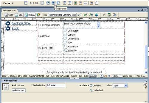
|
Notice that selecting a Radio Button form object exposes a set of customizable properties within the Properties Inspector: Radio Button name: Enter the unique name of the Radio Button form object in this text box. For the most part, you'll want to enter the same name for all Radio Button form objects relating to a specific group. Because we have two Radio Button objects that relate to a problem type, we'll name them both problemtype. This arrangement allows the application that will process this form to iterate through the Radio Button group and return the checked value. Checked value: The value you enter here is the value that is sent to the server for processing. For our Radio Button objects, we'll want to enter the values Hardware and Software, respectively. Initial state: You can set the state of the Radio Button form object to either checked or unchecked when the form page loads for the first time. Because we want to guarantee that a user selects one option, we'll make the Software Radio Button checked initially. Class: When working with CSS, select a class from this menu to set the overall style of the Radio Button form object. We'll leave ours blank.
In our example, we've simply added two Radio Button form objects. However, suppose that you needed to insert a large list of Radio Button objects on the page. Doing them individually would be tedious work and might discourage you from using Radio Buttons. Instead of adding Radio Buttons individually, you might want to consider using the Radio Group option available by clicking the icon next to the Radio Button icon in the Insert bar. Selecting this option opens the Radio Group dialog (see Figure 9.9). Figure 9.9. Use the Radio Group dialog to add long lists of Radio Button form objects to your form. 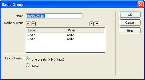
The Radio Group dialog exposes the following properties: Name: In this text box, enter the unique name to be given to all Radio Buttons in this group. Radio buttons: Use this pane to add new and remove or reposition existing Radio Buttons within the group. By default, the pane automatically includes two Radio Button form objects. To add a new Radio Button to the list, click the Add (+) icon. To remove a Radio Button from the list, click the Remove () icon. After the Radio Button is in the list, you can change the text label by simply clicking in the area of the Label column for the specific Radio Button. You can change the checked value by clicking in the area of the Value column for the specific Radio Button. Lay out using: Choose an option from this radio button group to set the layout of the Radio Button form objects on the page. Select the Line Breaks option to set the vertical positioning of Radio Buttons such that each Radio Button is spaced from the previous Radio Button using a line break (<br> tag). Select the Table option to position your Radio Buttons and text labels in an HTML table.
Lists and Menus Aside from simply adding Checkbox and Radio Button form objects, you can also add Listboxes and Drop Down Menus. You can use the Listbox form object to add a scrollable boxed pane that contains numerous values. Depending on how you configure the Listbox, users navigating the Listbox can hold down the Ctrl key and click to select multiple options within the list. Alternatively, you can use the Drop Down Menu form object as a way of storing numerous values in one expandable and collapsible menu. To demonstrate the use of these form objects, follow these steps: 1. | Place your cursor in the sixth cell of the first column and enter the text If Hardware Related:.
| 2. | Place your cursor in the sixth cell of the second column and click the List/Menu icon in the Insert bar to add a new List/Menu form object to the table's cell (see Figure 9.10).
Figure 9.10. Add a new List/Menu form object to the page. 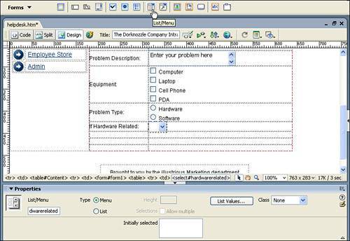
|
Because Drop Down Menu and Listbox form objects share common properties, they're added as a single object and configured as either a Drop Down Menu or Listbox in the Type radio group in the Properties Inspector. However, the Type option isn't the only property exposed by the List/Menu-based Properties Inspector: List/Menu name: Enter the unique name to be given to the Drop Down Menu or Listbox form object in this text box. Because we're currently working with a Drop Down Menu, let's name it hardwarerelated. Type: Select an option from this radio group to convert the form object to a Drop Down Menu or a Listbox depending on the selection. Selecting the List option enables the Height text box and Selection check box. For now, keep the object we're configuring as a Drop Down Menu. Height: When the List Type is selected, enter a value in this text box to set the number of items displayed in the list. Selections, Allow Multiple: When the List Type is selected, enable this check box to indicate whether the user can select multiple items from the list. List Values: Click this button to launch the List Values dialog. In this dialog, you'll enter the list of items to be displayed in the List/Menu object. Class: When working with CSS, select a class from this menu to set the overall style of the List/Menu object. We'll leave ours blank. Initially selected: The values you add in the List Values dialog also appear in this list box. You can set which value should be initially selected when the form page loads for the first time by selecting that value from this list.
Now that we've appropriately named our Drop Down Menu object, let's add some values. To do this, click the List Values button. The List Values dialog appears. Similar to the Radio Group dialog, the List Values dialog allows you to Add (+), Remove (), and reposition values within the list. By default, the dialog loads with the first line in the Item Label column highlighted. You can add the first item by simply typing into the outlined box. I'll add the text Computer as the first Item Label and leave the Value column blank. NOTE Each item in the list has a label (the text that appears in the list) and a value (the value that's sent to the processing application if the item is selected). If no value is specified, the label is sent to the processing application instead.
Now add three more items by clicking the Add (+) icon and adding the text Keyboard/Mouse, Monitor, and Speakers. When you finish, the List Values dialog will resemble Figure 9.11. Figure 9.11. Add four values to your Drop Down Menu. 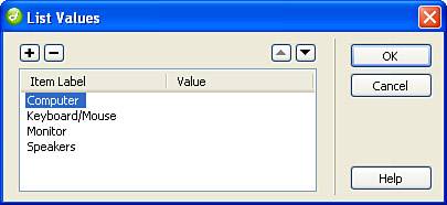
When you finish adding the values to the Drop Down Menu form object, click OK. Notice that the values I've added in the List Values dialog also appear in the Initially Selected list box in the Properties Inspector. Because we'll assume that people will have computer problems when they've selected the Hardware problem type, let's select the Computer option from the Initially Selected list box. Now that you have an idea how the Drop Down Menu form object works, let's add a Listbox form object. To do that, follow these steps: 1. | Place your cursor in the seventh cell of the first column and enter the text If Software Related:.
| 2. | Place your cursor in the seventh cell of the second column and click the List/Menu icon in the Insert bar to add a new List/Menu form object to the table's cell.
| 3. | In the Properties Inspector, name your Listbox object softwarerelated.
| 4. | Check the List option from the Type radio group.
| 5. | Enter a height of 3.
| 6. | Because we'll assume that a user can have multiple software issues, enable the Allow Multiple check box.
| 7. | Click the List Values button to open the List Values dialog. Add the values Dreamweaver, Fireworks, Flash, and Freehand.
| 8. | Click OK. The new, populated Listbox form object appears within the page, similar to Figure 9.12.
Figure 9.12. The new Listbox form object appears on the page. 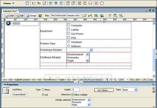
|
Buttons Possibly the simplest form object to understand is the Button. Although three types of Button objects exist, the most widely used is the Submit Button. The Submit Button, when clicked, initiates the transfer of the form to the processing application outlined in the form's action. You can insert a new Button form object by simply placing your cursor into the ninth cell of the second column of the table and clicking the Button icon in the Insert bar. By default, a Submit Button is inserted into the page similar to Figure 9.13. Figure 9.13. A new Submit Button is inserted into the page. 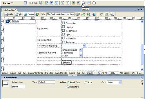
Selecting the Button form object changes the Properties Inspector to a button-based Properties Inspector with the following customizable properties: Button name: Enter the unique name to be given to the Button form object in this text box. Because naming Button objects isn't the highest of priorities, we'll leave ours with the default value of Submit. Label: Enter a value in this text box to set the text label for the Button object. Because we want to alert our users that clicking this button submits the form, we'll leave the default text (Submit) alone. Action: Sets what the button will do and how it will perform in the browser. For instance, the Submit Form action forces the form to submit to the intermediary file specified by the Action of the form when the button is clicked. The Reset Form action causes all form objects to reset to their initial states when the button is clicked. Finally, the None Action does nothing. Typically you'd use the None action when working with behaviors so that when the button is clicked, it doesn't submit or reset the form but instead performs your own custom action based on a behavior you create in Dreamweaver. Behaviors are covered with more detail in the next chapter. Class: When working with CSS, select a class from this menu to set the overall style of the Button object. We'll leave ours blank.
Now that you have a Submit Button object on the page, let's add a Reset Button next to the existing Submit button. To do this, place your cursor next to the existing Submit button and click the Button icon in the Insert bar. When your new Button object appears on the page, select it and change its Action to Reset Form in the Properties Inspector. When you finish, the form should resemble Figure 9.14. Figure 9.14. Insert a Reset Button form object. 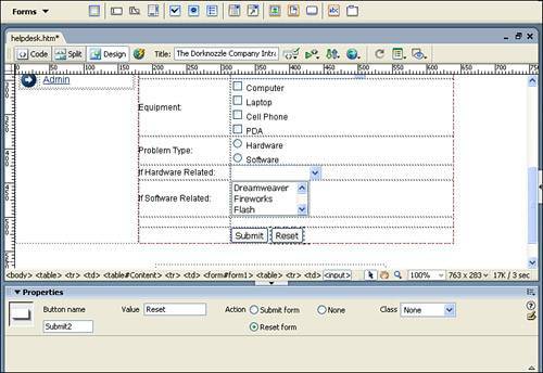
Test the Form The form is taking shape nicely and is now ready for testing within the browser. To see how users will interact with your form, save your work and preview the page in the browser. When the page appears, fill out the form objects, entering text into the Text Fields, picking options from the Checkboxes and Radio Buttons, and making selections from the Drop Down Menu and Listbox. When you finish, click the Submit button. If you typed the path to the processing application correctly in the Action text box for the form, the page should clear itself of the form objects and display what your selections and entries were. At first glance, it may seem confusing as to what happened. The process of sending form information to the server for processing will be cleared up in Part V, "Dynamic Web Page Creation," but for now, we can cover the process at a basic level. As mentioned in the beginning of the chapter, forms exist as a way for organizations to collect information from their end users (clients). By clicking the Submit button, the user can send the form and its form object values to an application (server), defined in the form's Action field, for processing. A visual representation of this process is shown in Figure 9.15. Figure 9.15. The form and form object values are sent to the server-side application for processing. 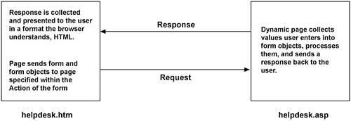
This approach, also known as client-server architecture, is central to the way thousands of organizations (also known as application service providers) do business on the web. In our scenario, the helpdesk.htm form page, which is what the client interacts with, is what you've just created. The application, helpdesk.asp, has already been created and resides on the server (www.dreamweaverunleashed.com). The application's sole purpose is to collect the values in the form objects and redisplay them in the client's browser in a readable format. As you'll learn in Part V, these applications can get much more complex than the simple example presented here. For now, this should give you an idea about the role of forms and form objects. Image Field The drawback to using form buttons is that they all look alike. The only way to differentiate form buttons is by their text labels. Although you can create CSS styles to reformat the look of form objects, including buttons, there is quicker way in the Image Field form object. The Image Field form object, which is essentially an image you create and add into Dreamweaver, is treated just as a Submit Button form object would be but is customizable based on your design standards. To add an Image Field form object to the page, follow these steps: 1. | Select and remove the Submit and Reset buttons located in the ninth cell of the second column.
| 2. | Click the Image Field icon located in the Insert bar (the fifth icon from the right). The Select Image Source dialog appears.
| 3. | Browse to the Images folder of the project, select the imagefield_submit.gif image, and click OK. The image appears in the cell similar to Figure 9.16.
Figure 9.16. The Image Field form object displays a custom image but is treated as a Submit Button form object. 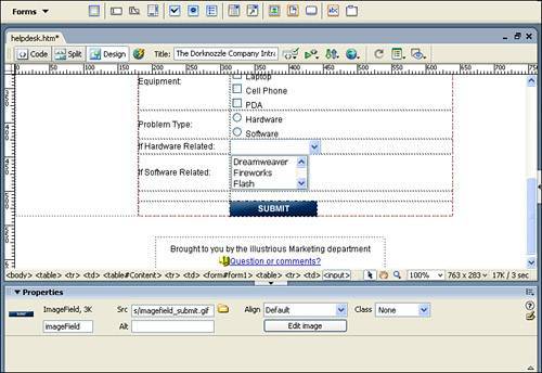
|
Selecting the button reveals the following customizable properties within the Properties Inspector: Image Field name: Enter the unique name to be given to the Image Field form object in this text box. As with Button form objects, naming Image Field objects isn't the biggest of priorities, so we'll leave ours with the default value of imageField. Src: Displays the source path of the Image Field form object. Alt: For accessibility reasons, you'll want to enter the alternate text to be associated with the Image Field form object here. We'll add the text Click Submit. More information on accessibility can be found in Appendix A, "Accessibility." Align: Select an option from this menu to set the alignment of elements around the Image Field object in relation to the Image Field. For instance, selecting Left from this menu aligns the Image Field to the Left and all elements, including text, around the Image Field's right. Edit Image: Click this button to launch the external editor specified for the Image Field's extension type. Remember that these external editors are specified in the File Types/Editors category in the Preferences window. Class: When working with CSS, select a class from this menu to set the overall style of the Image Field form object. We'll leave ours blank.
File Field One of the most under-used form objects available in Dreamweaver is the File Field form object. You can use this form object as a way of enabling end users to browse their hard drives for a file in order to upload that file to the server for processing. The File Field object, which is really just a Text Field with a Browse Button, is shown in Figure 9.17. Figure 9.17. Use the File Field form object to allow users to browse for and select files on the hard drive for uploading to the server. 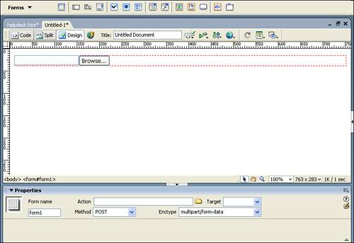
NOTE Initially the File Field seems like an object that would be widely adopted by web developers. The downside to the File Field is that it takes a lot of know how and code to get it to work server-side. The difficulty in integrating the File Field with server-side applications is the primary reason this form object is rarely used.
Hidden Field The Marketing department's friend, the Hidden Field form object is a common way to persist client-side data from page to page without the end user seeing or even realizing it. I say that this form object is the Marketing department's friend because this form object was used to death in the late 1990s' dot-com web-marketing crusade to sell unneeded and worthless software to unsuspecting web newbies. The scam was simple and involved nothing more than forms, form objects, and a couple of Hidden Fields. Typically starting with an email (spam) advertising the next best "free" software, unsuspecting users would click the accompanying link to visit the site offering the "free" software. Initially, the offer seemed legitimate, asking the user only for their email address with a button promising that the next step was the download. The unsuspecting user would click the button to download and be taken to a second page requiring more information such as name, address, age, and so on. The user, believing that the company already had their email address and that they will get spammed to the nth degree if they don't complete the process, cautiously enters more information and clicks yet another button that promises the next step is in fact the download. But to no avail; the user is now required to enter a credit card number and expiration date to purchase the $4.99 software which they initially thought was free. Fearing retaliation from the dastardly company, the user is left feeling that $4.99 and worthless software is a fair trade for not sharing the personal information they just entered into all the form objects. We've all seen this before, right? Although not everyone is fooled into actually purchasing the software, some inexperienced web users didn't know better and actually completed the purchase, much to their distain. Being a culprit at one time, I can tell you that you could have easily closed the browser and been fine. The personal information was not actually sent to the server when you clicked the Continue button to move from page to page but was in fact stored in Hidden Field form objects. On the first page, the user would enter their email address and click Continue. The value (the email address) was stored in a Hidden Field while the user entered more values. When the user clicked Continue on that second page, the new information was stored in a new series of Hidden Field objects. The process would go on until the last page, at which time the user would finally pay for the software and then the personal information was taken from the Hidden Fields and stored by the company. Figure 9.18 diagrams the process. Figure 9.18. Hidden Fields are used to collect information from page to page of a multipage form. 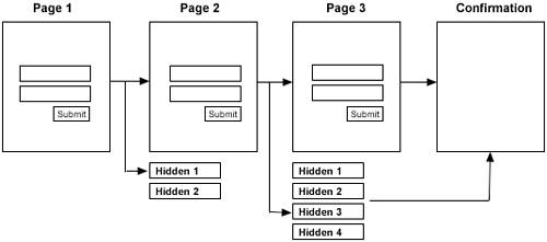
Fortunately, this scam isn't widely used anymore. Now that we're in the twenty-first century, we've graduated to pop-up ads (covered with more detail in the next chapter) and spyware! Jump Menu You can use a Jump Menu to create a quick, compact navigation option for the end user. Although a Jump Menu is more of a prebuilt component than it is a form object, it does incorporate the use of the Drop Down Menu and Button form objects to aid in its functionality. With a Jump Menu, you can easily add navigation options to a Drop Down Menu that, when selected, "jump" the page to a specified hyperlink. To insert a Jump Menu, follow these steps: 1. | Create a new blank HTML page by choosing the New option from the File menu. When the New Document dialog appears, select the HTML option from the Basic Page category and click Create.
| 2. | With your cursor on the page, click the Jump Menu icon in the Forms tab of the Insert bar. This action launches the Insert Jump Menu dialog box.
| 3. | Initially, you can add items to your new Jump Menu by clicking the Add (+) icon and typing the label of the menu item in the Text text box. I'll add the text Go to Yahoo.
| 4. | Type the URL you'd like that menu item to link to. You can either browse for a local file or type an absolute URL. I'll add the absolute path http://www.yahoo.com.
| 5. | Repeat steps 3 and 4, adding a few more selectable options. When you finish, your Jump Menu dialog may resemble mine (see Figure 9.19).
Figure 9.19. Add some selectable options to your Jump Menu. 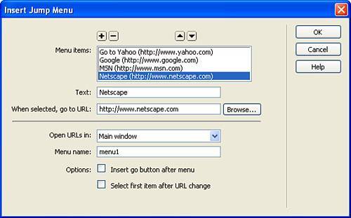
| 6. | Test your page in the browser by selecting the Preview in Browser option in the Document bar or by pressing F12. In the browser, you should be able to select an option from the menu and automatically be redirected to the specific URL.
|
You may have noticed that the Insert Jump Menu component includes more customizable properties than we actually used. Following is a complete list of available options within the Insert Jump Menu dialog: Menu items: Use this widget to add, remove, and reposition items within the Jump Menu. The Menu Items pane displays the text of the item complete with the associated URL in parentheses. Text: Enter the text to be associated with the Jump Menu item in this text box. When selected, go to URL: Enter the URL to be associated with the Jump Menu item. This is the path that the browser will navigate to when the item in the Jump Menu is selected. Open URLs in: Use this menu to select where you want the link to open. You can target a frame in a frameset or simply target the existing window (default). Menu name: Enter the unique name to be given to the Jump Menu in this text box. Insert go button after menu: Select this check box to have the Jump Menu appear with a Go button next to it. The Jump Menu uses the onChange event to trigger the browser redirection that may not be supported in older browsers. The onClick event associated with the Go button, however, is supported in older browsers. Select first item after URL change: Check this option when your Jump Menu resides in a frame and the redirection occurs in another frame. Enabling this option guarantees that the item selected is highlighted when the "jump" occurs.
Although there's no easy way to modify the Jump Menu once the Jump Menu dialog has been configured, modifying the Jump Menu's structure isn't impossible. If you simply need to change some of the menu items, you can highlight the Jump Menu and click the List Values button in the Properties Inspector. If you need to make more advanced modifications, however, use the Behaviors panel. We'll discuss this option with more detail in the next chapter. Fieldsets One of my favorite HTML design elements is the Fieldset. You can use the Fieldset form object as a handy way to group similar form objects within a bordered container. The Fieldset, in conjunction with its corresponding Label, helps users distinguish different form objects as they relate to specific functionality on the page. To demonstrate the Fieldset, follow these instructions: 1. | Open the helpdesk.htm page if it's not open already.
| 2. | Place your cursor in the form and select the <form> tag from the Tag Selector. The entire form should be highlighted, as shown in Figure 9.20.
Figure 9.20. Select the form by clicking the <form> tag in the Tag Selector. 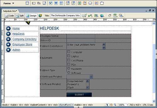
| 3. | Cut the form out of the page by choosing Edit, Cut or by pressing Ctrl+X on Windows and Option+X on a Mac.
| 4. | With your cursor now blinking in the cell, click the Fieldset icon in the Insert bar (it's the last icon in the group). Clicking this icon opens the Fieldset dialog.
| 5. | In the Legend text box, enter the text New Ticket and click OK. The Fieldset dialog closes.
| 6. | Place your cursor just to the right of the New Ticket text (the Fieldset's Legend) and press Enter. Immediately paste your form back into the page by selecting Edit, Paste or by pressing Ctrl+V on Windows or Option+V on a Mac.
|
Preview your page in the browser by selecting the Preview in Browser option from the Document bar or by pressing F12. As you can see from Figure 9.21, the form objects are outlined with a pane complete with the text label, New Ticket. Figure 9.21. The Fieldset generates a clean border around your form objects. 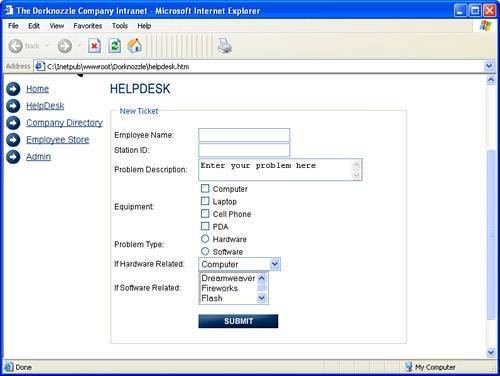
Labels The final form element you can use in your pages is the Label element, available from both the Insert, Form menu and the Forms category in the Insert bar. You can use this element as a way of defining a unique association between text and a form element. For instance, the following code outlines a Text Field form element: <form> <label>Company:<input type="text" name="company"></label> ... </form>
Notice how the Text Field is nested within the <label> tag. Doing this creates a simple association between the Company text and the Text Field form element. |