Using the ListView Control
Using the ListView ControlThe ListView control is similar to the ListBox control in that it can display a list of items to the user in a boxlike UI. The ListView control adds additional functionality over the ListBox . In addition to plain text items, the ListView control can display optional images and sub-items that add detail about the item. The items in a ListView can be displayed in four different views: Details view, LargeIcon view, List view, and SmallIcon view. The ListView control exposes the View property that represents the current view. The View property is of type System. Windows .Forms.View , which is an enumeration. The following list describes the members of the View enumeration and how they affect the ListView control.
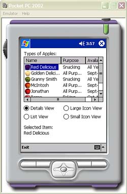
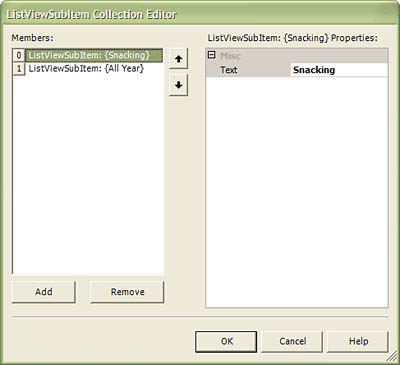
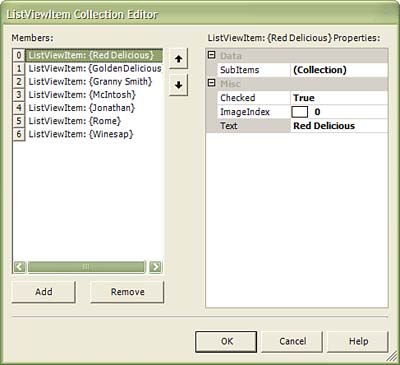
When the View property is set to Details , the ListView can display sub-items, which act as additional information related to the item. When the ListView is in Details mode, the items appear to be listed in tabular format, with each row separated into columns. The first column contains text and an option icon. The subsequent columns contain the text of the sub-items. Figure 3.23 shows an example of the ListView running in details view on the Pocket PC emulator. The complete code listing for this sample can be found in the source code collection for this book. Figure 3.23. This application showcases the ListView control application running on the Pocket PC 2002 emulator. Adding Columns to the ListViewColumns can be added to the ListView at design time as well as runtime. This is done by adding ColumnHeader objects to the ListView 's Columns collection property. The columns will only be displayed only when the ListView is in Details mode. The following code demonstrates how to add columns to a ListView control: C# System.Windows.Forms.ColumnHeader columnHeader1 = new ColumnHeader(); System.Windows.Forms.ColumnHeader columnHeader2 = new ColumnHeader(); System.Windows.Forms.ColumnHeader columnHeader3 = new ColumnHeader(); columnHeader1.Text = "Name"; columnHeader2.Text = "Purpose"; columnHeader3.Text = "Availability"; listView1.Columns.Add(columnHeader1); listView1.Columns.Add(columnHeader2); listView1.Columns.Add(columnHeader3); VB Dim columnHeader1 = new ColumnHeader() Dim columnHeader2 = new ColumnHeader() Dim columnHeader3 = new ColumnHeader() columnHeader1.Text = "Name" columnHeader2.Text = "Purpose" columnHeader3.Text = "Availability" listView1.Columns.Add(columnHeader1) listView1.Columns.Add(columnHeader2) listView1.Columns.Add(columnHeader3) Columns can also be added to the ListView at design time. First drag a ListView control from the ToolBox onto the applications form. Now click the ellipsis next to the Columns property name in the Properties windows. This will bring up the ColumnHeader Collection Editor (see Figure 3.24). Use the Add and Remove buttons to modify the list of ColumnHeader objects in the ListView control. Figure 3.24. The ColumnHeader Collection Editor. Adding Items to the ListView ControlAfter adding columns to the ListView control, you can begin to add items. The ListViewItem class represents items in a ListView control and the ListViewSubItem class represents a sub-item related to a ListViewItem . The ListViewItem class exposes the SubItems collection property that represents the list of sub-items related to an item. The number of sub-items should equal the number of columns minus one. The first column in a ListView control is populated with text and option image of the ListViewItem object. A ListViewItem object can display an image along with text. An ImageList must be used to associate an image with a ListViewItem object. The ListView control exposes two ImageList properties: SmallImageList and LargeImageList . The LargeImageList ImageList contains the images to use when the View property is set to View.LargeIcon . The SmallImageList ImageList contains the images to use when the View property is set to anything other then View.LargeIcon . Once the SmallImageList and LargeImageList properties have been set, you can set the ImageIndex property of each ListViewItem in the ListView control to the index of the appropriate image in the ImageList . Because only one index can be specified for the ListView.ImageIndex property, both the SmallImageList and the LargeImageList should contain corresponding index positions . This means that if the ImageIndex is set to zero, then the image at index zero both in the SmallImageList and in the LargeImageList will be used for that ListViewItem . See the "Using the ImageList Control" section for detail on how to load an ImageList . ListViewItem objects can be added to a ListView control at design time as well as runtime. The following code demonstrates how to add items to the ListView control configured in the "Adding Columns to the ListView" section. C# ListViewItem listViewItem1 = new ListViewItem(); ListViewSubItem listViewSubItem1 = new ListViewSubItem(); ListViewSubItem listViewSubItem2 = new ListViewSubItem(); listViewItem1.Text = "Red Delicious"; listViewSubItem1.Text = "Snacking"; listViewSubItem2.Text = "All Year"; listViewItem1.SubItems.Add(listViewSubItem1); listViewItem1.SubItems.Add(listViewSubItem2); listView1.Items.Add(listViewItem1); VB Dim listViewItem1 = new ListViewItem() Dim listViewSubItem1 = new ListViewSubItem() Dim listViewSubItem2 = new ListViewSubItem() listViewItem1.Text = "Red Delicious" listViewSubItem1.Text = "Snacking" listViewSubItem2.Text = "All Year" listViewItem1.SubItems.Add(listViewSubItem1) listViewItem1.SubItems.Add(listViewSubItem2) listView1.Items.Add(listViewItem1) ListViewItem objects can also be added at design time. First click the ListView control that will contain the items. If ImageList controls have been configured for the ListView control, then assign the ImageList controls to the LargeImageList and SmallImageList properties in the Properties window. Next click the ellipsis next to the Items property in the Properties window. The ListViewItem Collection Editor will appear (see Figure 3.25). Use the Add and Remove buttons to modify the items in the ListView . Set the ImageIndex property if an ImageList has been configured for the ListView . If you need to add sub-items to the ListViewItem objects, then click the ellipsis next to the SubItems property in the editor. The ListViewSubItem Collection Editor will appear (see Figure 3.26). Again, use the Add and Remove buttons to modify the collection of sub-items. Figure 3.25. The ListViewItem Collection Editor. Figure 3.26. The ListViewSubItem Collection Editor. Determining the Selected ItemOn the full .NET Framework, the ListView control supports the MultiSelect property. This property determines whether multiple items can be simultaneously selected. The .NET Compact Framework does not support this property, and only one item can be selected at a time. Despite the lack of support for the MultiSelect property, the ListView still exposes the SelectedIndices property. This property contains the list of indexes of all the select items. Because the MultiSelect property is not supported, this list will contain at most only one index. A SelectedIndexChanged event is fired when the SelectedIndices property changes. You can trap this event to processing on the newly selected or deselected item. It is important to note that changing the selection from one item to another generates two SelectedIndexChanged events. The first event is fired to inform you that the previously selected index was removed from the SelectedIndices list. In this case the SelectedIndices collection will be empty. The second event informs you that the newly selected item index has been added to the SelectedIndices list. The following code demonstrates how to handle the SelectedIndexChanged event: C# private void listView1_SelectedIndexChanged(object sender, System.EventArgs e) { if(this.listView1.SelectedIndices.Count <= 0) return; int selNdx = this.listView1.SelectedIndices[0]; label3.Text = listView1.Items[selNdx].Text; } VB Private Sub _ listView1_SelectedIndexChanged(ByVal sender As System.Object, _ ByVal e As System.EventArgs) Handles listView1.SelectedIndexChanged If Me.listView1.SelectedIndices.Count <= 0 Then Return End If Dim selNdx = Me.listView1.SelectedIndices(0) If selNdx >= 0 Then label3.Text = listView1.Items(selNdx).Text End If End Sub You can also use ListView.Selected property to determine if the item is selected in the ListView . You would loop through the ListView.Items collection, checking the Selected property, to determine which item is selected. Additional ListView Control PropertiesTable 3.6 contains a list of addition ListView properties and a description of their effect on the ListView control. Table 3.6. ListView Control Properties and Their Descriptions
Table 3.7. ColumnHeaderStyle Enumeration Properties and Their Descriptions
 |
EAN: 2147483647
Pages: 206
- Structures, Processes and Relational Mechanisms for IT Governance
- Integration Strategies and Tactics for Information Technology Governance
- Linking the IT Balanced Scorecard to the Business Objectives at a Major Canadian Financial Group
- A View on Knowledge Management: Utilizing a Balanced Scorecard Methodology for Analyzing Knowledge Metrics
- The Evolution of IT Governance at NB Power