ActionScript for Flash s Built-In Components
| I l @ ve RuBoard |
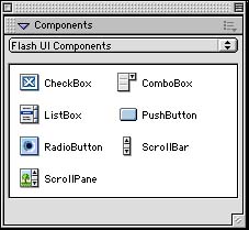
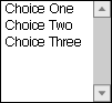
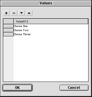
ActionScript for Flash's Built-In ComponentsThere are seven different built-in components. Figure 21.1 shows the Components panel, which includes the names and icons for each of these. Figure 21.1. The Components panel is where you select components to add to your movie. To add a component to your movie, you can either double-click on a component in the panel, or click and drag a component to the stage. PushButtonClick and drag the PushButton component to the stage. This creates a new instance of the PushButton component on the stage. It also adds a ton of Library elements to your movie. Fortunately, these Library elements are stored in neat folders, so they won't get in your way too much. Figure 21.2 shows the PushButton component on the stage. It is a simple box with the words "PushButton" in the middle. Figure 21.2. The PushButton is the simplest of the components.
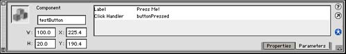
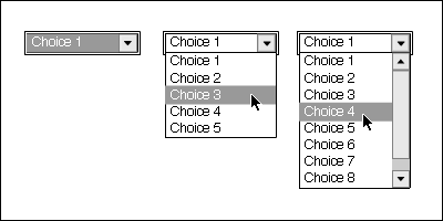
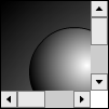
After the PushButton is on the stage, you can select it and open the Properties panel to change its name . Figure 21.3 shows the Properties panel for this component. Figure 21.3. The Properties panel for components features Properties and Parameters tabs. You can switch between these two modes to see different information about the component. Two parameters can be set for the PushButton component. The first is the Label; change that to Press Me! The second is the Click Handler. This is the name of the function that will be called when the button is clicked. This function must be in the same timeline as the button; so if the button is at the root level, the function should be in the main timeline. Set the Click Handler to buttonPressed. Also, name the component instance testButton as shown in Figure 21.3. Now all you have to do is to create the buttonPressed function. Here is a simple example. It just sends some text to the Output window: function buttonPressed(buttonInstance) { if (buttonInstance == testButton) { trace("Test Button Pushed."); } else { trace(buttonInstance._name); } } A button handler function is passed one parameter: a reference to the button that called it. So you can test this instance to see whether it is testButton . This sample function prints out a special message if it is that button, and the button instance name if it is not. You can see this example in the movie 21pushbutton.fla. CheckBoxesThe CheckBox component is similar to the one we created in Hour 15, " User Input Elements." You can see three of them in Figure 21.4. Figure 21.4. CheckBox components allow the user to select nonexclusive options. To make a CheckBox component, double-click it in the Components panel, or click and drag it to the stage. To make a second one, go to the Library and open the Flash UI Components folder that was created when you added the first component. Drag the CheckBox component from there onto the stage. In the example movie 21checkboxes.fla, I have created three CheckBoxes. If you select any one of these and bring up the Properties panel, you will see that it includes a few more parameters than the PushButton Properties panel, shown in Figure 21.3. In addition to Label and Change Handler parameters, you now also have Initial Value and Label Placement parameters. The Initial Value parameter is either true or false, depending on whether you want the CheckBox to start off checked. The Label Placement parameter allows you to select right or left. Right is the default placement, which is shown in Figure 21.4. If you switch to left, the text will be to the left of the box instead. In the example movie, I have named the three CheckBox instances option1, option2, and option3. I also labeled them Option One, Option Two, and Option Three. The Change Handler for each is set to changeOptions. I placed the changeOptions function in the main timeline. This will be triggered any time one of the CheckBoxes is clicked. It will send the name of the CheckBox and its new state to the Output window. function changeOptions(checkBoxInstance) { trace(checkBoxInstance._name+": "+checkBoxInstance.getValue()); } In 21checkboxes.fla, I also added a PushButton component. This button is named doneButton and calls the buttonPressed function. This function loops through all the CheckBoxes and sends its state to the Output window. function buttonPressed(buttonInstance) { if (buttonInstance == doneButton) { trace("Option One: "+option1.getValue()); trace("Option Two: "+option2.getValue()); trace("Option Three: "+option3.getValue()); } } Instead of sending the results to the Output window, you will probably want to use them in some other fashion. For instance, you might want to placed them in a LoadVars object so that they can be sent to a server. RadioButtonsRadioButtons are similar to CheckBoxes, except that they are arranged in groups. Only one RadioButton in a group can be on at one time. You can see what RadioButtons look like in Figure 21.5. Figure 21.5. RadioButton components allow the user to select exclusive options. The example movie 21radiobuttons.fla has three RadioButtons. If you select one of the buttons and bring up the Properties panel for that button, you will see that it has more parameters than the CheckBox or PushButton components. In addition to the parameters seen in the CheckBox component, there are Group Name and Data parameters. The Group Name parameter specifies which group the RadioButton belongs to. In the example movie, all three RadioButtons have this set to firstGroup. If there was a second group of buttons with a different name, these two groups would be treated separately when it comes to deciding which RadioButton is on. The Data parameter is an optional one that can be used by you in your scripts. You can access it with the getData() function. You can store instructions that your script can pick up on when the choice is made. Or, you could avoid the Data parameter and refer to the name of the RadioButton. In the example movie, the three RadioButtons are named choice1, choice2, and choice3. The labels for these buttons are Choice One, Choice Two, and Choice Three. Determining which choice the user has made is done when the PushButton in the movie is clicked. The PushButton then runs this script to determine which choice has been made. The script loops through the three buttons looking for a button that returns a true from the getState() function. This is the RadioButton that is turned on. function buttonPressed(buttonInstance) { if (buttonInstance == doneButton) { var choice = "none"; for(i=1;i<=3;i++) { if (this["choice"+i].getState()) { choice = this["choice"+i]._name; } } trace("Choice: "+choice); } } ListBoxA ListBox is a simple way to allow the user to select one or more options. A ListBox can take the place of either a set of CheckBoxes or a set of RadioButtons. It is particularly useful when you have many choices but limited screen space. Figure 21.6 shows a ListBox with three choices. It looks a lot like a scrolling text field ”in fact, it is. Each line represents a different choice for the user. If there were more choices than could fit in the space, the user could scroll up and down the list to see them all. Figure 21.6. The ListBox component allows the user to select one or more choices. When you create a new ListBox instance, you must set its Select Multiple parameter. If true, the user can use the Shift, Command, or Ctrl keys to select more than one line. If false, only one line may be selected at a time. In addition, you must set the Labels parameter. However, this is not a single value but an array of values. Flash has a special interface for entering these values. When you click on the Labels parameter in the Properties panel, you get a dialog that looks like Figure 21.7. Figure 21.7. The Values dialog lets you enter an array of items for different component parameters. You also have a Data parameter that can take an array of data. This Data parameter, like the one used with radio buttons, allows your code to get additional information about the choice(s) that the user made. However, it is not required. In the example movie 21listbox.fla, I have placed a ListBox component with three choices on the screen. It is set to accept multiple selections. When the user clicks on a line, the listBoxChange function is called. This is specified by its Change Handler parameter. This function tells you which line was just selected: function listBoxChange(listBoxInstance) { trace(listBoxInstance.getValue()); } There is also a PushButton component in the example movie. When it is clicked, it runs this function. It uses the getSelectedItems() function to get an array of the choices selected in the list box. Each item in the array is an object with a label and data property. Because we didn't use the data properties of the list box, we'll get the labels instead. function buttonPressed(buttonInstance) { if (buttonInstance == doneButton) { items = myListBox.getSelectedItems(); for(var i=0;i<items.length;i++) { trace(items[i].label); } } } You can also add or remove lines from the list box using ActionScript. For instance, addItem adds an additional choice to the list box. myListBox.addItem("Choice Four"); You can use addItemAt , removeItemAt , and replaceItemAt to make even more changes to the list box with ActionScript. ComboBoxA combo box is something that Windows users will be familiar with, but no such thing exists in standard Macintosh interfaces. It is a pull-down menu where the user can also type in a value manually. Fortunately, you can also turn off the option to edit the value. This turns the combo box into a normal pull-down menu. The parameter for doing this is the first one in the Properties dialog for a combo box, named Editable. In addition to that parameter, you can also provide arrays for the Labels and Data. Another parameter for a combo box is the Row Count. Combo boxes can act a little like list boxes. When the user clicks them, they expand into a list of choices. If the number of choices exceeds the Row Count, a scrolling bar appears to the right to allow the user to scroll through the choices. Figure 21.8 shows all three variations of a combo box. The box on the left is what a combo box looks like when it is inactive. The second box shows what happens when the user clicks the combo box. The third box shows what happens when there are more choices than rows. Figure 21.8. Three different looks for the combo box. When a user selects a new choice in the combo box, the Click Handler is called. Here is one that simply tells you the label that was selected: function comboBoxChange(comboBoxInstance) { trace(comboBoxInstance.getValue()); } You can also use getSelectedIndex() to get the zero-based number of the selected choice. The example movie 21combobox.fla shows an example of a ComboBox component. ScrollPaneThe next two components are different from the previous five. They are not used to allow the user to make choices, but are instead used to display large amounts of information in small spaces. The ScrollPane component consists of a vertical and horizontal scrollbar and a rectangular viewing area. Its main parameter is Scroll Content. This is the Linkage name for a movie clip. When you run the movie, the movie clip is copied from the Library and placed in the view area of the scroll pane. The scrollbars then allow the user to view different parts of the movie clip. Figure 21.9 shows the ScrollPane with a movie clip inside. You can see this example in the movie 21scrollpane.fla. Figure 21.9. The ScrollPane allows the user to view a large movie clip in a small space. If you set the Drag Content parameter to true, the user can also click in the display area and drag the image around. The scrollbars follow the dragging. Although the ScrollPane does not require any ActionScript at all to work, there are plenty of functions that you can use to determine which part of the movie clip is being viewed or to change the width and height of the pane. You can also use the Properties panel to change the width and height of the scroll pane. When you do this, the scroll pane looks distorted in Flash, but it looks fine when you run the movie. One useful ActionScript command is the loadScrollContent command. This command takes a URL and gets an external movie clip to display in the pane. myScrollPane.loadScrollContent("myMovieClipFile.swf"); The scroll pane can be useful as an image browser. ScrollBarThe last component is the ScrollBar. This adds scrolling bars to text fields. You can use this component without any ActionScript at all. Just drag and drop a ScrollBar component to a text field, and it adds itself there. The ScrollBar component does have a small list of ActionScript-accessible properties. For instance, you can use getScrollPosition() to get the current scroll position and setScrollPosition() to change it. |


| I l @ ve RuBoard |
EAN: 2147483647
Pages: 272