| Some of the most practical and simple aspects of the Titler are its template functions. As you can deduce from the last step of the previous lesson, templates are ready-made titles with text and objects that you can replace and modify on a project-by-project basis, without altering the original. You can build your own custom title templates as we just did, modify the templates included with the Titler, or use the built-in designs as is. For the second half of the chapter, you will modify a ready-made template and resave it as a custom template and then create a credit roll template, which is very valuable for most production work. These lessons rely on such basic title functions as selecting, moving, and modifying the properties of existing objects in the title template. The final lesson goes a bit further, exploring Tab Stops, Roll/Crawl Options, and Properties settings for text. Adding Logos and Modifying Pre-Made Templates When you want help refining the style and eloquence of your titles, the best place to look is the Templates dialog. You very easily can load one of the more than 100 built-in templates, then alter its elements to suit your project needs. In this lesson, which assumes you're putting together a DVD of a baby's first birthday, you'll learn how to alter a template and save the adjustments as a new template. You will open one of the templates in the Celebrations folder and add a picture to personalize the title. Just in case your family has a baby boom, you will save the modified template as a custom template. An important element of this lesson is incorporating pictures or graphic file elements to your title document: You will explore adding a logo as well as using an image for a fill texture. Notes Premiere Pro can insert a logo or a texture, but what's the difference? A logo is the type of identifying graphic for which people and companies pay a lot of money. They are very client-oriented, professional graphics that are meant to be used as delivered. The logo tools manage the size and aspect ratios of logos, providing minimal support for altering them artistically. Textures, on the other hand, are all about the art and adding mood, depth, and feeling to your graphics and titles. So, if you want to preserve the aspect ratio of a graphic, you can insert it as a logo and reduce the adjustments that can be applied to the image. If you want to blend the graphic with other title elements, then insert it as a texture.
1. | Open the Template_Start.prproj file from the APPST2 Lesson Files/Chapter 15 folder. Be sure you are using the workspace layout defined in the first lesson of this chapter. BdayBoy.jpg, which is located in the same folder, is the primary image (logo) that you will incorporate into the title template.
| 2. | Select File > New > Title or press F9 to open a new title. Name it Baby_Template. Press Ctrl+J on your keyboard and in the Templates dialog, go to Title Designer Presets > General > Baby Boy > Baby Boy Low3. Click Apply to load the template.
Once the template is loaded, you can modify and manipulate any of the title elements without affecting the original template. For this template, you want to replace the image of the rattle with a picture of the baby boy. There are two ways of doing this; I want to show you the most efficient method.
| | | 3. | Using the Selection tool, select the rattle graphic in the lower-left corner and twirl down the Properties in the Title Properties panel. The Logo Bitmap should display a small version of the rattle graphic. Click within the boundaries of this graphic (Figure 15.19). From the Choose a Texture Image dialog, choose the BdayBoy.jpg file from the APPST2 Lesson Files/Chapter 15 folder.
When a logo is selected in your title, you can quickly replace it by clicking on the Logo Bitmap icon in the Properties area of the Title Properties panel. Using this technique replaces the current logo with the new logo using the exact dimension and sizing that the previous logo had.
Figure 15.19. With a logo selected from your title, you can see the dimension of the logo in Transform area; this logo is 129.6 x 143. In the Properties area you can see a preview of the selected logo. Clicking on that logo allows you to replace the current logo with a new one, preserving the exact dimensions of the original 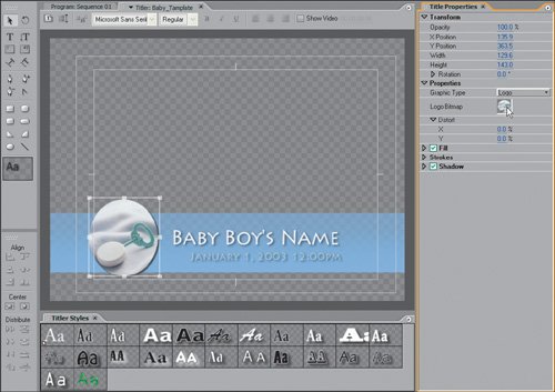
An alternate method for this same task would be to right-click within the boundary of your Titler panel and select Logo > Insert Logo. This inserts the Logo at its full size, and then you must manually resize it to get it to the proper dimensions.
Note that because the rattle was not the same aspect ratio as the BdayBoy logo, there is a slight distortion to the image.
| | | 4. | With the Logo of the boy still selected, turn off the Shadow setting in the Title Properties panel, twirl down and expand Strokes, and then expand Outer Strokes. Add an outer stroke with the settings (Figure 15.20):
Figure 15.20. The rattle logo image was replaced with a new image, and its properties were adjusted because the new logo is a rectangle and not an oval 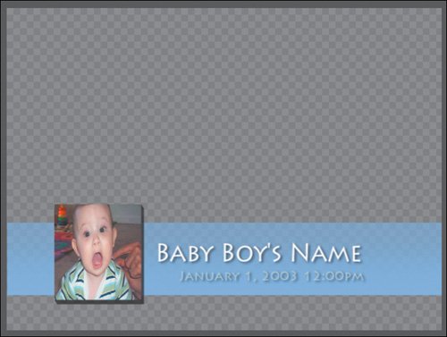
| |
|---|
Type: Depth | Fill Type: Solid | Size: 9 | Color: Black | Angle: 315 | Opacity: 70% |
Because you replaced the rattle logo, the properties of the object itself are still intact. Because the rattle was a circle and this is a square, you turned off the shadow and instead, added a stroke.
You now have a custom picture in your template, but say you would prefer it in an oval like the rattle graphic. The primary limitation of using the Logo feature is that the original shape and dimensions of the file will be adhered to in the title. If the picture is a square, you can't just change it to a circle. This is good when you are bringing in corporate logos that should not be adjusted or distorted; you can, however, work around this limitation by assigning a logo or graphic to fill an object.
| | | 5. | Right-click on the baby picture, and clear the file from the title. Press the E key to select the Ellipse tool, and make a circle in the bottom-left corner of the title frame. Click the default style swatch in the first position of the Titler Styles panel to give the object a default white fill. The circle should be approximately 140 x 140. Instead of using the square image of the baby, you created a circular object in which you will use the baby picture as a texture fill.
| 6. | With the newly created circle selected, twirl down the Fill listing in the Title Properties panel. Check the box for Texture, and twirl it down. Click in the blank gray box to the right of the word "Texture," and select the BdayBoy.jpg file from the Choose a Texture Image dialog box. Click Open (Figure 15.21).
Figure 15.21. No matter what type of object you create, you can fill it not only with gradients and colors, but also with textures or graphic images. Here you can see the selected texture in a small preview area and the circle now filled with the image of the boy 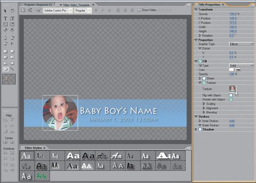
To add a picture, graphic, or grayscale texture to any object, activate the Texture Fill and select your desired texture file. With the texture in place, you can modify it a number of ways.
| | | 7. | Continuing in the Title Properties panel, twirl down Fill, then Texture, then Scaling, and set Object X and Object Y both to Face from the drop-down menus. Set Horizontal and Vertical to 110%. Next, twirl down Alignment, and set Object X and Object Y both to Face. Change X Offset to 2.0 and Y Offset to -1.0.
When you are working with a texture fill, you need to keep in mind some scaling and alignment rules for the texture that is filling the object. In terms of scaling, Clipped Face and Face resize the graphic to fit within the boundaries of the object it is filling. Texture uses the graphic's default size as the dimensions of the fill image. You then scaled the texture to make it a little larger within the oval.
If you reduced the size of the texture to be smaller than the boundaries of the object shape, the Tile check boxes allow the image to tile vertically and horizontally in order to fill the object. Without tile, there would be black space around the image where it did not fill the object.
Once the image is scaled and placed within the boundaries of the object, Alignment lets you offset or slightly nudge the image horizontally or vertically. Here, shifting the image a bit to the left centered it within the object.
When the Alignment Rule X is set to Left, the texture locks to the left edge and it grows to the right. Offsetting the X value by 2 moves that left edge a value of 2 to the left; it is offset. Rule Y is set to Top, this means it is locked to the top edge and grows downward. With a Y Offset of -1, you pull the image one pixel toward the top. In order for no black space to appear in the area above the image where it was pushed down, tiling is turned on. Tiling repeats the texture from all edges.
| 8. | Add an inner stroke to the selected object:
| |
|---|
Type: Edge | Color: White | Size: 6.0 | Opacity: 100% | Fill Type: Solid | |
| | | 9. | Add a shadow with the settings (Figure 15.22):
| |
|---|
Color: Black | Distance: 9 | Opacity: 40% | Size: 1 | Angle: 135 | Spread: 33 |
Figure 15.22. The new graphic is now unified with the other elements to match color and shadowing with a far better look and feel than the square image that you originally inserted. If a general logo insert doesn't give you the result you want, consider using an image as a texture within a custom object instead 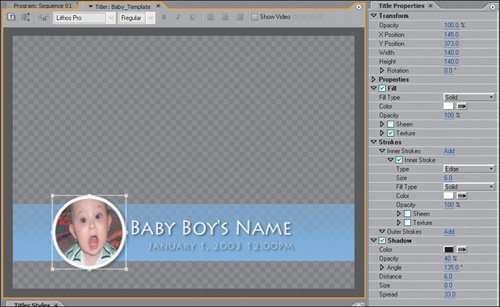
The small inner stroke and shadow unify the look of the added object with the look of the title's other objects. Now that the title is complete, you can save it as a template for continued use.
| 10. | Finally, select and change each of the text elements in the title (Baby Boy's Name and January 1, 2003 12:00 PM) to information relevant to your project. If you like, you now can open the Templates dialog, select Save <Baby_Template> as Template from the wing menu, and name the template. I saved it as New_Baby_Template.
|
I encourage you to use your own graphics and images in the titles that you create and templates that you modify. Although logos have less flexibility and adjustment qualities (for good reason), you can always add an image or graphic into your title as a texture fill. Design-wise, if you don't feel like you have a good sense of how a title should look, simply load a template and modify it to suit your needs. Creating a Custom Credit Roll Template To provide you with more experience working with text and moving titles, the final lesson of this chapter will guide you through creating your own custom credit roll. Although your font taste and spacing may deviate from the example, the most important things to learn are the basic settings and adjustments needed for a simple, clean credit roll. With that in mind, you will focus on text spacing and tab stops. | | 1. | Open Rolling_Title_Start.prproj from the APPST2 Lesson Files/Chapter 15 folder. From the Title menu, select Title > New Title > Default Roll. Name the title Credit Roll. Select the Area Type tool from the Tool panel, then click and drag from the top-left corner of the inner title-safe boundary down and to the right just out of frame with the right side of the tool on the edge of the right title-safe boundary (see Figure 15.23).
Figure 15.23. Because you want to roll from above the top of the frame to below the bottom of the frame, you want your text square to be larger than the inner frame in the Titler drawing area 
This first step shows you a new feature for 2.0: the ability to automatically create a rolling credit from a menu, as opposed to selecting the option from the Titler panel itself. The rest of the step defines the area in which the rolling text will be written and roll from. The area you defined is the absolute boundary in which your text can roll. By defining the top and bottom of the area text to be outside the visible frame (as delineated by the title-safe boundaries), you ensured that your credit will roll up and then out as if it came from below the image and disappeared above the image. If you instead created a square that fit inside the title-safe boundary, the rolling text would appear rolling up in the lower-third portion of the frame and disappear as it reached the upper-third portion of the frame.
| | | 2. | Go to the wing menu of the Titler panel and turn on Tab Markers. Either select Title > Tab Stops or press Ctrl+Shift+T to open the Tab Stops dialog. Click in the white space above the ruler bar to add a tab stop. Position the tab stop so that it rests in the center of the drawing area on top of the center hash mark in the title-safe boundary. Click the Centered Tab button to make this tab a center justified tab stop. Add a second tab stop just to the right of the left edge, and click the Left Justified button. Add a third and final tab stop just to the left of the right edge, and click the Right Justified button. Click OK (Figure 15.24).
Figure 15.24. Each of the tab stops has an associated justification for the text that is assigned to it. Each tab stop directly corresponds with the yellow tab stop lines in the Titler. The center tab stop is center justified, the left tab is left justified, and the selected right tab stop is right justified 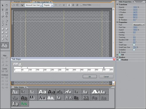
When you tab to the stops you set, the text you add will assume the right, left, or center justification that the tab stop represents. Try adding some text to see how it looks.
| | | 3. | Select the Type tool, and press the Tab key twice to navigate to the center tab stop. Type the word "Group." In the Title Properties panel, twirl down Properties and set Courier New > Bold for Font. Set Font Size to 30 and Leading to 8.2. Back in the drawing area, press Enter to create a new line. Press the Tab key once, and type the word "Position." Press the Tab key twice, and type First Lastname. Select the second line of text from the word "Position" to "Lastname." As shown in Figure15.25, set:
Font Size: 21.8
Leading: 8.2%T
Tracking: -5
Figure 15.25. By selecting a group of words, you can alter the font size and all the styles properties of the selection separate from that of the other text in the square 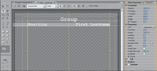
First, you center the main heading for the group of credits to follow. You could change the word "Group" to "Cast" later, for example, if the first section of credits is for the cast of your project. The second line of text creates two listings, one for the cast position and the other for the individual's name. The second line's reduced font size enables more text to fit, and the reduced tracking tightens the space between each letter on a uniform scale. Reducing the leading closes the overall space between the first and second line.
| 4. | With the second line of text still selected, press Ctrl+C to copy it. Click after the letter "e" in Lastname in the second line, and position the cursor at the end of the text on the right tab stop. Press Enter to create a new line. Paste the text onto the second line (Ctrl+V). Repeat this step twice more to create four listing lines. Select these four lines, and reduce their leading to 6.
Notice that instead of pasting at the first tab stop, you paste at the left edge of the square. The selection for the text recognizes that the first word has a tab stop value of 1 and the second set of words has a tab stop value of 3, so Premiere pastes them accordingly.
| | | 5. | With the Type tool still selected and the cursor blinking after the last Lastname, press Ctrl+A to select all the text. Copy it (Ctrl+C), deselect the text by clicking after the last Lastname, and then press Enter three times to create three lines of spacing. Paste (Ctrl+V) the text at the current cursor position. Press Enter three more times, and paste again. To extend the Roll area lower than currently assigned, grab the bottom of the Text area and drag it downward to elongate the roll text area (Figure 15.26).
Figure 15.26. To lengthen the roll area, grab the bottom of the text area and manually drag it downward to reveal any text beneath it. Once you have dragged it down, you can scroll with the scroll bar on the right side of the Titler panel to see all the text 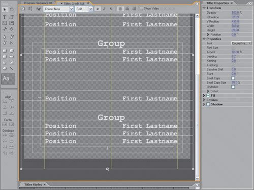
Although the last copied text group is technically off-screen, you can still scroll down through the text and modify the information by dragging the Text area downward allowing you to scroll even further. In these five steps, you created a custom credit roll with groups of text that you can fill on a project-by-project basis. Now it's time to assign the Roll/Crawl Options and save the template.
| | | 6. | From the Title menu, select Roll/Crawl Options. In the resulting dialog, click the check boxes for Start Off Screen and End Off Screen. Click OK. Click the Templates button to open the Templates dialog. From the wing menu, select Save < Credit Roll > as Custom Template. Name the title Custom Roll, and click OK.
Choosing to start and end your title off screen means that even if you have text at the top of the frame, your titles will start blank and roll the text of your title into frame, then end by rolling the text completely out of frame. The Ease-In and Ease-Out settings slow the title when it first rolls in and when the title ends and rolls out.
|
To see the title I came up with and how different durations affect the speed at which the title rolls, open Rolling_Title_Finished.prproj from the APPST2 Lesson Files/Chapter 15 folder. You can take a number of clues and tips from this lesson and switch them to customize your tabs stops, font, font size, and line spacing to create your own custom credit template or title with text. Notes The speed of a rolling or crawling title depends on the duration you assign to the title when it is added to the timeline. When added to the timeline, the title file must complete from top to bottom or side to side within the duration it is assigned. If you have 200 lines of text in a rolling title and the title has a duration of only five seconds, for example, the text will fly by in order to get from the top to the bottom in that amount of time. To slow a rolling or crawling title, extend its duration; decrease its duration to speed it up.
|