Section 19.3. Margins
19.3. MarginsMargins are an amount of space that may be added around the outside of the element's border. There are properties for specifying a margin amount for one side at a time or by using the shorthand margin property.
Values:<length> | <percentage> | auto | inherit Initial value:0 Applies to:All elements (except elements with table display types other than table and inline-table) Inherited:No
Values: [<length> | <percentage> | auto]{1,4} | inherit Initial value:See individual properties Applies to:All elements (except elements with table display types other than table and inline-table) Inherited:No With the margin-top, margin-right, margin-bottom, and margin-left properties, you can specify a margin for one side of an element. Margin size may be specified in any of the accepted units of length. Negative values are permitted. Figure 19-4 shows examples of adding margins to individual sides of an element. Note that the dotted lines are a device to point out the outer edge of the margin and would not display in the browser. h1 { margin-top: 3px; } h1 { margin-right: 20px; } h1 { margin-bottom: 3px; } h1 { margin-left: 20px; } Percentage values are also permitted, but be aware that percentages are calculated based on the width of the parent element. If the parent element gets narrower (perhaps as the result of the browser window resizing) the margins on all sides of the child elements will be recalculated. Margins may also be set using the keyword auto, which allows the user agent to fill in the amount of margin necessary to fit or fill the containing block. Figure 19-4. Individual margin settings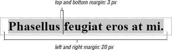
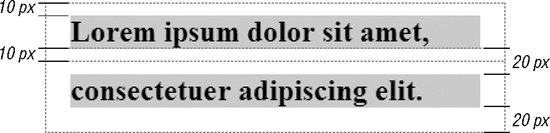
19.3.1. The Shorthand margin PropertyAs an alternative to setting margins one side at a time, there is the shorthand margin property. The accepted values are the same as those previously listed. What changes slightly is the syntax as the margin property provides a lot of flexibility for specifying values. In the values listed for margin above, the {1,4} notation means that you can provide one, two, three, or four values for a single margin property. Here's how it works. When you provide four values, the values are applied around the edges of the element in clockwise order, like this (some people use the mnemonic device "TRouBLe" for the order Top, Right, Bottom, Left): { margin: top right bottom left } The four margin properties listed in Figure 19-4 could be condensed using the margin property as so: { margin: 3px 20px 2px 20px; } When one or more of the four values is missing, certain provided values are replicated for the missing values. If three values are provided, it is assumed the value for the left margin is missing, so the value for right is used for left ({margin: top right/left bottom}). This rule, therefore, is equivalent to the previous example: { margin: 3px 20px 3px; } If two values are provided, the right value is replicated for the missing left value, and the top value is replicated for the missing bottom value ({margin: top/bottom right/left}). Again, the same effect achieved by the previous two examples could be accomplished with this rule: { margin: 3px 20px; } Finally, if only one value is provided, it is replicated for all four values. This declaration applies 20 pixels of space on all sides of an element: { margin: 20px; } 19.3.2. Margin BehaviorIt is helpful to be aware of these general margin behaviors.
|

EAN: 2147483647
Pages: 325