| Project Web Access in Project 2003 expands the exciting Web-based reporting features of Project Central in Project 2000. With the expansion of these features, a project manager is now able to share information with co-workers , managers, and executives at every level of the organization. Project Web Access now offers five different views. Table 1 describes the intended use of each view. Table 1. Available Project Web Access Views | View | Purpose | | Project | A Project view provides a detailed account of a single project. A project manager would use this type of view to track and refine a project schedule. | | Project Center | A Project Center view provides a high-level overview of multiple projects. An executive would use this type of view to examine project performance across the organization. Two Project Center views, the Portfolio Modeler and the Portfolio Analyzer, are available only in the Professional edition. | | Assignment | An Assignment view provides assignment details for one or more resources. A team leader would use this type of view to monitor the workload of his or her team. | | Resource Center | A Resource Center view provides a high-level overview of multiple resources. A resource manager would use this type of view to examine resource workloads across the organization. | | Portfolio Analyzer | A Portfolio Analyzer view provides powerful analysis capabilities directly to Project Server users. This type of view utilizes Microsoft SQL Server 2000 Analysis Services to generate OLAP cubes for querying data. The Portfolio Analyzer view is available only in the Professional edition. | To create a new view or modify an existing view, select Admin, Manage Views. Then select Add View to create a custom view. At the top of the page, you can select any of the five available views. The information displayed in the bottom sections of this page differs , depending on which view is selected. The specifications for each view have common sections, and the following sections cover each of the available sections and how to create a Portfolio Analyzer view. Table Selection For Project views, you must select the type of information you want displayed in the view. You can choose to display task, resource, or assignment information. Available Fields You can select the fields you want in your view and move them into the Displayed Fields window. Using the Up and Down buttons , you can set the display order of the fields. The top item in the Displayed Fields window will be the leftmost item on the screen. You should limit the number of fields selected to a number that can be displayed on the screen without requiring the user to scroll left to right. For each field that you add to the Displayed Fields section, you can set a specific field width (in pixels) or have the server automatically fit the field to width. TIP You cannot remove the default fields displayed when you first enter this screen. For example, if you selected a View Type of Project, then you cannot remove the Task Name , Start and Finish fields. If you wish to de- emphasize them, just move them to the end of the Displayed Fields list so that they appear last on the screen in Project Web Access.
Splitter-bar This field defines the left offset (in pixels) for the splitter bar. By setting a value of approximately 430 pixels, the splitter bar would be placed in approximately the center of the view, evenly dividing the view between the Gantt chart and data fields. Gantt Chart Format The Gantt Chart Format option allows you to select from the list of available Gantt chart formats. Project Server also offers the capability to define and configure all available Gantt chart formats. To configure Gantt chart formats, select Custom Microsoft Project Web Access and then Gantt Chart Formats from the Actions pane. The dialog box shown in Figure 3 appears. Figure 3. To rename a Gantt chart format, select the format from the drop-down list and then click the Rename button. 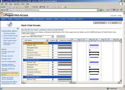 Type the new name in the New Name for Gantt Chart window, and then click the green check mark to save the changes. To modify the appearance of a Gantt chart format, select Format from the drop-down list. Then select Bar Types to Display by using the check boxes in the Display column. You can modify the appearance of any bar type by selecting the desired shape, color , pattern, endpoints, and dates from the corresponding drop-down lists. Grouping Format You can use Grouping Formats to control the appearance (that is, the color and font) of the grouping bands. You do not use formats to designate which fields are grouped. To customize a grouping style scheme, select Customize Project Web Access, and then select Grouping Formats from the sidepane. You can rename and customize grouping style schemes by following the same steps you follow to customize Gantt chart formats. Default Group , Sort This feature allows you to establish a default grouping of data for the view. Grouping can be done by any field that has been added to the view. The data can also be sorted in either ascending or descending order. Filter You use the Filter section to limit the number of rows displayed in a customized view. Filter specifications are optional. Each row in the filter specifications grid is an independent Boolean statement that can be joined with another statement by using and or or . NOTE If a task has not started, the value for Actual Start is NA. The same applies for all other date fields.
Available Categories The Available Categories section allows you to assign a new view to specific categories so that users belonging to these categories can use the view. CAUTION Be sure to click Save Changes before leaving the Specify Views page, or you will lose your changes.
Creating a Portfolio Analyzer View To create a Portfolio Analyzer view, you need to select Admin, Manage Views, Add View, and then select the Portfolio Analyzer radio button, as shown in Figure 4. Figure 4. You can choose the Portfolio Analyzer view radio button and give the view a name. 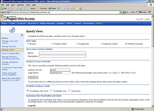 Following are the steps and parameters associated with creating a new, or modifying an existing, Portfolio Analyzer view: -
Provide a unique name for the view and describe the view. -
Specify the type of view to be created. There are three mutually exclusive view options: -
PivotTable only Creates a View that contains numeric data only. -
Chart Only Creates a view that contains graphically displayed data only. -
PivotTable with Chart Creates a view that contains both the numeric data and its associated chart. This is the default option. NOTE To describe all components of the Portfolio Analyzer view definition, the following steps assume that the option selected is PivotTable with Chart. If either of the other two options is chosen , you will not see the relevant section of the entry screen displayed. -
Initially the PivotTable is blank, as shown in Figure 5, but there are four distinct areas marked where data elements can be placed: -
Filter Fields The contents of this area act as filters for the incoming data. Information from the OLAP cube is displayed only if the incoming data meets the criteria that are defined here. -
Column Fields The fields in this area form the columns of the PivotTable spreadsheet. -
Row Fields The fields in this area form the rows of the PivotTable spreadsheet. -
Data Fields The data fields provide the values placed in each of the cells in the PivotTable spreadsheet. Figure 5. Note that the color coding of fields in an empty PivotTable maps to the different types of data that can be placed there. 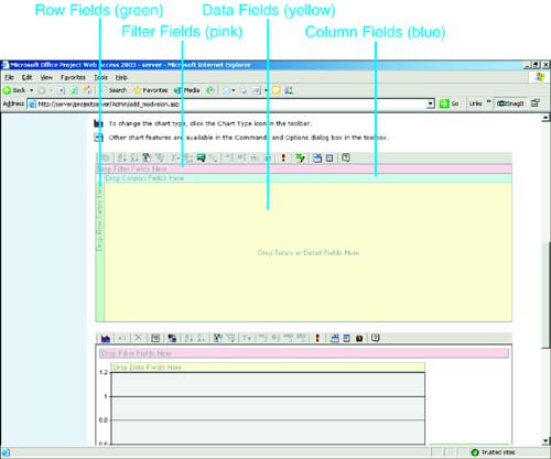 These areas are often referred to as the drop zones, where fields from the field list can be dropped. -
Specify the Pivot Graph. If data has been placed in the PivotTable, the Pivot Graph will show that data; otherwise , the Pivot Graph is initially blank. Four distinct areas are marked where data elements can be placed on a Pivot Graph. -
In the Default View Settings section, check either Show Field List or Show Toolbar to have those tools displayed by default when the user brings up this Portfolio view (see Figure 6). Figure 6. You can specify the default view settings and the categories that the view belongs to. 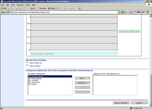 -
In the Categories section, you can restrict which users are able to see the Portfolio Analyzer view by specifying which categories the view belongs to. The valid categories are stored in the right pane. The left pane contains the categories that have been defined by the administrator but that are not able to see the view being defined. You can move entries either from the left pane to the right pane or vice versa by utilizing the Add, Add All, Remove, and Remove All buttons. Only users who have the correct authority as set by the administrator for the categories in the right pane are able to see this view. -
Populate the specific field areas in the PivotTable and/or Pivot Graph, as described in the next section, "Adding and Modifying Portfolio Analyzer View Data." Adding and Modifying Portfolio Analyzer View Data To add or modify Portfolio Analyzer View data, you need to be working with an existing Portfolio Analyzer view, as described earlier in this chapter. The following steps describe how to add or modify data on a Portfolio Analyzer Pivot Graph; you can use exactly the same process to populate the PivotTable: -
Right-click the graph area and select Field List from the list of options to bring up the Chart Field list. The Chart Field list contains a list of fields from the OLAP cube that can be used to populate the Portfolio Analyzer view with data. The Chart Field list contains two types of data, totals and dimensions: -
Totals These fields can be used to populate the Data section of the chart. To add a particular Totals field to the chart, simply drag the desired Totals field from the Field list and drop it into the Data section (colored yellow) of the chart. -
Dimensions These fields are used to subdivide and analyze the Totals data. To "slice and dice" Totals field data different ways, simply drag the desired Dimensions field from the Field list and drop it into the Filter (pink), Category (blue), or Series (green) section of the chart. The Chart Field List dialog box opens, with the Totals section expanded, as shown in Figure 7. Figure 7. The Chart Field list contains the data items that can be used on a Pivot Chart. 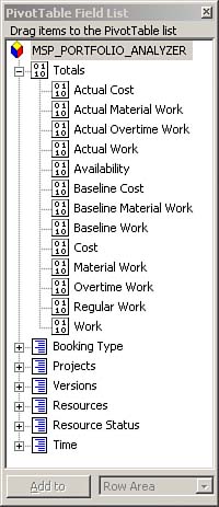 The following standard dimensions are automatically created when the OLAP cube is generated: -
Project dimension The Project dimension holds the names of all projects in the cube. -
Project Version dimension The Project Version dimension holds each project and version combination. -
Time dimension The Time dimension holds the day, week, month, quarter, and year time settings. -
Resource dimension The Resource dimension holds the resource names in the cube. -
Enterprise custom outline codes A dimension is created for each of the enterprise custom outline codes that has been defined in the Enterprise Global template. For example, if Enterprise (Resource) Custom Outline Code 1 has been defined as Skill, there is a Dimension called Skill. If the Skill code (Enterprise Custom Outline Code 1) has two levels, so will the Skill dimension. Figure 8 shows how work changes over time by using the Time dimension as a category. Figure 8. This chart displays work over time ( years ); however, any totals and dimensions can be displayed with the Time dimension. 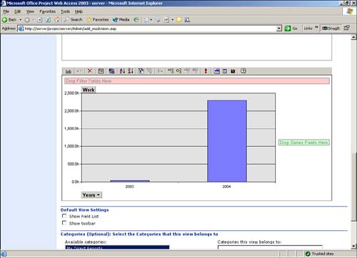 To see how work is allocated across projects, the Project dimension could be used as a category. To see how work has changed in each project over time, the Project dimension could be used as a series and the Time dimension could be used as a category. -
You can expand dimensions to reveal a lower level of data available for use. For example, expanding the Time dimension shows Day, Week, Month, Quarter, and Year. To see how work has changed by year, the Year element of the Time dimension could be dragged to the Category box. This would show one column per year. To see it at a monthly level, you would drag the Month element instead. -
Click on a Dimensions drop-down box to show the dimensions' individual entries, as shown in Figure 9. By default, all the entries are checked (that is, all skills are shown). If the list is changed, the chart is dynamically updated. Figure 9. Clicking on the Time dimension's drop-down box allows you to dynamically modify the chart. 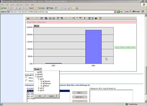 The first entry in the list is titled All. This box selects or deselects all the entries in the drop-down list. To select only a few entries from a long list, deselect the All box ( deselecting everything) and then select the required entries individually. -
To change the entries in any of the areas, first remove an existing entry. You change entries similarly to the way you add them. Click the field that needs to be removed and drag it away from the graph. You can drop it in the Chart Field list or anywhere off the chart. Then drag the new field from the Chart Field list to the required location on the chart. Making Additional Portfolio Analyzer View Customizations This section describes how to customize a Portfolio Analyzer view's graph types and how to modify the commands and options that are available to users when the Portfolio Analyzer view is displayed. The default graph type is a two-dimensional bar chart; however, many other graph types are available. You can view these graph types by selecting the Chart Wizard icon on the far right of the toolbar or the Chart List icon on the far left of the toolbar. The Command and Options icon on the toolbar allows the creator of the view to control what can be seen and what each part of the chart looks like. The following tabs appear in the chart workspace, in the Commands and Options dialog box: -
General This tab provides general formatting commands to a chart workspace or other chart areas, including the following: -
Add a Chart Legend Clicking on this icon (just below the word Add in the middle-left of the dialog box) adds a legend to the right side of the chart. This then becomes another component of the chart, and if you click it or select it from the drop-down box in the General tab, you can modify it. -
Add a Chart Title Clicking on this icon (just below the word Add in the middle-left of the dialog box) adds a chart title to the top of the chart and creates another component of the chart. If the new component is selected and the Format tab is selected, you can change the content of the title, as well as the font, the size , and the emphasis of the text. -
Border/Fill You can use the Border/Fill tab to change text and backgrounds. -
Data Details The Data Details tab shows the data connection for the chart. -
Type The Type tab shows and allows you to change the chart type. -
3D View The 3D View tab changes the parameters for the 3D view, moving the perspective and lighting. -
Series Groups The Series Groups tab allows you to merge and create a new series. -
Show/Hide There is often a difference between the fields that are available to the creator and modifier of a Portfolio Analyzer view and the fields that are available to a general user or viewer. The Show/Hide tab determines what can be viewed when the chart is published, as shown in Figure 10. Figure 10. The creator of a Portfolio Analyzer view can establish what the viewer can see. 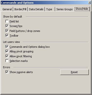 Following are the definitions for each Show/Hide tab item: -
Field List If this is not checked, new fields cannot be identified or dragged to a drop zone on the chart. -
ScreenTips If this is not checked, application hints are not displayed when the cursor hovers over certain areas of the screen. -
Field Buttons/Drop Zones If this is not checked, then it is not possible to drag items from the Field list to the drop zone, but it is possible to add items to the chart from the Add To function at the bottom of the dialog box. It is not possible to remove items from the chart when this is not checked. -
Toolbar If this is not checked, the bar at the top of the screen that controls the other functions is not displayed. With this checked, it is possible for the user to initiate the Commands and Options dialog box and change the configuration. -
Commands Options If this is not checked, the user cannot initiate the Commands and Options dialog box by clicking on the chart. -
Pivot Grouping If this is not checked, items in the drop zones can be filtered but not changed. -
Pivot Filtering If this is not checked, the user cannot select or deselect any of the level entries from the fields entered in the drop zones. -
Selection Marks If this is not checked, the marks that show the existence of the drop-down boxes for the drop zones are not displayed. This is only useful, for example, if the layout of any of the drop zones is such that the text and the box are not visible. When you have finished specifying the PivotTable or Pivot Chart, click the Save Changes button. The new Portfolio Analyzer view should now be available to all users that belong to the categories to which you've assigned the view. |