Innovative Screen Design
| < Day Day Up > |
| You're not limited to the base controls in either language. There are basic guidelines, but they're only suggestions. If you see a good idea, steal it. Imitation is the sincerest form of flattery. In the sections that follow, I'll explore some variations on the existing base control classes, and experiment with some new ideas imported from the browser environment. Extending Screen Design in Visual FoxProVisual FoxPro permits us to build rich and varied interfaces. The possibilities are limited only by the imagination . The traditional FoxPro application consists of a background screen ( _Screen as MDI form, or an MDI form screen) and the following components :
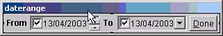
There's nothing wrong with this approach. It does everything your users need. But increasingly, we're expected to build more elegant and exciting interfaces. The Internet is one of the motivating factors; users see interesting and intuitive screen designs and ask us for similar approaches. Can we do it? Of course! All we need is ideas. The Windows Design GuideA dozen years ago, Microsoft Press published the Windows Design Guide , the internal specifications for the Microsoft Office suite spruced up for public consumption. The Windows Design Guide describes font usage, distance between controls, and usability recommendations. But it was a guide for designing three products. Database screens are a subset of that set, with considerable additional and more demanding requirements in the data entry dimension. The Windows Design Guide gives little guidance with regard to form design for database applications. But there are several places we can look to get ideas. Successful products are one area, and Web pages are another rich source of design concepts. We'll start with the most successful database application ever designed ”Quicken, from Intuit software. (An interesting historical note: Intuit was originally a printing company. The owner designed Quicken and gave it away in order to entice its users to buy preprinted checks.) The Quicken InterfaceGet Quicken 2003, install it, and start it up. You'll see the screen shown in Figure 8.5. The hallmarks of this interface include multiple frames , an icon-based toolbar across the top, links at the top of the target pane, a page frame, and a grid that contains a user control with drop-down combo boxes, links, and calendar buttons . This is the competition. Figure 8.5. The Quicken interface.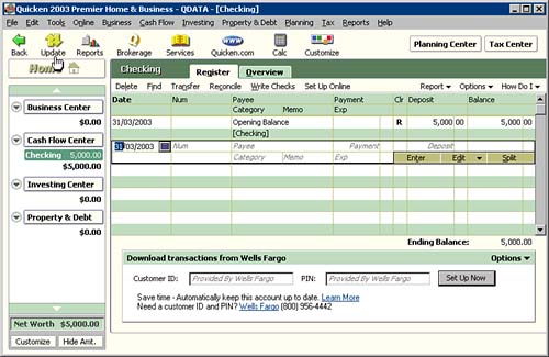 I'm going to guesstimate that Intuit spent millions of dollars designing this interface. That's a dozen staff designers (or a four-man team from Accenture) working for several years. My clients can't afford that. But the time it took to design this interface is a lot more than the time it will take to borrow and implement its main ideas. This interface also uses colors to its advantage. The alternating background color in the grid makes it easier for the eye to remember which line we're on. There are at least eight different background colors used on this screen, and nearly as many foreground colors for text. A wonderful little shareware program, GetPixel, described in the Tools section at the end of this chapter, lets you capture screen colors as RGB (Red, Green, Blue) codes. Can you implement features similar to those on the Quicken 2003 screen in FoxPro? Of course. The toolbar is actually just a series of eight image controls with Click event code. Allocate a few hours for each icon. They're really, really labor- intensive . You can capture them from someone's screen and repackage the graphic. (IconTools has an icon extractor tool for those who, like me, have no shame.) For implementing the page frame, you can use the page frame control that comes with FoxPro. But there are also third-party page frame controls, with more control over the cosmetics of the tabs. We'll see more in the section on OCX controls later. In Visual FoxPro 7, the links on the Quicken page are easily implemented using Label controls. You could use the "\<" prefix to highlight a "hotkey," but labels don't respond to Alt+Key hotkeys. So you'll probably prefer to use the FontUnderline property to underline the entire link. The MouseEnter and MouseLeave events can be used to change the color of the "link" to red when the mouse enters, and back to black when the mouse leaves . The label's Click event can launch the expected behavior. The LinkLabel control in Visual FoxPro 8 appears in the Form Controls toolbar and acts exactly as you'd expect. For dates, I built a Calendar.SCX control containing an instance of the Calendar Control 11.0 . I call it from my MyDate class, which has DblClick code to call this modal form, passing it the value of the date in the ControlSource field of the object. The Init code in Calendar.SCX displays the passed date (see Listing 8.24). Listing 8.24. Validating Date EntryPARAMETERS pdDate IF EMPTY ( pdDate ) pdDate = DATE() ENDIF WITH THISFORM .Date = pdDate .Calendar.Year = YEAR (pdDate) .Calendar.Month = MONTH(pdDate) .Calendar.Day = DAY (pdDate) ENDWITH The DblClick code on the Calendar control itself passes back the selected value (see Listing 8.25). Listing 8.25. Returning the Value Selected by the User in FoxPro Date Format*** ActiveX Control Event *** THISFORM.Date = DATE ( THIS.Year, THIS.Month, THIS.Day ) THISFORM.Release Finally, the Calendar form's Unload event passes back the selected value: RETURN THISFORM.Date The Date property is then used to set the value of the MyDate object that called it (see Listing 8.26). Listing 8.26. Popping Up the Calendar FormMyDate::DblClick: DO FORM Calendar TO Result IF NOT EMPTY ( Result ) THIS.Value = Result ENDIF You can also call the Calendar form from a CommandButton class that includes a property that is set to name the MyDate object that is to be updated if a date is picked from the Calendar screen. This works exactly like the little Calendar button on the Quicken screen. The use of data as a link, as shown in Figure 8.6, in which the "Min Bal" value that is underlined , is accomplished by displaying a subclassed Label control with a Target property that can be used in the Click event code of the subclass to DO FORM ShowBalances or whatever you want to do: MyLinkLabel::Click IF NOT EMPTY ( THIS.Target ) Cmd = THIS.Target &Cmd ENDIF Figure 8.6. Use data as a link by displaying a subclassed Label control with a Target property.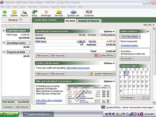 The Quicken Interface in Visual Basic .NETQuicken is pretty easy to simulate in Visual Basic .NET because it was probably written in Visual Basic 6. Refer back to Figure 8.4 as I talk about specific design elements. It's important to match screen colors, and I used to guess. Now I use GetPixel, a little utility you can find on the Internet, to exactly duplicate screen colors on screens that I like. You just run it, then position the mouse cursor over any part of the screen, and the color codes are displayed in both RGB and hexadecimal form. You can then type them into the appropriate BackColor property in your own control. The screen background color for the menu bar in Quicken 2003 is RGB(192,192,192). That's our first problem, because as of this writing the MainMenu control takes its BackColor from the System color setting. But the icons just below it have a background color of RGB(255,251,240), and because most of the form is covered by other controls, you can use that for the form's BackColor . The icons below the menu are used to launch other screens, so anything with a Click event will do. Buttons, however, have a dark border that you can't get rid of, so I used PictureBox controls. I bought IconCool from Newera Software and was about to draw some of these icons when I noticed an Import option on the File menu. I clicked it and pointed to the Quicken directory, and every time I highlighted a DLL or EXE, a list of icons appeared. Unfortunately there are dozens of DLLs in the directory, so you have to look for quite a while before you find the one containing the icons you want. Sometimes the names help, but not always. This is one time when I long for a single huge .exe like we build in FoxPro. You can also use a Capture Region function from any screen capture program ”I use HyperSnap DX from Hyperion, and it does a good job with everything. When I had my image, I dropped eight PictureBox controls on the screen, assigned my captured icon images to their Image properties, and put calls to MsgBox("Run a program here") code in the Click event code. Similarly, the Home button has soft edges that are just different enough so that a PictureBox will give you the exact look. But a Button wouldn't be a bad choice. The Click event code for this control would bring the user back to the starting screen. The Planning Center and Tax Center "buttons" involve similar cosmetic issues, so their solutions would be the same as the one chosen for the Home button. The Checking, Register, and Overview tabs suggest a page frame. However, if you add a page frame and try to come anywhere near duplicating the look on the Quicken screen, you'll see that it's not your father's page frame. This is either a third-party tool, a special page frame built at Intuit, or an illusion. Illusion is cheap and easy, so we'll go with that. Create three graphics by screen-capturing the three tabs on the Quicken screen, add your own text, and use the images for ”surprise ”three more PictureBox controls. After you've done this, displaying the appropriate child form in the area below the "tabs" is easy. The grid in the Quicken screen has two detail lines. To simulate this, you have to build UserControl s that mimic the two lines in each cell . Each row is tall enough to hold two "rows." In some columns , there's only a single row. In others, cells have buttons that display other small forms to perform special tasks . This is a very, very busy screen. But you can't argue with success. But if you click on any column heading, you see something that's very revealing . The balance in the rightmost column is dependent on what has happened in prior rows, so the value that's displayed only "makes sense" if you display transactions in chronological order. So what looks like a grid is actually a display mechanism that lists field contents for as many fields as will fit in the display area, calculating the Balance column as it goes. It's not a grid that's bound to the data; it's just an illusion. The area at the left of the screen is called a CoolBar . If you click on any selection, it expands it. All you have to do to simulate this is have a procedure that uses the name of the clicked button as a parameter, and repaints this part of the screen by adding controls as it goes. Expand the generated code for any screen that has a few controls on it and you'll see what's called for. It's not much harder than just drawing the controls on the screen. The Download Transactions from Wells Fargo block at the bottom of the screen assumes that your bank has a Web Service, or more likely a Remoting component that you can call. Web Services are very, very easy to build. They're also very, very easy to read as they stream around the Internet. Remoting allows you to encrypt the data and send it to a structure (usually a class) with exactly the same structure as the source, in a process called serialization. The Microsoft download "101 Samples for Visual Basic .NET" contains a directory named 101 VB.NET Samples\VB.NET - Advanced - Remoting - How-To TCP Remoting\ , which contains an example of how to build a remoting host and client. It's not trivial, but if you can make the sample code work, you can make your own version work as well. As an exercise, you may want to build a screen similar to some application whose look you fancy. The Quicken screen is a good challenge, but I sometimes download vertical market products with expiration dates and see what it takes to copy them. RANT <rant>I used to get requests from software developers wanting to know how to copy-protect their FoxPro executables. I'd say that if you can duplicate the look and the menu and the interface in a few hours, and simply infer how the software works from the structure of the tables in the database, copy-protecting your software is a poor way to spend your energy. I think that working hard to stay ahead of the competition is the way to succeed in the software business, and it gives the customer a better deal, too.</rant> See how close you can come without using any third-party tools. It will take a while, but you'll learn a lot. The FoxPro GridThe FoxPro grid has several new features that help spiff up your interface. The most interesting new feature is probably the row highlighting, enabled by setting the HighlightStyle to 1 or 2. If you want to use a grid as a drill-down, you'll probably want to set the ReadOnly property to .T. for all of the grid columns. The DblClick method of the grid won't help you, though; it has to be set for each of the columns in the grid. This has inspired some developers to create their own column class and build their grid programmatically when the form instantiates. It takes a little longer to write the first time, but thereafter it's effortless. The expandable display at the left of the form is built programmatically. It's a Container object. When an arrow is clicked, the components corresponding to the arrow that was clicked are added to the container, and their Top and Left properties are set on the fly. Some or all of the controls can have Click event code. So if the user clicks on the first arrow, the first group is expanded in detail; clicking on the second arrow rebuilds the container with the second group of items expanded. Buttons That Load a Different FormThe Planning Center and Tax Center buttons at the upper right of the Quicken screen bring up these two forms, respectively. This is where we can take a cue from Visual Basic. In Visual Basic .NET, you instantiate all forms at the startup of an application, then Show() them when called for. We can do the same thing in FoxPro. Alternatively we can instantiate only the startup form. Then, when a form is launched using one of the buttons, use DO FORM <FormName> NAME <FormName> This associates the form with an object which can be used to SHOW the form. The existence of the form can be tested using the form's Caption property (set in the property sheet) with WEXIST("FormName") . So if you want to launch the form only if it's not already running, and activate it if it is, the code to do this is shown in Listing 8.27. Listing 8.27. Activating a Form That Is Already Running, or Instantiating It If It's Not IF WEXIST("Customer") Customer.Show ELSE DO FORM Customer NAME Customer Customer.Show ENDIF Thus, three or four forms having the same size and shape will appear to replace one another seamlessly. It's an alternative to page frames that doesn't require the page tabs, and doesn't require addressing screen objects using THISFORM.PageFrame1.Page1.<ObjectName> . SDI FormsAlthough FoxPro developers and users are used to seeing the _Screen object in the background, and using it as the repository for _MSYSMENU , it's not the only way to do it. You can build applications that look like those written in Delphi or Visual Basic by taking a few simple steps:
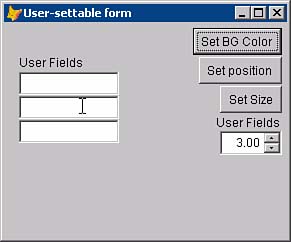
ColorsDatabase developers have been slow to adapt to the increasing use of colors in the rest of the design world. Happily, copying is easy, and there are tons of examples. The Internet is a vast source of attractive color combinations. And you don't have to be an expert. If you like it, it's a good color combination. Colors are usually specified in FoxPro using RGB color specifications; 0 is none and 255 is all there is. So RGB(255,0,0) is red, and RGB(0,0,255) is blue. In between there are about 16 million combinations. Rather than guess until you get close (admit it ”you've done it and so have I), you can use a program like GetPixel (described earlier) to move your mouse pointer over a screen element and read off the RGB values. It's so easy, and the results are a thing of beauty. So give the world of color a try. Colors in Form ControlsThe most valuable minute you can spend with FoxPro is the 60 seconds it takes to subclass the FoxPro base classes. The instant you put a few labels and text boxes on a form and decide to change the forecolor of the labels or the color that a text box assumes when it gets focus, your 60-second investment will pay for itself a thousand times. Changing the color of the active text box makes it easier to see. It takes four lines of code in the class you derive from the TextBox base class. The code is shown in Listing 8.28. Listing 8.28. Method Code for the Subclassed TextBox ControlTextBox::GotFocus() THIS.ForeColor = RGB ( 255, 255, 255 ) THIS.BackColor = RGB ( 255, 0, 0 ) TextBox::LostFocus() THIS.ForeColor = RGB ( 0, 0, 0 ) THIS.BackColor = RGB ( 255, 255, 255 ) Text Color on Command Buttons, Radio Buttons, and Check BoxesI built the form shown in Figure 8.8 to experiment with text and background colors on these three types of controls. I didn't come to any earthshaking conclusions, though. Download the code and try it for yourself; it's easy to use. Figure 8.8. A form to experiment with text colors and backgrounds on form controls.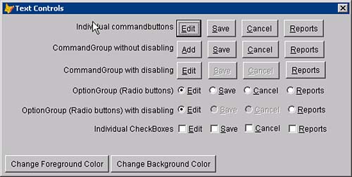 Colors on Graphical Style ControlsYou can set the Style property of command buttons, radio buttons, and check boxes to Graphical and include a picture. You can either include or exclude a caption. I've seen a lot of applications that used both images and captions, and I think they look hokey. You can use a ToolTip (set the ShowTips property of your form classes to .T. ) to display text to elucidate the meaning of a graphic. But good graphics are helpful as well. Tools like IconCool can be used to extract attractive icons from executables, so if you see something you like, imitation is the sincerest form of flattery. But there's an interesting hybrid: Use graphics that display text. They look a lot better than simple text does, and can make your screen a work of art. For example, I used IconCool to build a set of graphics that consisted simply of the captions I would normally have on my buttons. I created a colored background, then placed two copies of the text on each button. The first instance was black text; the second was white, offset one pixel up and one to the left, on top of the black text. The result is shown in Figure 8.9. Figure 8.9. Graphical controls.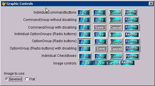 You might not appreciate my delicate color sense, but you must admit they're eye-catching. These buttons took about five minutes, and were my first effort. Figure 8.10 shows my second effort. Figure 8.10. My second try at designing graphics for my controls.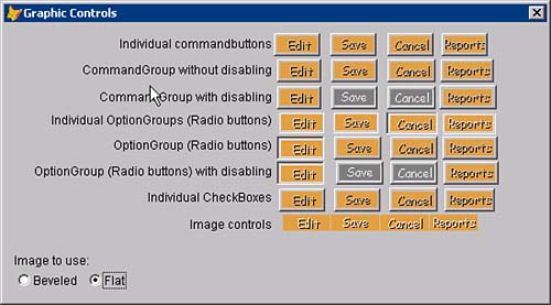 There are tiny differences that recommend each of these controls for different tasks. For example, when graphical style controls are disabled, they gray out. I usually use individual command buttons; however, if you use a command group (command buttons) or an option group (radio buttons), the selected option remains depressed. It's more obvious when you use a graphical style control. So some types of applications would definitely benefit from the choice of a graphical command group or option group. For sheer looks, I favor a line of Image controls. After all, they also have a Click event. User-Settable Form Size and LocationAlthough it's less common in database applications, in certain instances users can take control of their forms. Figure 8.11 shows a form that demonstrates three user-controlled settings that are written to a file and read back on startup: size, screen location, and the number of user fields that are displayed. Figure 8.11. User-settable options. The code to control these features is quite small (see Listing 8.29). The structure of FORMSETTINGS , the table used to store settings, is embedded in comments within the listing. Listing 8.29. User-Settable OptionsPROCEDURE Resize FOR EACH Ctrl IN THISFORM.Controls IF Ctrl.Tag = [Anchor] Ctrl.Left = THISFORM.Width - Ctrl.Width - 5 ENDIF ENDFOR ENDPROC PROCEDURE Init GetProps ( THISFORM ) THISFORM.Resize THISFORM.UserFieldsTitle.Visible = ( THISFORM.UserFields > 0 ) FOR I = 1 TO THISFORM.UserFields ObjName = [Text] + TRANSFORM(I,[@L ##]) ClsName = [UserTextBox] ClsLib = [pinter.vcx] THISFORM.NewObject ( ObjName, ClsName, ClsLib,, I ) THISFORM.&ObjName..Visible = .T. ENDFOR ENDPROC PROCEDURE cmdsetbgcolor.Click SaveColor = THISFORM.BackColor THISFORM.BackColor = GETCOLOR() IF MESSAGEBOX( "Save this color?", 292 ) <> 6 THISFORM.BackColor = SaveColor ELSE SetProp( THISFORM, [BackColor] ) ENDIF ENDPROC PROCEDURE cmdsetposition.Click SetProp( THISFORM, [Top] ) SetProp( THISFORM, [Left] ) ENDPROC PROCEDURE cmdsetsize.Click SetProp( THISFORM, [Height] ) SetProp( THISFORM, [Width] ) ENDPROC PROCEDURE spnuserfieldcounter.Valid SetProp( THISFORM, [UserFields] ) ENDPROC PROCEDURE SetProps * Program-ID...: SetProps.PRG * Used in User-settable forms PARAMETERS oForm, cProp IF NOT USED ( 'FormSettings') SELECT 0 USE FormSettings ENDIF SELECT FormSettings * Structure for FORMSETTINGS.DBF: * Field Field Name Type Width * 1 FORMNAME Character 10 * 2 PROPERTY Character 20 * 3 PROPTYPE Character 1 * 4 PROPVALUE Character 20 GO TOP LOCATE FOR UPPER(FormName) = UPPER(oForm.Name) AND Property = cProp IF NOT FOUND() APPEND BLANK REPLACE FormName WITH oForm.Name, Property WITH cProp ENDIF REPLACE NEXT 1 PropValue WITH [] Cmd = [REPLACE NEXT 1 PropValue WITH "] ; + ALLTRIM(TRANSFORM( oForm.&cProp. )) + ["] &Cmd REPLACE NEXT 1 PropType WITH VARTYPE ( oForm.&cProp. ) ENDPROC PROCEDURE GETPROPS * Program-ID...: GetProps.PRG * Used in User-settable forms PARAMETERS oForm SaveAlias = ALIAS() IF NOT USED ( 'FormSettings') SELECT 0 USE FormSettings ENDIF SELECT FormSettings SELECT * FROM FormSettings ; WHERE UPPER(formname) = UPPER(oForm.Name) ; INTO ARRAY aProps IF _Tally = 0 RETURN ENDIF FOR I = 1 TO ALEN (aProps, 1 ) cProp = ALLTRIM(aProps(I,2)) cPropType = ALLTRIM(aProps(I,3)) cPropVal = ALLTRIM(aProps(I,4)) DO CASE CASE cPropType $ [IN] cPropVal = VAL(cPropVal) CASE cPropType = [C] cPropVal = VAL(cPropVal) CASE cPropType = [L] cPropVal = IIF(cPropVal=[.T.],.T.,.F.) ENDCASE oForm.&Cprop. = cPropVal ENDFOR IF NOT EMPTY ( SaveAlias ) SELECT ( SaveAlias ) ENDIF ENDPROC Grids ReduxWe looked at grid settings earlier, but if you don't like what you see, it's not too hard to write your own. I wrote my own code to build the gorgeous grid shown in Figure 8.12. Figure 8.12. A home-built grid.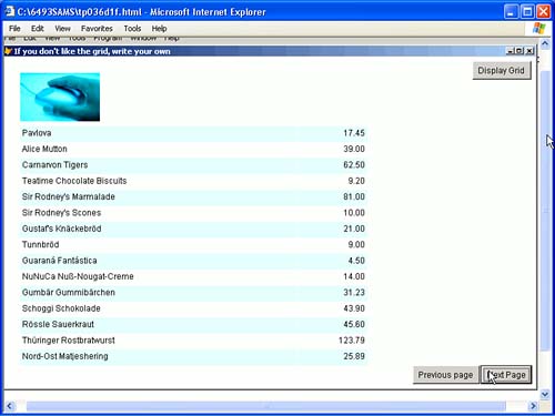 The code to do this is ready to turn into a class that you can use on your own forms (see Listing 8.30). Listing 8.30. A Home-Built Grid PROCEDURE ListRecords WITH THISFORM * Remove any previously displayed objects: CellCount = 0 DIMENSION CellList(1) FOR EACH Ctrl IN THISFORM.Controls IF UPPER(Ctrl.Name) = [CELL] CellCount = CellCount + 1 DIMENSION CellList(CellCount) CellList(CellCount) = Ctrl.Name ENDIF ENDFOR IF CellCount > 0 FOR EACH Ctrl IN CellList .RemoveObject ( Ctrl ) ENDFOR ENDIF RELEASE CellList, CellCount Flipper = 1 GO ( .StartTop ) .LastTop = RECNO() CellTop = .CellTop SCAN WHILE CellTop < ( .Height - 50 ) CellName1 = "Cell1" + TRANSFORM(CellTop) CellName2 = "Cell2" + TRANSFORM(CellTop) IF MOD(Flipper,2) = 1 .AddObject ( Cellname1, "Even", CellTop, 25, 400, ; "SQLResult.ProductName" ) .AddObject ( Cellname2, "Even", CellTop, 426,100, ; "SQLResult.UnitPrice" ) ELSE .AddObject ( Cellname1, "Odd", CellTop, 25, 400, ; "SQLResult.ProductName" ) .AddObject ( Cellname2, "Odd", CellTop, 426,100, ; "SQLResult.UnitPrice" ) ENDIF .&CellName1..Visible = .T. .&CellName2..Visible = .T. .&CellName2..InputMask = [#,###.##] CellTop = CellTop + 23 Flipper = IIF ( Flipper = 1, 2, 1 ) ENDSCAN ENDWITH ENDPROC PROCEDURE Load lcStr = "driver={SQL Server};server=(local);database=northwind;uid=sa;pwd=;" Handle = SQLSTRINGCONNECT( lcStr ) IF Handle < 1 MESSAGEBOX( "Couldn't connect to SQL server", 16 ) RETURN .F. ENDIF lr = SQLEXEC( Handle, "SELECT * FROM PRODUCTS" ) IF lr < 0 MESSAGEBOX( "Couldn't return data", 16 ) RETURN .F. ENDIF SQLDISCONNECT(0) SET CLASSLIB TO FormLib ENDPROC PROCEDURE Unload USE ENDPROC PROCEDURE command1.Click THISFORM.Image1.Visible = .T. THISFORM.PageTops(1) = 1 THISFORM.cmdNext.Click ENDPROC PROCEDURE cmdprevious.Click WITH THISFORM .PageCounter = .PageCounter - 1 IF .PageCounter < 2 .PageCounter = 1 .cmdPrevious.Enabled = .F. ENDIF .StartTop = .Pagetops(.PageCounter) .ListRecords .cmdNext.Enabled = .T. ENDWITH ENDPROC PROCEDURE cmdnext.Click WITH THISFORM .StartTop = RECNO() .ListRecords .PageCounter = .PageCounter + 1 DIMENSION .PageTops ( .PageCounter ) .PageTops(.PageCounter) = .StartTop IF EOF() THIS.Enabled = .F. ENDIF IF .PageCounter > 1 .cmdPrevious.Enabled = .T. ENDIF ENDWITH ENDPROC Figure 8.13 shows a grid that sports incremental searching. Figure 8.13. A grid with incremental searching. Listing 8.31 shows the code for this grid, all of it in the KeyPress event of the form. Listing 8.31. A Grid with Incremental Searching* Form KeyPress event code: LPARAMETERS nKeyCode, nShiftAltCtrl WITH THISFORM IF nKeyCode = 13 .Grid1.DblClick NODEFAULT RETURN ENDIF IF NOT BETWEEN ( nKeyCode, 64, 128 ) RETURN ENDIF .Label3.Visible = .T. .SearchLabel.Visible = .T. THIS.SearchLabel.Caption = UPPER(CHR(nKeyCode)) LOCATE FOR UPPER(EVALUATE(THISFORM.KeyField)) = THIS.SearchLabel.Caption .Label3.Visible = .T. IF NOT FOUND() Msg = THIS.SearchLabel.Caption + " not found" MESSAGEBOX( Msg, 16, [Search], 1000 ) THIS.Caption = Msg RETURN ENDIF .Grid1.SetFocus Start = SECONDS() DO WHILE SECONDS() - Start < 1 .KeyPreview= .F. a = INKEY() THIS.SearchLabel.Caption = THIS.SearchLabel.Caption + UPPER(CHR(a)) LOCATE FOR UPPER(EVALUATE(THISFORM.KeyField)) = THIS.SearchLabel.Caption .Label3.Visible = .T. IF NOT FOUND() Msg = THIS.SearchLabel.Caption + " not found" MESSAGEBOX( Msg, 16, [Search], 1000 ) THIS.Caption = Msg EXIT ENDIF .Grid1.SetFocus ENDDO .KeyPreview = .T. .Label3.Visible = .F. .SearchLabel.Visible = .F. ENDWITH Sometimes all you need is color to make a grid work for you. The grid in Figure 8.14 is similar to one that I did for a shipping company a few years ago. Figure 8.14. Color-coded grid using a timer.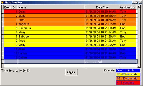 This demo represents a pizza parlor, and shows the times when orders will need to be removed from the oven. As the critical time nears, the row color changes from blue to yellow to orange to red. All it takes is a single line of code in the DynamicBackColor property of each grid column, as shown in Listing 8.32. Listing 8.32. A Color-Coded GridIIF(DateTime-DateTime()>60,RGB(0,0,255), ; IIF(DateTime-DateTime()>30,RGB(255,255,0), ; IIF(DateTime-DateTime()>15,RGB(255,128,0), ; RGB(255,0,0)))) Tree Views and Lists in FoxProFor smaller amounts of data, lists offer a clean and simple object. The DblClick event fires anywhere on a row, and doesn't require coding a DblClick event for each column as grids do. However, don't try this if you have more than a few hundred items to load ”maybe a thousand tops. It gets real slow. There are nine ways to load a ListBox . However, only one of them really works. Use this paradigm shown in Listing 8.33 to load multicolumn lists. Listing 8.33. Loading Multicolumn List BoxesWITH THISFORM.List1 .Clear SCAN .AddListItem ( Column1 ) Row = .NewItemID .AddListItem ( Column2, Row, 2 ) ENDSCAN ENDWITH Tree views are very interesting, and much maligned. Unlike any of the FoxPro controls besides the grid (before the arrival of the XMLAdapter , that is), they're the only control that contains a second object inside them (the Node object) that you have to instantiate before you can use the container control. As a result, they don't work and you can't look inside them to figure them out. Luckily, Microsoft has provided us with a simple example, the BldTree.SCX solution form in the Solutions subdirectory of the FoxPro home directory. It's shown in Figure 8.15, and contains method code to do just about anything you'd want to do. Figure 8.15. The BldTree form from the Visual FoxPro Solutions examples.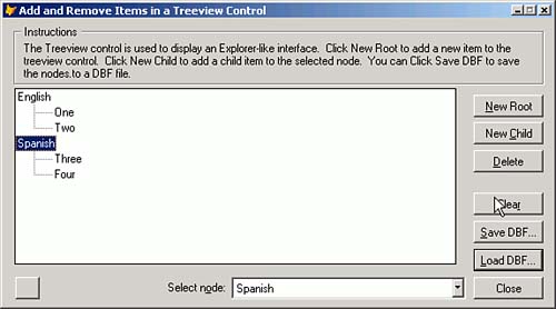 TIP The sample code takes whatever you want to load and puts it into a two-column table that you can understand. The data is then loaded from this temporary two-column table. I strongly recommend that you do likewise. Build Your Own MenuThe Internet has given us some interesting technologies. The best of them is the variety of menuing systems in browser screens. What a coincidence ; the worst thing about FoxPro is its menuing system. So can we borrow some of this technology? Figure 8.16 says Yes. Figure 8.16. A JavaScript-style menu in a FoxPro screen.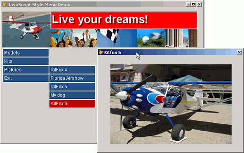 I wrote a little class library that's pretty easy to use. You place the JavaMenu class anywhere on the screen, even though it's a nonvisual class, and the code uses its placement on the form to position the first menu element. The rest of the menu pads (the first column) and the menu bars (the selections dependent on the currently selected menu pad) are placed automatically relative to the first element. The menu loads from a table contains the data shown in Figure 8.17. Figure 8.17. Contents of MENU.DBF .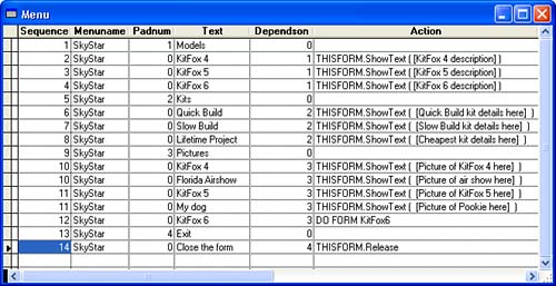 Listing 8.34 gives you the code. Listing 8.34. JavaMenu CodeDEFINE CLASS javamenu AS custom initialx = 0 x = 0 initialy = 0 y = 0 normalcolor = (RGB(43,85,128)) livecolor = (RGB(192,0,0)) textcolor = (RGB(255,255,255)) cellheight = 22 cellwidth = 100 Name = "javamenu" *-- Name of the menu to load from MENU.DBF. menuname = .F. DIMENSION menu[1,1] DIMENSION action[1,1] PROCEDURE showmenu PARAMETERS nItemNumber WITH THISFORM IF NOT EMPTY ( nItemNumber ) .LockScreen = .T. DIMENSION oList ( .Objects.Count ) FOR I = 1 TO .Objects.Count oList ( I ) = .Objects(I).Name ENDFOR FOR I = 1 TO ALEN ( oList ) IF oList(I) = [Bar] .RemoveObject ( oList(I) ) ENDIF ENDFOR .LockScreen = .F. ENDIF ENDWITH THIS.LoadMenu ( nItemNumber ) IF VARTYPE ( THIS.Menu(1,1) ) <> [C] RETURN ENDIF FOR I = 1 TO ALEN ( THIS.Menu, 1 ) THIS.AddCell ( THISFORM, I, ALLTRIM(THIS.Menu(I,1) ), nItemNumber ) ENDFOR ENDPROC PROCEDURE addcell PARAMETERS oForm, nRow, MenuItemText, nItemNum WITH oForm CellName = IIF ( EMPTY(nItemNum), "Pad", "Bar" ) cName = CellName + TRANSFORM ( nRow ) IF PEMSTATUS ( THISFORM, cName, 5 ) RETURN ENDIF .NewObject ( cName, "MenuItem", "pinter.vcx" ) WITH .&cName. .Top = THIS.X .Left = THIS.Y .BackColor = THIS.NormalColor .ForeColor = THIS.TextColor .ActiveColor = THIS.LiveColor .InactiveColor = THIS.NormalColor .Value = MenuItemText .Width = THIS.CellWidth .Height = THIS.CellHeight THIS.X = THIS.X + .Height .Visible = .T. ENDWITH ENDWITH ENDPROC PROCEDURE loadmenu PARAMETERS nItemNum IF NOT USED ( [MENU] ) SELECT 0 USE MENU ENDIF DIMENSION THIS.Menu ( 1, 2 ) IF EMPTY ( nItemNum ) SELECT Text, PadNum ; FROM MENU ; WHERE MenuName = THIS.MenuName ; AND PadNum > 0 ; ORDER BY Sequence ; INTO ARRAY THIS.Menu ELSE SELECT Text, Action ; FROM MENU ; WHERE MenuName = THIS.MenuName ; AND DependsOn = nItemNum ; ORDER BY Sequence ; INTO ARRAY THIS.Menu ENDIF IF _Tally = 0 MESSAGEBOX( [No menu defined in MENU.DBF with MenuName "] ; + THIS.MenuName + ["], 16, [Programmer error], 3000 ) THIS.Menu(1,1) = .F. ENDIF ENDPROC PROCEDURE bouncingform PARAMETERS oCell, FormName oCell.Bounce DO FORM ( FormName ) ENDPROC PROCEDURE Init THIS.X = THIS.Top THIS.Y = THIS.Left * If specified, InitialX and InitialY reposition the menu: IF THIS.InitialX > 0 THIS.X = THIS.InitialX ENDIF IF THIS.InitialY > 0 THIS.Y = THIS.InitialY ENDIF THIS.ShowMenu() ENDPROC ENDDEFINE DEFINE CLASS menuitem AS editbox Height = 18 ScrollBars = 0 SpecialEffect = 1 Width = 136 BorderColor = RGB(255,255,255) activecolor = (RGB(255,0,0)) droppable = .F. Name = "menuitem" inactivecolor = .F. PROCEDURE Click IF THIS.Name <> [Bar] RETURN ENDIF IF THIS.Droppable WITH THISFORM DIMENSION oList ( .Objects.Count ) FOR I = 1 TO .Objects.Count oList ( I ) = .Objects(I).Name ENDFOR FOR I = 1 TO ALEN ( oList ) IF oList(I) = [Bar] AND oList(I) <> THIS.Name .RemoveObject ( oList(I) ) ENDIF ENDFOR ENDWITH FOR I = THIS.Top TO THIS.Parent.Height - THIS.Height STEP 10 a=INKEY(.02) THIS.Top = I ENDFOR A=INKEY(.1) THIS.Visible = .F. ENDIF ActionNum = VAL ( RIGHT ( THIS.Name, 1 ) ) Cmd = THISFORM.JavaMenu1.Menu ( ActionNum, 2 ) &Cmd IF THIS.Droppable THISFORM.RemoveObject ( THIS.Name ) ENDIF ENDPROC PROCEDURE Init PARAMETERS nTop, nLeft IF PCOUNT() > 0 THIS.Top = nTop THIS.Left = nLeft ENDIF ENDPROC PROCEDURE MouseEnter LPARAMETERS nButton, nShift, nXCoord, nYCoord THIS.BackColor = THIS.ActiveColor IF THIS.Name = [Bar] RETURN ENDIF IF nXCoord <= THIS.Left OR nXCoord >= ( THIS.Left + THIS.Width ) RETURN ENDIF WITH THISFORM .LockScreen = .T. WITH .JavaMenu1 .X = THIS.Top .Y = THIS.Left + THIS.Width .ShowMenu ( VAL ( RIGHT ( THIS.Name, 1 ) ) ) ENDWITH .LockScreen = .F. ENDWITH ENDPROC PROCEDURE MouseLeave LPARAMETERS nButton, nShift, nXCoord, nYCoord THIS.BackColor = THIS.InactiveColor ENDPROC ActiveX ControlsVisual Basic .NET includes a huge number of controls; I count 49 as of this writing, although some of them (like the Color dialog) are functions or foundation classes in FoxPro. To use them, you drag them from the toolbox and drop them on the design surface. If they're nonvisual, as is the case with data components and dialogs and printing components, or hybrids like the MainMenu control, they appear in the tray at the bottom of the designer. Otherwise, they appear wherever you put them on the screen. In FoxPro, the form controls constitute only the basic visual components. The form controls that come with FoxPro are not the only ones you can use on your screens. There is a whole universe of OCX and DLL controls that can enhance the appearance and usability of your application. The collective name for this type of control is ActiveX. Some are installed as a part of Windows; others are added when you install FoxPro or other languages. And some are installed as part of other software, like Adobe Acrobat, WinDiff, or other programs. You can use any of them on your FoxPro forms. Select Tools, Options, Controls from the FoxPro IDE menu. You'll see a long list of installed controls. The names are not always perfectly indicative of their function, but many are recognizable. Figure 8.18 contains a sampling of them. Figure 8.18. Miscellaneous OCX controls.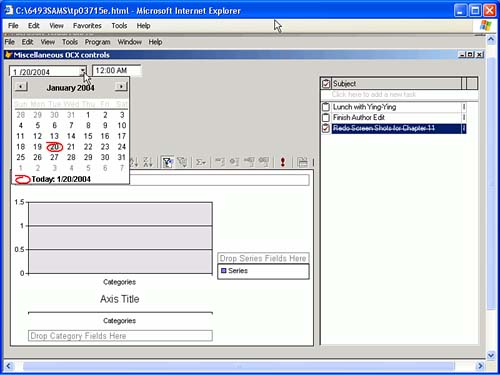 The Microsoft Date and Time picker is an excellent replacement for FoxPro's TextBox with date formatting. It returns numeric values for Month, Day, and Year. ActiveX controls don't have the ability to bind to FoxPro controls ”they don't have a ControlSource property. So, you'll need to add something like the code shown in the LostFocus event of the control in order to convert the date back to FoxPro date format and put it into the field: REPLACE ShipDate DATE ( THIS.Year, THIS.Month, THIS.Day ) Similarly, controls like the Infragistics ScheduleX DayView and the TaskPad return lists that must be manually loaded from and stored back to your own tables. It usually requires only a SCAN...ENDSCAN to load and a FOR EACH...ENDFOR to save them. Some ActiveX controls are installed by software that you install. I don't even know where the CurveFitter that appears in my COM objects list came from. And sometimes, you'll simply be amazed. For example, I bought BeyondCompare from ScooterSoftware.com to compare edited source code files. While writing this chapter, I was looking at my ActiveX controls and found one called DiffView . I noticed that it had a method called DiffTwoFiles with two filename parameters. So I dropped it on the OCX testbed form shown in Figure 8.18, and added two text boxes with THIS.Value = GetFile([PRG]) in the DblClick events. Download the source code and try it to see what happens. There are a number of vendors that are aware of FoxPro developers' needs and cater to them. DBI Technologies (dbi-tech.com) has been FoxPro-friendly for years. HALLoGRAM.com, Infragistics.com, ComponentSource.com, and NewObjects.com are good sources for these valuable tools. Build Your Own ControlsOne of the best ways to enhance your interface is to build controls that do exactly what you want. They also make development easier because you can drop them on any screen with similar requirements. The screen shown in Figure 8.19 contains a Date Range control that lets users pick a starting and ending date for reports. It makes the task quick and easy in several ways:
Figure 8.19. A date range picker. I used a Container control to build this custom class. I added two labels, two Date/Time Picker ActiveX controls, and a CommandButton . The ActiveX controls have a custom property dialog that you can use to set various properties, such as the Checked property, which sets the date value to NULL if unchecked, allowing the user to say that the date doesn't matter in a simpler way than blanking out the date. We can't build custom property sheets in FoxPro, although you can in Visual Studio .NET. It's a nice touch. The Init code takes two parameters that are used to pass information back to the form. If we used a modal form, this wouldn't be required, but I wanted to show something a little different (see Listing 8.35). Listing 8.35. The Init Code for the DateRange ControlPARAMETERS pDateFieldName, pDestination IF PCOUNT() < 1 MESSAGEBOX( [You must pass a date field name to this control] ) RETURN .F. ENDIF IF PCOUNT() < 2 MESSAGEBOX( [You must pass a target property name to this control] ) RETURN .F. ENDIF THIS.DateFieldName = pDateFieldName THIS.Destination = pDestination The Done::Click code formats the date and uses macro expansion to fill in the target field: WITH THIS.Parent * Note: Unchecking changes the date control's value to .NULL. DateExpr = [] DO CASE * Both checked, no date entered - assume all dates CASE NOT ISNULL ( .FromDate.Object.Value ) ; AND NOT ISNULL ( .ToDate.Object.Value ) ; AND EMPTY ( .FromDate.Object.Value ) ; AND EMPTY ( .ToDate.Object.Value ) DateExpr = [BETWEEN (] + .DateFieldName ; + [, {1/1/1900}, {12/31/2089})] * First checked, second date not checked; assume single day CASE NOT ISNULL ( .FromDate.Object.Value ) ; AND ISNULL ( .ToDate.Object.Value ) DateExpr = [BETWEEN (] + .DateFieldName + [, {] ; + LEFT(TTOC ( .FromDate.Object.Value ),10) + [},] ; + [{] + LEFT(TTOC ( .FromDate.Object.Value ),10) + [})] * Both checked, both entered CASE NOT ISNULL ( .FromDate.Object.Value ) ; AND NOT ISNULL ( .ToDate.Object.Value ) ; AND NOT EMPTY ( .FromDate.Object.Value ) ; AND NOT EMPTY ( .ToDate.Object.Value ) DateExpr = [BETWEEN (] + .DateFieldName + [, {] ; + LEFT(TTOC ( .FromDate.Object.Value ),10) + [},] ; + [{] + LEFT(TTOC ( .ToDate.Object.Value ),10) + [})] ENDCASE Dest = .Destination &Dest = DateExpr THISFORM.Refresh FOR EACH oItem IN THIS.Parent.Objects oItem.Visible = .F. ENDFOR .Visible = .F. ENDWITH The form shown in Figure 8.20 demonstrates one use of this control. In lieu of displaying the data, I just show the resulting query. Figure 8.20. The date range picker in action.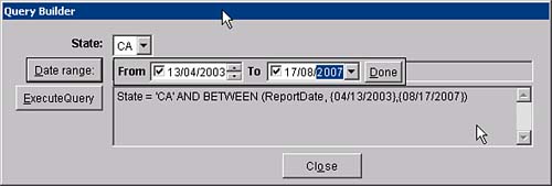 Listing 8.36 shows the code that makes this control work ( DateRange::Click ). Listing 8.36. Implementing the Date Range PickerWITH THISFORM IF NOT PEMSTATUS ( THISFORM, [DateFilter], 5 ) .AddProperty ( [DateFilter], [] ) .DateFilter = [Pending...] .Text2.ControlSource = [THISFORM.DateFilter] .NewObject ( ; [DateRange1],[DateRange],[pinter.vcx],[],[ReportDate],[THISFORM.DateFilter]) ENDIF WITH .DateRange1 FOR EACH oItem IN .Objects oItem.Visible = .T. ENDFOR .Top = THIS.Top .Left= THIS.Left + THIS.Width + 10 .Visible = .T. .SetFocus ENDWITH ENDWITH Listing 8.37 shows the required implementation code ( ExecuteQuery::Click ). Listing 8.37. Implementing the Date Range PickerWITH THISFORM .Edit1.Value = [SELECT * FROM ORDERS] Cmd1 = [] Cmd2 = [] IF NOT EMPTY ( .Combo1.Value ) Cmd1 = [ AND State = '] + .Combo1.Value + ['] ENDIF IF NOT EMPTY ( .Text2.Value ) Cmd2 = [ AND ] + .Text2.Value ENDIF Cmd = Cmd1 + Cmd2 IF NOT EMPTY ( Cmd ) .Edit1.Value = SUBSTR ( Cmd, 6 ) ENDIF .Edit1.Refresh ENDWITH |
| < Day Day Up > |
EAN: 2147483647
Pages: 130