Hack91.Distribute Reports Wisely
Hack 91. Distribute Reports Wisely
Don't waste people's time by sending out pages and pages of data Given all you've learned at this point in the book, I'm sure you're thinking "That's a lot of information to communicate." You're right, it is. Fortunately there are some simple, effective strategies for distributing reports that take advantage of what we know about people's relationships with information. While I'm forced to use some generalities, experience tells me that often these assumptions hold up under scrutiny and can help you make better decisions about who gets what report when. 7.2.1. Give the People What They Want, or Better Yet, What They NeedPeople have a tendency, when volumes of data are available, to present volumes of data and let the reader sort it out; this is often the case with web measurement data. The problem with this strategy is that it assumes the reader will take the time to figure out which information is relevant to her; this is rarely the case in web measurement, usually because the data is foreign to most people. The best strategy to get people to invest their time is to give them the data they need to do their job and little else. If you take the time to figure out which data is most relevant to a person or group within your company and present that data in language they use and understand, you'll see your efforts pay off, and inevitably your recipients will ask different and, hopefully, better questions. 7.2.2. Use the Same Language Your Audience Uses Whenever PossibleRather than using the technical jargon used throughout this book, seriously consider translating your reports into the same language your business uses. Other than the fundamental definitions of page view, visit, unique visitors, and referrers [Hack #1], which are important to define clearly for your audience, make sure they understand each termpresenting web site activities in the lingua franca of your company is highly recommended. This is essentially an "if it ain't broke, don't fix it" recommendation. Also, keep in mind that some people are more visual than others and that images can augment language in ways you don't expect. 7.2.3. A Picture Says a Thousand WordsWhile much of the data you're collecting and analyzing is presented back to you in rows and columns, try and keep in mind the value of using images when presenting complex information. You don't have to go out of your way to read Edward Tufte's The Visual Display of Quantitative Information (Graphics Press, 1992), but make use of visual elements whenever appropriate. For example, Figure 7-1 shows how raw data can be transformed into a much more dramatic presentation. Figure 7-1. Rich presentation in Visual Science's Visual Workstation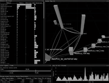 Of course, you don't always have to go to such extremes. If you're absolutely unable to visually represent the data, do simple things such as using up and down arrows to represent trends; color "good" numbers in green and "bad" numbers in red [Hack #92]; use bold, italics, and underline strategically to highlight information; and leverage ratios to convey as much information as possible. 7.2.4. Ratios Are Better than CountsWhile the difference between a ratio and a key performance indicator [Hack #94] is subtle at best, the difference between a count and a ratio is not. Would you rather know that 1,000 people bought something at your web site yesterday or that 16 percent of all visitors made a purchase? OK, sure, you probably want to know both, but the 1,000 people are presented out of context. "A thousand customers" is great news if you had only 10,000 visitors (a 10 percent conversion rate!) but slightly less good news if you had 1,000,000 visitors. Plus, there is tremendous value in comparing timeframes (this day versus this day last week, for example), which is very difficult to do when presenting only a raw measurement. When in doubt, present both a meaningful ratio and the counts that support it, as shown in Figure 7-2. Figure 7-2. Key performance indicators and supporting metrics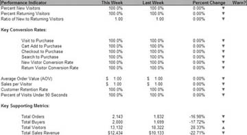 7.2.5. Distribute Reports RegularlyOne of the worst mistakes businesses make regarding web measurement data is to look at it infrequently or only on an ad hoc basis. Because this data is not the kind many have experience with, it's important to keep people's attention focused; the best way to do this is by getting reports in front of them frequently enough to generate familiarity and help them do their jobs better. If your marketing staffs tweak their advertising purchases on a weekly basis, make sure their marketing report is in their inbox at the beginning of every week. If your merchandising staffs rotate products every few days, make sure their merchandising reports are delivered every day. You have to be especially careful regarding the timing of report delivery and consider the previous four recommendations. If you provide too much data, use confusing language, or make them scan ugly tables to mine for actionable information, it won't matter how often you send the report, because it will always end up in the garbage. Conversely, if you do a good job of presenting the information people need to do their jobs in an easily understood format, you'll be generating a report that people expect and rely upon for their ongoing success. |
EAN: 2147483647
Pages: 157