War Between the States User Interface (UI)
|
|
The user interface for our purpose was conceived with the intention to provide first and foremost a straightforward and meaningful set of tools to be used continuously throughout War Between the States. To give you an insight into the reason behind our chosen idea for the UI, let us first show an example of a screen from War Between the States’ user interface.
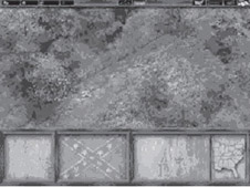
Figure 1: War Between the States UI
As you can see, our layout has a unique and smooth flow to it. The idea behind creating a flawless interface begins with understanding how the game will play out and how the user will “read” the screen. For War Between the States, the game plays out with the user’s vantage point (being one from above at a slight angle). The view can be rotated along a Z-axis, moved directionally along the X- and Y-axis, and zoomed in and out. With these settings, our major “Play/Motion” of the viewing screen will be one that consists mostly of scrolling throughout the world. In order for us to take advantage of this motion and use its flow consistently with that of our user interface, we decided to divide it with a top bar and a lower bar. A distinct difference in size is noticeable, and for our purpose the larger of the two was placed at the bottom of the screen to give the impression of a strong and solid foundation from which to display the “Game Screen.” These two bars section off the screen in an even and calm fashion providing an almost “framed” impression. With the smaller top bar that supports the more important and most-used information and the lower bar containing the broader sets of information, the UI bars divide themselves appropriately pertaining to how we “read” the screen.
To continue with this thought, the layout also added a strong visual effect for the “read” of the screen. The most common way of viewing a screen is as we read from left to right and top to bottom. Therefore the UI bars’ horizontal construction subtly moves the user across and throughout the screen. Remember as a designer and artist, we must realize that it is our job to subconsciously direct and lead the users where we want them to go for the sole purpose of providing them the greatest experience possible.
There are multiple UI bars to choose from in War Between the States and each with its own distinct look and feel. When approaching the base set of colors and tones used for the UI bars, it is best to create an image that will stand out when it is looked at and gently fade into the background when it is not being looked at. There are several things that can affect how a UI bar is viewed, one being if the UI bar is too detailed and “busy” it tends to distract the user from the game as well as make it difficult to quickly access the information needed throughout the game. Dead space, unused space, and “bad negative space” on a UI bar also creates eyesores that distract the user, and it would be best to avoid such cases.
Aside from the color and other artistic renderings applied to a UI bar, the entire shape of the UI bar also dictates how well the user will react. For our game, we have chosen a clean-cut look with solid color schemes and layouts. The UI bars that border our gaming screens have been created with a straight bar across. This was chosen so that we could keep the UI bars from becoming too complex looking as well as to aide us in not creating a feeling of parts of the scene appearing hidden behind a cut up user interface. Now these things are very subtle, but they are what make the difference between a UI that works well and one that does not for this game. This does not mean that other UI screens cannot work, but for ours, this type of layout is by far the most comprehensive and complimentary to our game type and idea.
For a visual demonstration of what I have been talking about I have prepared a few examples that compare other user interfaces.
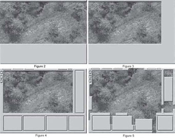
As you can see, each is quite different and unique. Starting with Figure 3, the major difference is the addition of a right side bar. This is an excellent example of how the flow of the eye can be immediately stopped and the fluid motion from point to point on the screen is disrupted. It does allow for more options on the screen, which means more buttons but also more distractions. If a right side bar is to be added, the best advice artistically speaking is to frame in the entire screen. What that will produce is a much more evenly balanced and visually pleasing layout. Examining Figure 4, it allows the eye to find and better focus in on what the designer wants them to focus on. What happens without the left UI bar, simply put, is a process where the eye will overfocus on either the game screen or the UI and not create the smooth flow between the two, or it will cause the eye to slip to the left of the viewing screen subconsciously because of the open area at the edge of the screen. One other thing we avoided was breaking the UI screen in to several pieces along its horizontal line. As you can see from Figure 5, when a UI is broken up such as this, it again does not allow for even flow across. It creates a definite stop and restart. This slows the process and adds more time getting the information needed.

With Figure 5, we see a segmented UI that needs some help. Cutting up a UI can work, but not like this. If a UI is going to be cut up, it needs to have a good reason for being cut into separate pieces. One reason that comes to mind is that the information in each box is very different and need not be placed next to any other UI information. Another is that there may be so little information needed that to artistically create a well-balanced layout, the UI bars and buttons are separated across the gaming screen. See Figure 6.
As designers and artists, we are trying to create works of art with every frame of motion in a game. As any artist will tell you, no matter how beautiful the painting, if its frame is bad it will only lessen the impact of the image.
|
|
EAN: 2147483647
Pages: 179