| Let's examine a more complex example, employing a list and event handlers. Listing 23.3 demonstrates a stock price application, utilizing multiple mobile Web forms in a single page. This listing highlights many of the most common features found in mobile Web applications. You'll see just how easy it is to build mobile pages, especially with your existing knowledge of ASP.NET pages. Listing 23.3 Handling User Events 1: <%@ Page Inherits="System.Web.UI.MobileControls.MobilePage" Language="VB" %> 2: <%@ Register TagPrefix="Mobile" Namespace="System.Web.UI.MobileControls"  Assembly="System.Web.Mobile" %> 3: 4: <script runat="server"> 5: sub StockPick(Sender as Object, e as ListCommandEventArgs) 6: lblName.Text = "Price for " + e.ListItem.Text 7: lblPrice.Text = e.ListItem.Value 8: ActiveForm = frmPrice 9: end Sub 10: </script> 11: 12: <Mobile:Form BackColor="#ccddcc" 13: runat="server" 14: FontName="Times" FontSize="3"> 15: <Mobile:Label runat="server" StyleReference="title" 16: Text="Companies"/> 17: <Mobile:List runat="server" OnItemCommand="StockPick"> 18: <Item Text="Microsoft" Value="56.10" /> 19: <Item Text="Cisco" Value="32.45" /> 20: <Item Text="AMD" Value="132.34" /> 21: <Item Text="Agilent" Value="132.33" /> 22: </Mobile:List> 23: </Mobile:Form> 24: 25: <Mobile:Form BackColor="#ccddcc" 26: runat="server" 27: FontName="Times" FontSize="3"> 28: <Mobile:Label runat="server"/> 29: <Mobile:Label runat="server"/> 30: </Mobile:Form> Assembly="System.Web.Mobile" %> 3: 4: <script runat="server"> 5: sub StockPick(Sender as Object, e as ListCommandEventArgs) 6: lblName.Text = "Price for " + e.ListItem.Text 7: lblPrice.Text = e.ListItem.Value 8: ActiveForm = frmPrice 9: end Sub 10: </script> 11: 12: <Mobile:Form BackColor="#ccddcc" 13: runat="server" 14: FontName="Times" FontSize="3"> 15: <Mobile:Label runat="server" StyleReference="title" 16: Text="Companies"/> 17: <Mobile:List runat="server" OnItemCommand="StockPick"> 18: <Item Text="Microsoft" Value="56.10" /> 19: <Item Text="Cisco" Value="32.45" /> 20: <Item Text="AMD" Value="132.34" /> 21: <Item Text="Agilent" Value="132.33" /> 22: </Mobile:List> 23: </Mobile:Form> 24: 25: <Mobile:Form BackColor="#ccddcc" 26: runat="server" 27: FontName="Times" FontSize="3"> 28: <Mobile:Label runat="server"/> 29: <Mobile:Label runat="server"/> 30: </Mobile:Form>  | Save this listing as Listing2303.aspx, and view it through your browser with the URL: |
http://localhost/tyaspnet21days/day23/Frame.aspx?page=listing2303.aspx You should initially see Figure 23.6, and Figure 23.7 after clicking one of the list items. Figure 23.6. Menus make it easy to make selections in mobile devices.
Figure 23.7. The second mobile form is displayed when a menu item is clicked.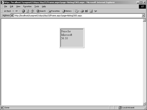
Listing 23.3 creates two mobile forms, beginning on lines 12 and 25. Yet Figure 23.6 only shows one. What gives? ASP.NET displays only the first form in a mobile Web page at any time; unless otherwise specified, it is the first form in the page. You can control this by setting the ActiveForm property to the form to display, as shown on line 8. When a user clicks on one of the items in the list, the second form is displayed. Let's examine the rest of the code. Lines 1 and 2 show the standard header required by all mobile pages. Moving down to line 12, you see a typical mobile Web form declaration. Inside this form, you have two controls: a Label, which has already been discussed, and a List control, which is very similar to the ListBox control in ASP.NET. The Label has a property you haven't seen before: StyleReference. Although you can build your own styles for each control, this property refers to a built-in style provided by ASP.NET. These built-in styles ensure that your control will be rendered correctly for each different mobile device. StyleReference can have one of two values: Title (causes the control to render in bold with emphasis) or Error (renders the control in a red, italicized text). The List control provides many different properties and methods, similar to the ASP.NET ListBox control; they are not all covered here. The List control uses Item controls to display individual items in the list, as shown on lines 18 21. When a user selects one of these items, the ItemCommand event fires. On line 17, you set the event handler for this method to the StockPick method, shown on line 5 (more on that in a moment). You can set the SelectType property of the ListBox to alter its behavior on the devices that support it. This property can be DropDown, ListBox, or Radio; each of these values is self-explanatory. You can also change the Decoration property to alter its appearance; this property can be None, Bulleted, or Numbered. The second mobile form, named frmPrice, begins on line 25. This form simply contains two Label controls, which will display stock prices after a user has clicked on an item in the first Web form. In the StockPick method, on lines 6 and 7, you simply display the details of the chosen selection in the labels on lines 28 and 29, in the second Web form. This is done with syntax very similar to ASP.NET. On line 8, you set the ActiveForm property to frmPrice, which causes the second form to be displayed instead of the first. Because you already set the values for the labels in the second form, the user is shown the proper data. In this way, it is easy to present user interfaces across different mobile devices. Mobile server controls also support the full data binding behavior of ASP.NET server controls. This means you can retrieve information from a database by storing it in a DataSet, and binding that DataSet to the control. The List control will automatically loop through and display the records in the data, just as regular server controls would do. Listing 23.4 shows an example using the database created in Day 8, "Beginning to Build Databases." This example creates an address book, similar to the ones in many cell phones. Listing 23.4 Mobile Controls Support Data Binding 1: <%@ Page Inherits="System.Web.UI.MobileControls.MobilePage" Language="VB" %> 2: <%@ Register TagPrefix="Mobile" Namespace="System.Web.UI.MobileControls" Assembly="System.Web.Mobile" %> 3: <%@ Import Namespace="System.Data" %> 4: <%@ Import Namespace="System.Data.OleDb" %> 5: 6: <script runat="server"> 7: sub Page_Load(Sender as Object, e as EventArgs) 8: dim objConn as new OleDbConnection _ 9: ("Provider=Microsoft.Jet.OLEDB.4.0;" & _ 10: "Data Source=c:\ASPNET\data\banking.mdb") 11: 12: dim objCmd as new OleDbDataAdapter _ 13: ("select * from tblUsers", objConn) 14: 15: dim ds as DataSet = new DataSet() 16: objCmd.Fill(ds, "tblUsers") 17: 18: lNames.DataSource = ds.Tables("tblUsers").DefaultView 19: lNames.DataBind() 20: end sub 21: 22: sub NamePick(Sender as Object, e as ListCommandEventArgs) 23: lblName.Text = e.ListItem.Text 24: lblPhone.Text = e.ListItem.Value 25: ActiveForm = frmPrice 26: end Sub 27: </script> 28: 29: <Mobile:Form BackColor="#ccddcc" 30: runat="server"> 31: <Mobile:Label runat="server" StyleReference="title" 32: Text="Names" /> 33: <Mobile:List runat="server" 34: OnItemCommand="NamePick" 35: DataTextField="FirstName" 36: DataValueField="Phone" /> 37: </Mobile:Form> 38: 39: <Mobile:Form BackColor="#ccddcc" 40: runat="server"> 41: <Mobile:Label runat="server"/> 42: <Mobile:Label runat="server"/> 43: </Mobile:Form> | Save this file as Listing2304.aspx. Lines 7 19 should be nothing new. You create an OleDbConnection object on line 8, and an OleDbDataAdapter object on line 12 that retrieves all rows from the tblUsers table. You create a DataSet and fill it on lines 15 and 16, and finally set the DataSource and bind the List control on lines 18 19. |
The NamePick method beginning on line 22 is the same as the StockPick method from Listing 23.3, except for the name change. The UI portion of the page, lines 29 43, is also nearly identical to the previous listing, except that the Item elements are removed from the List control, and two new properties are added to the List: DataTextField and DataValueField. Recall that these properties are used to determine which fields from the database will be used to populate, respectively, the text and value portions of the list. These properties were also available on the ListBox ASP.NET server control. Therefore, this entire listing should be familiar. Viewing this listing with the URL http://localhost/tyaspnet21days/day23/Frame.aspx?page=listing2304.aspx produces the image shown in Figure 23.8. Figure 23.9 shows the output when a name is clicked. Figure 23.8. Listing 23.4 produces an address book type display.
Figure 23.9. The information displayed in the second mobile form.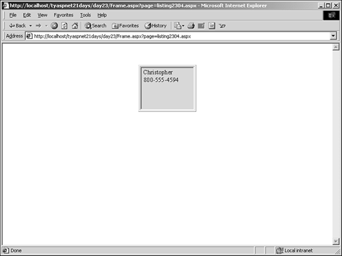
When a user clicks on one of the links in Figure 23.8, the NamePick method executes, which sets the Text properties of the labels in the second form, and then displays the second form with ActiveForm. The chosen name and phone number is then displayed to the user. Adding Paging Capabilities Obviously, because cell phones don't use Web browsers such as Internet Explorer or Netscape, you won't see the scroll bar shown in Figure 23.8. Those tiny screens display one set of data at a time, chunked into pages; you don't scroll through a long list on one page, but rather move to different pages that each contain a few list items. The mobile server controls all provide automatic-paging features that present an appropriate display depending on the device being used; this is known as internal pagination. By default, internal pagination is turned off, but you can easily turn it on using the AllowPaging property. For example, change the List control on line 33 of Listing 23.4 to read as follows: 33: <Mobile:List runat="server" 34: OnItemCommand="NamePick" 35: DataTextField="FirstName" 36: DataValueField="Phone" 37: AllowPaging="true" /> The List control will now automatically add Next and Previous menu items to navigate through the list. Depending on the device, these items will appear differently. Add the following code before line 19: lNames.PageSize = 2 ASP.NET will automatically determine how many items should be displayed on each page depending on the viewing device's screen size. However, you can modify this using the PageSize property. PageSize tells ASP.NET how many items should be shown per page. If you set this value to something higher than the number of items that one page on the device can display at once, ASP.NET generates the necessary navigation (such as a Next menu item) for the device. This listing should now produce the image in Figure 23.10. Figure 23.10. Internal pagination causes Next and Previous menu items to appear.
With internal pagination, ASP.NET will look at how many items are in your data source and automatically create the appropriate number of pages. You can also define a custom routine for handling pagination by setting the AllowCustomPaging property to true and setting a number for the VirtualItemCount property, which specifies how many items should be in the list in total. The purpose of custom pagination is to allow you to fetch data as needed; normal pagination retrieves all records at once, and renders only a few at a time. Custom pagination, however, retrieves only a few records at a time and it is up to you to retrieve the next set when necessary. The PageIndexChanged event is typically where you would handle this. For example, the following code snippet provides a method to handle the PageIndexChanged event, and checks to see whether the Next or Previous button was clicked: sub GetNewData(Sender as Object, e as PageChangedEventArgs) if e.NewPageIndex > e.OldPageIndex then 'user clicked next, grab next set of data else 'user clicked previous, grab previous set of data end if end sub ... <Mobile:List runat="server" ... OnPageIndexChanged="GetNewData"/> You can then define the code to actually retrieve the data in question. Device-Specific Output and Template Sets Even though ASP.NET automatically handles the rendering of each mobile control depending on the device being used, there might be times where its capabilities don't suit your needs. You might want to display one control when viewed from a cell phone, or another, different control when viewed from a browser. For example, when someone using a device with a color screen comes to your site, you might want to show an image of a logo. However, this image won't come across very well in monochromatic devices such as certain cell phones, so for these you'd simply display the text version of the logo. For this, ASP.NET introduces the <DeviceSelect> and <Choice> elements. These allow you to render different items depending on the parameters specified by the device in question (you'll learn about these parameters in the next section). Let's take a look at some code to familiarize you with these two elements, shown in Listing 23.5. Listing 23.5 Modifying User Interfaces for Different Devices 1: <%@ Page Inherits="System.Web.UI.MobileControls.MobilePage" Language="VB" %> 2: <%@ Register TagPrefix="Mobile" Namespace="System.Web.UI.MobileControls" Assembly="System.Web.Mobile" %> 3: 4: <Mobile:Form runat="server"> 5: <DeviceSelect> 6: <Choice Capability="PreferredRenderingType" Argument="html32"> 7: <template name="HeaderTemplate"> 8: <table width="100%" height="100%"> 9: <tr> 10: <td bgcolor="#cccc99"> 11: <img src="/books/4/226/1/html/2/header.gif" height="26" 12: width="100"> 13: </td> 14: </tr> 15: <tr> 16: <td bgcolor="#ffffff" valign="top"> 17: </template> 18: <template name="FooterTemplate"> 19: </td></tr> 20: <tr><td bgcolor="#cccc99" height="4"></td></tr> 21: </table> 22: </template> 23: </Choice> 24: <Choice> 25: <template name="HeaderTemplate"> 26: <Mobile:Label runat="server" 27: StyleReference="Title" 28: Text="MySite.com" /> 29: </template> 30: </Choice> 31: </DeviceSelect> 32: <Mobile:Label FontSize="Small" FontName="Arial" 33: Text="Welcome to my site!" /> 34: </Mobile:Form> | Lines 1 4 should look familiar it's the same header we've been using for all the mobile pages so far. Line 5 begins something new with the <DeviceSelect> element, which acts as a container for <Choice> elements, shown on lines 6 and 24. The first <Choice> examines a capability of the calling device called PreferredRenderingType, which indicates what type of display the device has. If the device renders HTML version 3.2, the Argument property on line 6 tells ASP.NET to display the UI on lines 7 22 (the code contained within the first <Choice> element). If the device doesn't support HTML 3.2 (most cell phones don't), display the content contained in the second <Choice> element. Because the second <Choice> doesn't contain an Argument property, it will be used as the default choice. |
You can have as many <Choice> elements in a <DeviceSelect> container as you want one for every different type of display you expect, if necessary. Only one of these elements will be rendered: the one that best matches the capabilities of the device. If two match identically, the one that appears first in the source code is chosen. If, however, none of them matches, ASP.NET will display the UI as it would normally, according to the device used. There are a few more elements which will be familiar in this listing; specifically, the templates on lines 7, 18, and 25. Recall that you used these same templates in the Repeater, DataList, and DataGrid ASP.NET server controls (refer to Day 9, "Using Databases with ASP.NET"). They function identically here, providing a portion of a user interface to display. Figures 23.11 and 23.12 show the output of this listing from a browser when the different choices are selected. Figure 23.11. When the device is capable of displaying HTML 3.2, the first <Choice> is selected.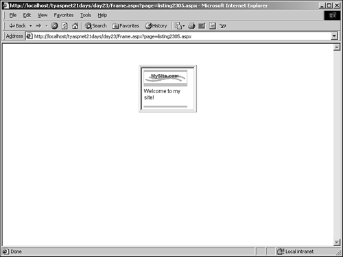
Figure 23.12. The second <Choice> is selected if the device isn't capable of HTML 3.2.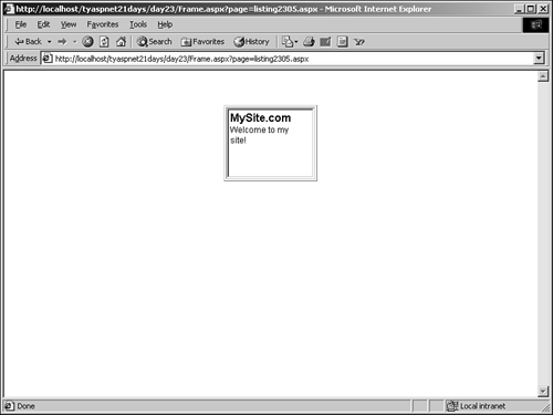
Note Template controls are not necessary in <Choice> elements; if you don't need much layout control, you can specify the content to render in the <Choice> element itself with the value property: <Choice Capability="PreferredRenderingType" Argument="html32" value="header.gif" The preceding code causes the header.gif image to be displayed if the capability and argument match.
Using Mobile Device Capabilities When a Web browser requests a Web page, it passes along certain information to the Web server. This information identifies the browser, letting the server determine the browser's capabilities, such as whether it can support Java applets, JavaScript, and so on. Mobile devices pass along such identifying information as well, and the mobile forms framework can use this identification information to determine the device's features and functionalities. Because each mobile device potentially provides a different display mechanism, ascertaining its capabilities is essential. All the content that you output must be tailored for each specific mobile device accessing the mobile Web page, and luckily, ASP.NET handles much of this for you. As shown in the previous section, you can use the <DeviceSelect> and <Choice> elements to alter your display depending on the capabilities of the viewing devices. Table 23.2 lists all the capabilities specific to mobile devices. (Note that not all devices support all of these capabilities, but this is the general set.) Table 23.2. Mobile Device Capabilities | Property | Default | Description | | Browser | "Unknown" | The brand of browser being used. | | CanCombineFormsInDeck | true | Indicates if the particular device can have multiple mobile Web forms on one page. | | CanInitiateVoiceCall | false | Indicates whether the device can make a voice phone call. | | CanRenderEmptySelects | true | Indicates if the device will render empty <select> elements. | | CanRenderInputAndSelectElementsTogether | true | Indicates if the device can render <input> and <select> elements together. | | CanRenderMixedSelects | true | Indicates if the device can handle <select> tags with <option> elements that include both onpick and value attributes. | | CanRenderOneventAndPrevElementsTogether | true | Indicates if the device can handle the elements <Onevent> and <do type="prev" label="Back"></prev></do> when they are put together. | | CanRenderPostBackCards | true | Indicates if a device can use postback cards. | | CanRenderSetvarZeroWithMultiSelectionList | true | Indicates if the device can accepts the <setvar> element with value set to zero. | | CanSendMail | true | Indicates if the device can send mail. | | GatewayMajorVersion | 0 | Major version number of the current gateway (that is, 4.x). | | GatewayMinorVersion | 0 | Minor version number of the gateway (that is, x.5). | | GatewayVersion | "None" | Version string of gateway. | | HasBackButton | true | Indicates if the device browser has a dedicated back button. | | HidesRightAlignedMultiselectScrollbars | false | Indicates if the scroll bar for a <select multiple> element is hidden by the scroll bar for the page. | | InputType | " " | Type of input device (that is, VirtualKeyPad, telephoneKeypad). | | IsColor | false | Indicates whether the device's display is color. | | IsMobileDevice | true | Indicates if the device is mobile. | | Item | N/A | The default indexer used to retrieve mobile capabilities. | | MaximumRenderedPageSize | 2000 | The max length of the page in bytes the device can display. | | MaximumSoftKeyLabelLength | 8 | Max length of labels for softkeys in characters. | | MobileDeviceManufacturerer | "Unknown Mobile Device Manufacturer" | Manufacturer of the device. | | MobileDeviceModel | "Unknown Mobile Device Model | The model of the device.Mobile Device Model" | | NumberOfSoftKeys | 0 | The number of softkeys. | | PreferredImageMime | image/gif | The MIME type of the image content preferred by the device. | | PreferredRenderingMime | "text/html" | MIME type for rendering content. | | PreferredRenderingType | "html32" | MIME type for rendering text. | | RendersBreaksBeforeWmlSelectAndInput | false | Indicates if the device renders a line break before a <select> or <input> element. | | RendersBreaksAfterHtmlLists | true | Indicates if the device renders breaks after HTML list tags. | | RendersBreaksAfterWmlAnchor | false | Indicates if a break is rendered after a standalone anchor. | | RendersBreaksAfterWmlInput | false | Indicates if a break is rendered after input elements have been received. | | RendersWmlDoAcceptsInline | true | Indicates if <do> is rendered as an inline button or softkey. | | RendersWmlSelectsAsMenuCards | false | Indicates if <select> elements are rendered as menu cards instead of combo boxes. | | RequiredMetaTagNameValue | " " | Returns a meta tag value required by some devices. | | RequiresContentTypeMetaTag | false | Indicates if the browser is Pocket Internet Explorer. | | RequiresAttributeColonSubstitution | false | Indicates if colons in tag names need to be substituted with a different character on rendering. | | RequiresHtmlAdaptiveErrorReporting | false | Indicates if the device should get the default ASP.NET error message, or an adaptive one. | | RequiresLeadingPageBreak | false | Indicates if the device should render an extra break at the beginning of a page. | | RequiresNoBreakInFormatting | false | Indicates if formatting tags must not contain <br> tags. | | RequiresOutputOptimization | false | Indicates if the adapter will try to generate minimal output to reduce page size. | | RequiresPhoneNumbersAsPlainText | false | Indicates if the device only supports phone dialing based on plain text instead of special markup. | | RequiresSpecialViewStateEncoding | false | Indicates if the device requires special encoding on view state information. | | RequiresUniqueFilePathSuffix | false | Indicates if unique file suffixes are needed to stop gateways and devices from caching pages. | | RequiresUniqueHtmlCheckboxNames | false | Indicates if <input> tags require unique attribute values. | | RequiresUrlEncodedPostfieldValues | false | Indicates if the device encodes text from a form post. | | ScreenBitDepth | 8 | The depth of the display in pixels. | | ScreenCharactersHeight | 40 | The height of the screen in characters. | | ScreenCharacterWidth | 80 | The width of the screen in characters. | | ScreenPixelsHeight | 480 | The height of the screen in pixels. | | ScreenPixelWidth | 640 | The width of the screen in pixels. | | SupportsAccessKeyAttribute | false | Indicates if the device can handle the AccessKey attribute for <a> and <input> elements. | | SupportsBodyColor | true | Except where noted, all of the following properties indicate if the device supports a particular HTML element. SupportsBodyColor, for instance, indicates if the device supports the bgcolor attribute in the <body> tag. | | SupportsBold | false | | | SupportsCacheControlMetaTag | true | Indicates if the device supports the meta tag Cache-Control: max-age-0. | | SupportsCss | false | | | SupportsDivAlign | true | | | SupportsDivNoWrap | false | | | SupportsFontColor | true | | | SupportsFontName | false | | | SupportsFontSize | false | | | SupportsImageSubmit | false | | | SupportsIModeSymbols | false | Indicates if the device supports i-mode symbols. | | SupportsInputIStyle | false | Indicates if the device supports the IStyle attribute in <input> elements. | | SupportsInputMode | false | | | SupportsItalic | false | | | SupportsJPhoneMultiMediaAttributes | false | Indicates if the device supports J-Phone multimedia attributes. | | SupportsJPhoneSymbols | false | Indicates if the device supports J-Phone specific picture symbols. | | SupportsQueryStringInFormAction | true | | | SupportsUncheck | true | | Let's take a look at these properties in an example. Listing 23.6 shows an example of iterating through these capabilities. Listing 23.6 Retrieving and Displaying the Capabilities of the Viewing Device 1: <%@ Page Inherits="System.Web.UI.MobileControls.MobilePage" Language="VB" %> 2: <%@ Register TagPrefix="Mobile" Namespace="System.Web.UI.MobileControls" Assembly="System.Web.Mobile" %> 3: <%@ Import Namespace="System.ComponentModel" %> 4:5: 6: <script runat="server"> 7: sub Page_Load(Sender as Object, e as EventArgs) 8: if not Page.IsPostBack then 9: dim objProp as PropertyDescriptorCollection = _ 10: TypeDescriptor.GetProperties(Request.Browser) 11: if not objProp is nothing then 12: lCapabilities.DataSource = objProp 13: lCapabilities.DataBind() 14: end if 15: end if 16: end sub 17: 18: sub ShowProperty(Sender as Object, e as ListCommandEventArgs) 19: dim strName as String = e.ListItem.Text 20: lblName.Text = strName 21: lblValue.Text = DataBinder.Eval(Request.Browser, _ 22: strName, "{0}") 23: 24: ActiveForm = frmProperty 25: end sub 26: </script> 27: 28: <Mobile:Form runat="server"> 29: <Mobile:Label runat="server" StyleReference="title" 30: Text="Mobile Capabilities" /> 31: <Mobile:List runat="server" 32: DataTextField="Name" OnItemCommand="ShowProperty" 33: AllowPaging="true" /> 34: </Mobile:Form> 35: 36: <Mobile:Form runat="server" > 37: <Mobile:Label runat="server" 38: StyleReference="title" /> 39: <Mobile:Label runat="server" /> 40: </Mobile:Form> | This page retrieves all the capabilities of the viewing device and displays them in a List control on line 31. When one of the items is clicked, the second form (shown on line 36) is populated with the value of the capability and then displayed. Let's analyze the code. |
The Page_Load event retrieves all the capabilities and binds them to the list control. Line 9 declares a new PropertyDescriptorCollection object (which is very useful for storing this type of information), and populates it with the capabilities of the browser, shown on line 10. The TypeDescriptor.GetProperties method retrieves the properties for a component the Browser object in this case (which you retrieve by calling Request.Browser). The variable objProp now contains a list of all the properties and capabilities of the device and browser, so you simply bind it to the List control on lines 12 and 13. The ShowProperty method on line 18 executes when an item in the list is clicked. It sets values for the labels in the second form on the page. The DataBinder.Eval method formats the data to be displayed in the label as text. On line 24, the second form is set to active. The UI portion of this listing is fairly standard; all these elements and properties were covered earlier today. Now take a look at this listing from the browser. Note that Frame.aspx is not used here because we simply want to display the capabilities. This isn't part of a mobile application. Figure 23.13 shows the output. Figure 23.13. Click on an item to see the value for that particular capability.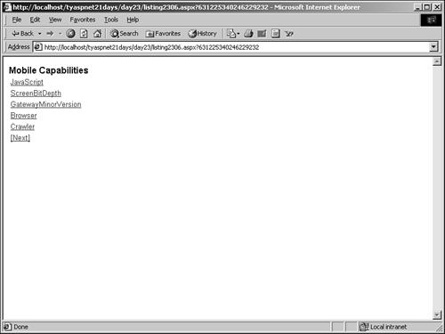
| 