Common Project-Level Metrics
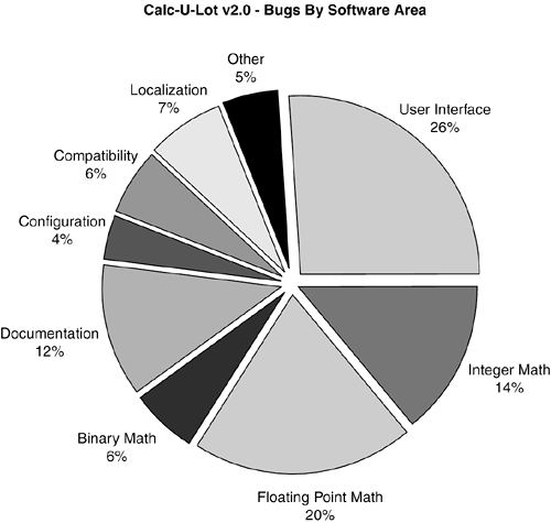
| Put on your "big boss" hat and think about the questions that managers mull over their coffee every morning: Is the software project making progress? Will it be ready to release on schedule? What's the risk of it hitting that date? What's the overall reliability? Management is fundamentally interested in the overall view of the projectwhat its quality and reliability level is and whether it's on track to be ready when scheduled. The bug-tracking database is the perfect tool to provide this information. Think back to Chapter 3, "The Realities of Software Testing," where you learned one of the basic rules of testingthe more bugs you find, the more bugs there are. This concept holds whether you're looking at just a small piece of the software or thousands of modules grouped together. By following this concept, it's easy to create metrics and graphs that can be used to get a view into the software and determine the status of not just the test effort, but the entire project. NOTE Most likely it will be the test manager or project manager who builds up these metrics. It's important, however, for you to be familiar with them so that you know how your test effort is affecting the overall project and whether your team is making progress. Figure 20.6 is a fundamental pie chart that shows a breakout of the bugs found against the Calc-U-Lot v2.0 project. In this chart, the bugs are separated into the major functional areas of the software in which they were found. Figure 20.6. A project-level pie chart shows how many bugs were found in each major functional area of the software.
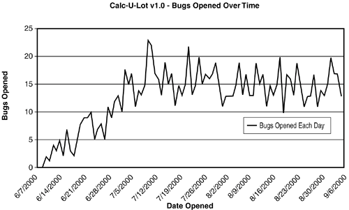
Assume that this graph was generated about halfway through the product development process. By following the rule of "bugs follow bugs," which areas do you think are most likely to still have more bugs and probably need additional testing? Three areasthe user interface, integer math, and floating-point mathmake up 60 percent of all the bugs found. If the test effort to date has been consistent across the entire product, there's a good chance that these three areas are indeed buggy and probably still have more bugs to find. NOTE In reaching this conclusion, it's important to consider whether the test effort has been consistent across the product. It's possible the other areas weren't yet thoroughly tested or they have much less code or are much less complex. These could all be reason for their disproportionately low bug counts. Care should always be taken when generating and interpreting bug data to make sure that all the underlying facts are known. This data tells you and management a great deal about the project and is a good example of how lots of bug information can be distilled down to something simple and easily understood. This graph is a very common one used by many teams to understand where the bugs are coming from and if there are areas of the project that need more or less testing attention. What this graph doesn't show is timing information. For example, it's possible that the bug find rate for the user interface areas is leveling off and that the find rate for localization is increasing. This is something you can't tell from the graph. For that reason, another basic set of graphs is often used that shows bugs found over time. Figure 20.7 is an example of this type of graph. Figure 20.7. A graph that shows bugs opened over time can reveal a lot about a software project.
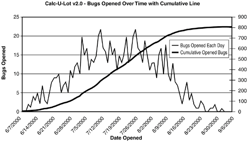
In this graph, weekly dates from June 7 through September 6 are shown on the x-axis, and the number of bugs found each day over that period are shown on the y-axis. You can see that at the start of the project, the bug-find rate was low and steadily increased until it became fairly consistent at around 15 bugs per day. Assume that the project schedule is targeting a release date of September 15. By looking at the chart, do you think the software will be ready? Most rational people wouldn't think so. The graph clearly shows the bug-find rate remaining constant over time with no hint of trending down. Of course, it's possible that the downward spike over the last three days might continue, but that could just be wishful thinking. Until there's a clear trend showing that the number of bugs is declining, there's no reason to think that the software is ready to go. The clear trend that indicates progress is shown in the graph in Figure 20.8. This project starts out the same as the one in Figure 20.7 but after the bug-find rate peaks in mid July, it starts to trail off, eventually bouncing around one or two per dayan indication that bugs in the software are becoming fewer and more difficult to find. Figure 20.8. This graph shows a project that could make its scheduled release date of September 15.
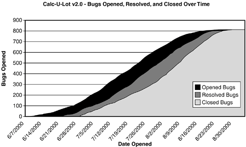
This graph also has an additional line that shows the cumulative bugs found over time. You can see the gentle slope up and then the flattening of the curve indicating the decreasing bug-find rate. A project that makes it to this point is usually in a good position to be released. NOTE Be careful how you interpret the data. Consider the graph shown in Figure 20.8. It shows the bug-find rate declining over time. The assumption is that this is due to the product becoming more stable as bugs are found and fixed. But, it could also be due to many of the testers being out of the office because of illness. If the testers aren't testing, there won't be anyone finding bugs and the graph of the bug data will look just like one that says everything's okay. The simplified graphs shown in these examples have only the calendar dates across the x-axis. In a graph for a real project, it would be important to map not just the dates but also the project's schedule and milestones, such as major releases of the software, the different test phases, and so on. Doing so would help clarify why, for example, the trend line levels out earlier than expected (maybe the end of a test phase has concluded and the testers are waiting for more code to test) or why it climbs almost straight up (a lot of new, previous untested code became available for testing). Again, the chart is just data. It needs to be clarified and thoroughly understood to be successfully used. One of the most effective bug graphs that reveals the status of a project is shown in Figure 20.9. This graph is similar to the one in Figure 20.8 but adds two more lines, one showing the cumulative resolved bugs and another the cumulative closed bugs, with shading underneath to show the space between them. Figure 20.9. Is this the be-all-end-all software testing status graph? Maybe, maybe not. It's very effective, though, at communicating the project's status.
The top line is the same one as in Figure 20.8 and represents the bugs opened over time. There's no change, here; it's used the same way. The next line down represents the resolved bugs over timeones that the programmers have fixed or the review committee has determined aren't to be addressed. As the bugs are resolved, this line moves up, hopefully tracking the opened line. There's a gap between the two lines (shown as the black filled area) because the programmers and reviewers often can't resolve the bugs as soon as they're entered by the testers. The bugs usually start to pile up and the gap widens between the two states of the bug's life cycle. Eventually the programmers and project managers catch up and the two lines meetthe number of resolved bugs eventually equaling the number of opened bugs. The third line shows the bugs that are closed over time. Remember, once a bug is resolved it's assigned back to the tester for regression testing to ensure that it's been fixed. If the bug fix checks out, the bug is closed. This line lags the resolved line for the same reason the resolved line lags the opened linethe testers usually can't close bugs as fast as they're resolved because they're still busy testing the rest of the software. Eventually the closed bugs catch up to the resolved and opened bugs and the curves flatten out as fewer and fewer bugs are found, resolved, and closed. What does this graph tell you? In short, the filled-in areas show how much work is left for the programmers and testers to do. A widening black area means that the programmers are getting further and further behind in fixing bugs. A widening dark gray area means that the testers are having trouble keeping up with the programmer's fixes. If the curves are flattening out and coming together, the project manager is sleeping better at night. NOTE This graph is typically shown using colors. Red indicates opened bugs, yellow indicates resolved bugs, and green indicates closed bugs. A quick glance can tell you the project's status. Lots of red means lots of programmer's work. Lots of yellow means lots of tester's work. Lots of green means the project is getting close to release. Adding the resolved and closed data lines to the opened data line and putting it all on the same graph provides a comprehensive view of the overall project and helps minimize misinterpretation of the data. A previous note mentioned that a leveling of the bug open rate could mean that the testers were either not finding bugs, or were out sick. The data couldn't tell you which. Another possibility is that they decided to close out bugs for a few days and forgo new testing. Having all the information on one graph would make it clearer as to what was happening. Think about this and look for a question regarding it in the quiz section for this chapter. |
EAN: 2147483647
Pages: 233