4.2 Techniques
|
| < Day Day Up > |
|
4.2 Techniques
In this section we discuss some GEF and Draw2d techniques that are useful when developing a GEF application.
4.2.1 Drag and drop
One of the most essential parts in today's desktop applications is drag and drop. In this section we discuss drag and drop inside GEF applications.
As you might know, drag and drop is organized in SWT around Transfers. They are the base representation of something that is transferred between the SWT controls in an drag and drop operation. Basically, there is no difference compared with GEF.
The Graphical Editing Framework provides some classes and concepts to ease the development of drag and drop in GEF applications. For example, you won't have to deal with SWT DragSource objects and other lower level classes.
The base concept in GEF is that you add TransferDragSourceListener and/or TransferDropTargetListener to an EditPartViewer. TransferDragSourceListeners are used to enable EditPartViewers as a source for drag operations and TransferDropTargetListener are used to enable EditPartViewers as target for drop operations.
When implementing drag and drop listeners for the viewers in your GEF application, be sure to inherit from the abstract base classes. A good point to look for further implementation information is the template drag and drop palette demonstrated in the Logic example application provided by GEF. Our sample application will also provide an introduction into implementing drag and drop.
4.2.2 Palette: Implementing a sticky tool preference
The default behavior for GEF tools is to unload a tool after it is used once. This causes the EditDomain's default tool, which is typically the SelectionTool, to be reactivated. This behavior is desirable for some types of operations and not for others. In addition, sometimes a tool that is normally used sporadically needs to be repeated several times, and then the default behavior becomes cumbersome.
In these cases it is useful to customize each tool's unloading behavior based on the type of tool, or based on user preference. The base class for GEF tools, org.eclipse.gef.tools.AbstractTool, contains the method setUnloadWhenFinished(boolean), which is used to control the unloading behavior. Because tools are not instantiated until they are ready to use, setting this property requires gaining access to tool instances, either in the factory that creates them, or by obtaining them from the EditDomain as they become activated.
The latter technique can be used in applications that use the GEF palette and whose editor class is derived from GraphicalEditorWithPalette.
-
Create a class that implements the org.eclipse.gef.palette.PaletteListener interface, which contains the single method:
void activeToolChanged(PaletteViewer palette, ToolEntry tool)
Add your listener to the palette by calling the palette's method:
public void addPaletteListener(PaletteListener paletteListener);
The code inside your listener then needs to get the actual active tool from the EditDomain's getActiveTool() method. Then you can set the active tool's setUnloadWhenFinished() method to set this behavior based on whatever criteria your application wants to use, such as a user setting or preference, or based on what tool is active.
4.2.3 Printing
Starting with GEF version 2.0, there is built-in support for printing from GEF applications. You simply need to add a PrintAction to your editor's action registry as shown in Example 4-3.
Example 4-3: Adding a PrintAction
 |
ActionRegistry registry = getActionRegistry(); IAction action; action = new PrintAction(this); // "this" is your IEditorPart-derived editor registry.registerAction(action);
|
In your application's action bar contributor class, you can provide keyboard or menu access to the PrintAction by calling:
addGlobalActionKey(IWorkbenchActionConstants.PRINT);
The Draw2D class PrintOperation and its subclasses PrintFigureOperation, PrintGraphicalViewerOperation provide support for printing in Draw2D, ultimately using a Graphics context, PrinterGraphics, that is created using an instance of SWT's org.eclipse.swt.printing.Printer.
The PrintGraphicalViewerOperation class locates the printable layers in your editor's viewer. The current selection in your editor is saved, then disabled while printing, and restored after printing. Only the contents of the printable layers are printed. Also, the parent figure's background color is set to white for printing, then restored. Figures are scaled by the ratio of the printer's resolution (in DPI®) to that of the display, so that the actual size of a figure is maintained.
4.2.4 Zooming
Support for zooming was added to GEF in version 2.0. The scaling functionality is built into ScalableLayeredPane and ScalableFreeformLayeredPane. These classes support scaling by maintaining the current scaling level, and by taking the scaling factor into account when doing point translations and calculating their client area and preferred size. They use the ScaledGraphics subclass of Graphics as the their graphics context for painting their child figures.
The ScaledGraphics class applies the current scale factor to the normal graphics operations, performing transformations on point lists and rectangles before painting them. It also scales fonts, stretches or shrinks bitmaps, and scales the line width for line drawing operations.
The ZoomManager class is used to manage zoom operations on ScalableFigure figures, that is, ScalableLayeredPane or ScalableFreeformLayeredPane. It provides several methods to control the zooming operations:
-
It supports a zoom style, which currently cab be either a "jump" zoom or animated zoom.
-
You can set a list of zoom levels, which is used be the zoomIn and zoomOut methods to determine the next of zoom.
-
It can set a view location.
-
You can set the zoom level to a specified magnification, or zoom in or out one level.
-
It supports zoom listeners - controls that allow for zooming up or down can register themselves as zoom listeners, so that when the zoom level changes, they can determine their enablement.
The root EditParts ScalableFreeformRootEditPart and ScalableRootEditPart contain a ZoomManager, which is accessible via their getZoomManager() method. You can access the ZoomManager through your editor's GraphicalViewer:
ZoomManager zoomManager = ((ScalableFreeformRootEditPart)getGraphicalViewer().getRootEditPart()). getZoomManager();
You can do this if you need to modify the ZoomManager's configuration, such as to set the supported zoom levels.
When you want to add zoom controls to your editor's user interface, GEF includes classes for zoom actions and a ContributionItem, named ZoomComboContributionItem. These are shown in Figure 4-1.
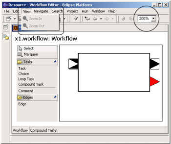
Figure 4-1: Zoom controls provided by GEF
The ZoomComboContributionItem creates a combo box interface that controls the zoom level for the active workbench part. It uses the IAdapter interface to locate the ZoomManager for the current IWorkbenchPart. Your editor should include code similar to the following, in Example 4-4, in order to allow its zoom level to be controlled by this mechanism.
Example 4-4: Returning the ZoomManager via the IAdapter interface
|
public Object getAdapter(Class type) { if (type == ZoomManager.class) return ((ScalableFreeformRootEditPart)getGraphicalViewer() .getRootEditPart()).getZoomManager(); return null; } |
The actions supplied by GEF, ZoomInAction, and ZoomOutAction, enable you to easily add menu items or tool bar buttons that let the user zoom in or out, one level at a time. These actions are derived from the base class ZoomAction, which saves the current ZoomManager and registers itself as a ZoomListener. The actions call ZoomManager.zoomIn() or zoomOut() each time they are invoked, until the minimum or maximum zoom level is reached. They detect this by implementing the zoomChanged() method of the ZoomListener interface. They then update their enablement each time the zoom level is changed.
Adding zoom support
To add zoom support to your GEF application, you must first make your root EditPart either ScalableFreeformRootEditPart and ScalableRootEditPart. Then you only need to add some user interface access to set the current zoom level.
To add the zoom combo box, add it to the tool bar manager in the class that implements your application's ActionBarContributor, as shown in Example 4-5:
Example 4-5: Adding ZoomComboContributionItem to the tool bar
|
public void contributeToToolBar(IToolBarManager toolBarManager) { super.contributeToToolBar(toolBarManager); // other items added here... toolBarManager.add(new Separator()); toolBarManager.add(new ZoomComboContributionItem(getPage())); } |
To add the zoom actions, add code in your EditorPart-derived editor class that registers the actions with the action registry. See Example 4-6.
Example 4-6: Registering the zoom actions
|
IAction zoomIn = new ZoomInAction(zoomManager); IAction zoomOut = new ZoomOutAction(zoomManager); getActionRegistry().registerAction(zoomIn); getActionRegistry().registerAction(zoomOut); // also bind the actions to keyboard shortcuts getSite().getKeyBindingService().registerAction(zoomIn); getSite().getKeyBindingService().registerAction(zoomOut);
|
Finally, to add menu items for the zoom actions to the action bar menu, you add them to the MenuManager as shown in Example 4-7.
Example 4-7: Adding a menu for the zoom actions
|
public void contributeToMenu(IMenuManager menuManager) { super.contributeToMenu(menuManager); // add a "View" menu after "Edit" MenuManager viewMenu = new MenuManager("View"); viewMenu.add(getAction(GEFActionConstants.ZOOM_IN)); viewMenu.add(getAction(GEFActionConstants.ZOOM_OUT)); } |
4.2.5 Decorating connections
The connections in Draw2d, and therefore also in GEF, are generally drawn using the PolylineConnection figure. In many cases you will want more than a plain line connecting the nodes in your GEF application, and the PolylineConnection class has built-in support for decorating connections that you can take advantage of.
You can decorate the ends of a PolylineConnection by specifying a RotatableDecoration for either the source, target, or both ends of the connection figure. The RotableDecoration interface is designed to allow a figure to rotate itself based on the position of a specified reference point. This allows the decoration to stay aligned with the line it is decorating as the line changes its angle, such as if one of the nodes that the line connects is moved.
The classic endpoint decoration is the arrowhead. Draw2d includes two implementations of RotatableDecoration; these are RotatablePolyline and RotatablePolygon. The default constructors for both of these classes create an arrowhead. These can be attached to a PolylineConnection by calling its setSourceDecoration or setTargetDecoration methods.
If you want a more customized decoration, you can call either classes' setTemplate method, passing it a list of points for your custom polyline or polygon figure. You can also control the size of your decoration by calling its setScale method.
PolylineConnections use a DelegatingLayout for their layout manager, meaning that its child figures must provide a constraint that is a subclass of Locator. When you place a decoration on a connection using setSourceDecoration or setTargetDecoration the these methods will automatically create an ArrowHeadLocator and set it as the constraint on the decoration. The arrowhead locator will ensure that the decoration is placed correctly on the ends of the connection.
In some applications, you may want to attach additional figures to a PolylineConnection. One example is to add a label to a PolylineConnection to display some annotation text. As the PolylineConnection has a DelegatingLayout manager, all you need to do is to create a Label figure and add it as a child of the PolylineConnection, and then set the constraint to position your label. The code shown in Example 4-8 places a label at the connection's midpoint.
Example 4-8: Placing a label in the center of a connection
|
PolylineConnection connection = new PolylineConnection(); Label connectionLabel = new Label(); connection.add( connectionLabel ); connection.getLayoutManager().setConstraint( connectionLabel, new MidpointLocator() );
|
4.2.6 Resource management
When implementing your GEF application, it is important that you pay attention to your application's usage of the underlying graphics system's resources. You must take care to manage your use of graphics objects, including images, bitmaps, colors, fonts, and so on. There are several techniques that can help to control your application's use of resources:
-
Create static variables for resources that you will use frequently throughout the life span of your application. In the case of colors, the class org.eclipse.draw2d.ColorConstants provides many useful constants.
-
Manage graphics resources that you want to create dynamically using the EditPart life cycle. Override the EditPart's activate() and deactivate() methods to handle creating and disposing of the EditPart's graphics resources.
-
When your application has graphics objects that may not be used in every session, use a lazy loading scheme, deferring the object(s) creation until they are needed.
-
If there are resources that are used across different parts of the application, consider implementing a cache that manages the objects. Different parts of your application can then share the same instance of these objects.
4.2.7 Feedback techniques
Visual feedback is an important part of a graphical editor's user interface. GEF allows for a number of techniques for proving feedback to the user:
-
Changing the cursor when targeting parts to indicate whether the part supports the tool's operation. Similarly, the cursor graphic is changed to indicate where drag and drop operations are supported.
-
Indication of a part's selection and focus state. Typically, a selected part should be clearly differentiated from unselected parts of the same type. This can be accomplished by enclosing the part with a selection figure or by changing the part's color or shape.
-
Display of handles, graphical elements that visually indicate the targets for operations that allow the user to move or reshape a graphical object.
In GEF commands, most feedback effects are controlled by EditPolicies. In this section we examine in more detail the various EditPolicies that contribute visual feedback to the editor framework, and we discuss where these effects can be customized. EditPolicies that contribute feedback effects are subclasses of GraphicalEditPolicy. This base class provides access to the EditPart's figure. It also declares addFeedback() and removeFeedback() methods that draw feedback figures on the root figure's root feedback layer, LayerConstants.FEEDBACK_LAYER.
| Note | All EditPolicies can disallow operations by returning null when requested to create a command. This will cause the tool to display a "disallowed operation" cursor. Similarly, commands which return false from their canExecute() will also cause this feedback. |
DirectEditPolicy
Direct editing allows for visual editing of graphical elements by launching a cell editor in response to mouse clicks on the target EditPart. Creating a direct edit implementation is discussed in detail in "4.2.9, "Using direct edit" on page 158", and is demonstrated in our redbook sample application.
Customizing:
-
You can expose different properties of your model to editing based on where the user clicked.
-
You can respond differently to double-clicks.
-
You can create custom cell editors
GraphicalNodeEditPolicy
This class provides visual feedback while creating or reconnecting connections. It works in conjunction with NodeEditPart-derived EditParts to provide a simulated connection while the connection is being dragged to a target. The NodeEditPart returns the best potential anchor point given the current mouse position. The simulated connection, drawn on the feedback layer, will snap to anchor proposed by the NodeEditPart. In typical implementations this will be the source anchor that is closest to the current mouse position.
Customizing:
-
Override createDummyConnection() to return a customized figure to show the creation feedback, possibly by changing the color, or line style or weight.
-
In your NodeEditPart-derived EditPart's implementation of getTargetConnectionAnchor or getSourceConnectionAnchor, apply additional filtering criteria to hide anchors that are not appropriate sources or targets for the current request. These anchors will then be ignored.
-
Add target connection feedback. The default implementation has no visual effect for highlighting the target connection.
LayoutEditPolicy
This is a base class for EditPolicies that place their child EditParts using some type of LayoutManager. Subclasses should provide visual feedback that shows how the layout constraints will determine where a new element can be inserted. Key methods include:
-
showLayoutTargetFeedback - This method gives visual feedback showing where the current operation will place the resulting figure. Subclasses will typically be constraining the placement of new figures to certain locations, and this feedback should make those constraints clear to the user. The figure returned by this method is effectively a type of cursor showing where the insertion point for the operation is located.
-
getSizeOnDropFeedback - Shows the size that the new figure will assume if the drag operation is completed.
Customizing:
-
The default implementation of showLayoutTargetFeedback does nothing. Implement this in a subclass to show the insertion point for new objects.
-
The default implementation of getSizeOnDropFeedback() can be changed to use a different shape or color, and so on.
-
Override getSizeOnDropFeedback() can be used if you want to provide visual feedback indicating the size of the new figure is constrained to some minimum and/or maximum size.
FlowLayoutEditPolicy
This EditPolicy is used in conjunction with EditParts whose figure uses a FlowLayout layout manager. This class provides an insertion point indicator which is a two pixel thick solid line.
Customizing:
-
The getLineFeedback() method can be called to get the default line figure, and then some of its attributes can be modified, such as thickness, line style, or thickness. If you want to use a different figure altogether, then you will probably need to override the showLayoutTargetFeedback() to do the math required to locate and size your figure correctly.
SelectionEditPolicy
This is an abstract base for EditPolicies that provide visual feedback for the focus selection state of EditParts. Note that the feedback figures are drawn on the feedback layer (LayerConstants.FEEDBACK_LAYER). The methods in this class include:
-
protected void showFocus()
-
protected abstract void showSelection()
-
showPrimarySelection()
-
hideFocus()
-
hideSelection()
The purpose of these methods is clear from the method names. Custom subclasses could be used to:
-
Provide a non-standard focus or selection indicator, perhaps to conform to a non-rectangular figure.
-
Provide an implementation for figures that can be selected but not moved.
-
Render the selection indicator of the primary selection in a way that distinguishes it from the other selections.
SelectionHandlesEditPolicy
This EditPolicy supplies a specialization of the SelectionEditPolicy that supports selections with handles. Subclasses provide the list of Handles that should decorate the selected EditPart. For instance, GEF includes the following SelectionHandlesEditPolicy-derived subclasses:
-
BendpointEditPolicy: This SelectionEditPolicy displays bendpoint handles when a Connection is selected.
-
ConnectionEndpointEditPolicy: This EditPolicy displays handles on the ends of a Connection when it is selected to support disconnecting and reconnecting connections.
-
NonResizableEditPolicy: This EditPolicy, which prevents resizing, surrounds the selected EditPart with a simple outline and places a small square in each corner that allows for dragging.
-
ResizableEditPolicy: This class extends the NonResizableEditPolicy class by adding handles on each side of the selection rectangle to allow for resizing. Customize these classes to:
-
Indicate that resizing is limited to one dimension, or may be constrained to maintain the part's aspect ration. Implementing this would also require customizing the DragTracker to enforce these constraints.
-
Provide a selection effect that is more visually harmonious with unusually shaped parts.
-
Create a "lighter weight" visual for selection that may work better for showing the selection on small parts.
-
Use custom handles.
-
4.2.8 Palette-less applications
For many applications, it may be desirable to display a GEF viewer without the palette. For instance this may be useful when:
-
The GEF view is read-only, but the user is allowed to select objects in the view in order to view their properties.
-
The GEF application lays out its graphical objects automatically. The user is not allowed to add or rearrange these objects, but may be able to modify the model state by selecting objects, modifying their properties, and so on.
-
There are a small number of tools in the application which do not justify the screen real estate that the palette would consume.
The EditDomain class is designed to integrate with the palette when it is present. There are two methods that are used to establish its connection to the palette:
-
When the EditDomain's PaletteRoot is set by calling setPaletteRoot(PaletteRoot root), the EditDomain will then obtain its default Tool from the PaletteRoot
-
Setting the EditDomain's PaletteViewer by calling its setPaletteViewer(PaletteViewer palette) method will cause it to register itself as a listener for tool selection changes in the palette.
Therefore, the first step in creating a palette-less application is to omit setting the EditDomain's PaletteRoot and PaletteViewer. This EditDomain will then return the SelectionTool when its getActiveTool() method is called. This can be achieved simply by constructing your editor as a subclass of org.eclipse.ui.parts.GraphicalEditor.
For some types of applications, the SelectionTool may be the only tool needed. In that case, there is no additional user interface needed to select tools, since the SectionTool is already selected by default. Other applications may have a need to change the active tool through some other user interface mechanism besides the palette. In these cases the EditDomain's setActiveTool(Tool tool) method can be called by the actions you create for the tools your application requires.
In this section we demonstrate how to add a toolbar button that sets the EditDomain's active tool. The action we create could also be used to make the tool available on the editor's context menu if desired. For the purposes of this example we use the Graphical Editing Framework logic editor example program. We modify it so that the tool to create a "Flow Container" is available as a button on the tool bar, as show in Figure 4-2.
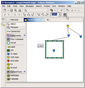
Figure 4-2: The Flow Container toolbar button
The steps required to make this change are as follows:
-
Create an Action for the tool:
Create the new class AddFlowContainerAction in the package org.eclipse.gef.examples.logicdesigner.actions. An abbreviated version of the Java code appears below in Example 4-9. Notice that this is a fairly generic-looking action implementation. The constructor includes calls to set the action's image, description, and title to the same values that were formally set in the palette entry. The run() method creates a new tool instance and uses it to call the editor's setActiveTool method, which in turn sets the EditDomain's active tool via its own setActiveTool method.
Example 4-9: The AddFlowContainerAction class
package org.eclipse.gef.examples.logicdesigner.actions; import org.eclipse.gef.Tool; import org.eclipse.gef.examples.logicdesigner.LogicEditor; import org.eclipse.gef.examples.logicdesigner.LogicMessages; import org.eclipse.gef.examples.logicdesigner.ToolActivationListener; import org.eclipse.gef.examples.logicdesigner.model.Circuit; import org.eclipse.gef.examples.logicdesigner.model.LogicFlowContainer; import org.eclipse.gef.requests.CreationFactory; import org.eclipse.gef.requests.SimpleFactory; import org.eclipse.gef.tools.CreationTool; import org.eclipse.gef.ui.actions.EditorPartAction; import org.eclipse.jface.action.Action; import org.eclipse.jface.resource.ImageDescriptor; import org.eclipse.ui.IEditorPart; public class AddFlowContainerAction extends EditorPartAction { private CreationFactoryfactory; private Tool tool; static public StringADD_CONTAINER = "add container"; /** * @param editor */ public AddFlowContainerAction(IEditorPart editor) { super(editor); setDescription( LogicMessages.LogicPlugin_Tool_CreationTool_FlowContainer_Description ); setImageDescriptor( ImageDescriptor.createFromFile(Circuit.class, "icons/logicflow16.gif") ); setText( LogicMessages.LogicPlugin_Tool_CreationTool_FlowContainer_Label ); factory = new SimpleFactory(LogicFlowContainer.class); } /* (non-Javadoc) * @see org.eclipse.jface.action.IAction#run() */ public void run() { tool = new CreationTool( factory ); ((LogicEditor)getEditorPart()).setActiveTool( tool ); } protected boolean calculateEnabled() { return getEditorPart() != null; } protected void init() { super.init(); setId(ADD_CONTAINER); } } -
Add the button to the action bar:
Modify the class LogicActionBarContributor in the same package, org.eclipse.gef.examples.logicdesigner.actions, first adding the member variable addFlowContainerAction, as shown in Example 4-10. Note that the constructor's IEditorPart argument is passed as null. This is because there is no active editor when the buildActions method is called. This is the reason for storing a reference to the action. Its setEditorPart method is called whenever the active editor changes. This is done by overriding the setActiveEditor method, and after calling the super class implementation calling:
addFlowContainerAction.setEditorPart(editor)
Example 4-10: Modifications to the LogicActionBarContributor class
private AddFlowContainerActionaddFlowContainerAction; /** * @see org.eclipse.gef.ui.actions.ActionBarContributor#createActions() */ protected void buildActions() { addRetargetAction(...); // existing actions here... addFlowContainerAction = new AddFlowContainerAction( null ); addAction( addFlowContainerAction ); } public void contributeToToolBar(IToolBarManager tbm) { tbm.add(..); // existing tbm.add() calls here tbm.add(new Separator()); tbm.add(getAction( AddFlowContainerAction.ADD_CONTAINER ) ); } // override this so that the addFlowContainerAction instance can track the current editor public void setActiveEditor(IEditorPart editor) { super.setActiveEditor(editor); addFlowContainerAction.setEditorPart( editor ); } }The only other change we make in the LogicActionBarContributor class is adding the code in the contributeToToolBar method which appends a separator and the button for our AddFlowContainerAction action.
At this point you should have a functioning tool bar button whose function is identical to the palette entry that adds a flow container.
Another user interface option for a palette-less application is to add commands to a menu. The AddFlowConterAction that we developed can also be used for this purpose. As shown in Figure 4-3, a new Tools menu item has been added which contains a submenu item that invokes our AddFlowConterAction action.
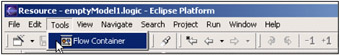
Figure 4-3: The AddFlowContainerAction added to the menuThe code fragment in Example 4-11 shows the changes you must make to the contributeToMenu method of the LogicActionBarContributor class.
Example 4-11: Adding a Tools menu in contributeToMenu
public void contributeToMenu(IMenuManager menubar) { super.contributeToMenu(menubar); // existing menu insertion code here... MenuManager toolsMenu = new MenuManager("Tools"); toolsMenu.add(getAction(AddFlowContainerAction.ADD_CONTAINER)); menubar.insertAfter(IWorkbenchActionConstants.M_EDIT, toolsMenu); }
4.2.9 Using direct edit
Direct edit is a feature of the Graphical Editing Framework that allows you to open a cell editor on a selected EditPart using a mouse gesture. There are three ways for a user to invoke direct edit:
-
Double-click the mouse on an EditPart.
-
Click once on an EditPart that is already selected. This method is analogous to the Windows Explorer file name editing capability, which opens a text edit box if you click selected file name, allowing you to then edit the file's name.
-
Press the F2 key when an EditPart is selected.
Figure 4-4 shows a simple Label figure when its cell editor is activated. This simple example can be seen in the GEF logic example application. However, direct edit can be used for much more visually complex EditParts in which clicking in areas of your EditPart invokes different cell editors, including dialogs.
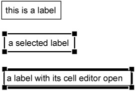
Figure 4-4: A Label figure showing the selected and cell editing states
The behavior of direct edit in your application is customizable. You specify what cell editor to open, and your application can determine this dynamically depending on criteria such as where the user clicked on your EditPart as well as the current state of your model, and so on. Direct Edit supports activating cell editors derived from org.eclipse.jface.viewers.CellEditor. Eclipse includes several useful subclasses that provide cell editors for booleans, combo boxes, text, and dialogs. By subclassing the DialogCellEditor, you have full flexibility to create dialogs that allow for the display or editing of your EditPart's properties.
This section outlines the steps you take to implement Direct Edit for one of your application's EditParts:
-
First modify your EditPart's createEditPolicies to install a new edit policy with the key EditPolicy.DIRECT_EDIT_ROLE, as shown in Example 4-12.
Example 4-12: Install the DIRECT_EDIT_ROLE edit policy
protected void createEditPolicies(){ super.createEditPolicies(); installEditPolicy(..); installEditPolicy(EditPolicy.DIRECT_EDIT_ROLE, new LabelDirectEditPolicy()); } -
Add code in performRequest, as in Example 4-13, that invokes your DirectEditManager-derived edit manager class. The second argument to your DirectEditManager constructor determines what type of CellEditor will be created. For the third argument, you provide a class derived from:
org.eclipse.gef.tools.CellEditorLocator
Example 4-13: Calling DirectEditManager.show() in performRequest
public void performRequest(Request request){ if (request.getType() == RequestConstants.REQ_DIRECT_EDIT) { if(manager == null) manager = new LogicLabelEditManager(this, TextCellEditor.class, new LabelCellEditorLocator((Label)getFigure())); manager.show(); } }This will calculates where you want the cell editor to appear within your EditPart. The example code shown here checks for a request type of RequestConstants.REQ_DIRECT_EDIT. The value of the request type allows you determine which of two mouse gestures was used to request the direct edit function. A request type of RequestConstants.REQ_DIRECT_EDIT indicates that the user single-clicked on a selected edit part, whereas the request type RequestConstants. REQ_OPEN indicates that the user double clicked on the edit part. You have the option to handle both request types as the same operation, ignore one of the types, or respond with different user interfaces for each type.
-
The EditPolicyclass you create must be a subclass of org.eclipse.gef.editpolicies.DirectEditPolicy.
Your subclass must minimally provide implementations of the two abstract methods:
protected abstract Command getDirectEditCommand(DirectEditRequest request);
This method constructs the command for the direct edit request. It should return a class, subclassed from org.eclipse.gef.commands.Command that updates your model with the results of the cell editing session. It should also support undo operations by caching the pre-edited state of you EditPart's model.
protected abstract void showCurrentEditValue(DirectEditRequest request);
The showCurrentEditValue method is called to update your EditPart's figure with the current value obtained from the request's cell editor. See Figure 4-5 for an example.
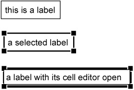
Figure 4-5: Current edit value
| Tip | Normally during direct edit, your EditPart's selection handles will be shown, because the EditPart had to be selected in order to enter direct edit mode. This may not be aesthetically desirable. There are a couple of approaches to address this. In the show() method of your DirectEditManager subclass you can save the current selection state:
List savedSelection = source getSelectedEditParts(); Then temporarily remove the selections:
source.deselectAll(); Then override the bringDown() so that the saved selection state is restored when the cell editor is closed. A second option is to customize the graphics that indicate your EditPart's selected state, changing them to something that doesn't interfere visually with the cell editor. |
4.2.10 Accessibility
Designing an accessible application is fundamentally about allowing for choice and flexibility in both input and output methods. An accessible application may receive input from the keyboard or serial port rather than the mouse. It needs to support accessibility clients that use sound, speech synthesis, or screen magnification to convey the output to the user.
GEF provides built-in support for accessibility, allowing you to create visual editors that can be controlled with little or no mouse interaction. The editor and palette are preconfigured to understand several keyboard navigation commands. Examples are the ability to select objects and palette entries, cycle through an object's selection handles, and drag or resize an object using the arrow keys:
-
It supports the use of keyboard commands for users with limited dexterity.
-
It provides annotations for the selected part, such as name, description, help text, and so on. that can be used by accessibility clients which may magnify or speak these strings for the user.
-
It maps between the EditPart in focus and the accessibility client's view of the screen. This allows applications such as the Windows magnifier to track the user's actions within a GEF editor. This assists sight-impaired users.
-
GEF supports autoscrolling, which allows the editor to scroll automatically to expose parts of a diagram that may be outside of the viewable area as the user drags their mouse to the edge of the view.
| Tip | WIndows users can experiment with the accessibility features in the logic example by launching the Windows Magnifier application. Launch the Windows Magnifier by selecting Programs -> Accessories -> Accessibility ->Magnifier |
GEF's accessibility implementation
In this section we describe the classes that implement GEF's accessibility support. We describe the roles they play and what you need to do to include accessibility in your GEF application.
Accessible EditParts
Accessible EditParts are able to participate in the accessibility support that is included in SWT and ultimately in the underlying operating system on which that your GEF application is running. Accessibility client applications can listen for selection changes in your GEF application and then obtain accessibility information about the selected EditPart via the EditPartViewer.
The AccessibleEditPart abstract class declares the methods that accessibility clients may use to interrogate your EditPart. These methods mirror the interface in org.eclipse.swt.accessibility.AccessibleAdapter, which defines the equivalent interface for SWT parts. The Javadoc in that class is a good source for documentation of the semantics of each of these methods. These methods allow your EditPart to enhance its accessibility by returning information such as its name, help string, keyboard shortcut, description, its selection and focus state, and by providing access to its child parts.
When you create an EditPart, you override the getAccessibleEditPart method in AbstractEditPart in order make your EditPart accessible. AccessibleGraphicalEditPart provides much of the default behavior needed by a custom EditPart. You will typically need to override the methods to return your part's name, description, and so on.
AccessibleGraphicalEditPart
AccessibleGraphicalEditPart is an inner class of AbstractGraphicalEditPart that provides GEF's implementation for the underlying SWT accessibility API, defined in org.eclipse.swt.accessibility package. This an abstract class, so EditParts supporting accessibility must provide a concrete subclass that is returned when the AbstractEditPart.getAccessibleEditPart() is called.
Accessible handles
Making a handle accessible requires that the handle provide a single point, in absolute coordinates, at which it can be selected. Keyboard navigation can then use this coordinate when selecting the handle, effectively simulating a mouse click at that location. Accessible handles are obtained from the EditPolicies that are responsible for handle management, such as subclasses of SelectionEditPolicy.
The AccessibleHandleProvider interface is used to collect a list of accessible handles for a Handle or EditPart. The AccessibleGraphicalEditPart implements this interface through its IAdaptable implementation. It collects a merged list of all the accessible handles contributed by its EditPolicy instances which also implement the AccessibleHandleProvider interface. Ultimately each Handle interface's getAccessibleLocation method returns the coordinate that indicates the location of its accessible handle. The AbstractHandle class provides most handles with a default implementation of this method that returns the center point of the handle. Other handle types can override this as appropriate.
The SelectionHandlesEditPolicy is an abstract class that is adaptable to an AccessibleHandleProvider, providing accessibility for subclasses that use GEF's default handles. If you design your own handles, you will need to provide an implementation of the getAccessibleLocation that returns a point inside your handle.
Accessible anchors
Accessible anchors work similarly to accessible handles. An EditPart provides an implementation of the AccessibleAnchorProvider interface by implementing the IAdaptable interface. The AccessibleAnchorProvider interface contains methods to return a list of source and target anchor locations. These points will be used to programmatically simulate a mouse event at that location. The targeting tool will then provide the same targeting behavior and feedback as if a mouse was used.
To implement this capability in your own EditParts, you will need to traverse all the ConnectionAnchor-derived children of your EditPart's parent figure, and return an appropriate point for each one.
AbstractTool
The AbstractTool class serves as the base class for contains the state machine which interprets accessible actions such as translating arrow keys into drags, and so on. Pressing the Enter key commits a drag
SelectionTool
When an edit part is selected, the SelectionTool's accessibility support enables the user to traverse the EditPart's available selection handles, select one, and perform drag operations all by using the keyboard. The keyboard commands supported by this class are summarized in Table 4-2.
| Key | Action |
|---|---|
| Period | Select next handle |
| '>' | Select previous handle |
| Left Arrow | Drag left |
| Right Arrow | Drag right |
| Up Arrow | Drag up |
| Down Arrow | Drag down |
| Enter | Commit the drag operation |
| Esc | Abort the drag operation |
ConnectionCreationTool
The keyboard handling in this class allows the user to indicate the start and end of connections using the Enter key. The user can cycle through the available anchor points of accessible EditParts by using the arrow keys. The tool will snap the connection to the next available anchor.
GraphicalViewerKeyHandler
This key handler class provides keyboard-based navigation for the GraphicalViewer. Table 4-3 lists the key bindings provided by the GraphicalViewerKeyHandler class. Note that SHIFT and CTRL keys can be used to modify the navigation keys. Pressing the CTRL key will cause the focus, rather than the selection, to move. Pressing the SHIFT key while using one of the navigation keys will extend the selection.
| Key | Action |
|---|---|
| SPACE | Selects |
| LEFT_ARROW | Navigates to EditPart on left |
| RIGHT_ARROW | Navigates to EditPart on right |
| UP_ARROW | Navigates to EditPart above |
| DOWN_ARROW | Navigates to EditPart below |
| '/' or '?' | Navigates to EditParts's next connection |
| '\' or '|' | Navigates to EditPart's previous connection |
| ALT + DOWN_ARROW | Navigates into a container node |
| ALT + UP_ARROW | Navigates out of a container node |
PaletteViewerKeyHandler
This class, the keyhandler for the palette, supports keyboard commands in the palette. It supports moving between palette entries and moving into and out of palette drawers. The commands are summarized in Table 4-4.
| Key | Action |
|---|---|
| LEFT_ARROW | If the focus is on an expanded drawer, then collapse it, otherwise sets focus on the drawer. |
| RIGHT_ARROW | If the focus is on a collapsed drawer, then it expands it. If the focus is on an expanded drawer, then it moves into it. |
| UP_ARROW | If the focus is inside a drawer, it sets the focus on the drawer. |
| DOWN_ARROW | It moves to the next container. |
|
| < Day Day Up > |
|
EAN: 2147483647
Pages: 70