Win Customer Confidence
| All too often, Web sites are drenched with marketing hype instead of accurate descriptions of the products and services they sell. Customers will trust a site that clearly explains a product or service and includes images, but too much detail up front can be overwhelming. When information is extensive, we suggest layering it. A few carefully placed accolades and positive reviews also help assure consumers that they are putting their trust (and money) in the right place. Describe the ProductShallow product descriptions are another culprit in the failure of online sales. Common mistakes are:
Product descriptions need to be detailed enough to give people a good sense of the product or service and help them differentiate among the choices. Precise descriptions help people make confident purchase decisions. The rules for writing for the Web that we discussed in Chapter 8 apply to presenting product information as well. Be concise. Be diligent in leaving out unnecessary words or fluffy language. For a broad audience, use common, everyday terms. When reading online, users will skip over information that they don't understand, such as links or navigation items that use made-up words or jargon. Having your content overlooked is bad on any site. But it's worse if users overlook product descriptions: When people don't understand something, they sometimes assume the worst. For example, if a bank says in its description of checking accounts that it charges one dollar for something called "POS" and users don't know what POS means, they will fear that they'll have to pay a lot of these fees. (In the likely case that you don't know either, POS stands for "point of sale" and refers to potential fees imposed when you use a bankcard to pay at a supermarket or other store.) Figuring out the differences between various checking accounts on this bank site is not an easy task. The description contains too many industry terms, making it virtually impossible for potential customers to understand the options. The wording might make perfect sense to someone who works in the banking industry but not to general audiences. For example, participants didn't know how to interpret ATM/MasterCard Check Card, Relationship balance, Telephone Banking accessible, or POS. "I'm a little bit unsure. People are confused by ATM. Does it work as debit card, or is it a credit card? This is a little misleading. If you can clarify that line, that would help. What's a foreign ATM?" 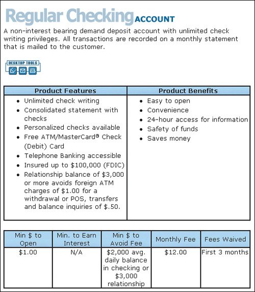 www.dimewill.com (Facing page, bottom) Incomplete information squelched people's enthusiasm for this product. While it's nice to offer discount packages, this site didn't have enough information for people to buy confidently. They couldn't figure out exactly what they would get for the price. For example, what's included in a "Modified American Dining Plan"? People's tendency not to purchase if they don't know what they're getting increases with high-ticket items. "I would rather go someplace where I could talk to someone on the phone and get the specific questions answered rather than get a vague collection of information when I want something specific." 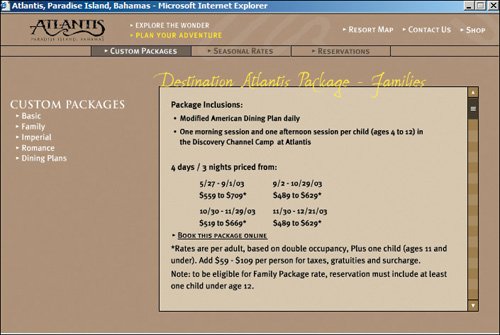 www.atlantis.com It's aggravating not to be able to get a description of upcoming shows. If you're curious about Charo's show, for example, you can't click on the listing for it to get information. The blue text appears clickable, but it's not. Why assume that people already know what they want before they get here? It is a huge missed opportunity. 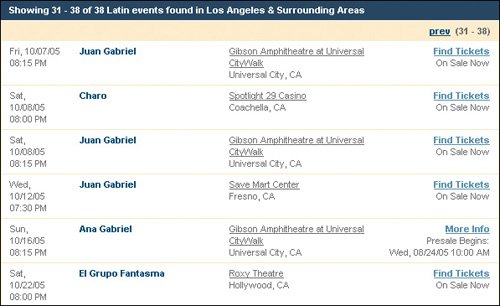 www.ticketmaster.com Provide Pictures and Product IllustrationsWhen presented properly, meaningful illustrations and images can complement text descriptions to show, rather then tell, what items look like. Space on Web pages is usually limited, so make your images count. Don't waste valuable real estate on images or graphics solely for decoration. Instead, support your customers' browsing behavior by choosing images that show the relevant details they care about. Keep your site efficient by setting image size and resolution as low as possible, but make sure you retain sufficient detail for customers to comfortably make out the important elements. Make it possible for users to enlarge photos for a close-up view of products. Seeing a specific detail or assessing a texture helps increase shoppers' confidence in purchasing online. It's gratifying that most sites obey this guideline and offer zoom features, but sometimes sites implement this feature incorrectly. The worst mistake is when a user clicks the "enlarge photo" button and the site displays the same photo. Such do-nothing links and buttons waste time and increase user confusion. Almost as bad are sites that let users enlarge photos but only by a minute amount. When users ask for a big photo, show them a big photo. People are even willing to wait for it to download. It's often best to offer an enlargement that fills up the most common screen size used by your customers (1024 by 768 pixels at the time of this writing). Other times, it's better to offer a range of close-ups to give users the details they need without requiring them to scroll a very large photo.
Make it possible for users to enlarge photos for a close-up view of products. Seeing a specific detail or assessing a texture can give shoppers the confidence they need to place an order online.
Yes, initial pages should use small photos to avoid hogging bandwidth and real estate. Yes, you want to be aware of download times and watch your page weight quota. Even in this broadband age, slow response times are still common. Be sensitive to people with slow connections, as large files can take too long to load, or even worse, lock up their computers. People's willingness to wait for images to download has its limits; they especially don't like waiting very long if the payoff isn't worth the effort.
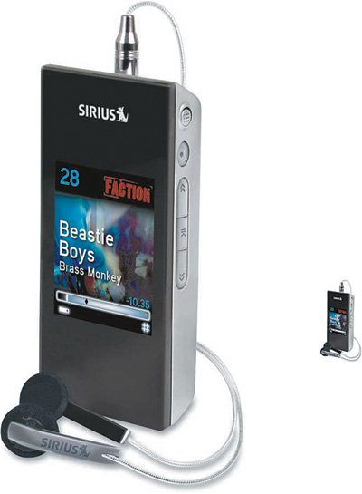
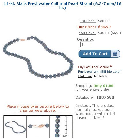
Crutchfield offers two levels of enlargements of the photos on its site. Notice how the larger picture includes sufficient detail to give you a very good idea of the style of the headphones and controls on this satellite radio. Of course, images this big can't be on the primary product page for two reasons: They download too slowly and would leave too little space for other product info. But it facilitates sales to make detailed photos available when users ask for them. www.crutchfield.com Amazon provides a clear close-up that shows the details of a ring. In addition, the site shows the product with other bands so that users can see its relative size. It would be better to include a side view to show the thickness of the ring. And for small objects, it's often a good idea to include a known item such as a coin in the photo to give users an easy way to gauge the size. (Below) The photos are too small to show enough of the kind of detail that would help people quickly discern differences among the choices without clicking on each to get a larger picture. Photos on the initial page should be small, but they need to be large enough to show salient details for each product. www.amazon.com 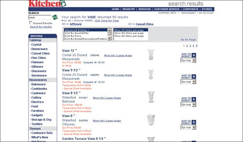 www.kitchenetc.com The use of thumbnails here is meaningless because viewers can't make out the differentiating details for each product. The text is illegible and the products look similar in these small-scale photos. 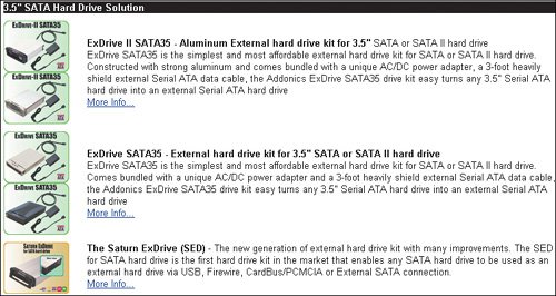 www.addonics.com What, no back view? People want to know what the back of trousers look like. Are there pockets, and do they have flaps? Are the pants in a wrinkly fabric? 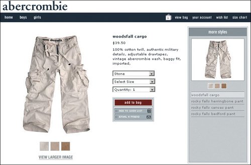 www.abercrombie.com This site does a good job of illustrating the item in views that people care about. Showing the beads against a ruler gives an idea of their size. It would have been ideal to include a picture of a person wearing them to give customers a sense of how they might look while being worn. www.overstock.com 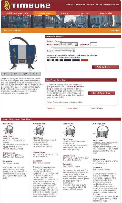 www.timbuk2.com What is Cordura fabric, and what does the inside of the bag look like? It would be nice to get more close-ups of the fabric and an inside view of the bag. To the site's credit, it has a nice chart at the bottom of the page detailing the bag's dimensions, but it's too far down the page and away from the Select Size input area to be noticed. 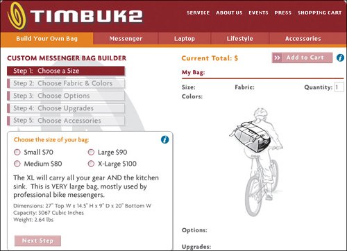 www.timbuk2.com A simple sketch can help people choose a bag size. This simple low-resolution drawing of a bag on a person sufficiently illustrates its relative size. Layer Product PagesPresenting ample specifics and details about your products doesn't mean overwhelming your customers. You don't need to present all the details at once; layer the information by revealing the key points first, and make it easy for shoppers to get the specifics. Customers shouldn't be forced to find related information in separate parts of the Web site. Product pages should have links to all other product-related topics such as:
Don't overwhelm your customers. Layer information by revealing the key points first, and make it easy for shoppers to get the specifics. Manufacturers' sites should always provide detailed information on all their products. It's common for people to visit the manufacturer's site when product information is lacking elsewhere, so providing rich product information can save the sale for you if a retailer's site is lacking. This is a good example of an effective product page. A bulleted list provides a high-level snapshot description of the product, while links guide interested customers to deeper information. Offering related accessories is also a nice way to boost sales while being helpful to customers. Showing prices for each accessory item is a plus. 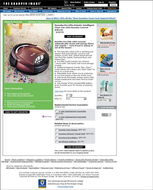 www.sharperimage.com Here's another good product page. Links to detailed product information are grouped together and prominently shown. This page gives just enough detail without being overwhelming. Including the delivery fees early in the shopping process also facilitates shopping. 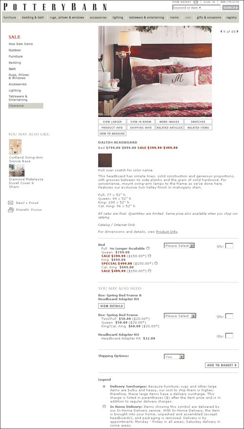 www.potterybarn.com Crutchfield offers rich information about the fairly complicated electronics products it sells. But instead of overwhelming users with all the information on one screen, the site makes good use of hyperlinks to layer the information. The initial display (shown here) provides an overview that is probably too detailed. Additional information is available through the tabs in the description area or by following links like "request a copy of the manufacturer's warranty." Of course, this strategy only works if the links to the additional information are clear, and the links on this page are indeed pretty self-explanatory. 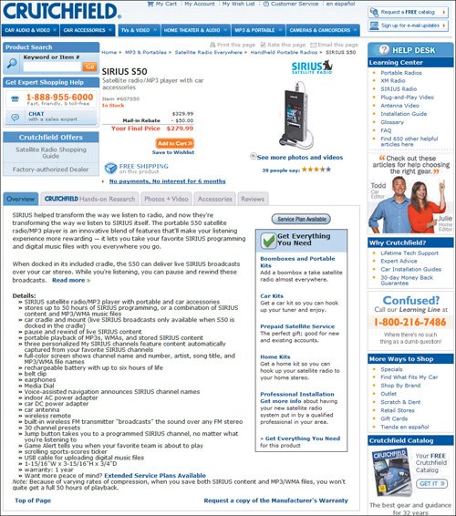 www.crutchfield.com (Facing page, bottom) This product page provides only superficial information and no access to details that customers care about. The brief summary doesn't give the specs that customers need to make purchase decisions. The page should support both new and returning customers, but related resourcesmaintenance manuals, warranties, replacement partsare missing. People expect a product page to be the one place that has complete information about a specific item or service. When they don't see it, they assume that the site doesn't have it. 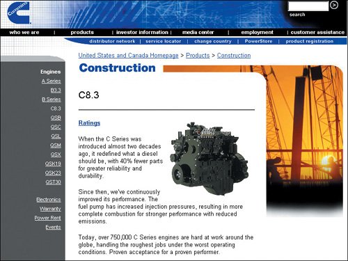 www.cummins.com (Facing page, top) It's virtually impossible to confidently choose a campsite on this site. The generic description for each campsite makes it difficult for people to differentiate among the choices. The incremental detail that people get with each click isn't worth the effort and it's mostly unintelligible. The average camper isn't going to know what is meant by the codes or site descriptions such as EnvironmentalLarge. 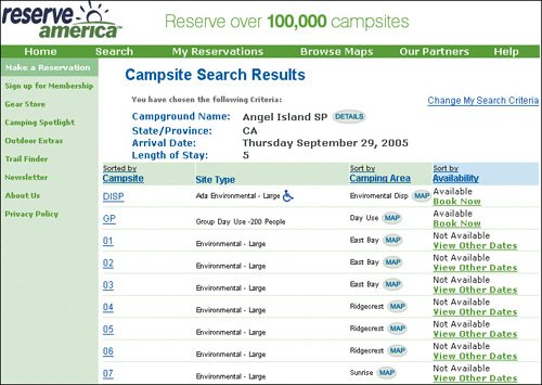 www.reserveamerica.com (Facing page, bottom) If you click for details on one of the campsites, the next page gives hardly any additional useful information. You're still baffled by what Environmental Sites or DISP mean, or what the campsite looks like. The information on vehicles doesn't make sense. Does it mean that they aren't allowed on the campsite? Without clear and complete information, people will abandon the online reservation process. 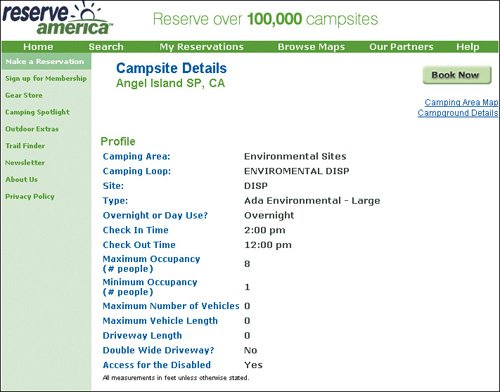 www.reserveamerica.com (Below) Even if you click the Campground Details link, the link names are meaningless. Who knows what the difference is between East Bay and Groups Platform? At this point, most people give up, leave the site, or telephone someone for assistance. 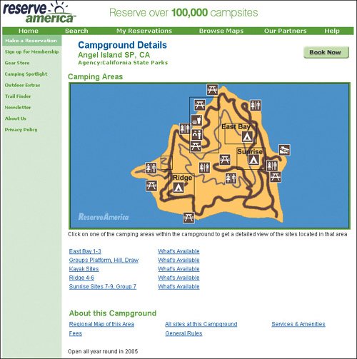 www.reserveamerica.com Display Bona FidesAcknowledging awards and recognition for the quality of products and services is one way to enhance your organization's credibility and build trust online. Instead of just listing them in a Press Releases section, consider mentioning recent awards directly on the appropriate product page. Major awards should also be shown in your About Us area. But don't feature old awards. They will just clutter your page and might undermine your credibility, suggesting that you haven't recently done anything noteworthy. If your products have been favorably reviewed in the press or on respected Web sites, feature quotes from the reviews and link to them. Such links add enormous credibility because they show that you are not afraid to let users read the full review. Most users won't click the links, but having them there still works wonders. Honda missed an opportunity to highlight important accomplishments that could sway customers in its favor. Telling customers about safety awards on other relevant pages, such as the product and safety pages, would have helped. 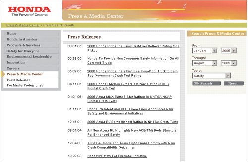 http://automobiles.honda.com |
EAN: 2147483647
Pages: 107