Navigation: Beware the Coolness Factor
| Navigation is a means to an end: Its purpose is to get people where they need to be quickly. The more efficient you make it, the more likely people will stay interested. Main topics should be static and appear at once so people can quickly skim through the choices. Waiting for navigation to slowly load or rotate is a waste of their time. Any type of dynamic navigation needs to be easy to operate. Menus that are too sensitive and change even at the slightest mouse movement may be more cumbersome than they're worthand they'll kill your chances of getting any business from senior citizens, people with disabilities, and novice Web users. Users are not looking for a scavenger hunt, so don't hide main navigational items. It's not enjoyable to chase moving targets or move the pointer around a site ("minesweeping") in hopes of finding something clickable. It is even more difficult for a person with reduced manual dexterity or motor impairments who has a hard time controlling the mouse. It's much faster for everyone to survey options when they're simply visible. In sum, avoid cute and fancy navigation. People despise it. Save your creative juices for those areas of your site that users actually care about.
Avoid cute and fancy navigation. People despise it. Save your creative juices for those areas of your site that users actually care about.
The main menu on this site automatically moves across the page at a slow and steady pace. If you want Reservations, for example, you wait for it to appear. You could increase the speed by moving the pointer over the arrows, but who wants to mess with that? Web sites should be able to maintain an elegant design without sucking up people's time. 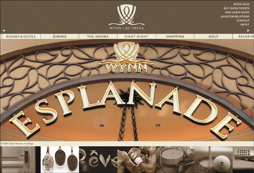 www.wynnlasvegas.com Old design: Our users were frustrated when the product offerings on this site moved as they moved their mouse over the page. Some had no idea that they were controlling the movement! In general, people resent having to scrub their mouse over one area at a time to get information. Some of our users didn't have the patience to hunt for products in this manner and said they would give up: "It moves around too much. When you try to get to an item, it moves. It makes you dizzy. I don't like it." "It's frustrating that it goes away when I'm trying to get to it." 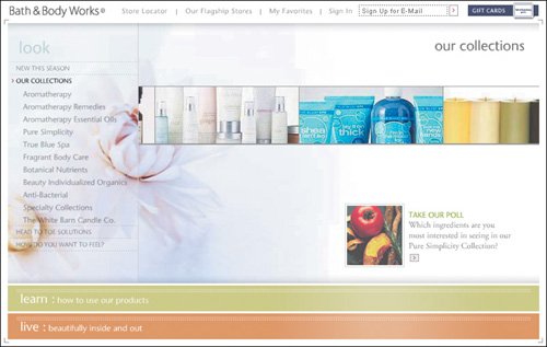 www.bathandbodyworks.com New design: This Bath & Body Works redesign is better and eliminates several of the usability problems we found in our user testing. Static pages have replaced the fancy dynamic interaction model. People no longer have to move their pointer over pictures to get product descriptions. We have included screenshots from the previous design because its flaws still appear on other sites. Just as Bath & Body Works learned its lesson, you can too. And unlike them, you may not have to lose business first! 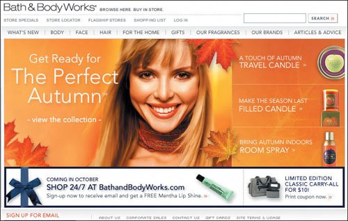 www.bathandbodyworks.com (Facing page, top) Hidden navigational labels trip people up. For example, this page doesn't appear to have anything to click until users hover their pointers to reveal text labels. Some of our users didn't realize this and wondered what they were supposed to do on this page. People prefer visible choices so they can be reviewed in a single glance.  www.dimewill.com (Facing page, bottom) The navigational panel on this site appears only after people move their pointers over the graphical areas in the center. Our users balked at having to conjure the navigational menu each time they needed it.  www.atlantis.com |
EAN: 2147483647
Pages: 107