Complying with Design Conventions and Usability Guidelines
| The entire concept of "Web design" is a misnomer. Individual project teams are not designing the Web any more than individual ants are designing an anthill. Site designers build components of a wholeespecially now that users are viewing the Web as a single, integrated resource. Unfortunately, much of the Web is like an anthill built by ants on LSD. Many sites don't fit into the big picture and are too difficult to use because they deviate from expected norms.
We must eliminate confusing design elements and move as far as possible into the realm of design conventions. Even better, we should establish design standards for every important Web site task. Standards enhance users' sense of mastery over a site, help them get things done, and increase their overall satisfaction with a site.
Even if you don't believe in the theoretical arguments in favor of user interface standards, the empirical evidence strongly favors complying with existing design conventions and usability guidelines. In this chapter, we have seen that the users most often:
With this little time to communicate your product benefits to prospective customers, you want everything else out of the way. If a user spends 27 seconds looking at a product page, you don't want them to spend most of it wondering about your navigation design or puzzling over other user interface elements. If your design follows conventions, they can allocate their attention to your content. That's the simple business rationale for complying with standards. There are certainly cases where it's OK to deviate from the usability guidelines. That's why they are called "guidelines"because they usually, but not always, hold. Take Victoria's Secret as an example. The very successful e-commerce site of this famous fashion and lingerie company usually scores among the top sellers on the Web. The nature of the company's products and positioning mean that it can do certain things on its site that would be a mistake for almost any other company. For example, the Web site attracts large numbers of visitors every time it streams an hour-long video production. Most Web sites would do better with shorter video clips. Even those sites that violate some guidelines are only successful if they comply with the vast majority of them. A few sites are so special that they can get away with violating most of the guidelines, but they are truly the exceptions. Every year Victoria's Secret produces a fashion show that is broadcast on television and available as streamed video off its Web site. This video is usually one of the most downloaded videos on the Internet and clips from it are available on many other sites. A full hour of video much exceeds our recommendation that Web videos be no longer than one or two minutes. Unless yours feature supermodels in lingerie, you are better off sticking to the guideline and producing short videos for your site instead of recycling television productions. 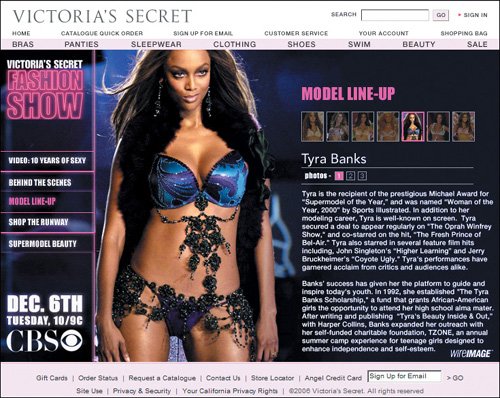 www.victoriassecret.com Victoria's Secret may violate the usability guideline on Web videos, but the company's e-commerce pages are pretty much by the book. On this page, however, there ought to be a buy button next to the main product, and it would be better if the model in the photo were wearing the shoes that the site is promoting in the cross-sales area of the page. This disparity emphasizes the need for e-commerce sites to shoot their own photos instead of repurposing images from a print catalog. 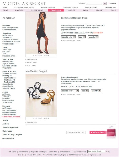 www.victoriassecret.com Victoria's Secret continues to comply with usability guidelines in its shopping cart. It follows standard guidelines such as indicating whether a product is in stock (though it should do so on the product page as well), providing an easy link for checking shipping and handling fees, and letting users check out without having to register. Despite the site's emphasis on glamour, this is an easy place to shop, and as a result, it is among the 25 best-selling e-commerce sites in the world. 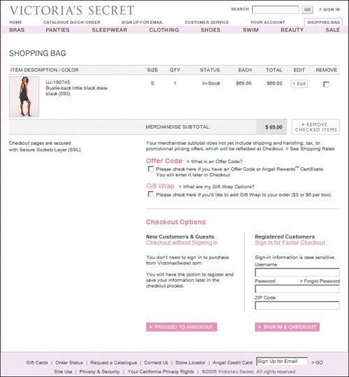 www.victoriassecret.com |
EAN: 2147483647
Pages: 107