Night Drive: Converting static site mock-ups to code, and solving problems when doing so
|
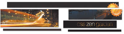
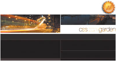
| Dave Shea, Designer www.csszengarden.com/064  EVOCATIVE: Driving around the city shortly past dusk, with speakers crooning a John Coltrane sax melody, yellow lights blurring past the windows, rich blues of the sky overhead. Dave Shea set out to re-create the mood of a mellow summer evening in Night Drive. A dark color palette sets the dim, warm tone. The dark orange used in the majority of text and imagery is balanced with brighter orange patches to keep the overall palette from appearing too brown. Both are complemented by subtle blue sprinkled throughout the text and photos to leave the color contrast purposely understated and tranquil, without appearing too monotone. Photos were chosen for their color as well as their subject matter: While driving after sundown, you might expect to see blurred lights, glassy water, and a hazy blue skyline. Visualizing CodeAs Shea designed Night Drive in Adobe Photoshop, he paid little attention to how it would be coded. The visuals came first, so any implementation problems would have to be resolved later, as the code was built. How does one take a flat mock-up and turn it into an interactive site? Various images must be saved as the design is divided into segments that will later be reassembled in CSS. There are no hard and fast rules about the process, and the key to satisfactory results is flexibility. Being aware of alternate methods ahead of time aids the decision-making process. ChoicesConsider the header of Night Drivea series of joined boxes, overlaid with a beveled and shiny yellow badge (FIGURE 1). Two challenges are present: laying out the area with its mixed photos and lines, and then placing the badge on top using a transparent graphic. After some thinking, Shea arrived at two possible courses of action: Figure 1. Night Drive's header.
Shea ended up choosing the second method, with a twist of the first: Instead of slicing each box into its own image, he separated out the two photographs into their own JPG files (FIGURE 3). The "css Zen Garden" title text was saved as a GIF, and the entire boxy layout behind the other images became a single, highly compressed GIF. What could have been a messy jumble of code to keep the header together ended up being a clean mix of the possible layout methods, which use both the GIF and JPG file formats for their intended purpose. Figure 3. Photos and text saved separately from the background. After the files were saved, assembling them required further planning: Which images would be applied to which elements? With judicious use of the background-image attribute and some image-replacement techniques, the answers became evident: There weren't enough elements within #pageHeader; the #exTRaDivs would have to be called up from the bottom of the document. Shea ended up attaching the main background image to the h1 element and the "css Zen Garden" title text to the h2 element. The code that applies to each of these images is highlighted: h1 { width: 770px; height: 166px; margin: 0; background: #000 url(bg2.gif) top left no-repeat; } h2 { width: 244px; height: 42px; background: #000 url(h1.gif) top left no-repeat; position: absolute; top: 120px; margin: 0; margin-left: 495px; } h1 span, h2 span { display: none; } The extra span styling hides the HTML-based text since it's being replaced with imagery, though this particular method is now considered a deprecated one. Note Methods and issues with image replacement is described in further detail in "Using Background-Image to Replace Text" (www.stopdesign.com/articles/replace_text). Absolute-Positioning TrickeryThis set the stage for the photographs, but pulling them into the header posed an additional challenge within the layout: Absolute positioning doesn't work well with centering. Shea employed a useful trick to work around the problem: He absolutely positioned the parent elements along the left edge of the screen, set their width to 100% to have them span the entire browser window horizontally, and centered the child elementsin this case the spanswithin the parent. Accounting for various browser bugs, this is the code required: #extraDiv1 { position: absolute; top: 41px; left: 0; text-align: center; width: 100%; } #extraDiv1 span { background: transparent url(granville.jpg) top left no-repeat; display: block; margin-left: auto; margin-right: auto; height: 123px; width: 770px; } This works if the child element is supposed to be dead center, but what if it isn't? Applying a padding value to the child increases its total width, offsetting it from the center. The trick is twofold: Padding expands the element both left and right, so a value double the desired offset is necessary; and the padding offsets the element in the opposite direction of the side it is applied to, so moving an image left of center means applying a padding-right value, and vice versa. Note The padding value needs to be greater than you'd expect. Applying 100px of padding-right will move the element only 50px right from the central axis. Since the element is centered, and any added padding is effectively increasing the width of the element, it's moving in both directions equally. Sleight of HandAfter the header was settled, Shea ran into an additional problem when connecting it to the rest of the content. He had intended a double line to run vertically between the columns, but simply applying a vertically-repeating background image to either column wouldn't work. The left column (#linkList) doesn't expand far enough vertically, while the right column is actually composed of three individual div elements (#quickSummary, #preamble, and #supportingText). Lacking one single element to apply the background image to, he instead applied it to all three divs, assuming they'd be the same width and therefore align horizontally: #quickSummary, #preamble, #supportingText { background: transparent url(bg4.gif) top left repeat-y; margin: 0 0 0 400px; width: 342px; } They aligned, but an unexpected problem arose: There was a vertical gap between each div (FIGURE 4). None of them had specific margin values, so where was the gap coming from? Figure 4. Problematic gaps between borders. Collapsing MarginsA somewhat obscure quirk of the CSS box model is something called collapsing margins. This means that if two elements rest one on top of the other and they both have non-zero margins and no padding, borders, or other conditions mentioned, the total combined height of both margins will be to less than their sum. So 20 pixel margins won't add up to a 40 pixel gap between elementsinstead each margin collapses into the other and you end up with a 20 pixel gap. But what does this have to do with the gap problem? Collapsing affects parent and child elements equally; because the divs have no vertical margins, each div's bottom margin collapses into its last child paragraph's bottom margin. But because the total margin value is not zero, the paragraph's 10px margin still has to be honored. It pokes through the bottom of the containing div (FIGURE 5). Figure 5. A paragraph's margins poke through the bottom of its containing div. The problem is easy to fix once the diagnosis is made: When a slight 1px vertical padding value is applied to the divs themselves, the conditions for margin collapsing are no longer met and the gaps disappear: #quickSummary, #preamble, #supportingText { background: transparent url(bg4.gif) top left repeat-y; margin: 0 0 0 400px; padding: 1px 0; width: 342px; } Note Collapsing margins are defined in the CSS 2.1 spec as "collapsing margins means that adjoining margins (no non-empty content, padding or border areas or clearance separate them) of two or more boxes (which may be next to one another or nested) combine to form a single margin." (www.w3.org/TR/CSS21/box.html#collapsing-margins). Image TrickeryNow that the header and body were determined, attention shifted to the badge in the top-right corner. Placing an image with transparent areas (the drop shadow in this case) over the top of other imagery generally means saving the image to take into account whatever it overlays. Shea could have flattened the Photoshop mock-up and saved the final badge image as a GIF or a JPG, complete with bits of the photo and lines underneath to preserve the transparency effect (FIGURE 6). Or he could have punched away the background areas and saved a transparent GIF, though most of the drop shadow would be lost (FIGURE 7). Figure 6. Badge saved with a full background, no transparency. Figure 7. Badge saved with the background punched out, limited GIF transparency. Instead, because the badge is considered "nonessential" imagery, Shea decided to use the PNG file format and save himself some trouble. A PNG with 256 levels of alpha transparency will preserve the drop shadow effect, regardless of what it's placed on top of. FIGURES 8 and 9 demonstrate this blending on two different backgrounds. Figure 8. Badge saved as a transparent PNG, overlaying a white background. Figure 9. Badge saved as a transparent PNG, overlaying a textured background. The PNG format is discussed in further detail later in the book, but for now the main thing to note is that Microsoft Internet Explorer for Windows doesn't render the alpha transparency, so what's needed is a way to hide the PNG from it. The easiest way to accomplish this is to use a child selector, which Internet Explorer for Windows doesn't understand, thus selectively serving the PNG only to browsers that are capable of rendering it. html>body #extraDiv4 span { background: transparent url(seal.png) top right no-repeat; } Obviously, with a more formal Web project, Internet Explorer support for even nonessential imagery is important. While the simpler one-level, on/off transparency of GIF is more limited, it's still functional enough that it would have worked well with proper planning. The Zen Garden encourages experimentation, but your clients may not. One Small StepStarting with merely a mock-up and a deadline, producing a full CSS-based layout is a daunting challenge. The key is to break it up into smaller tasks; tackling the header for Night Drive involved two separate steps, for example. Knowing the possibilities ahead of time allows for more robust decision making when problems arise, whether the solution should be switching positioning models, adjusting margins, or applying effects to a different element altogether. |


|
 Visual Enlightenment for the Web")
EAN: N/A
Pages: 117
- Chapter VIII Personalization Systems and Their Deployment as Web Site Interface Design Decisions
- Chapter XII Web Design and E-Commerce
- Chapter XIII Shopping Agent Web Sites: A Comparative Shopping Environment
- Chapter XV Customer Trust in Online Commerce
- Chapter XVI Turning Web Surfers into Loyal Customers: Cognitive Lock-In Through Interface Design and Web Site Usability