Designing a Cover and Spread
| This next project will tap all of the design skills you've learned in this book so far. You're going to create a magazine cover and two-page spread from scratch. The client is looking for something cutting-edge but also clear to readerssomething that will really jump off the newsstand and keep readers interested when they start reading. To kick it off, you'll hit the newsstand yourself for some research, and then get to the challenging task of preparing images and text and laying them out. Project Brief: Phashion MagazineA Chicago-based publishing house is planning to launch a brand-new magazine called Phashion. As the name suggests, this print magazine will cover the latest news and creations in the fashion industry worldwide and will focus on the Internet as a global marketplace for trendy clothing. It targets retail consumers more than industry insiders; readers will find stories covering online fashion events and where to buy clothing on the Web. The magazine will also include guides to related Internet resources, as well as hot topics such as the need for new international size standards in Web merchandise. The target audience is fashion-savvy cosmopolitan types and interested suburbanites, both male and female. They're typically well-paid professionals between their mid-20s and late 40s. The execs over at Phashion are looking to you to help them determine the design direction for their future spreads and covers. You'll work on a cover and a two-page spread based on your own article and image choices, and then present it to them. Project Summary
Project StepsUnlike many large-scale design jobs, this project puts you in charge of every facet. You have lots of creative freedom, but you must still communicate to your audience clearly and effectively. 1. Collect Images and IdeasIn the magazine industry, the editorial department will generally provide text and images. But Phashion just doesn't have any yet, so to nail this design job, it's time to go to the nearest newsstand and check the Web for images and possible titles and topics that are relevant to this magazine. You can scan or download images as necessary since they are for mock-up purposesbut remember that for any real-world professional design, all images must be original. You should come up with at least 15 small and large images for the project. You won't use them all, but they'll give you a good starting point. Try to find shots of catwalks, photo shoots, famous designers, celebrities in designer wear, geographic locations where fashion events take place (such as Paris, New York, and Milan), and other fashion-related images. Also, try to grab groups of photos that have the same theme, since they may be used in a spread for the same article later. If you're not sure of the style and quality of images typically found in classy fashion magazines, spend some additional research time on this before choosing your images. Find out about the target audience as well, and learn what these readers will find appealing. To keep yourself on track, describe in short sentences the visual content of the images you have collected. 2. Collect Topics and Story IdeasJot down at least five topics, articles, or stories that could accompany the images you've found. Here are a couple of examples:
You may wonder why you, as the designer and not a writer, have to come up with stories and ideas for a magazine cover. For draft purposes, you'll often have to give a client a polished sample that incorporates some believable dummy text as a placeholder. Also, inventing the stories and searching for the images helps you to understand the audience and learn the best way to convey the magazine's themes. 3. Create a Simple LogoDid we mention that Phashion doesn't even have a logo yet? If you've already finished Chapter 7, "Logo Design," you should be able to tackle this step more easily. Magazine logos are typically type-based with no supporting graphics. And the typeface is usually just a simple one. Why? Overly decorative elements and ornate text can distract readers from the cover image and headlines. Since the most common use of the logo is on the busy cover itself, the logo doesn't need supporting elements to explain what the brand is all about. That's why magazine logos are usually just one color as well. When you create your logo, just work with black on white. Then, when you add it to the cover in the next step, you can choose a color that coordinates or contrasts with the cover image. The logo should be simple, but take your time with each letter and experiment with things like spacing, upper- and lowercase, and other elements to make it clean, cohesive, and unique. Figure 9.16. Experiment with logo designscome up with lots of them, and narrow them down to theone you think does the best job of conveying the Phashion theme simply.
Work on your logo in Illustrator and save it as an .eps file to use later. 4. Plan Your CoverAfter you've identified your source images and story ideas, narrowed them down to the best ones, and finished the logo, you're ready to work on a cover. But where do you begin? Here are some ideas to get you going. First, do your research. Yes, again! If you're not familiar with fashion magazines by now, go back to the newsstand. Especially if you are not a member of the magazine's target audience, you'll need to look long and hard at comparable cover designs. Ask yourself questions such as:
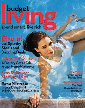
Next, you'll need to be compelling. The cover will need to compete with hundreds of other magazines sending hundreds of other messages. The combination of text and image will need to intrigue the viewer. Speaking of images, please be tasteful when making your image selections. The cover should call attention to specific articles in addition to expressing what the whole magazine and brand is about. The audience will likely be giving the news rack a quick scan. Since this is a fashion magazine with an Internet twist, the cover needs to scream "fashion magazine." Stick to the "one-message rule." If you take a closer look at most (good) magazines, you will find that they feature one main message on the cover. Even if the cover hints at several storylines, one image and heading will generally be linked to create an effective message. Figure 9.17. One bold image, with an unexpected pose, ties in with the largest headline on this Budget Living cover"Dive In! 201 Splashy Steals and Dazzling Deals." Like most popular magazines, Budget Living lists several secondary stories but presents them with less emphasis than the lead story.
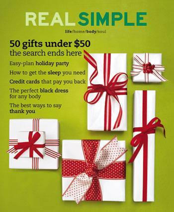
Figure 9.18. The "50 gifts under $50" headline on this Real Simple cover ties right into the bold gift box imagery to form a single main message. Less important stories are listed with less emphasis so you notice them after the first one attracts your attention.
5. Design the CoverMost magazine covers are around 8 by 11 inches or larger and created in CMYK color mode in a high resolution for printing. They're often created in layout software such as QuarkXPress or InDesign, but you can get a good feel for layout with your trusty friend Photoshop. To begin, create a new document in Photoshop that is 8 inches wide by 11 inches tall, in CMYK color mode, and 300 dpi resolution. Remember to save often as an editable .psd file as you work. Locate and open the .eps file of your final magazine logo. When opening this in Photoshop, you will be asked what size and resolution you would like to use. Choose 300 dpi and a size that spans most of the width of your cover. If you don't like the size you select, close the logo file and try againthis will give you much better quality than if you try to scale the logo later. When you have it the size you like, drag it to your cover and position it. When positioning the logo, think about the magazine examples you've seen in the lesson and the ones you found in your research. At this stage, you'll most likely want to change the color of your logo to fit your planned design. Now, select the most intriguing of your stories and choose one image as the main eye-catcher. Keep in mind what you learned earlier and your other research. Bring your image onto your cover file and position as needed. You may also want to do some tweaking to the image, such as retouching, cropping, or modifying the background. Take close notice of the negative space around the image and how the image interacts with the logo at the top. Make any changes you need to. Use the Type tool in Photoshop to place the dominant headline for this topic/image as well as any subheading that accompanies it. Make sure that it, along with the image, dominates the cover. Consider the headline's placement (around the image? over the image?) and its font and color. If you choose to present other, secondary story titles on the cover, make sure that you give them minimal visual attention while still handling them tastefully. You may also like to add other standard magazine elements to the cover, like the month or price. 6. Plan Your SpreadWith the cover finished, you'll create a two-page spread that will introduce your cover story. Take some time to review the spreads in this chapter as well as from the magazines you researched, and consider the various successful approaches you can take in presenting an article. Recall that in the opening spread of the MAGNET story, the designer used very little copy in order to create good contrast and impact before entering the text-dense area on the following pages. The Popular Science spread uses a similar approach but includes some of the body text as well to draw readers in. Regardless of whether you choose to include some of the body copy, the goal is not to overwhelm the reader with text but rather to get her interested enough in the idea of the story to turn the page. Take inventory of the elements that you could use in the spreadvarious images you've collected and text you've come up with. Narrow it down to what you think is necessary to get the point across, and then start sketching some ideas for placement with a grid. The number of images is up to you, but typically one main image and perhaps a smaller image or two works well. Don't reuse the image on your cover, but a related image works great. 7. Design the SpreadLike the cover, you'll create a CMYK, 300 dpi Photoshop file. This time, make it 16 inches wide (representing two pages side-by-side) and 11 inches tall. Save your editable .psd file often as you work. Though your text and image placement will certainly be different from the examples we've seen so far, the grid may be similar and should start with three columns. Go to View > Rulers to get started with the grid. Click your pointer in the left ruler and drag to the right until you reach the center of the document. This guide divides the two pages. Then measure and drag guides to create three columns on each page with an equal amount of spacing between them. You may also want to drag horizontal guides from the top ruler, though these don't have to be in thirds like in the MAGNET exampleuse your judgment based on your design ideas and page elements. Retouch your images as necessary before bringing them onto your grid. You can apply an interesting graphic treatment as well if you feel it contributes to the articlelike the sepia treatment in the Tom Waits article. Bring your images to the grid, and size and position them considering the alignment, proximity, and negative space. Add at least the headline and a subheading, carefully working to maintain the appropriate hierarchy on the page. It is up to you how much text you want beyond that, such as body text, pull quotes, or captions. Step back from your spread and see if it needs additional elements such as background colors, decorative lines, and so on that help draw attention to the right parts of the page and provide appropriate contrast and interest. Add these last, and be sure they are not a dominant part of your design. Student WorkWhat icons have other designers created? Here are some work samples from Sessions students: Figure 9.19. This cover by Rollo Girando is fresh and feminine with strong photo composition and a clear main message.
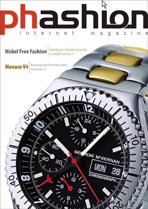
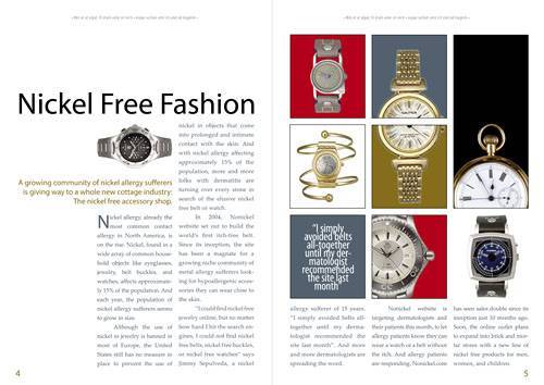
Figure 9.20. Geordie McKernan built his cover around this illustration of a watch and used a three column grid in his spread to flow the text and present an interesting take on the main article image and pull quote. The far-left column is blank aside from a spanning heading and subheading for negative space.
Figure 9.21. In Lauren Bzdak's spread, some geometric accents add interest and balance, and lots of negative space keeps the spread clean and sophisticated.
|

EAN: 2147483647
Pages: 103