Elements of Design
| Every design we've looked at so far exhibits a skill in handling four elements: imagery, color, typography, and composition. Now we'll explore some basic principles for each area. The Role of ImageryThe use of imageryphotographic images or illustrationsis the most direct way to communicate to a wide audience. There's a scientific reason for this: Our mind processes any kind of picturea shape, a representation, even an outline of a figuremuch more quickly than it does a word or sentence. There's a commercial reason, too. Design must speak to a wide audience and speak quickly. This is partly because we are inundated with visual messageswe see graphic design everywhere. How much time do you devote to scanning a magazine ad, evaluating cereal boxes, or checking out someone's cool new sneakers? Not a lot. A design often has a fraction of a second to command attention and communicate. If the message is not compelling or clear, the opportunity is lost. Figure 1.9. In this promotional leaflet design, Canadian designer Janine Vangool uses a visual analogy to communicate what typography is all about.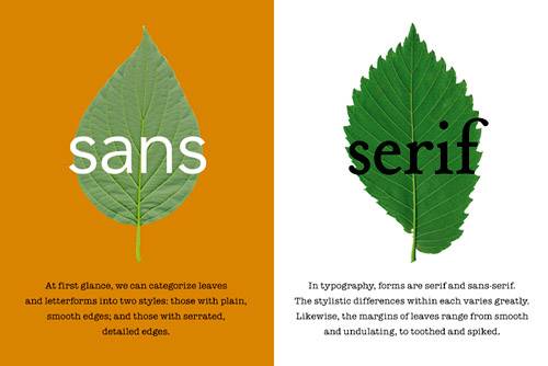 Read these words, then try to visualize them: Bowler hat. SUV. Convenient online services. Imagery is important in design because a picture (a cliché, but true) often conveys far more than mere words can. Almost any concept that you can imagine: a car, a refreshing taste, trust, fresh produce, retirementis more quickly (and better) expressed through an image than the written word. tip If a professional photographer is not available (or affordable) designers often use stock photography for high profile jobs. The quality of the source image is a paramount consideration. Simply showing a picture is not enough, however. Whether it's a photograph or an illustration, imagery must be expertly handledcropped, edited, or simplified to bring out the essence of the message. The more economical the message, the better it communicates. A simple approach without distracting or irrelevant detail will determine whether the viewer grasps the concept or jumps to the wrong conclusion. At a psychological level, the imagery in an ad or layout does much more than simply conveying a concept. It also communicates a general feeling, emotion, or mood that a viewer will associate with the product or publication. Tapping this intangible quality of imagery is essential to brand marketing. It is why designers, some of them, get paid the big bucks. Photographic ImagesTo excel at design, it helps to immerse yourself in photography. The best designers understand the powerful qualities in the photographic image. A photograph catches the eye because it is understood by the viewer as capturing reality. The eye is immediately drawn to it, prompting questions of who, what, where, and why. It begs for interpretation. Show me a photo of a person, and I will try to identify who it is. (Two people? I will try to figure out their relationship.) A photo of a product? I will wonder what it does or who made it. If I see a photo of a place: I will want to know where it is or what type of place it is. Or if it's a photo of an action or event, I will ask why it is happening. Figure 1.10. Fashion ad, right? Wrongcloser inspection reveals that Viva Dolan Communications created this ad to showcase ArjoWiggins paper. The model is wearing clothing fabricated from high-end paper stock marketed to the fashion industry.
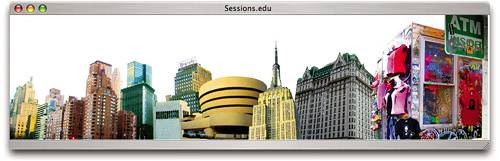
What makes a photographic image successful in a design context? The subject of each photograph is immediately clear and quite simple, and yet the image is rich in color or detail. The image is powerful enough that it attracts the eye and explains itself almost without the need for accompanying text. The designer has integrated the image with the other elements into a pleasing composition. The designer has made sure the emotive qualities of the image that are most important to the message stand out: a smile, the eyes, the reflective surface of the car, the play of light on a diamond. The scaling and cropping of the image and its treatment (color, black and white, or duotone), together with its framing, help direct the viewer to the salient parts. Of course, another compelling aspect of photographic imagery is that it can be altered, doctored, enhanced, or (to put it another way) Photoshopped. The digital image is so wonderfully malleable. Today, 90 percent of the photographic images we see in the media have been retouched: digitally altered, corrected for color, or otherwise made more appealing. This may include removing extraneous details, replacing backgrounds, and even creating whole new scenes with multiple images. Figure 1.11. This background image for the Sessions.edu Web site was composited from a series of New York City photos. The result is a larger-than-life background that evokes the excitement of the big city.
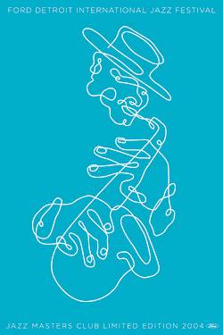
 And boy, do we love it. Such digital imagery is superbly evocative precisely because we interpret it as realistic, even when we realize that an image has been digitally altered. Many eye-catching ads introduce subtle, unnatural elements to an image, playing on the tension between artifice and reality. And we're fascinated. Our attention is drawn because we realize that something is not real and we want to figure out what it is. IllustrationWhat role does the traditional art of illustration play today? One might think that as more people design on computers, drawing itself would begin to die out. Not so. Digital photography is so prevalent now that anything drawn or otherwise crafted, sculpted, stitched, or fashioned by hand has a higher value. Line art and drawings suggest individuality, style, humanity, and a point of view. Illustrations are often used in fashion and publishing to create a nostalgic association with the past, when everything was made by hand. Furthermore, you can draw on the computer. Digital illustrationscreated in vector art programs such as Illustratorevoke many of the same feelings traditional illustrations do. They look hand-drawn, but they fit neatly into any design context because they can be edited, replicated, and mass-produced at will. Figure 1.12. Illustration is inherently creative, and so this wonderfully free Felix Sockwell illustration is a great choice for the Ford Detroit Inter-national Jazz Festival poster.
Digital illustrations have an inherent association with creativity. Illustrations are used when a designer must communicate artistic, editorial, or business flair. The creative spark of the illustrator, his or her skill in handling the art of representation, can be associated in the viewer's mind with the company or organization that is delivering the message. Digital illustration also is a crucial component of visual identity design. Since the first companies began, illustrators have created symbols or marks that worked along with typography to convey the identity of a company or organization. And further back in time, artists created flags and crests for kings and nobles. Unlike photographswhich we interpret as slices of realityan illustrator's drawings are understood as symbolic representations of a person, company, or concept. Figure 1.13. Logo design is a natural application for illustration. This playful Ecuadorean car wash logo was designed for a woman-owned business.
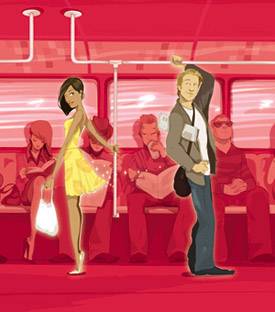
Zoinks! Let's not forget that illustration can impart a tone that is playful, imaginative, or downright fun. Illustrations and sketches resonate with the universal experience of our childhood attempts to represent the world through pictures. They remind us of newspaper cartoon strips and animated movies. They are often associated with products or messages that evoke a playful experience or provide a relief from the ennui of adult life. Figure 1.14. Designer Marcos Chin's marvelous ads for online dating site Lava Life create an appealing image that refreshes the sometimes uncertain realm of dating. Stylish young singles are depicted in the process of becoming attracted to each other.
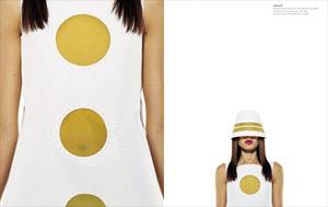
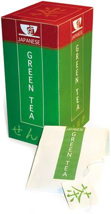
As you can see, the choice of imageryphoto or illustrationis important for a designer. Who would want a photo of a scaly fish on their can of tuna? Conversely, who would want to see a fun illustration used in a serious context like an insurance ad? It's a choice between realism and representation. One compromise is to use photos and illustrations together in a project; one is usually the focus while the others play a supporting role. ColorColor is the graphic designer's best friend and most powerful weapon. In the digital era, color is chosen and deployed with a few clicks or keystrokes. The use of color can bring an immediate, emotive quality to visual communication. Color can help establish the overall genre and mood of a piece as well as the relative importance of the different elements within it. Good designers understand how to tap our universal associations with color. When we see green, we think "healthy" or "natural"; when we see red, we think "dangerous" or "important." Blue is often used to evoke calm, purple to convey luxury. While these underlying qualities of color vary from country to country, they are surprisingly consistent in the West. Figure 1.15. Color is particularly important in food packaging. This Green Tea package design uses colors that are very appropriate for a Japanese audience.
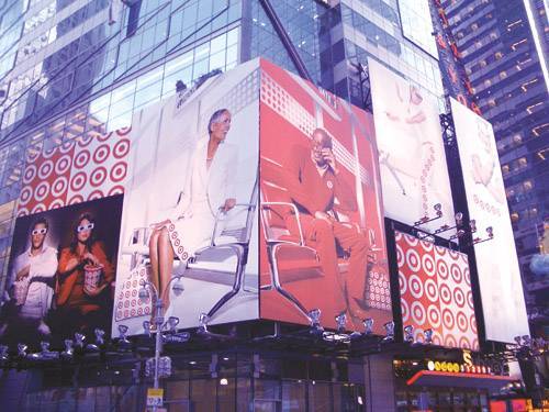
In addition to inspiring moods, colors are associated with brand identitiespolitical parties, nationalities, sports teams, and companies, to name just a few. Subtle variations of red could bring to mind associations as diverse as the Republican party, the country of China, the San Francisco 49ers, or Coca-Cola. Being aware of existing color associations will help you avoid sending the wrong message. Based on how they reach the eye, colors, also known as hues, can be perceived as warm or cool, light or dark, active or calm. Some colors pop out, others recede. Designers can adjust the tone and intensity of a color (its brightness and saturation) to tailor how it is perceived. Figure 1.16. Notice the use of color to both excite the eye and reinforce a brand in these billboard ads for fashionable retailer Target. The company's visual identity is both vivid and unmistakable.
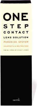
Complicating the issue further is the fact that color is relative. The perception of any color varies depending on what other colors it is combined with. Designers must use great care to select color schemes, or sets of colors, that are appropriate for a project and convey the right message. A tool called a color wheel is used to select harmonious color schemes. Designers must also consider the lighting and environment in which the piece will be displayed. Every designer should take some time to learn color theory: the principles that explain how and why color interactions produce pleasing effects and desired emotions. Deploying color appropriatelyoften by using it sparinglyis key to the success of visual communication. tip Colors in design are never purely decorative; they are chosen for a reason. It's good practice for a designer to explain his or her color choices to clients. TypographyTypographybroadly defined as the art of type design and text layoutis essential to graphic design. Text and image must work together to create a message. Most design projects actually begin with some poor, bare information that needs a designer's touch. And without text, if you think about it, a design project would simply be art, photography, or illustration. Like every other element in a design project, the written component, often called the copy, must be honed to capture the viewer's attention. No use in creating a razor-sharp image to accompany some flabby prose! The field of advertising illustrates just how intelligently and creatively text and image can be combined. In ad agencies, copywriters work with visual designers to make sure that both visuals and copy work in perfect sync. Figure 1.17. Beautiful design concepts can emerge from the imaginative use of typography, as witnessed in this packaging design for a lens cleaner.
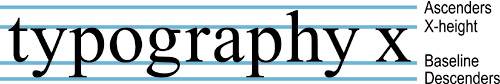
To tap the power of type, a designer must understand how letterforms and typefaces are constructed. The fonts that we so casually access from our drop-down menus are the product of centuries of evolution in printing, having been originally hammered out in hot metal (and before that, chiseled into stone). A typeface is still defined by certain distinct visual components. One fundamental is the vertical proportion of the typeface: the distance between the baseline, upon which a row of letters sits, and the x-height, ascender line, and descender line. These points of referencethe height of lowercase letters, and the length of their upstrokes and downstrokesare generally consistent within a typeface. Figure 1.18. The heights and proportions of x-heights, ascenders, and descenders are among the major features that distinguish typefaces.
Why should a designer care about such minutiae? The more you get to know typography, the more you realize that a typeface is just like a colorit has a very specific language and the ability to convey specific emotions or moods. In high-level design projects, typography is handled with as much care as imagery or color. Any graphic design begins with the important choice of typeface or font. Unless the typeface is already dictated by the client or publisher, a designer must choose between serif and sans-serif fonts (with and without ledges on the ends of letters, respectively) and drill deeper into finer distinctions between type families: Times, Palatino, Garamond, or Bodoni? Or perhaps a custom, avant-garde solution from a type foundrya type design firmwill provide the required edge? Equally important to the layout of type are decisions about the hierarchy of information. The size, weight, proportions, and placement of text on the page are critical to helping the reader's eye navigate through the layout and intuit the importance and purpose of each piece of content. Figure 1.19. The choice of typefacetraditional, austere, or playfulis an important design decision.
Prominent text (titles, headlines, and company logos) may need fine-tuning for coherence and impact, in which case the designer will adjust the kerning or spacing between pairs of letters. In blocks of text (body copy), margins and justification (line length and left/right alignment) and tracking and line spacing (spaces between letters and lines) may all be tweaked to promote readability and enhance the overall composition. note Any prominent text such as headlines and logos will need careful adjustments to letter spacing for maximum impact. Studying typography can yield enormous dividends. The more you immerse yourself, the more you will discover that type itself is a graphic element. The shapes of letterformstheir distinctive contours and the negative spaces they createare powerful tools in your work. A mastery of typography is the mark of a designer. Figure 1.20. Expressive use of type is the hallmark of a designer, shown here in Gabriela Monroy's work.
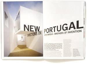
CompositionNow that we've explored how imagery, color, and typography each play a role in a design, let's look at the big picture: composition. Composition is the art of layout or placement of all those elements on a page. It's the heart of graphic design, and yet when done well, it is invisiblethe feature a viewer will be least conscious of. Most design projects begin with the arrangement of elements on a page: a two-dimensional surface or screen with defined boundaries. The page is a blank slate. You can place elements anywhere on it, and divide the space any way you like. Careful, thoughproportion and balance will play an enormous role in the psychological impact of your message. Emphasis is a critical element in composition. It's particularly important in editorial design, in which the size, color, and grouping of elements are used to establish a visual hierarchy. In a magazine article, for example, the relative importance of different blocks of text or images helps the reader quickly scan and grasp the purpose of each item: headline, byline, body text, pull quote, and so on. Figure 1.21. This two-page spread for architecture magazine Azure does a wonderful job of creatively interpreting the article title to pull the reader into the story.
Depending on how you place objects on the page, you can attract the eye to a place of rest or lead it in a merry dance by suggesting movement. A single, centered object or set of objects will evoke calm, stillness, and equilibrium. Objects sitting to the left or right may connote movement or draw attention in that direction. Objects positioned toward the top or bottom of the page will pull the eye up or down. When you place any object in a two-dimensional space, part of your image will be interpreted as positive space (the subject of the piece) while other parts will be seen as negative space (the background). Using contrast will give due emphasis to the subject of the piece. But this doesn't mean to ignore the background. The form of the background plays a strong role in the viewer's perception of the overall composition. Smart designers are often able to exploit the shape of negative space and the ambiguity between what is foreground and what is background to add intrigue and impact to a piece. Figure 1.22. A half-munched apple or a marketing company that understands its customers? This identity developed by 98pt6 plays a clever game with negative space.
The balance of your composition must complement the message too. Designs with elements proportioned equally on a central axis (visible or implicit) are said to be symmetrical. Symmetrical compositions suggest calm, order, and rationality. Everything has been neatly arranged for you. Compositions that distribute elements unevenly, by weighting the page mostly to the left or right, are said to be asymmetrical. These can feel unbalanced, energetic, and edgywhich could be the right direction for a certain kind of project. |


EAN: 2147483647
Pages: 103