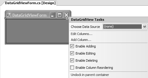
Smart Tags
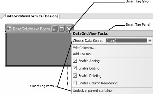
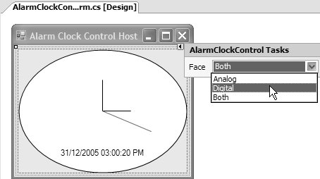
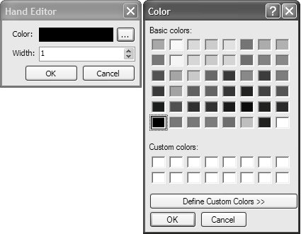
| Smart tags are designed to present the most commonly used or contextually relevant configurations for a component right next to the component on the design surface (visual or nonvisual). Figure 12.6 shows the smart tag for the DataGridView control. Figure 12.6. DataGridView's Smart Tag Presenting configuration options in this manner makes the design-time experience for developers much more focused and efficient because they avoid sifting through the entire set of properties available from the Properties window to find the few they are most likely to use. Many Windows Forms components provide smart tag support by leveraging a subset of types in the System.ComponentModel.Design namespace (in System.Design.dll). These types are known collectively as designer actions. Designer ActionsThe Windows Forms Designer notices whether a component implements designer actions and, if so, renders a clickable smart tag glyph at the top-right edge of the component when it's selected on the design surface. The glyph is clicked to display the smart tag panel, a special UI managed by the Windows Forms Designer; to provide access to one or more smart tag items for a component. Figure 12.7 highlights these elements on the DataGridView's smart tag. Figure 12.7. Smart Tag Glyph, Panel, and Items In designer action infrastructure parlance, smart tag items are referred to as designer action items, which are shuttled around the design time in groups known as designer action lists. If a component requires smart tag support, it must pass at least one designer action list containing at least one designer action item to the Windows Forms Designer. The same designer action list is then forwarded to the smart tag panel, which converts each designer action item into an equivalent visual task. Designer Action ListsBecause you must package designer action items in designer action lists, the best place to start adding smart tag support to your component is to build a designer action list. The designer action infrastructure implements a special class to represent designer action lists, appropriately called DesignerActionList: namespace System.ComponentModel.Design { class DesignerActionList { public DesignerActionList(IComponent component); public virtual bool AutoShow { get; set; } public IComponent Component { get; } public object GetService(Type serviceType); public virtual DesignerActionItemCollection GetSortedActionItems(); } }The DesignerActionList class is designed to associate one or more designer action items with a single component. You make the association via its constructor, which expects a component's IComponent reference and is available from the read-only Component property after construction. Designer action lists aren't lists in the sense that they implement IList or ICollection. Instead, designer action lists implement the GetSortedActionItems method to return a list of designer action items stored in a DesignerActionItemCollection. The smart tag panel converts this list into one or more smart tag items. If GetSortedActionItems returns an empty DesignerActionItemCollection, the smart tag glyph isn't displayed for the associated component. To implement a list of designer action items for your component, you create a custom DesignerActionList, which you start by deriving from it: class AlarmClockControlDesignerActionList : DesignerActionList {...}Smart Tag PropertiesBecause a component is primarily about setting properties, it follows that the most common type of smart tag item to be displayed on the smart tag panel is a smart tag property item. In similar fashion to the Properties window, each property item is composed of a label that describes the property, and a control that allows developers to edit the property. Creating a Smart Tag Property ItemUsing the AlarmClockControl as an example, let's consider the Face property. Recall from Chapter 11 that the Face property is used to determine whether the AlarmClockControl's face is rendered as analog or digital (or both). Because Face is one of the properties most likely to be configured at design time on the AlarmClockControl, it is an ideal smart tag candidate. To provide a way for GetSortedActionItems to create a DesignerActionItem object for this property, we implement a Face property on the custom DesignerActionList: class AlarmClockControlDesignerActionList : DesignerActionList { ... // Face proxy property public ClockFace Face { get { return this.AlarmClockControl.Face; } set { ... } } ... // Helper property to acquire an AlarmClockControl reference AlarmClockControl AlarmClockControl { get { return (AlarmClockControl)this.Component; } } }The reason we implement the property on DesignerActionListrather than use the component's own implementationis that the smart tag panel is geared to operate on DesignerActionList objects rather than directly with the components themselves. In reality, DesignerActionItems are pointers to members on the DesignerActionList that the smart tag panel needs to expose. Thus, DesignerActionLists must implement a public property that exposes the component's property, by proxy, that the smart tag panel can read from and write to. The role of the proxy property is illustrated in Figure 12.8. Figure 12.8. Intermediary Designer Action List with Proxy Property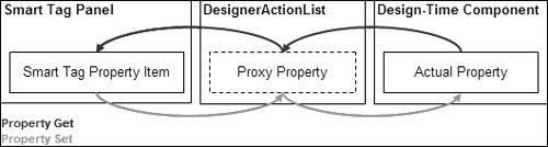 In light of this requirement, there is another consideration. The proxy property cannot set the actual property on the component directly; when you set properties using this technique, design-time servicessuch as immediately refreshing the Properties window to reflect a change to the property, and supports undoing property setsare circumvented. You can avoid such naughtiness by using TypeDescriptor to set the component's property safely: class AlarmClockControlDesignerActionList : DesignerActionList { ... // Face proxy property public ClockFace Face { get { return this.AlarmClockControl.Face; } set { this.SetProperty("Face", value); } } // Helper method to safely set a component's property void SetProperty(string propertyName, object value) { // Get property PropertyDescriptor property = TypeDescriptor.GetProperties(this.AlarmClockControl) [propertyName]; // Set property value property.SetValue(this.AlarmClockControl, value); } ... }This has the same effect as using the Windows Forms Designer's component change service to update a property, as you saw earlier, although the code to use TypeDescriptor is more concise. The proxy Face property, in conjunction with the custom DesignerActionList's base GetSortedActionItems method implementation, comprises the minimum implementation required by a designer action list. GetSortedActionItems is called from the smart tag panel before the panel opens and when it is refreshed, in both cases converting the proxy Face property into a designer action item that's eventually displayed as an equivalent smart tag task. The initial value of the smart tag property item is retrieved from the component's Face property via the proxy Face property we implemented on AlarmClockControlDesignerActionList. When the Face property is edited via the smart tag panel, the component's Face property is set using the same proxy property. Of course, since we haven't yet passed our designer action list to the smart panel, nothing is displayed. Using custom Designers to Expose Designer Action ListsDesigner actions are classified as design-time-only functionality; this means they are provided to, and used by, a component solely from within the design-time environment. A custom designer makes perfect sense as the means for exposing a custom designer action list. Luckily, the custom designer we baked earlier in this chapter has just popped out of the oven: class AlarmClockControlDesigner : ScrollableControlDesigner {...} [Designer(typeof(AlarmClockControlDesigner))] class AlarmClockControl : ScrollableControl, ... {...} As you can see, AlarmClockControlDesigner derives from ScrollableControlDesigner, which indirectly derives from ComponentDesigner. ComponentDesigner implements a read-only property, ActionLists, that returns an instance of DesignerActionListCollection. By default, the base ComponentDesigner class's ActionList property returns an empty DesignerActionListCollection, which is viewed by the Windows Forms Designer as "Smart Tags Not Required" for the component in question. However, you can change that to "Smart Tags Required" by overriding ActionLists to return an instance of the DesignerActionListCollection class that contains at least one DesignerActionList object: [3]
class AlarmClockControlDesigner : ScrollableControlDesigner { ... DesignerActionListCollection dalc; // Cache action list collection ... public override DesignerActionListCollection ActionLists { get { // Create action list collection if( this.dalc == null ) { this.dalc = new DesignerActionListCollection(); // Add custom action list this.dalc.Add( new AlarmClockControlDesignerActionList(this.Component)); } } } ... }As a performance measure, this code creates a designer action list collection field that needs to be initialized only once, even though ActionLists are inspected multiple times. That's all the implementation you need to edit a property from the smart tag panel. After rebuilding the updated AlarmClockControl solution and dragging the new AlarmClockControl onto the form, you should be able to edit the Face property from the smart tag panel of AlarmClockControl, as shown in Figure 12.9. Figure 12.9. The Modern Face of Smart Tag Property Items Under the covers, the smart tag panel inspects ActionLists for a DesignerActionListCollection object and calls the GetSortedActionItems method on each designer action list in the collection, using the results to populate the smart tag. One feature of the smart tag panel that you have no control over is its title field. However, in lieu of developer-configurable support, the Windows Forms Designer uses a reasonable default that conforms to the following naming convention: ComponentTypeName Tasks The Windows Forms Designer also takes care of determining which controls are used to provide display and editing of designer action property items. Displaying Smart Tag Property ItemsIn Figure 12.9, you can see that the smart tag panel renders enumeration types like the Face type, as drop-down lists. The heuristics employed by the smart tag panel to translate property types to editable controls include the following:
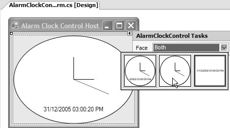
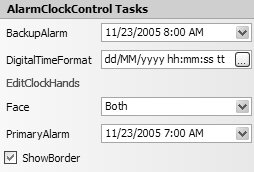
Although you have no influence over the control that's chosen by the Windows Forms Designer, you can use many of the design-time attributes you saw in Chapter 11 to enhance the appearance and usage of smart tag property items. For example, recall that the AlarmClockControl implements FaceEditor, a custom UITypeEditor for the Face property, to enable a more aesthetic experience. We can associate FaceEditor with the proxy Face property by adorning it with the Editor attribute, just as we did with the actual Face property: using System.Drawing.Design; ... class AlarmClockControlDesignerActionList : DesignerActionList { ... // Face proxy property [Editor(typeof(FaceEditor), typeof(UITypeEditor))] public ClockFace Face { get { return this.AlarmClockControl.Face; } set { this.SetProperty("Face", value); } } ... } We do a quick rebuild, and now editing the Face property on the smart tag panel is somewhat prettier, as shown in Figure 12.10. Figure 12.10. The Face Property Item's FaceEditor in Action FaceEditor is a drop-down style of UI type editor, but you can use the same technique with modal UI type editors, such as the DigitalTimeFormatEditor that AlarmClockControl associates with the DigitalTimeFormat property: class AlarmClockControlDesignerActionList : DesignerActionList { ... // DigitalTimeFormat proxy property [Editor(typeof(DigitalTimeFormatEditor), typeof(UITypeEditor))] public string DigitalTimeFormat { get { return this.AlarmClockControl.DigitalTimeFormat; } set { this.SetProperty("DigitalTimeFormat", value); } } ... }A modal UI type editor behaves the same from the smart tag panel as it would from the Properties window, including being opened from an ellipses button, as shown in Figure 12.11. Figure 12.11. DigitalTimeFormat Property Item's DigitalTimeFormatEditor in Action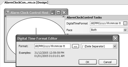 If a proxy property is one of the .NET Framework's intrinsic types that have UI type editors associated with them, such as DateTime, the smart tag panel automatically provides access to UI type editors, as shown in Figure 12.12 for the BackupAlarm and PrimaryAlarm properties. Figure 12.12. Intrinsic .NET Framework Types with UI Type Editors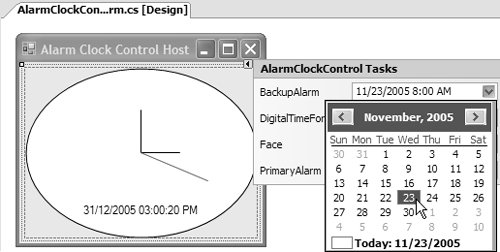 The basic process of adding designer action property items to the smart tag panel and providing additional support like UI type editors is straightforward. A variety of more exotic scenarios is supported, however, and we take a look at some of those next. Design-Time-Only Smart Tag Property ItemsThere is no rule that says designer action property items must expose properties implemented by a component. They can also be used to expose design-time-only properties implemented by a custom designer. One such property is ShowBorder, which, as you saw earlier, is implemented by AlarmClockControlDesigner: class AlarmClockControlDesigner : ScrollableControlDesigner { ... // Implement ShowBorder to provide // storage for created ShowBorder property [Category("Design")] [DesignOnly(true)] [DefaultValue(true)] [Description("Show/Hide a border at design time.")] public bool ShowBorder { get; set; } ... }The principles of implementing a proxy property for ShowBorder are the same as you've seen, although the property that's wrapped by the proxy property originates on AlarmClockControlDesigner rather than the component: class AlarmClockControlDesignerActionList : DesignerActionList { ... // ShowBorder proxy property public bool ShowBorder { get { return this.Designer.ShowBorder; } set { this.Designer.ShowBorder = value; } } ... // Helper method to acquire an AlarmClockControlDesigner reference AlarmClockControlDesigner Designer { get { IDesignerHost designerHost = this.GetService(typeof(IDesignerHost)) as IDesignerHost; if( designerHost == null ) return null; return (AlarmClockControlDesigner) designerHost.GetDesigner(this.AlarmClockControl); } } ... }The proxy ShowBorder property uses a helper property to acquire a reference to the AlarmClockControl's designer, because it isn't natively available from DesignerActionList. It then gets and sets the actual ShowBorder property directly, rather than use the SetProperty helper introduced earlier. In this case, SetProperty isn't necessary because we rely on the actual AlarmClockControlDesigner's ShowBorder property implementation to issue change notifications against the component change service: class AlarmClockControlDesigner : ScrollableControlDesigner { ... public bool ShowBorder { get { return this.showBorder; } set { // Change property value PropertyDescriptor property = TypeDescriptor.GetProperties( typeof(AlarmClockControl))["ShowBorder"]; this.RaiseComponentChanging(property); this.showBorder = value; this.RaiseComponentChanged( property, !this.showBorder, this.showBorder); // Update clock UI this.AlarmClockControl.Invalidate(); } } ... }It's important to leave this change notification code implemented by AlarmClockControlDesigner to ensure that when design-time code other than our designer action list updates the property value, correct change behavior is applied. The only thing left to do is rebuild the solution, and, as if by magic, ShowBorder appears on the smart tag panel, shown conjured up in Figure 12.13. Figure 12.13. Hey, Presto! ShowBorder Design-Time-Only Smart Tag Property Items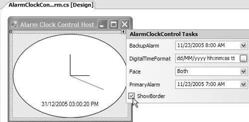 Because ShowBorder is a Boolean, it appears as a check box in the smart tag panel. If you play with the sample, you'll notice that, besides the border appearing and disappearing as the ShowBorder smart tag property is toggled, the Properties window's ShowBorder field is updated immediately to reflect the change. This is the expected result of the actual ShowBorder property's component change service integration. Multivalue Smart Tag Property ItemsOne other type of smart tag property item you might need to handle is one whose type is multivalued. Examples include the HourHand, MinuteHand, and SecondHand properties implemented by AlarmClockControl, as shown in Figure 12.14. Figure 12.14. Multivalued Property Editing with the Properties Window As you may recall from Chapter 11, expandable properties are a great way to simplify multivalue property editing, thanks to ExpandableObjectConverter. Unfortunately, unlike the Properties window, the smart tag panel doesn't allow expandable property editing because such a feature doesn't fit into the less-is-more style of the smart tag panel's UI. However, the smart tag panel still relies on HandConverter, the custom Hand class's type converter, to facilitate conversion between a Hand object and a multivalued string representation of a Hand object, as shown in Figure 12.15. Figure 12.15. Not-So-Pretty Multivalued Property Editing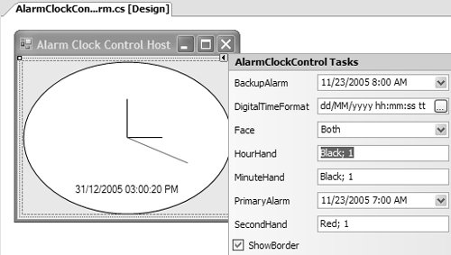 Developers can change the multivalued property and, if they get the format right, HandConverter converts it and sets the associated component's property correctly. But without expandable property editing, we still have the same problem we had in Chapter 11. The string format is not user friendly. One way to increase usability is to create a new modal UITypeEditor (HandEditor) to display a dialog (HandEditorForm) for editing both the Color and the Width properties with a bit more style, such as the one shown in Figure 12.16. Figure 12.16. The Hand UI Type Editor You can create HandEditor and HandEditorForm using techniques from Chapter 11, which also discusses how to hook HandEditor up to the Hand class using the Editor attribute: // HandEditorForm.cs partial class HandEditorForm : Form {...} // HandEditor.cs class HandEditor : UITypeEditor {...} // Hand.cs [Editor(typeof(HandEditor), typeof(UITypeEditor))] [TypeConverter(typeof(HandConverter))] class Hand {...} After we rebuild the AlarmClockControl project, HandEditor is available from all three Hand smart tag items via ellipses buttons, as shown in Figure 12.17. Figure 12.17. Editing Hand Smart Tag Property Items with Style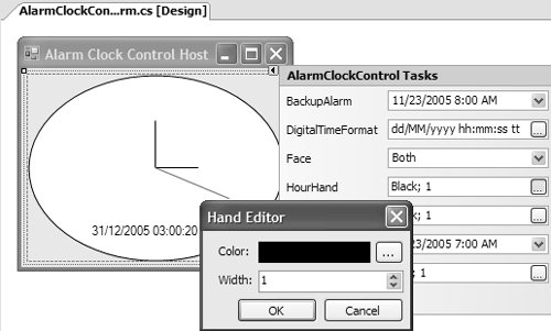 At least this technique provides a more usable way to edit multivalue properties, something that becomes more important as the number of values increases, as with a property of type Font. If developers wanted to reconfigure one of the Hand properties away from its default value, it's likely that they'd reconfigure all Hand properties. Although, thanks to HandEditor, they can do so, they must open and close the editor three times. It would be easier to combine the configuration of all three Hand properties into a single step. The smart tag solution is to change our strategy from using smart tag property items and to using smart tag method items. Smart Tag Method ItemsWhen a configuration is more complex than setting only a single property, you can use smart tag method items to reduce the complexity through the use of additional UIs, much as the PictureBox control does to allow developers to choose an image, as shown in Figure 12.18. Figure 12.18. Editing Smart Tag Items by Using a Modal UITypeEditor Smart tag method items are presented as link labels (like the Choose Image link label in Figure 12.18). When they are clicked, they perform an actionin this case, to display the Select Resource dialog. And, quite nicely, hooking up designer action method items turns out to be quite similar to using designer action property items. Creating a Smart Tag Method ItemTo add a smart tag method item to the smart tag panel that supports editing all clock hands at once, you add a method to your custom designer action list: class AlarmClockControlDesignerActionList : DesignerActionList { void EditClockHands() { // Create form HandsEditorForm form = new HandsEditorForm(); // Set current hand values form.HourHand = this.AlarmClockControl.HourHand; form.MinuteHand = this.AlarmClockControl.MinuteHand; form.SecondHand = this.AlarmClockControl.SecondHand; // Update new hand values of OK button was pressed if( form.ShowDialog() == DialogResult.OK ) { IDesignerHost designerHost = this.GetService(typeof(IDesignerHost)) as IDesignerHost; if( designerHost != null ) { DesignerTransaction t = designerHost.CreateTransaction(); try { this.SetProperty("HourHand", form.HourHand); this.SetProperty("MinuteHand", form.MinuteHand); this.SetProperty("SecondHand", form.SecondHand); t.Commit(); } catch { t.Cancel(); } } } } ...EditClockHands creates an instance of HandsEditorForm before passing it the three current Hand property values. If a DialogResult of OK is returned, the current Hand values are replaced with the new Hand values. Note that this method interacts with the components in the same way the proxy properties do, ensuring nice Windows Forms Designer behavior. Additionally, because setting three properties is really a single logical unit of activity, we need to support one-click undoing of all the changes made. That's why we wrap the property sets in a designer transaction using a DesignerTransaction object. If the transaction is successful, we commit the set of changes and turn them into a single undoable action. If the transaction fails, we attempt to cancel any changes made while the transaction was active. [4]
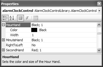
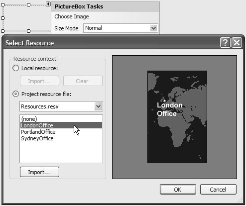
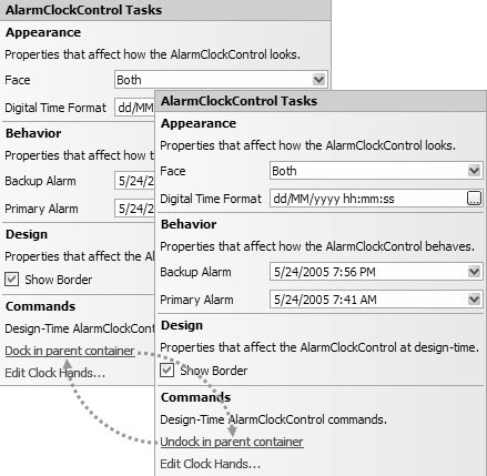
Figure 12.19 shows how the EditClockHands smart tag method item appears on the smart tag panel, replacing the three individual Hand properties with a single link label. Figure 12.19. Edit Clock Hands Designer Action Method Item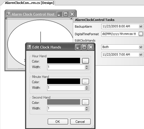 Unlike smart tag property items, the method implementation of a designer action method item can be private, protected, internal, or public. Also, the method must not accept any arguments because the smart tag panel doesn't provide a mechanism to capture and pass them to the designer action method implementation. Conversely, the designer action method implementation must not return a value because the smart tag panel can't receive or process it. Poor Man's Smart Tag Panel AppearanceWe've created smart tag property and method items and, to this point, have relied on the base GetSortedActionItems method of our custom designer action list to assemble a list of designer action items that ultimately winds up with the smart tag panel. The layout of those items on the smart tag panel is determined by the order in which GetSortedActionItems adds them to the DesignerActionItemCollection collection. This turns out to be alphabetical, as shown in Figure 12.20. Figure 12.20. GetSortedActionItems-Dictated Smart Tag Panel Appearance The smart tag panel is certainly functional, but it ain't pretty; for starters, the smart tag items are neither categorized nor described, two features we expect from our component in the Properties window. However, using the same Category and Description attributes we've come to know and love, we can create a Properties window-equivalent experience on the smart tag panel. We apply both attributes to each of the smart tag methods and smart tag properties on the custom designer action list: class AlarmClockControlDesignerActionList : DesignerActionList { ... [Category("Appearance")] [Description("Determines the clock face type to display.")] public ClockFace Face {...} ... [Category("Appearance")] [Description("Edit analog clock hand properties.")] public void EditClockHands() {...} ... }The updated and better-looking smart tag panel is shown in Figure 12.21. Figure 12.21. Better-Looking Smart Tag Panel Appearance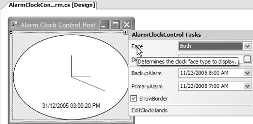 Because the smart tag panel is about using the minimum amount of real estate, smart tag item descriptions are displayed as tool tips rather than constantly visible text on the smart tag panel itself. The tool tips are activated (not necessarily obviously) when the mouse is hovered over the smart tag items. Also, the smart tag sorts the smart tag items by category and then by smart tag item name. Another way you can alter the appearance is to use the DisplayName attribute to make the smart tag item labels a little more human, including spaces and whatnot: class AlarmClockControlDesignerActionList : DesignerActionList { ... [Category("Appearance")] [Description("The digital time format, ...")] [DisplayName("Digital Time Format")] [Editor(typeof(DigitalTimeFormatEditor), typeof(UITypeEditor))] public string DigitalTimeFormat {...} // EditClockHands method [Category("Commands")] [Description("Configure the AlarmClockControl's hour, ...")] [DisplayName("Edit Clock Hands...")] public void EditClockHands() {...} ... }Figure 12.22 shows the result. Figure 12.22. Even Better-Looking Smart Tag Panel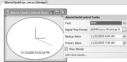 Using the DisplayName attribute also means that we can use ellipses to indicate that smart tag methods open dialogs, keeping the smart tag panel consistent with other UI elements like menu items. You may be able to get away with the look and feel you can cobble together with attributes and the base GetSortedActionItems method implementation, although there are some things you can't do. For example, the categories are not labeled automatically, so it's a little more difficult to see which smart tag items belong in which category. Also, there are no attributes to provide descriptive text labels. Finally, you can't control the order in which smart tag items appear, something you may want to do in some situations. You can address all these issues by overriding GetSortedActionItems. Custom Smart Tag Panel AppearanceTo customize the appearance of your smart tag panel, you construct your own DesignerActionItemCollection. You do this in GetSortedActionItems, the same place used by the base DesignerActionList class. This means overriding it in your custom designer action list implementation: class AlarmClockControlDesignerActionList : DesignerActionList { ... public override DesignerActionItemCollection GetSortedActionItems() { // Create list to store designer action items DesignerActionItemCollection actionItems = new DesignerActionItemCollection(); // Fill list of designer action items ... // Return list of designer action items (for smart tag panel) return actionItems; } // Method and proxy property implementations ... }Just as the base GetSortedActionItems method does, you create a DesignerActionItem object for each desired smart tag property and method. However, DesignerActionItem is an abstract class: abstract class DesignerActionItem {...}DesignerActionItem implements functionality that's common to all designer action items, but it doesn't implement enough functionality to support the specifics of all designer action items. Instead, there are several DesignerActionItem derivations that specialize DesignerActionItem for specific purposes. As you might guess, two of those are for smart tag property items and smart tag method items: sealed class DesignerActionPropertyItem : DesignerActionItem {...} class DesignerActionMethodItem : DesignerActionItem {...}DesignerActionPropertyItem provides a constructor that accepts two string arguments: member name and display name. Member name is the name of the public proxy property implementation on the custom designer action list class. Display name is how you want the smart tag property item's label to be formatted, just as if you'd used the DisplayName attribute. To create a designer action property item, you instantiate DesignerActionPropertyItem, passing the appropriate arguments to its constructor and adding it to DesignerActionItemCollection, shown here for the Face property: class AlarmClockControlDesignerActionList : DesignerActionList { ... public override DesignerActionItemCollection GetSortedActionItems() { // Create list to store designer action items DesignerActionItemCollection actionItems = new DesignerActionItemCollection(); // Fill list of designer action items // Add Face designer action property item actionItems.Add(new DesignerActionPropertyItem("Face", "Face")); ... // Return list of designer action items (for smart tag panel) return actionItems; } ... }DesignerActionMethodItem implements a constructor that also accepts both member name and display name strings, as well as a reference to the designer action list that implements the member.[5] Using a DesignerActionMethodItem is quite similar to using a DesignerActionPropertyItem:
class AlarmClockControlDesignerActionList : DesignerActionList { ... public override DesignerActionItemCollection GetSortedActionItems() { // Create list to store designer action items DesignerActionItemCollection actionItems = new DesignerActionItemCollection(); // Fill list of designer action items ... // EditClockHands designer action method item actionItems.Add( new DesignerActionMethodItem( this, "EditClockHands", "Edit Clock Hands...")); ... // Return list of designer action items (for smart tag panel) return actionItems; } ... }To assemble a complete list in this fashion, you place the items in the order you want them to appear on the smart tag panel. So, right off the bat, you can order them by category, yielding Figure 12.23. Figure 12.23. Manually Created Smart Tag Appearance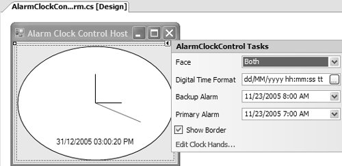 You may be wondering what happened to the categories we assigned earlier. And, although you can't see it, you should also wonder why tool tips no longer appear. The reason is that both category and description information must be included with a DesignerActionItem. When the base GetSortedActionItems method builds this list, it uses reflection to acquire category and description details from the attributes we used, passing the values to DesignerActionItems as it creates them. When you construct your own DesignerActionItem objects, this responsibility is placed squarely on your shoulders. Categories and DescriptionsBoth DesignerActionPropertyItem and DesignerActionMethodItem implement constructor overloads that accept two extra string arguments to collect category and description data. Here's how to provide both kinds of designer action items: class AlarmClockControlDesignerActionList : DesignerActionList { ... public override DesignerActionItemCollection GetSortedActionItems() { ... // Add Face designer action property item actionItems.Add( new DesignerActionPropertyItem( "Face", "Face", "Appearance", // Category string argument "Determines the clock ...")); // Description string argument ... // EditClockHands designer action method item actionItems.Add( new DesignerActionMethodItem( this, "EditClockHands", "Edit Clock Hands...", "Commands",// Category string argument "Configure the ...")); // Description string argument } ... }The result of updating all our designer action items is shown in Figure 12.24. Figure 12.24. Categorized and Described Face Smart Tag Item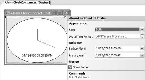 Figure 12.24 looks like what we could achieve without overriding GetSortedActionItems, and indeed, if this is all the appearance you need, you wouldn't need to. However, if you do override GetSortedActionItems, there is a host of smart tag features you can take advantage of, including sucking category and description information right off your components. Usually, components like AlarmClockControl apply both the Category and the Description attributes to their properties to influence their appearance in the Properties window. Consequently, when you provide both category and description string values, you must ensure that they are consistent with those supplied to the Category and Description attributes, respectively. Generics and reflection enable one way to do so: class AlarmClockControlDesignerActionList : DesignerActionList { ... public override DesignerActionItemCollection GetSortedActionItems() ... // Add Face designer action property item actionItems.Add( new DesignerActionPropertyItem( "Face", "Face", this.GetAttributeString<CategoryAttribute>( this.AlarmClockControl, "Face", "Category"), this.GetAttributeString<DescriptionAttribute>( this.AlarmClockControl, "Face", "Description"))); ... } ... // Helper method that returns the value of a property exposed // by an attribute that is adorning a component property string GetAttributeString<T>( object source, string sourceProperty, string attributeProperty) { // Get attribute adorning the specified property of a // particular component instance PropertyInfo sourcePropertyInfo = source.GetType().GetProperty(sourceProperty); T attribute = (T)sourcePropertyInfo.GetCustomAttributes(typeof(T), false)[0]; if( attribute == null ) return null; // Return the desired attribute's property value Type attributeType = attribute.GetType(); PropertyInfo attributePropertyInfo = attributeType.GetProperty(attributeProperty); return (string)attributePropertyInfo.GetValue(attribute, null); } ... }The Description attribute actually has a property on it called Description, which represents the value we passed to the constructor. To retrieve the description from the attribute, we use the GetAttributeString helper function and pass it four pieces of information: the object (AlarmClock), the name of the property on the alarm clock (Face), the type of attribute (the Description attribute, which is passed in as T), and the name of the property on the attribute that contains the value (Description). GetAttributeString then uses this information in conjunction with reflection to discover the desired attribute information. Null strings passed to the DesignerActionPropertyItem class's constructor are treated as if they weren't provided; the corresponding smart tag task is placed in the default category and doesn't have a tool tip. In general, properties that you expose from your components that can be configured from the design time should be adorned with both Category and Description attributes, especially because they influence the Properties window in the same manner to provide the same benefits. Why does GetAttributeString expect an object parameter to describe the source object rather than internally relying on an AlarmClockControl reference? It does so to handle situations where properties are implemented by different types. For example, the ShowBorder property is exposed from AlarmClockControlDesigner rather than AlarmClockControl. To get ShowBorder's Category and Description attribute values, you pass GetAttributeString a reference to AlarmClockControlDesigner: class AlarmClockControlDesignerActionList : DesignerActionList { ... public override DesignerActionItemCollection GetSortedActionItems() { ... // ShowBorder designer action property item actionItems.Add( new DesignerActionPropertyItem( "ShowBorder", "Show Border", this.GetAttributeString<CategoryAttribute>( this.Designer, "ShowBorder", "Category"), this.GetAttributeString<DescriptionAttribute>( this.Designer, "ShowBorder", "Description"))); ... } ... }In general, this technique works well for designer action properties because, as you know, component and designer properties are likely to be adorned with both Category and Description attributes. Designer action methods, on the other hand, are highly likely to be implemented in their entirety on the custom designer action list, rather than act as proxies to underlying implementations. Consequently, you must provide category and description strings when instantiating DesignerActionMethodItem: class AlarmClockControlDesignerActionList : DesignerActionList { ... public override DesignerActionItemCollection GetSortedActionItems() { ... // EditClockHands designer action method item actionItems.Add( new DesignerActionMethodItem( this, "EditClockHands", "Edit Clock Hands", "Appearance", "Configure the AlarmClockControl's ...", true)); ... } ... }Fortunately, these are unlikely to be repeated anywhere else. In those few cases where they might be repeated, you should easily be able to refactor both the GetCategory and the GetDescription methods to operate over method implementations. The major benefit of acquiring the category and description of each smart tag property item from the component is that it ensures consistency between the smart tag panel and the Properties window, something that can only be considered a benefit for users of your components. Note that if you want them sorted alphabetically, you must rearrange the order in which you add the designer action property and method items to the DesignerActionItemCollection object to suit. This can be a bit tricky because designer action method items don't appear among other properties in the Properties window. So you can either subcategorize each category by designer action item type or simply plonk all designer action method items into a single "Commands" category, as the Properties window does. HeadersEven though you can nicely categorize your designer action items, the category names aren't actually displayed on the smart tag panel (unlike the Properties window), leaving the smart tag item groupings appearing somewhat arbitrary. Fortunately, you can also assign each smart tag item a text header using DesignerActionHeaderItem, another type of designer action item. DesignerActionHeaderItem's constructor accepts a single string value, which must be the same name as the category into which it goes: class AlarmClockControlDesignerActionList : DesignerActionList { ... public override DesignerActionItemCollection GetSortedActionItems() { ... actionItems.Add(new DesignerActionHeaderItem("Appearance")); // Appearance category designer action items added here ... actionItems.Add(new DesignerActionHeaderItem("Behavior")); // Behavior category designer action items added here ... actionItems.Add(new DesignerActionHeaderItem("Design")); // Design category designer action items added here ... ... } ... }By using the same name as the category, you ensure that the designer action header item is located above all other designer action property and method items in that category. The application of designer action header items yields Figure 12.25. Figure 12.25. Smart Tag Header Items in Action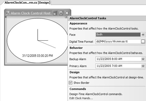 DesignerActionHeaderItems behave like DesignerActionPropertyItems and DesignerActionMethodItems with regard to how they appear within a category; if you want the label to appear at the top of your category, you must add it to DesignerActionItemCollection before all other designer action items in that category. Text LabelsOne final trick is to provide text to describe a category or a smart tag property or method item. To do so, use DesignerActionTextItem, whose constructor accepts a string description argument and a string category name: class AlarmClockControlDesignerActionList : DesignerActionList { ... public override DesignerActionItemCollection GetSortedActionItems() { ... actionItems.Add(new DesignerActionHeaderItem("Appearance")); actionItems.Add( new DesignerActionTextItem( "Properties that affect how the AlarmClockControl looks.", "Appearance")); // Appearance category designer action items added here ... ... } ... }The two parameter constructors ensure that labels are sorted first by the category they are assigned to, and then in the order in which they are added to the designer action item collection. The result of applying categories, descriptions, headers, and labels is the nicely titivated smart tag panel shown in Figure 12.26. Figure 12.26. Completely Titivated Smart Tag Panel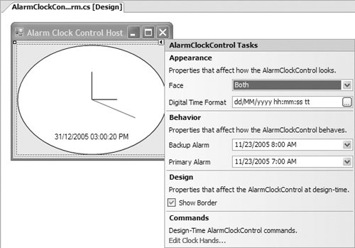 The smart tag panel in Figure 12.26 is a Rolls-Royce from a look-and-feel point of view, but you can easily mix and match subsets of categories, descriptions, headers, and labels to support a wide variety of scenarios. Note that the order in which smart tag items appear is determined by category and then the order in which each designer action property, method, header, or text item is added to the DesignerActionItemCollection object, whether or not those items are added contiguously. Adding a Smart Tag Method Item to the Context MenuThe sphere of influence exerted by designer action method items extends beyond the smart tag panel; they can be configured to be displayed in a component's context menu and in the Properties window. To do this, you use one of the DesignerActionMethodItem class's constructor overloads that accept an additional Boolean argument. When this argument is true, the designer action infrastructure adds a menu item to the underlying component's context menu and adds a link label in the Properties window's Description pane. This takes a little tweak to our existing solution: class AlarmClockControlDesignerActionList : DesignerActionList { ... public override DesignerActionItemCollection GetSortedActionItems() { ... // EditClockHands designer action method item actionItems.Add( new DesignerActionMethodItem( this, "EditClockHands", "Edit Clock Hands...", true)); ... } ... }Figure 12.27 shows the new additions to the component's context menu and Properties window. [6]
Figure 12.27. Displaying a Designer Action Method Item in Both the Context Menu and the Properties Window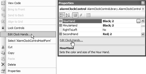 Note that custom designers implement a Verbs property that you can use to add and update context menus and the Properties window. If you built a custom designer before .NET 2.0 that uses designer verbs to add items to a control's design-time context menu, the Windows Forms Designer automatically turns the verbs into smart tag methods without any effort on your part. Unfortunately, you can't categorize designer verbs or lay them out as nicely as native designer action items. Toggling the Label Text of a Smart Tag ItemOne of the common designer action method items you'll find on rectangular controls in Windows Forms lets you dock and undock those controls to and from their parent container via a designer action method item available on the smart tag panel. The trick with the Dock/Undock property is to toggle the display name to reflect the current component's Dock state whenever the designer action method item's link label is clicked, something that ultimately looks like Figure 12.28. Figure 12.28. Toggling the Smart Tag Panel Dock Property To begin, we create a new designer action method item with an accompanying method implementation that toggles the Dock property between a DockStyle of Fill and a DockStyle of None: class AlarmClockControlDesignerActionList : DesignerActionList { ... public override DesignerActionItemCollection GetSortedActionItems() { ... // Dock/Undock designer action method item actionItems.Add( new DesignerActionMethodItem( this, "ToggleDockStyle", "Dock/Undock in parent container")); ... } ... // Toggle AlarmClockControl's Dock property void ToggleDockStyle() { if( this.AlarmClockControl.Dock != DockStyle.Fill ) { this.SetProperty("Dock", DockStyle.Fill); } else { this.SetProperty("Dock", DockStyle.None); } } ... }To toggle the display name of the designer action method item, we need two things: a helper method that calculates and returns the appropriate text, and a way to have it called when the dock style changes. With regard to the latter, the smart tag panel is refreshed whenever a property is changed, resulting in a subsequent call to GetSortedActionItems. So we can invoke the helper method from the DesignerActionMethodItem's constructor. The updated constructor and new helper method are shown here: class AlarmClockControlDesignerActionList : DesignerActionList { ... public override DesignerActionItemCollection GetSortedActionItems() { ... // Dock/Undock designer action method item with display name // generated from GetDockStyleText helper method actionItems.Add( new DesignerActionMethodItem( this, "ToggleDockStyle", this.GetDockStyleText())); ... } ... // Helper method that returns an appropriate display name for the // Dock/Undock property, based on the AlarmClockControl's current Dock // property value string GetDockStyleText() { if( this.AlarmClockControl.Dock == DockStyle.Fill ) { return "Undock in parent container"; } else { return "Dock in parent container"; } } ... }After a rebuild, the updated smart tag panel with the new designer action method item operates, as shown in Figure 12.28. Although this toggling technique should serve you well in general, there is a shortcut for docking and undocking that uses the Docking attribute (from the System.Windows.Forms namespace). You augment your custom control with the Docking attribute to automatically grant it docking and undocking smart tag support: [Docking(DockingBehavior.Ask)] partial class AlarmClockControl : ... {...}You specify the type of docking by passing one of the following DockingBehavior enumeration values: namespace System.Windows.Forms { enum DockingBehavior { Never = 0, // Never auto dock/undock Ask = 1, // Allow dock/undock via smart tag AutoDock = 2, // Allow dock/undock via smart tag and automatically // dock-fill when control is dropped onto a form } }Figure 12.29 illustrates the result. Figure 12.29. Toggling the Smart Tag Panel Dock Property Using the Docking Attribute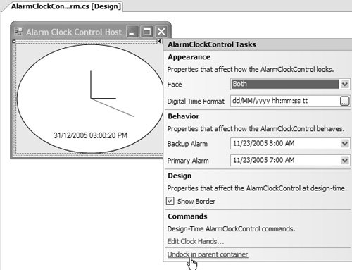 Designer Action ListsTo this point, we've spent our time working on a monolithic custom DesignerActionList class that returns all designer action items for a single component. However, designer action lists offer a little more flexibility and capability, which we explore next. AutoShowWhen a component that is likely to be dock-filled is dropped onto a form, you may want to let developers automatically toggle the dock state using the smart tag panel. If you need to, you can use the DesignerActionList class's AutoShow property to automatically pop open the smart tag for a component as soon as it is dropped onto a form. By default, the base implementation of AutoShow returns false, thereby keeping AutoShow turned off. Consequently, we override it to return true: class AlarmClockControlDesignerActionList : DesignerActionList { ... public AlarmClockControlDesignerActionList( ClockControl AlarmClockControl) : base(clockControl) { // Automatically display smart tag panel when // component is dropped onto a form this.AutoShow = true; } ... }You can specify whether a design action list automatically shows itself when dropped onto a form, but it is effective only when VS05 is configured appropriately. Specifically, you must ensure that the Automatically Open Smart Tags setting, available from Tools | Options | Windows Forms Designer | General, is set to true (the default). This has the effect of yielding autoshow control to the in-play designer action list. However, if this property is set to false, autoshow is turned off, no matter how the designer action list is configured. Multiple Designer Action ListsCurrently, the entire AlarmClockControl smart tag panel is constructed from a single custom designer action list. The larger and more complex a designer action list becomes, the less wieldy it becomes to support. In this situation, you can break a single, monolithic designer action list into several smaller and more manageable designer action lists. For example, we can arbitrarily break AlarmClockControlDesignerActionList into four individual custom designer action lists based on category: class AppearanceActionList : DesignerActionList {...} class BehaviorActionList : DesignerActionList {...} class DesignActionList : DesignerActionList {...} class CommandsActionList : DesignerActionList {...}To ensure that all four are passed to the designer action service, we update the custom designer's ActionLists property to return a DesignerActionListCollection containing all four: class AlarmClockControlDesigner : ControlDesigner { ... DesignerActionListCollection dalc; ... public override DesignerActionListCollection ActionLists { get { // Create action list collection if( this.dalc == null ) { this.dalc = new DesignerActionListCollection(); // Add custom action lists this.dalc.Add(new AppearanceDesignerActionList(this.Component)); this.dalc.Add(new BehaviorDesignerActionList(this.Component)); this.dalc.Add(new DesignDesignerActionList(this.Component)); this.dalc.Add(new CommandsDesignerActionList(this.Component)); } // Return to the designer action service return this.dalc; } } ... }Now the categories are rendered to the smart tag panel in the order in which they are loaded into DesignerActionListCollection, and this smart tag panel actually looks the same as the smart tag panel shown earlier in Figure 12.26. Note that if a component uses multiple designer action lists at once, all of them are automatically shown if at least one overrides its AutoShow property to return true (and if VS05 is configured appropriately). Dynamic Designer ActionsAnother advantage of splitting one monolithic designer action list into several discrete designer action lists is that it lets you pick and choose which ones to display on a smart tag panel at any one time.[7]
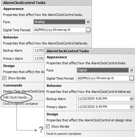
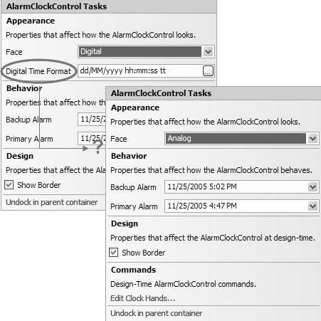
Dynamic Designer Action ListsYou might consider adding, removing, or changing which designer action lists are displayed when the value of a smart tag property item on one designer action list affects whether smart tag property or method items are displayed from other designer action lists. For example, when the AlarmClockControl's Face designer action property on the Appearance designer action list is set to ClockFace.Digital, it doesn't make much sense to edit the clock's hands via the Edit Clock Hands designer action method on the Commands designer action list. Consequently, you'd want to hide or show the Commands designer action list to hide or show the Edit Clock Hands designer action method as necessary. The logic to manage the showing and hiding of the Commands designer action list depends on the value of the Face property, which, when changed, can be used from the custom designer's ActionLists property appropriately: class AlarmClockControlDesigner : ScrollableControlDesigner { ... DesignerActionListCollection dalc; CommandsDesignerActionList cDal; ... public override DesignerActionListCollection ActionLists { get { // Create action list collection if( this.dalc == null ) { this.dalc = new DesignerActionListCollection(); // Add custom action lists this.dalc.Add(new AppearanceDesignerActionList(this.Component)); this.dalc.Add(new BehaviorDesignerActionList(this.Component)); this.dalc.Add(new DesignDesignerActionList(this.Component)); } // Hide/Show Commands designer action list as necessary if( this.cDal == null ) this.cDal = new CommandsDesignerActionList(this.Component); if( this.dalc.Contains(this.cDal) ) this.dalc.Remove(this.cDal); if( this.AlarmClockControl.Face != ClockFace.Digital ) { this.dalc.Add(this.cDal); } // Return to the designer action service return this.dalc; } } ... }We're almost there. The one thing that is missing is to broadcast to the designer action infrastructure that the Face value has changed and that a new set of designer action lists needs to be retrieved and displayed in the smart tag panel. To do this, we acquire a reference to DesignerActionService, which is the design-time service that manages smart tags on behalf of the Windows Forms Designer. DesignerActionService implements a Refresh method that, when invoked, provides exactly the behavior we need. Refresh should be called from the Face proxy property: class AppearanceDesignerActionList : DesignerActionList { ... // Face proxy property [Editor(typeof(FaceEditor), typeof(UITypeEditor))] public ClockFace Face { get { return this.AlarmClockControl.Face; } set { this.SetProperty("Face", value); // Refresh smart tag panel DesignerActionUIService das = this.GetService(typeof(DesignerActionUIService)) as DesignerActionUIService; if( das != null ) das.Refresh(this.Component); } } ... }Figure 12.30 shows the result. Figure 12.30. Dynamically Swapping Designer Action Lists Notice in Figure 12.26 that the DigitalTimeFormat smart tag property item is available when the Face property is set to ClockFace.Digital. The DigitalTimeFormat smart tag property item is not really needed when this is the case, and we can dynamically include or exclude it as needed. Dynamic Designer Action ItemsWhen you need to be selective about which designer action items are displayed at which time, it makes sense to control that selection from GetSortedActionItems, where you can decide which designer action items are added (and which are not added) to the DesignerActionItemCollection object as the designer action list is built. For example, we can check whether the AlarmClockControl's Face property is set to Analog (neither of the digital options), and, if it is, we avoid adding the DigitalTimeFormat designer action property item: class AppearanceDesignerActionList : DesignerActionList { ... public override DesignerActionItemCollection GetSortedActionItems() { ... // Add DigitalTimeFormat designer action property item // if Face is not Analog if( this.AlarmClockControl.Face != ClockFace.Analog ) { actionItems.Add( new DesignerActionPropertyItem("DigitalTimeFormat", ...)); } ... } ... }You also need to refresh the designer action service when the Face property value changes; because we already have that in place. However, we've done all that's needed (see Figure 12.31). Figure 12.31. Dynamically Hiding Designer Action Items There might be many scenarios that require you to dynamically add and remove designer action lists or designer action items, and the techniques we've discussed here should provide a solid foundation when you need to. And remember that this technique is not possible unless you override GetSortedActionItems. |
EAN: 2147483647
Pages: 216
- Article 285 Transient Voltage Surge Suppressors (TVSSs)
- Article 332 Mineral-Insulated, Metal-Sheathed Cable Type MI
- Article 334 Nonmetallic-Sheathed Cable Types NM, NMC, and NMS
- Article 348 Flexible Metal Conduit Type FMC
- Example No. D2(c) Optional Calculation for One-Family Dwelling with Heat Pump(Single-Phase, 240/120-Volt Service) (See 220.82)