Working with Labels
On the Chart Tools Layout tab, the Labels group provides buttons for controlling which labels appear on the chart. Figure 14.13 points out the various labels that you can use.
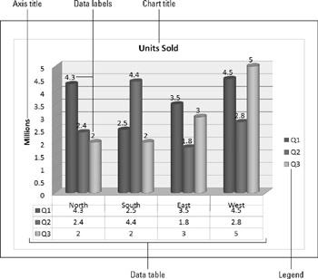
Figure 14.13: Labels help to make it clear to the audience what the chart represents.
Each of these label types has a button on the Layout tab that opens a drop-down list that contains some presets. The drop-down list also contains a "More" command for opening a dialog box that contains additional options. For example, the drop-down list for the Chart Title button contains a "More Title Options" command, as shown in Figure 14.14.
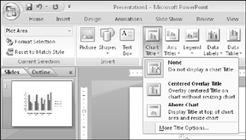
Figure 14.14: Each type of label has its own button that displays a drop-down list.
| EXPERT TIP | New in PowerPoint 2007, you can add data labels by right-clicking a series and choosing Add Data Labels. You can also format label text from the mini bar, which may be easier than using the Home tab's controls. |
You can format the label text, just as you can format any other text. To do this, select the text and then use the Font group on the Home tab. This allows you to choose a font, size, color, alignment, and so on.
You can also format the label box by right-clicking it and choosing Format name, where name is the type of label that the box contains. In some cases, the dialog box that appears contains only standard formatting controls that you would find for any object, such as Fill, Border Color, Border Styles, Shadow, 3-D Format, and Alignment. These controls should already be very familiar to you from Chapter 9. In other cases, in addition to the standard formatting types, there is also a unique section that contains extra options that are specific to the content type. For example, for the Legend, there is a Legend Options section in which you can set the position of a legend.
The following sections look at each of the label types more closely. These sections will not dwell on the formatting that you can apply to them (fonts, sizes, borders, fills, and so on) because this formatting is the same for all of them, as it is with any other object. Instead, they concentrate on the options that make each label different.
Working with Chart Titles
A chart title is text that typically appears above the chart-and sometimes overlapping it-that indicates what the chart represents. Although you would usually want either a chart title or a slide title, but not both, this could vary if you have multiple charts or different content on the same slide.
You can select a basic chart title, either above the chart or overlapping it, from the Chart Title drop-down list, as shown in Figure 14.14. You can also drag the chart title around after placing it. For more options, you can choose More Title Options to open the Format Chart Title dialog box.
However, in this dialog box there is nothing that specifically relates to chart titles; the available options are for formatting (Fill, Border Color, and so on), as for any text box.
Working with Axis Titles
An axis title is text that defines the category or the unit of measurement on an axis. For example, in Figure 14.13, the vertical axis title is Millions.
Axis titles are defined separately for the vertical and the horizontal axes. Click the Axis Titles button on the Layout tab, and then select either Primary Horizontal Axis Title or Primary Vertical Axis Title to display a submenu that is specific to that axis. When you turn on an axis title, a text box appears containing default placeholder text, "Axis Title." Click in this text box and type your own label to replace it, as shown in Figure 14.15. If you've plotted any data on a secondary axis, you'll see Secondary Horizontal and Secondary Vertical Axis Title options as well.
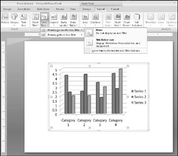
Figure 14.15: An axis title describes what is being measured on the axis; you can edit the placeholder text in the title.
| EXPERT TIP | You can easily select all of the placeholder text by clicking in the text box and pressing Ctrl+A. |
For the horizontal axis title, the options are simple: either None or Title Below Axis, as shown in Figure 14.15. You can choose More Primary Horizontal Axis Title Options, but again, as with the regular title options, there are no unique settings in the dialog box-just general formatting controls.
For the vertical axis title, you can choose from among the following options, as shown in Figure 14.16.
-
Rotated Title: The title appears vertically along the vertical axis, with the letters rotated 90 degrees (so that their bases run along the axis).
-
Vertical Title: The title appears vertically along the vertical axis, but each letter remains unrotated, so that the letters are stacked one on top of the other.
-
Horizontal Title: The title appears horizontally, like regular text, to the left of the vertical axis.
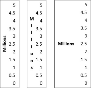
Figure 14.16: You can select these vertical axis titles, from left to right: Rotated Title, Vertical Title, and Horizontal Title.
Each type of vertical axis shrinks the chart somewhat when you activate it, but the Horizontal Title format shrinks the chart more than the others because it requires more space to the left of the chart.
| Caution | If you turn off an axis title by setting it to None and then turn it back on again, you will need to retype the axis title; it returns to the generic placeholder text. |
If the chart does not resize itself automatically when you turn on the vertical axis title, you might need to adjust the chart size manually. Click the chart, so that selection handles appear around the inner part of the chart (the plot area), as shown in Figure 14.17. Then drag the left side-selection handle inward to decrease the width of the chart to make room for the vertical axis label.
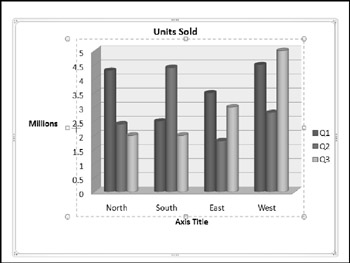
Figure 14.17: You can adjust the size of the plot area to make more room for the vertical axis title.
Working with Legends
The legend is the little box that appears next to the chart (or sometimes above or below it). It provides the key that describes what the different colors or patterns mean. For some chart types and labels, you may not find the legend to be useful. If it is not useful for the chart that you are working on, you can turn it off by clicking the Legend button on the Layout tab and then clicking None. You can also just click it and press Delete. Turning off the legend makes more room for the chart, which grows to fill the available space. To turn the legend back on, click the Legend button again and select the position that you want for it, as shown in Figure 14.18.
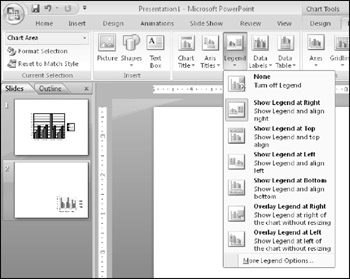
Figure 14.18: You can select a legend position, or turn the legend off altogether.
| Caution | Hiding the legend is not a good idea if you have more than one series in your chart, because the legend helps people to distinguish which series is which. However, if you have only one series, a legend might not be useful. |
To resize a legend box, you can drag one of its selection handles. The text and keys inside the box do not change in size.
When you right-click the legend and choose Format Legend, or when you choose More Legend Options from the Legend drop-down list on the Layout tab, the Format Legend dialog box opens with the Legend Options displayed, as shown in Figure 14.19. From here, you can choose the legend's position in relation to the chart and whether or not it should overlap the chart. If it does not overlap the chart, the plot area will be automatically reduced to accommodate the legend.
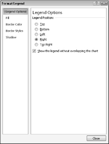
Figure 14.19: You can set legend options in the Format Legend dialog box.
| Note | The controls on the Legend Options tab refer to the legend's position in relation to the chart, not to the position of the legend text within the legend box. You can drag the legend wherever you want it on the chart after placing it. |
Adding Data Labels
Data labels show the numeric values (or other information) that are represented by each bar or other shape on the chart. These labels are useful when the exact numbers are important or where the chart is so small that it is not clear from the axes what the data points represent.
To turn on data labels for the chart, click the Data Labels button on the Layout tab. The options available depend on whether it's a 2-D or 3-D chart. Figure 14.20 shows the options for 2-D charting; for a 3-D chart your only choices are Show and None.
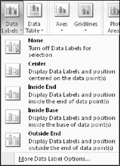
Figure 14.20: You can display or hide data labels using the Data labels button.
Data labels show the values by default, but you can also set them to display the series name and the category name, or any combination of the three. The data labels can also include the legend key, which is a colored square. To set these options, choose More Data Label Options from the Data Labels drop-down menu, to access the Format Data Labels dialog box, as shown in Figure 14.21. For a 3-D chart, the Label Position section does not appear.
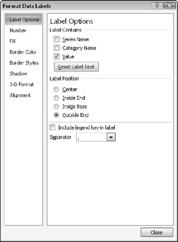
Figure 14.21: You can set data label options using the Format Data Labels dialog box.
| EXPERT TIP | To turn the data labels on or off for a particular data point or data series, select it and then select the None or Show option in the Data Labels drop-down menu. This is useful when you want to highlight a particular value or set of values. |
Adding a Data Table
Sometimes the chart tells the full story that you want to tell, but other times the audience may benefit from seeing the actual numbers on which you have built the chart. In these cases, it is a good idea to include the data table with the chart. A data table contains the same information that appears on the datasheet.
To display the data table with a chart, click the Data Table button on the Layout tab, as shown in Figure 14.22, and choose to include a data table either with or without a legend key.
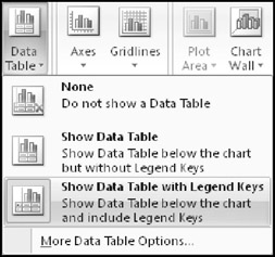
Figure 14.22: Use a data table to show the audience the numbers on which the chart is based.
To format the data table, choose More Data Table Options from the Data Table drop-down menu. From the Format Data Table dialog box that appears, you can set data table border options, as shown in Figure 14.23. For example, you can display or hide the horizontal, vertical, and outline borders for the table from here.
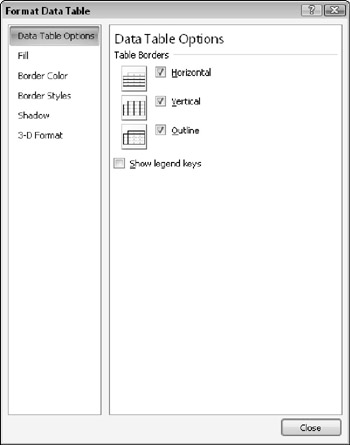
Figure 14.23: Use the Data Table Options to specify which borders should appear in the data table.
EAN: 2147483647
Pages: 268