Starting a New Chart
The main difficulty with creating a chart in a non-spreadsheet application such as PowerPoint is that there is no data table from which to pull the numbers. Therefore, PowerPoint creates charts using data that you have entered in an Excel window. By default, it contains sample data, which you can replace with your own data.
You can place a new chart on a slide in two ways: you can either use a chart placeholder from a layout, or you can place one manually.
If you are using a placeholder, click the Insert Chart icon. If you are placing a chart manually, follow these steps:
-
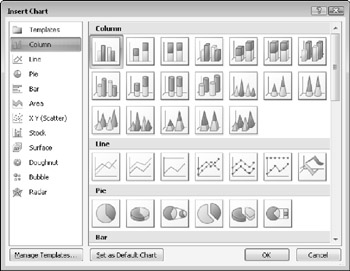
On the Insert tab, click Chart. The Insert Chart dialog box opens, as shown in Figure 14.4.

Figure 14.4: Select the desired chart type. -
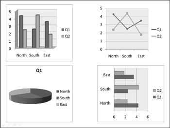
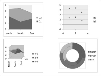
Click the desired chart type. See Table 14.1 for an explanation of the chart types. Figures 14.5 and 14.6 show examples of some of the chart types.
Table 14.1: Chart Types in PowerPoint 2007's Charting Tool
 Open table as spreadsheet
 Type
Description
Column
Vertical bars, optionally with multiple data series. Bars can be clustered, stacked, or based on a percentage, and either 2-D or 3-D.
Line
Shows values as points, and connects the points with a line. Different series use different colors and/or line styles.
Pie
A circle broken into wedges to show how parts contribute to a whole. This de-emphasizes the actual numeric values. In most cases, this type is a single-series only.
Bar
Just like a column chart, but horizontal.
Area
Just like a column chart, but with the spaces filled in between the bars.
XY (Scatter)
Shows values as points on both axes, but does not connect them with a line. However, you can add trend lines.
Stock
A special type of chart that is used to show stock prices.
Surface
A 3-D sheet that is used to illustrate the highest and lowest points of the data set.
Doughnut
Similar to a pie chart, but with multiple concentric rings, so that multiple series can be illustrated.
Bubble
Similar to a scatter chart, but instead of fixed-size data points, bubbles of varying sizes are used to represent a third data variable.
Radar
Shows changes of data frequency in relation to a center point.

Figure 14.5: Examples of chart types, from top left, clockwise: column, line, bar, and pie.
Figure 14.6: Examples of chart types, from top left, clockwise: area, scatter, donut, and surface. -
Click OK. The chart appears on the slide, and an Excel datasheet opens with sample data.
-
Modify the sample data as needed. To change the range of cells that appear in the chart, see the section "Redefining the Data Range," later in this chapter. If you want, you can then close the Excel window to move it out of the way.
| Note | After you have closed the Excel window, you can open it again by clicking Edit Data on the Chart Tools Design tab. |
| Note | At any point, you can return to your PowerPoint presentation by clicking anywhere outside of the chart on the slide. To edit the chart again, you can click the chart to redisplay the chart-specific tabs. |
| EXPERT TIP | If you delete a column or row by selecting individual cells and pressing Delete to clear them, the empty space that these cells occupied remains in the chart. To completely remove a row or column from the data range, select the row or column by clicking its header (letter for column; number for row) and click Delete on the Home tab in Excel. |
EAN: 2147483647
Pages: 268