Typography in Numeric Graphics
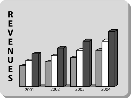
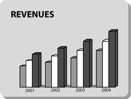
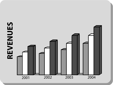
| The label on the left side of Figure 8.5 is "stacked." Type set this way is very hard to read. Think about it: The stacked label, containing eight letters , causes your eyes to make seven carriage returns. Ouch! Figure 8.5. The label on the left is "stacked." This problem is easy to solve, as in Figure 8.6. Figure 8.6. The more legible horizontal label. Use a horizontal label like the one in Figure 8.6, which makes the chart much clearer and easier to read. A close cousin of the stacked vertical label is the vertical label on end, in Figure 8.7. Figure 8.7. The vertical label on end. This practice is a carryover from documents. In a document, the reader can rotate the document to read the word "REVENUES." In a projected presentation slide, however, the audience members are forced to rotate their heads. This often seems like an adult variation of Simple Simon: " Left ears on left shoulders, place!" The solution is the same as for the problem of the stacked label (see Figure 8.6). Make the label legible by aligning it on the horizontal axis. Now you're not only minimizing your audience's eye sweeps , but their head movements as well. |
EAN: 2147483647
Pages: 94