The ControlPaint Class
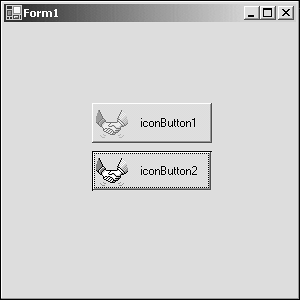
The ControlPaint ClassAlthough not part of GDI+, the ControlPaint class offers several methods for drawing standard UI elements. In fact, the IconButton developed in the preceding two chapters used the ControlPaint class to draw the button itself. It is interesting to note that although this class exists, the base class library does not use it. The standard Button class, found in the System.Windows.Forms namespace, implements its own drawing logic. The class itself is worth mentioning because it does provide a mechanism for drawing standard controls such as buttons, check boxes, and even focus rectangles. Also because IL (Intermediate Language) is fairly readable, loading up System.Windows.Forms.dll into ILDASM.exe and peeking into the ControlPaint methods helps give some insight into GDI+ and basic 2D drawings. The capability to draw the selected icon in a disabled state would enhance the IconButton. To accomplish this disabled image, as shown in Figure 4.8, the ControlPaint.DrawImageDiabled method can be used. Figure 4.8. The IconButton image disabled and enabled.
The IconButton will render the icon in a disabled state, as shown in Figure 4.8, when the Enabled property is set to false. Listing 4.12 shows the changes to the IconButton.DrawIcon method to implement rendering the IconButton in a disabled state. Listing 4.12 IconButton Update 1: protected virtual void DrawIcon( Graphics g ) { 2: System.Diagnostics.Debug.Assert( buttonIcon != null, "IconButton Icon is null" ); 3: 4: int top = ((Height/2) - (buttonIcon.Height/2)); 5: int height = buttonIcon.Height; 6: int width = buttonIcon.Width; 7: 8: if( (top + height) >= Height ) { 9: //Scale the image to fit in (w,h) of button 10: top = IconButton.EDGE_PADDING; 11: int drawHeight = Height - (2*IconButton.EDGE_PADDING); 12: float scale = ((float)drawHeight / (float)height); 13: width = (int)((float)width*scale); 14: height = drawHeight; 15: } 16: Rectangle iconRect = new Rectangle( IconButton.EDGE_PADDING, top, width, height); 17: 18: if( buttonState == ButtonState.Pushed ) 19: iconRect.Offset(1,1); 20: 21: if( base.Enabled ) 22: g.DrawIcon( buttonIcon, iconRect ); 23: else { 24: //Draw Image in disabled state 25: Image disabledImage = buttonIcon.ToBitmap( ); 26: disabledImage = disabledImage.GetThumbnailImage( iconRect.Width, The changes to the DrawIcon method are found between lines 21 and 28 of Listing 4.12. To use the ControlPaint.DrawImageDisabled method, the icon must be first converted to a bitmap. Then a thumbnail, or a reduced image, needs to be created based on the size of the iconRect calculated. After this is done, it's a simple matter of invoking the DrawImageDiabled method to render the grayscale image of the icon. |
 iconRect.Height, null, new IntPtr(0) ); 27: ControlPaint.DrawImageDisabled( g, disabledImage, iconRect.X, iconRect.Y,
EAN: 2147483647
Pages: 74