Chapter 5. Creating Navigation Bars
 | CONTENTS |  |
In this chapter:
- Navigation Bars
- Linking Web Pages Using SVG
- Adding Mouseover Effects
- Simple Navigation Bars
- Text Navigation Bars
- Tabbed Navigation Bars
- Using <svg> Elements to Aid Positioning
Navigation Bars
The requirements document for the SVG specification states explicitly that SVG was intended to replace "many uses" of bitmap graphics. One of the most common uses for bitmap and, to a degree, binary vector graphics on the Web has been for the creation of navigation graphics, whether it is simple text, buttons, 3D buttons, or something a little more sophisticated. Needless to say, any of the commonly used types of navigation graphics can be created straightforwardly using SVG. In this chapter, I show you how to create a variety of SVG navigation graphics for Web pages, to familiarize you with the relevant techniques.
The most interesting types of navigation "furniture" incorporate additional SVG visual components, such as animations, gradients, and interactions. Look at the graphics you create in this chapter as visual components you can add to those other types of visual components later to produce the graphics you want.
Before you can use any type of SVG graphic to navigate from page to page, you need to know how to create Web links in SVG from one Web page to another. After you have done that, you learn how to construct various pieces of Web page furniture to which you can apply your links.
Navigation around SVG images or Web pages is further discussed in Chapter 12, "Creating a Simple SVG Web Site," which discusses the creation of SVG Web pages.
In addition, to use any but the most basic Web page navigation, you also want to be able to add rollover effects to your SVG elements. I introduce simple mouseover and mouseout interactivity in this chapter and apply it to navigation graphics. Interactivity in SVG is discussed more fully in Chapter 11, "Creating Interactive SVG Graphics."
So let's move on and look at linking Web pages in SVG.
Linking Web Pages Using SVG
SVG provides two mechanisms for linking that operate in slightly different ways: the <a> element and XLinks.
To use SVG for navigating between Web pages, whether those are standard HTML or XHTML Web pages or SVG Web pages (as described in Chapter 12), you typically use the SVG <a> element.
The <a> element
Functionally, the SVG <a> element closely resembles an HTML or XTHML <a> element. The graphic or text that defines the link is nested within the <a> element, like this:
Listing 5.1 (SimpleA01.svg)
<?xml version="1.0" standalone="no"?> <!DOCTYPE svg PUBLIC "-//W3C//DTD SVG 1.0//EN" "http://www.w3.org/TR/2001/PR-SVG-20010719/ DTD/svg10.dtd"> <svg> <a xlink:href="PageToGoTo.html"> <text x="20" y="20" style="fill:blue; stroke:blue; font-size:14;"> Click Here! </text> </a> </svg>
You click on the graphic or text that denotes the link defined by the <a> element and, if the target of the link is the same browser window (which is the default behavior), the content of the browser window is replaced by the content of the Web page, whether it is HTML/XHTML or an SVG Web page to which the <a> element links.
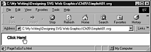
With the preceding code, you have a functioning link, as you can see in Figure 05.01. Note the pointing-hand cursor onscreen and the target for the link, PageToGoTo.html, in the status bar of the browser window.
Figure 05.01. A simple text link using the SVG <a> element. Note the pointing-hand cursor because the mouse is over the content of the <a> element.
Notice the difference between the locator xlink:href attribute in the SVG <a> element and that with which you are probably familiar in HTML or XHTML. You must use an xlink:href attribute rather than the href attribute you use in HTML. The value of the xlink:href attribute is simply a typical URL (Uniform Resource Locator). In the example, the link is made to the URL http://www.svgspider.com/default.svg. Because no indication exists otherwise, the default behavior of an SVG <a> element is that the target Web page is opened in the same browser window.
The following example shows how to create a simple button using a <rect> element with rounded corners that is nested within an SVG <a> element. The resulting graphic is shown in Figure 05.02.
Figure 05.02. A simple SVG navigation graphic nested within an <a> element.
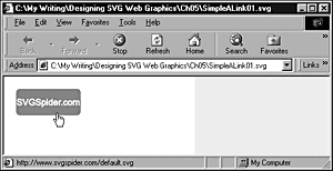
Notice that as with a bitmap graphic used in HTML or XHTML, the SVG graphic also produces a pointing-hand cursor when the mouse hovers over the graphic to indicate that the graphic is a hyperlink.
Listing 5.2 (SimpleALink01.svg)
<?xml version="1.0" standalone="no"?> <!DOCTYPE svg PUBLIC "-//W3C//DTD SVG 1.0//EN" "http://www.w3.org/TR/2001/PR-SVG-20010719/ DTD/svg10.dtd"> <svg width="300" height="200" xmlns:xlink="http://www.w3.org/1999/xlink" > <a xlink:href="http://www.svgspider.com/default.svg"> <rect x="20" y="20" width="100" height="40" rx="5" ry="5" style="fill:red; stroke:red;"/> <text x="20" y="45" style="fill:white; stroke:white; font-size:14;"> SVGSpider.com </text> </a> </svg>
In the start tag of the <svg> element is a namespace declaration I included for the XLink namespace:
xmlns:xlink="http://www.w3.org/1999/xlink"
Any processor application is then aware that when it encounters in your SVG document an attribute with an xlink prefix, the attribute belongs to the XLink namespace. An XLink-aware processor, such as an SVG viewer, then interprets the meaning of the attribute correctly. The Adobe SVG Viewer seems not to require that the namespace declaration be made, but being explicit about the namespace URI http://www.w3.org/1999/xlink, which is being referred to when the namespace prefix xlink is being used, is good practice.
An alternative approach is to add the namespace declaration to the <a> element itself:
<a xlink:href="http://www.svgspider.com/default.svg" xmlns:xlink="http://www.w3.org/1999/xlink">
All parts of the graphic that are to act as the hyperlink need to be nested within the <a> element. For example, the following code does not produce the desired result of linking because the <text> element lies outside the <a> element:
Listing 5.3 (SimpleALink02.svg)
<?xml version="1.0" standalone="no"?> <!DOCTYPE svg PUBLIC "-//W3C//DTD SVG 1.0//EN" "http://www.w3.org/TR/2001/PR-SVG-20010719/ DTD/svg10.dtd"> <svg width="300" height="200"> <a xlink:href="http://www.svgspider.com/default.svg"> <rect x="20" y="20" width="100" height="40" rx="5" ry="5" style="fill:red; stroke:red;"/> </a> <!-- The text is not nested within the <a> element as it should be. --> <text x="20" y="45" style="fill:white; stroke:white; font-size:14;"> SVGSpider.com </text> </svg>
The <text> element is not nested within the <a> element and is placed in front of the <rect> element. However, if you attempt to click on the link when the mouse is over the text rather than over the rectangle, no linking behavior results. That isn't surprising because the <text> element isn't nested correctly within the linking <a> element. One hint that something is wrong is that if you mouse over the graphic, the pointing-hand cursor that is present when you mouse over the rectangle changes to an I-bar-type cursor when you move it over the text. The cure is simple: Nest the text properly within the <a> element.
In HTML, you can open a link in a new window by setting the target attribute of the <a> element to _blank. In SVG, you set the xlink:show attribute of the SVG <a> element to new to achieve the same effect. In Internet Explorer 5.5, you can also use a target attribute with the value _blank, as you can in HTML. (See Listing 5.4, which uses the target attribute that works with Internet Explorer in the absence of support for the xlink:show attribute in the Adobe SVG Viewer.)
Listing 5.4 (SimpleALink03.svg)
<?xml version="1.0" standalone="no"?> <!DOCTYPE svg PUBLIC "-//W3C//DTD SVG 1.0//EN" "http://www.w3.org/TR/2001/PR-SVG-20010719/ DTD/svg10.dtd"> <svg width="300" height="200"> <a xlink:href="http://www.svgspider.com/default.svg" target="new"> <rect x="20" y="20" width="100" height="40" rx="5" ry="5" style="fill:red; stroke:red;"/> <text x="20" y="45" style="fill:white; stroke:white; font-size:14;"> SVGSpider.com </text> </a> </svg>
In the preceding code, I used the target attribute. The SVG specification recommends the use of xlink:show with a value of new to achieve the same effect.
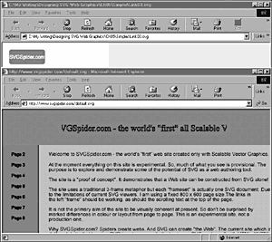
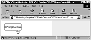
Figure 05.03 shows the linked page opened in a new window. The page being linked from is shown in the rear window. The linked page, http://www.svgspider.com/default.svg, is opened in a new browser window.
Figure 05.03. The target attribute on the <a> element when set to a value of new causes a new window to be opened in Internet Explorer to display the page or image referenced by the xlink:href attribute.
Thus, by using the SVG <a> element, you can either replace the content of the current window or, if the target attribute is given a value of _blank, you can open a new window.
mailto links
Strictly speaking, mailto links are not part of a navigation bar, but because they are based on the SVG <a> element, I describe them here.
Suppose that on the AndrewWatt.com Web site page on consulting services, you want to add a mailto link. The link is part of an SVG header for a particular Web page that includes other links. Your SVG code looks something like this:
Listing 5.5 (MailTo.svg)
<?xml version="1.0" standalone="no"?> <!DOCTYPE svg PUBLIC "-//W3C//DTD SVG 1.0//EN" "http://www.w3.org/TR/2001/PR-SVG-20010719/ DTD/svg10.dtd"> <svg width="800" height="150"> <svg x="0" y="0" width="800" height="150"> <rect x="0" y="0" width="800" height="150" style="fill:black; stroke:none;"/> <text x="30" y="30" style="font-family:Arial, sans-serif; font-size:36; stroke:#CCFF00; fill:#CCFF00;"> AndrewWatt.com </text> <a xlink:href="mailto:Consulting@AndrewWatt.com"> <text x="30" y="60" style="font-family:Arial, sans-serif; font-size:16; stroke:#3333FF; fill:#3333FF;"> Consulting Services </text> </a> </svg> </svg>
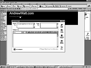
As you can see in Figure 05.04, an SVG mailto link, when properly written, causes the cursor to change to a hand, and in the Adobe SVG Viewer the link is displayed in the browser status bar.
Figure 05.04. Clicking on a mailto link in an SVG element causes the relevant mailing application to open a new email form, appropriately addressed. Here, the functionality is shown in AOL 6.0.
If you attempt to create a mailto link and find that the hand cursor is present but the link text is absent from the browser status bar, you may have written
<a href="mailto:Consulting@AndrewWatt.com">
using an href attribute (incorrect in SVG) rather than what you need to write, which is
<a xlink:href="mailto:Consulting@AndrewWatt.com">
using the xlink:href attribute.
Remember that because SVG is XML, it uses the XLink linking mechanism, not the HTML one. The syntax is similar but not identical.
Having introduced you to the SVG <a> element, I now describe the XLink functionality provided in SVG.
XLinks
As you have read in the preceding section, SVG provides in its <a> element linking capabilities that are similar to those in HTML and XHTML but using the xlink:href attribute. However, the xlink:href attribute is only one of several XLink linking attributes supported in the SVG specification. First, let's take a look at what XLinks are about.
XLink has no elements; rather, it has global attributes. XLink attributes can be associated with any SVG element indeed, with any XML element by simply adding the XLink namespace declaration in the appropriate place and using the available XLink linking attributes. SVG implements only sim-ple-type XLinks, which broadly correspond to familiar hyperlinking functionality in HTML and XHTML.
In addition to the xlink:href attribute, which you read about earlier, SVG also supports xlink:type, xlink:role, xlink:arcrole, xlink:title, xlink:show, and xlink:actuate global attributes.
The <a> element functionality is equivalent to the following XLink linking attributes placed on a <rect> element.
Listing 5.6 (XLink02.svg)
<?xml version="1.0" standalone="no"?> <!DOCTYPE svg PUBLIC "-//W3C//DTD SVG 1.0//EN" "http://www.w3.org/TR/2001/PR-SVG-20010719/ DTD/svg10.dtd"> <svg width="300" height="200"> <rect xmlns:xlink="http://www.w3.org/1999/xlink" xlink:type="simple" xlink:href="Replacement.svg" xlink:show="replace" xlink:actuate="onRequest" x="20" y="20" width="100" height="40" rx="5" ry="5" style="fill:red; stroke:red;"/> <text x="20" y="45" style="fill:white; stroke:white; font-size:14;"> Click to link </text> </svg>
The XLink functionality lies in the following code:
<rect xmlns:xlink="http://www.w3.org/1999/xlink" xlink:type="simple" xlink:href="Replacement.svg" xlink:show="replace" xlink:actuate="onRequest" x="20" y="20" width="100" height="40" rx="5" ry="5" style="fill:red; stroke:red;"/>
The XLink namespace is declared on the <rect> element. The meaning of xlink:href is as you saw previously it specifies the URL being linked to. The xlink:show attribute defines where the linked page or image will be displayed. In this case, the value of the xlink:show attribute is replace, which means that it is displayed in the current window. The xlink:actuate attribute has the value onRequest, which means that the link is activated when the containing element, the <rect> element, is clicked.
To use the XLink syntax to open a new window on request, you use this syntax:
<rect xmlns:xlink="http://www.w3.org/1999/xlink" xlink:type="simple" xlink:href="Replacement.svg" xlink:show="new" xlink:actuate="onRequest" x="20" y="20" width="100" height="40" rx="5" ry="5" style="fill:red; stroke:red;"/>
To open a new window when a page loads for example, to provide instructions for using a program or to make known details of a special offer from an e-store you set xlink:show to new and xlink:actuate to onLoad, as shown in the following example:
<rect xmlns:xlink="http://www.w3.org/1999/xlink" xlink:type="simple" xlink:href="Replacement.svg" xlink:show="new" xlink:actuate="onLoad" x="20" y="20" width="100" height="40" rx="5" ry="5" style="fill:red; stroke:red;"/>
None of the XLink attributes can be animated, although you can animate SVG elements on which the XLink attributes are present.
The full XLink linking functionality is not now supported in the Adobe SVG Viewer. Hopefully, by the time you read this chapter, one or more of the SVG viewers will have fully implemented XLink functionality and you can then try out the preceding code.
Adding Mouseover Effects
I talk about interactivity in SVG in greater detail in Chapter 11. In this chapter, I look only at mouseover and mouseout, which enable you to implement rollovers using SVG declarative syntax.
Rollover effects can be achieved in several ways, using SVG declarative animation. In Listing 5.7, the <set> element is used to create an animation that begins when the text is moused and ends when the mouse is removed. Notice that the <set> element is nested within the <text> element whose font-size property is being animated.
Listing 5.7 (MouseEvents01.svg)
<?xml version="1.0" standalone="no"?> <!DOCTYPE svg PUBLIC "-//W3C//DTD SVG 1.0//EN" "http://www.w3.org/TR/2001/PR-SVG-20010719/ DTD/svg10.dtd"> <svg width="800" height="200"> <text x="50" y="50" style="font-size:24; font-family:Arial, sans-serif; stroke:red; fill:red;"> <set attributeName="font-size" begin="mouseover" end="mouseout" to="36" /> This text will enlarge when moused. </text> <text x="50" y="100" style="font-size:24; font-family:Arial, sans-serif; stroke:red; fill:red;"> <set attributeName="font-size" begin="mouseover" end="mouseout" to="36" /> This text will enlarge when moused. </text> </svg>
Figure 05.05 shows the text when the lower text is moused. As you can see, the font size has increased. The font size increases from 24 to 36 while the mouse is over the text.
Figure 05.05. The lower text is moused, and its font size has increased.
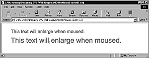
No <a> element is present in the code, so the pointing-hand cursor is not present. As you can see, an I-bar cursor appears when the mouse is over the text.
The <set> element creates step-wise transition from one value of an attribute or property to another. You may want to create a more subtle rollover effect that would require using one of the other SVG animation elements. For example, you may want text to expand its font size and then shrink back slightly. You could achieve that effect by using the <animate> element. However, you then would need to use two <animate> elements one to create the mouseover animation and the second to create the mouseout animation.
Listing 5.8 (MouseEvents02.svg)
<?xml version="1.0" standalone="no"?> <!DOCTYPE svg PUBLIC "-//W3C//DTD SVG 1.0//EN" "http://www.w3.org/TR/2001/PR-SVG-20010719/ DTD/svg10.dtd"> <svg width="1000" height="200"> <text x="50" y="50" style="font-size:24; font-family:Arial, sans-serif; stroke:red; fill:red;"> <animate attributeName="font-size" begin="mouseover" dur="1s" values="24; 36; 32" fill="freeze" /> <animate attributeName="font-size" begin="mouseout" dur="0.5s" values="32; 33; 24" fill="freeze" /> This text will enlarge then shrink slightly when moused. </text> </svg>
The mouseover animation lasts 1 second, and the mouseout animation lasts 0.5 seconds. In practice, you may want something a little faster than that. Similarly, you almost certainly will choose smaller font sizes; the large font sizes chosen here help you to see what is happening. During the first half-second of the mouseover event, the font size increases from 24 to 36, and then it shrinks back to 32 over the final half-second.
In the earlier examples of hyperlinking in SVG, two or more elements were nested within a single <a> element. When it comes to creating rollover effects on multiple elements, you need to make sure that you apply an appropriate animation to all the elements within the <a> element you want to animate.
I show you how to create a rollover that adapts the code shown in Listing 5.8. The rollover effect you create changes the white text to red (which involves animating both its fill and stroke properties) and the fill of the rectangle to white, leaving the stroke of the rectangle red. The appearance when the button is not moused is shown in Figure 05.06; the way it looks when it is moused is shown in Figure 05.07.
Figure 05.06. A mouseover effect where the fill and stroke of the text and the fill of the rectangle all change when the button is moused. In this figure, the button is not moused.
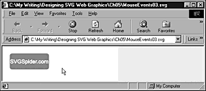
Figure 05.07. The same button when moused. The fill and stroke of the <text> element and the fill of the <rect> element all change color.
In Listing 5.9, I show you the code that achieves the desired rollover effect.
Listing 5.9 (MouseEvents03.svg)
<?xml version="1.0" standalone="no"?> <!DOCTYPE svg PUBLIC "-//W3C//DTD SVG 1.0//EN" "http://www.w3.org/TR/2001/PR-SVG-20010719/ DTD/svg10.dtd"> <svg width="300" height="200"> <a xlink:href="http://www.svgspider.com/default.svg" target="new" id="MouseTest"> <rect x="20" y="20" width="100" height="40" rx="5" ry="5" style="fill:red; stroke:red;"> <animate begin="MouseTest.mouseover" dur="0.1s" attributeName="fill" from="red" to="white" fill="freeze"/> <animate begin="MouseTest.mouseout" dur="0.1s" attributeName="fill" from="white" to="red" fill="freeze"/> </rect> <text x="20" y="45" style="fill:white; stroke:white; font-size:14;" pointer-events="none"> <animate begin="MouseTest.mouseover" dur="0.1s" attributeName="fill" from="white" to="red" fill="freeze"/> <animate begin="MouseTest.mouseout" dur="0.1s" attributeName="fill" from="red" to="white" fill="freeze"/> <animate begin="MouseTest.mouseover" dur="0.1s" attributeName="stroke" from="white" to="red" fill="freeze"/> <animate begin="MouseTest.mouseout" dur="0.1s" attributeName="stroke" from="red" to="white" fill="freeze"/> SVGSpider.com </text> </a> </svg>
To achieve the desired effect, the mouseover must apply when anything within the <a> element is moused. Just add an id attribute to the <a> element (in this case, MouseTest ), and use that id attribute as part of the value of the begin attribute for all mouseover effects. Thus, the following syntax means that when anything within the <a> element is moused, the mouseover effect begins:
begin='MouseTest.mouseover'
To achieve different color changes on the text and on the rectangle, you need separate animations nested within the <text> and <rect> elements, respectively. The first pair of <animate> elements within the <text> element changes the fill from white to red (and back again on mouseout); the second pair of <animate> elements changes the stroke property. The <animate> element nested within the <rect> element changes its fill property on mouseover and changes it back on mouseout.
You could have used the <set> animation element in a way similar to what you read about earlier for achieving a similar effect.
These animations are very simple. You can combine color changes like these with slight changes in font size or opacity, replace a solid fill with a graduated one, or even create an animated graduated fill. The possibilities are legion, but these simple effects are sufficient to allow you to move on and look at the creation of some Web page navigation furniture.
Simple Navigation Bars
In this section, I describe how to create simple navigation bars. The navigation furniture that is produced is not necessarily of a type you use in a production Web page, but the techniques I show you are useful in many settings. As with so many other aspects of SVG, what I am showing you are visual components you can use with other SVG visual components to produce your own SVG graphics.
The navigation bars I show you how to create in this section are typically in their own nested <svg> elements to allow you to reposition the navigation bar as a unit on the Web page while preserving the relative positions of its parts.
If you want to test these bars embedded within HTML and XHTML Web pages, see Chapter 10, "Embedding SVG in HTML or XHTML Pages," for the syntax required to do that.
Text Navigation Bars
A text navigation bar has just about the simplest design you can create. The code for a three-page text navigation bar is shown in Listing 5.10. The purpose of the deep blue rectangle is simply to show you the boundary of the navigation bar. The navigation bar is contained within a nested <svg> element. If you want to move the navigation bar slightly up or to the side (or even to the right side of the page), you can do that by changing only the x and y attributes of the nested <svg> element and maintaining the relative positioning of everything inside it.
Listing 5.10 (TextNavBar01.svg)
<?xml version="1.0" standalone="no"?> <!DOCTYPE svg PUBLIC "-//W3C//DTD SVG 1.0//EN" "http://www.w3.org/TR/2001/PR-SVG-20010719/ DTD/svg10.dtd"> <svg width="200" height="600"> <rect x="150" y="0" width="50" height="600" style="fill:#000099"/> <svg x="0" y="0"> <a xlink:href="Page02" id="Page02Link"> <text x="20" y="30" style="font-family: Arial, sans-serif; font-size:12; fill:#000099; stroke:#000099"> <set attributeName="stroke" begin="Page02Link.mouseover" end="Page02Link.mouseout" to="#FF0066"/> <set attributeName="fill" begin="Page02Link.mouseover" end="Page02Link.mouseout" to="#FF0066"/> Page 02 </text> </a> <a xlink:href="Page03" id="Page03Link"> <text x="20" y="60" style="font-family: Arial, sans-serif; font-size:12; fill:#000099; stroke:#000099"> <set attributeName="stroke" begin="Page03Link.mouseover" end="Page03Link.mouseout" to="#FF0066"/> <set attributeName="fill" begin="Page03Link.mouseover" end="Page03Link.mouseout" to="#FF0066"/> Page 03 </text> </a> <a xlink:href="Page04" id="Page04Link"> <text x="20" y="90" style="font-family: Arial, sans-serif; font-size:12; fill:#000099; stroke:#000099"> <set attributeName="stroke" begin="Page04Link.mouseover" end="Page04Link.mouseout" to="#FF0066"/> <set attributeName="fill" begin="Page04Link.mouseover" end="Page04Link.mouseout" to="#FF0066"/> Page 04 </text> </a> </svg> </svg>
Let's look in more detail at how the link and rollover effect for the link to Page 2 is constructed:
<a xlink:href="Page02" id="Page02Link"> <text x="20" y="30" style="font-family: Arial, sans-serif; font-size:12; fill:#000099; stroke:#000099"> <set attributeName="stroke" begin="Page02Link.mouseover" end="Page02Link.mouseout" to="#FF0066"/> <set attributeName="fill" begin="Page02Link.mouseover" end="Page02Link.mouseout" to="#FF0066"/> Page 02 </text> </a>
As before, the link is contained within an <a> element. The link is defined by the xlink:href attribute. Notice that the <a> element has an id attribute, which is used in defining the mouse effects. To create the rollover effect, you can use the <set> element because the changes you want are simple step-wise color changes from #000099 to #FF0066.
To create the links for additional pages, you can use the preceding code as a simple visual component, copy it, and then adjust various attributes accordingly. In this case, you need to change the id attribute on the <a> element, the y attribute on the <text> element, the begin and end attributes on both <set> elements, and the text contained within the <text> element that describes the link.
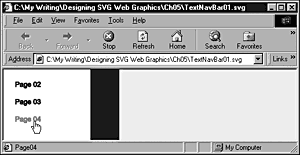
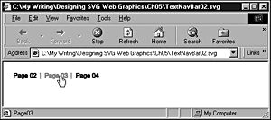
Figure 05.08 shows the simple text navigation bar with one of the links being moused.
Figure 05.08. A simple text navigation bar with one of the links showing a change in color when moused.
A simple horizontal text navigation bar is created similarly. Listing 5.11 provides you with code for that.
Listing 5.11 (TextNavBar02.svg)
<?xml version="1.0" standalone="no"?> <!DOCTYPE svg PUBLIC "-//W3C//DTD SVG 1.0//EN" "http://www.w3.org/TR/2001/PR-SVG-20010719/ DTD/svg10.dtd"> <svg width="800" height="200"> <svg x="0" y="0"> <a xlink:href="Page02" id="Page02Link"> <text x="20" y="30" style="font-family: Arial, sans-serif; font-size:12; fill:#000099; stroke:#000099"> <set attributeName="stroke" begin="Page02Link.mouseover" end="Page02Link.mouseout" to="#FF0066"/> <set attributeName="fill" begin="Page02Link.mouseover" end="Page02Link.mouseout" to="#FF0066"/> Page 02 </text> </a> <text x="70" y="30" style="font-family: Arial, sans-serif; font-size:12; fill:#999999; stroke:#999999"> | </text> <a xlink:href="Page03" id="Page03Link"> <text x="80" y="30" style="font-family: Arial, sans-serif; font-size:12; fill:#000099; stroke:#000099"> <set attributeName="stroke" begin="Page03Link.mouseover" end="Page03Link.mouseout" to="#FF0066"/> <set attributeName="fill" begin="Page03Link.mouseover" end="Page03Link.mouseout" to="#FF0066"/> Page 03 </text> </a> <text x="130" y="30" style="font-family: Arial, sans-serif; font-size:12; fill:#999999; stroke:#999999"> | </text> <a xlink:href="Page04" id="Page04Link"> <text x="140" y="30" style="font-family: Arial, sans-serif; font-size:12; fill:#000099; stroke:#000099"> <set attributeName="stroke" begin="Page04Link.mouseover" end="Page04Link.mouseout" to="#FF0066"/> <set attributeName="fill" begin="Page04Link.mouseover" end="Page04Link.mouseout" to="#FF0066"/> Page 04 </text> </a> </svg> </svg>
The horizontal navigation bar is shown in Figure 05.09. Note that I have added gray spacers between the linking elements. Be careful not to nest those within an <a> element because you are unlikely to want those to have either linking functionality or to show a rollover effect.
Figure 05.09. A horizontal navigation bar with gray vertical spacers and rollover changes in text color.
Tabbed Navigation Bars
One of the navigation graphics commonly used within some of the major e-commerce sites is the tabbed navigation bar. Take a look at Amazon.com or similar sites to find lots of tabbed navigation bars. Often, the tabbed navigation bar is combined with menu choices or drop-down menus (such as that shown in Chapter 11) in the space below the navigation tabs.
To demonstrate how to create a tabbed navigation bar in SVG, I show you how to create a possible navigation bar for S-V-G.com with links to a number of other SVG and XML technology-related sites. Figure 05.10 shows the finished product with one of the tabs moused.
Figure 05.10. A tabbed navigation bar demonstrating a rollover effect on the tab being moused.
The first step is to create a basic layout with a <rect> element that is 100 percent of the browser window width, nested within a nested <svg> element. If you do happen to need to reposition the navigation bar, you simply alter the x or y attributes of the nested <svg> element, thus saving lots of work fiddling with multiple positioning attributes on individual elements.
Listing 5.12 (TabbedNav01.svg)
<?xml version="1.0" standalone="no"?> <!DOCTYPE svg PUBLIC "-//W3C//DTD SVG 1.0//EN" "http://www.w3.org/TR/2001/PR-SVG-20010719/ DTD/svg10.dtd"> <svg> <svg width="100%" height="250" > <text x="10" y="40" style="font-family:Arial, sans-serif; font-size: 24; fill:#000066; stroke:#000066"> S-V-G.com </text> <rect x="0" y="60" width="100%" height="100" style="fill:#000099; stroke:#000099;"/> </svg> </svg>
The next step is to add the individual tabs and their text. At this stage, a little planning and careful sizing can save lots of time fiddling later. Decide, if possible, on the number of tabs you need. Then create each tab together with its associated text so that you finish (or so you hope) the creation of one tab before going on to create the next. One reason for doing that is that if you change, for example, the font size of the text on the tabs or swap a long name into a tab intended for a short name, you have to start manually adjusting a whole series of positioning attributes further across the page.
Be sure to place the <rect> elements for each tab earlier in the document order than the <rect> element that forms the dark blue bar across the screen. Suppose that you want to create rounded corners on the top of the tabs. By placing the <rect> elements behind the large bar, the rounded corners on the lower edge of the tabs are concealed.
This example has only three added tabs, although in a production setting you may want to add a larger number. I now have a static tabbed bar. The code for it is shown in Listing 5.13.
Listing 5.13 (TabbedNav02.svg)
<?xml version="1.0" standalone="no"?> <!DOCTYPE svg PUBLIC "-//W3C//DTD SVG 1.0//EN" "http://www.w3.org/TR/2001/PR-SVG-20010719/ DTD/svg10.dtd"> <svg> <svg width="100%" height="250" > <text x="10" y="40" style="font-family:Arial, sans-serif; font-size: 24; fill:#000066; stroke:#000066"> S-V-G.com </text> <rect x="140" y="40" width="100" height="25" rx="5" ry="5" style="fill:#000099; stroke:#000099"/> <text x="146" y="56" style="fill:white; stroke:white;"> SVGSpider.com </text> <rect x="245" y="40" width="100" height="25" rx="5" ry="5" style="fill:#000099; stroke:#000099"/> <text x="255" y="56" style="fill:white; stroke:white;"> SVGenius.com </text> <rect x="350" y="40" width="110" height="25" rx="5" ry="5" style="fill:#000099; stroke:#000099"/> <text x="360" y="56" style="fill:white; stroke:white;"> AndrewWatt.com </text> <rect x="0" y="60" width="100%" height="100" style="fill:#000099; stroke:#000099;"/> </svg> </svg>
Next, I have added an <a> element to each tab. While coding, I find it helpful to create gaps between blocks of work, such as each tab. That strategy makes it less likely that I inadvertently insert code in the wrong place, and I avoid debugging time. Because I plan to create a mouseover effect for each tab, I add an id attribute to each <a> element, to be used in the begin and end attributes of a <set> element. Because I also want each link to open in a new window, I set the target attribute of each <a> element to a value of new.
I use a <set> element to create the rollover effect on each tab. The rollover effect I have chosen is of the fill property of the tab. It changes from a deep blue, #000099, to a pale bluish color, #CCCCFF. I had considered also adding a rollover of the text color to a deep blue, but decided that the rollover effect on the rectangle fill alone was satisfactory.
Following the addition of the <a> elements and the rollover effects, the code looks like that shown in Listing 5.14.
Listing 5.14 (TabbedNav03.svg)
<?xml version="1.0" standalone="no"?> <!DOCTYPE svg PUBLIC "-//W3C//DTD SVG 1.0//EN" "http://www.w3.org/TR/2001/PR-SVG-20010719/ DTD/svg10.dtd"> <svg> <svg width="100%" height="250" > <text x="10" y="40" style="font-family:Arial, sans-serif; font-size: 24; fill:#000066; stroke:#000066"> S-V-G.com </text> <a xlink:href="http://www.svgspider.com/default.svg" target="new" id="SVGSpiderLink"> <rect x="140" y="40" width="100" height="25" rx="5" ry="5" style="fill:#000099; stroke:#000099"> <set begin="SVGSpiderLink.mouseover" end="SVGSpiderLink.mouseout" attributeName="fill" to="#CCCCFF"/> </rect> <text x="146" y="56" style="fill:white; stroke:white;"> SVGSpider.com </text> </a> <a xlink:href="http://www.SVGenius.com/" target="new" id="SVGeniusLink"> <rect x="245" y="40" width="100" height="25" rx="5" ry="5" style="fill:#000099; stroke:#000099"> <set begin="SVGeniusLink.mouseover" end="SVGeniusLink.mouseout" attributeName="fill" to="#CCCCFF"/> </rect> <text x="255" y="56" style="fill:white; stroke:white;"> SVGenius.com </text> </a> <a xlink:href="http://www.AndrewWatt.com/" target="new" id="AWLink"> <rect x="350" y="40" width="110" height="25" rx="5" ry="5" style="fill:#000099; stroke:#000099"> <set begin="AWLink.mouseover" end="AWLink.mouseout" attributeName="fill" to="#CCCCFF"/> </rect> <text x="360" y="56" style="fill:white; stroke:white;"> AndrewWatt.com </text> </a> <rect x="0" y="60" width="100%" height="100" style="fill:#000099; stroke:#000099;"/> </svg> </svg>
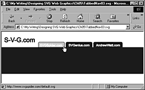
In Figure 05.11, you can see the rollover effect working on one of the tabs.
Figure 05.11. A tabbed navigation bar with functioning rollover effect.
As a final step in this example, I add a simple horizontal text navigation bar for the About Us, Contact Us, and Consultancy pages. I firmly believe in the notion of visual components, and the code in Listing 5.11 is this type of visual component. It already has the functionality you need for a horizontal navigation bar for this example, and it is nested in its own <svg> element so that you can reposition the horizontal text navigation bar as a whole. Of course, I needed to make a number of adjustments to various attributes, including the x and y attributes on the <svg> element, which contains the horizontal text navigation bar. The link text, xlink:href attributes, text fill, and stroke also needed to be tweaked to correspond to their new use. Despite those changes, the reuse of the horizontal text navigation bar saved time in adding code to the tabbed navigation bar.
When reusing code, be careful to paste it in the correct place. Failure to do so can cause major problems with the display of SVG. Also, particularly in your early attempts at reusing code, make sure that you change only one thing or a couple of obviously connected things at a time. Then, resave (with a new filename so that you can go back to a previous working version), and view the SVG again in an SVG viewer.
If you are careful and methodical in making these types of changes, you should minimize the likelihood of making a series of changes, making a mistake while carrying them out, and then not knowing which of the changes you made is causing your problem.
Listing 5.15 (TabbedNav04.svg)
<?xml version="1.0" standalone="no"?> <!DOCTYPE svg PUBLIC "-//W3C//DTD SVG 1.0//EN" "http://www.w3.org/TR/2001/PR-SVG-20010719/ DTD/svg10.dtd"> <svg> <svg width="100%" height="250" > <text x="10" y="40" style="font-family:Arial, sans-serif; font-size: 24; fill:#000066; stroke:#000066"> S-V-G.com </text> <a xlink:href="http://www.svgspider.com/default.svg" target="new" id="SVGSpiderLink"> <rect x="140" y="40" width="100" height="25" rx="5" ry="5" style="fill:#000099; stroke:#000099"> <set begin="SVGSpiderLink.mouseover" end="SVGSpiderLink.mouseout" attributeName="fill" to="#CCCCFF"/> </rect> <text x="146" y="56" style="fill:white; stroke:white;"> SVGSpider.com </text> </a> <a xlink:href="http://www.SVGenius.com/" target="new" id="SVGeniusLink"> <rect x="245" y="40" width="100" height="25" rx="5" ry="5" style="fill:#000099; stroke:#000099"> <set begin="SVGeniusLink.mouseover" end="SVGeniusLink.mouseout" attributeName="fill" to="#CCCCFF"/> </rect> <text x="255" y="56" style="fill:white; stroke:white;"> SVGenius.com </text> </a> <a xlink:href="http://www.AndrewWatt.com/" target="new" id="AWLink"> <rect x="350" y="40" width="110" height="25" rx="5" ry="5" style="fill:#000099; stroke:#000099"> <set begin="AWLink.mouseover" end="AWLink.mouseout" attributeName="fill" to="#CCCCFF"/> </rect> <text x="360" y="56" style="fill:white; stroke:white;"> AndrewWatt.com </text> </a> <rect x="0" y="60" width="100%" height="100" style="fill:#000099; stroke:#000099;"/> <svg x="30" y="75" width="800" height="100"> <a xlink:href="AboutUs.html" id="AboutUsLink"> <text x="20" y="30" style="font-family: Arial, sans-serif; font-size:12; fill:white; stroke:white;"> <set attributeName="stroke" begin="AboutUsLink.mouseover" end="AboutUsLink.mouseout" to="#FF0066"/> <set attributeName="fill" begin="AboutUsLink.mouseover" end="AboutUsLink.mouseout" to="#FF0066"/> About Us </text> </a> <text x="80" y="30" style="font-family: Arial, sans-serif; font-size:12; fill:#999999; stroke:#999999"> | </text> <a xlink:href="ContactUs.html" id="ContactLink"> <text x="90" y="30" style="font-family: Arial, sans-serif; font-size:12; fill:white; stroke:white;"> <set attributeName="stroke" begin="ContactLink.mouseover" end="ContactLink.mouseout" to="#FF0066"/> <set attributeName="fill" begin="ContactLink.mouseover" end="ContactLink.mouseout" to="#FF0066"/> Contact Us </text> </a> <text x="160" y="30" style="font-family: Arial, sans-serif; font-size:12; fill:#999999; stroke:#999999"> | </text> <a xlink:href="Consultancy.html" id="ConsultancyLink"> <text x="170" y="30" style="font-family: Arial, sans-serif; font-size:12; fill:white; stroke:white"> <set attributeName="stroke" begin="ConsultancyLink.mouseover" end="ConsultancyLink.mouseout" to="#FF0066"/> <set attributeName="fill" begin="ConsultancyLink.mouseover" end="ConsultancyLink.mouseout" to="#FF0066"/> Consultancy </text> </a> </svg> <!-- This is the end of the re-used horizontal text nav bar. --> </svg> <!-- This is the end of the deep blue bar we created early in this example. --> </svg> <!-- This is the end of the document <svg> element. -->
Notice the three </svg> end tags in this code. A horizontal text navigation bar (contained in its own <svg> element) is nested within the <svg> element, which contains the deep blue bar that formed the basis for the tabbed navigation bar, which is itself nested within the document <svg> element.
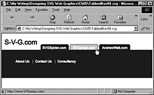
Figure 05.12 shows the finished tabbed navigation bar with one of the choices in the reused horizontal text navigation bar moused.
Figure 05.12. The completed tabbed navigation bar with rollover effects accessible on the tabs and on the link choices in the reused horizontal text navigation bar.
You can, of course, make many further refinements to such a tabbed navigation bar. One that comes to mind is to set each part of the link text of the horizontal text navigation bar against a self-colored rectangle, with or without an outline, and to create additional rollover effects on the fill or the stroke of the rectangle.
Using <svg> Elements to Aid Positioning
Back in Chapter 2, "SVG Document Overview," I mentioned that you could nest one <svg> element inside another and that you could use the nested <svg> element as a container for an SVG component. Creating navigation bars, as you have seen in the examples in this chapter, can be a useful application of that technique.
A navigation bar can consist of many individual components, including graphical shapes and text. If you nest within a <svg> element all the SVG elements that make up the navigation bar, all the positioning of the elements within a group relative to each other remains fixed. By altering the values of the x and y attributes of the nested <svg> element, the whole navigation bar and its component parts or other visual components can be moved around without disturbing the carefully crafted relative positioning of its parts. This makes the reuse of SVG code much easier and saves you from lots of time writing new code (and thus saves time debugging it), making the whole operational use of SVG more pleasant, more fun, and more efficient.
With the techniques in this chapter, your repertoire of knowledge about SVG is growing to the point where you can begin to produce useful SVG graphics. Chapter 6, "Creating SVG Gradients," examines the use of gradients to allow you to produce more subtle and sophisticated visual effects than with the solid fills you have seen in the examples so far.
| CONTENTS | |
EAN: 2147483647
Pages: 26