Building Smart Forms
| You use several of the basic Web controls to represent standard HTML form elements such as radio buttons , text boxes, and list boxes. You can use these controls in your ASP.NET pages to create the user interface for your Web application. The following sections provide detailed overviews and programming samples for each of these Web controls. NOTE See Appendix C, "Web Control Reference," for a detailed reference of all the properties, methods , and events of the Web controls. Using Label ControlsThe easiest way to add static text to your Web Forms Page is simply to add the text to the body of the page. However, if you want to be able to modify the text displayed on a page within your code, you need to display the text within a Label control. See Table 2.1 for a list of all the properties and methods of this control. Table 2.1. Label Properties, Methods, and Events
The Label control has one important property: Text . You can assign any text or HTML content that you want to this property. When the Label control is rendered on a page, any text assigned to the Text property is displayed in place of the control. You can assign a value to the Text property in two ways: declaratively or programmatically. First, you can assign a value to the Label control when you declare it on the page like this: <asp:Label ID="lblMessage" Text="Here is some text!" Runat="Server" /> Alternatively, you can assign the text within the code of the page. For example, the page in Listing 2.1 displays different content in a Label control depending on the time of day. Listing 2.1 Label.aspx<Script Runat="Server"> Sub Page_Load If TimeOfDay < #12:00pm# Then lblMessage.Text = "Good Morning!" Else lblMessage.Text = "Good Day!" End If End Sub </Script> <html> <head><title>Label.aspx</title></head> <body> <form Runat="Server"> <asp:Label ID="lblMessage" Runat="Server" /> </form> </body> </html> The C# version of this code can be found on the CD-ROM. In Listing 2.1, the Text property is assigned the value "Good Morning!" or the value "Good Day!" depending on the time of day. The contents of a Label control are rendered within a <span> tag (you can see this if you click View Source on your browser). This means that you must be careful about where you use the Label control in a page. For example, using the Label control in the <title> tag of your page would not be a good idea because the literal text <span> also would appear in the title. NOTE The LiteralControl is very similar to the Label control except for the fact that it does not render <span> tags. You can use the LiteralControl within the <title> tag of a page. Using the TextBox ControlThe TextBox control can render any one of three different HTML tags. The control can be used to display a standard HTML text input field, an HTML password input field, or an HTML text area. All the properties, methods, and events of this control are listed in Table 2.2. Table 2.2. TextBox Properties, Methods, and Events
The ASP.NET page in Listing 2.2 illustrates how you can use the TextBox control to display a single-line text box, password text box, and multi-line text box. Listing 2.2 textbox.aspx<html> <head><title>TextBox.aspx</title></head> <body> <form Runat="Server"> Username: <asp:TextBox id="txtUsername" Columns="30" Runat="Server" /> <p> Password: <asp:TextBox id="txtPassword" TextMode="password" Columns="30" Runat="Server" /> <p> Comments: <br> <asp:TextBox id="txtComments" TextMode="multiline" Columns="30" Rows="10" Runat="Server" /> <p> <asp:Button Text="Click Here!" Runat="Server" /> </form> </body> </html> The C# version of this code can be found on the CD-ROM. Even though the same Web control ” TextBox ”is used to create the Username, Password, and Comments fields on the page in Listing 2.2, very different user interface elements are displayed (see Figure 2.1). The different user interface elements are determined by the TextMode property of the TextBox control. Figure 2.1. A TextBox control with different TextMode properties. The TextMode property can have any one of the following three values:
NOTE The values of the TextMode property are mutually exclusive. This means that you cannot have a multiline password text box. This fact shouldn't be surprising because an ASP.NET control can display only HTML, and there is no such thing as a multiline password HTML element. Notice that, unlike an HTML <input> tag, the TextBox control does not use a Size property. Instead, the horizontal size of a text box is determined by the Columns property. In the case of a multiline text box, the vertical size is specified by the Rows property. Both the Columns and Rows properties specify the size in characters. NOTE You also can specify the horizontal and vertical size of a text box by using the Width and Height properties of the base WebControl class. The advantage of using these properties is that you can use units other than characters such as pixels or percentages. For more information, see the section "Base Web Control Properties" later in this chapter. A TextBox control also has a MaxLength property, which you can use to limit the number of characters that can be entered into a text box. This property works only with single-line and password text boxes. You cannot use MaxLength with multiline text boxes. If you need to limit the number of characters entered into a multiline text box, use either the RegularExpressionValidator or CustomValidator validation control. (See "Validating Expressions: The RegularExpressionValidator Control" in the next chapter for a code sample.) Assigning Text to a Text BoxYou use the Text property of a TextBox control to assign a value to a text box or read a value that a user has entered into it. You can use this property in two ways. First, you can use the Text property when declaring the control to provide the text box with a default value like this: <asp:TextBox ID="txtTextBox" Text="This is a default value!" Runat="Server" /> Alternatively, you can assign or read a value from a text box in code. For example, in Listing 2.3, the Country text box is assigned the default value "United States" when the page is first loaded. Listing 2.3 TextBoxText.aspx<Script Runat="Server"> Sub Page_Load( s As Object, e As EventArgs ) If Not IsPostBack Then txtCountry.Text = "United States" End If End Sub </Script> <html> <head><title>TextBoxText.aspx</title></head> <body> <form Runat="Server"> Please enter the name of your country: <br> <asp:TextBox id="txtCountry" Runat="Server"/> <asp:Button Text="Submit!" Runat="Server"/> </form> </body> </html> The C# version of this code can be found on the CD-ROM. NOTE How do you assign a string that contains a quotation mark to a text box? For example, suppose that you want to assign the value He said "Good Morning!" to a text box named Comments. If you try to use the following statement, you receive an error: Comments.Text = "He said "Good Morning!" " To assign a string that contains a quotation mark to the Text property, you need to double your quotation marks like this: Comments.Text = "He said ""Good Morning!"" " When the quotation marks are actually rendered on the page, the quotation marks appear as " characters. Handling the TextBox Control's TextChanged EventThe TextBox control has a TextChanged event, which is raised whenever the contents of the text box are changed and the form containing the text box has been posted back to the server. For example, the page in Listing 2.4 uses the TextChanged event to report whether the contents of the text box contained in the form have been changed. Listing 2.4 TextBoxChanged.aspx<Script Runat="Server"> Sub Page_Load lblMessage.Text = "" End Sub Sub txtSomeText_TextChanged( s As Object, e As EventArgs ) lblMessage.Text = "You changed the value!" End Sub </Script> <html> <head><title>TextBoxChanged.aspx</title></head> <body> <form Runat="Server"> <asp:TextBox ID="txtSomeText" Text="Apple" OnTextChanged="txtSomeText_TextChanged" Runat="Server"/> <asp:Button Text="Submit!" Runat="Server"/> <p> <asp:Label id="lblMessage" Runat="Server" /> </form> </body> </html> The C# version of this code can be found on the CD-ROM. When the contents of the txtSomeText control are changed in Listing 2.4, the txtSomeText_TextChanged subroutine is executed. This subroutine displays the text You changed the value! in the Label control named lblMessage . Notice that the Page_Load subroutine clears the value of the Label control every time the page is loaded. The Page_Load subroutine always executes before the TextChanged event. You need to use the Page_Load event because the Label control participates in the form's view state. If this control were not cleared on every page load, it would automatically retain the same value between posts. It would continue to display You changed the value! even when the value of the text box wasn't changed. The TextBox Control's AutoPostBack PropertyThe TextBox control also has an AutoPostBack property. When AutoPostBack has the value True , the form containing the text box is automatically posted whenever the contents of the text box are changed. When AutoPostBack is enabled, JavaScript code is sent to the browser when the page is rendered to capture TextBox onChange events. Because the AutoPostBack property relies on JavaScript, you cannot use this property with older browsers. (It works fine on the latest versions of Netscape Navigator and Internet Explorer, however.) The page in Listing 2.5, for example, uses the AutoPostBack property to create a simple game. This page contains three text boxes. To win the game, you must enter the word Apple into all three text boxes. Listing 2.5 TextBoxAutoPostBack.aspx<Script Runat="Server"> Sub ChangeBox1( s As Object, e As EventArgs ) txtBox1.Text = strReverse( txtBox1.Text ) CheckWin End Sub Sub changeBox3( s As Object, e As EventArgs ) txtBox3.Text = strReverse( txtBox3.Text ) CheckWin End Sub Sub CheckWin If txtBox1.Text = "Apple" _ And txtBox2.Text="Apple" _ And txtBox3.Text="Apple" Then lblMessage.Text = "You Win!" End If End Sub </Script> <html> <head><title>TextboxAutoPostBack.aspx</title></head> <body> <form Runat="Server"> Enter the word Apple into all three TextBoxes: <p> <asp:TextBox ID="txtBox1" AutoPostBack="True" onTextChanged="ChangeBox3" Runat="Server"/> <p> <asp:TextBox ID="txtBox2" AutoPostBack="True" OnTextChanged="ChangeBox1" Runat="Server"/> <p> <asp:TextBox ID="txtBox3" AutoPostBack="True" OnTextChanged="ChangeBox3" Runat="Server"/> <p> <asp:Label ID="lblMessage" Runat="Server" /> </form> </body> </html> The C# version of this code can be found on the CD-ROM. The AutoPostBack property for each of the three text boxes has the value True . If you change the text in a text box, the form containing the text boxes is automatically submitted, and the subroutine associated with that text box is executed. If you change the text contained in the second text box, for example, the changeBox1 subroutine is executed. This subroutine reverses the text contained in the first text box. If you successfully enter the word Apple into all three text boxes, the message "You Win!" is displayed in the Label control named lblMessage (see Figure 2.2). Figure 2.2. The TextBox control's AutoPostBack property. Limiting TextBox Input with Request ValidationASP.NET 1.1 includes a new feature named Request Validation . When Request Validation is enabled (which it is by default), you cannot enter certain content into a TextBox control without receiving an error. For example, you cannot add HTML tags such as a <b> tag into a TextBox and you cannot enter potentially dangerous strings such as the string Expression( into a TextBox . Request Validation was added to the ASP.NET Framework to handle security worries about cross-site scripting attacks. If users are able to enter arbitrary text into a TextBox , and that information is redisplayed on your Web site, then a user could execute a JavaScript script on your Web server that performs a malicious or obscene task. For example, if you are hosting a message board, then a user could post a message that automatically redirects anyone who views the message to the PlayBoy.com Web site. NOTE Request Validation is implemented behind the scenes by a private class named the CrossSiteScriptingValidation class (this class is located in the System.Web namespace). If you are curious about exactly which strings are illegal, then you can use the ILDASM tool to view the methods of this class. There are certain situations, however, in which you'll need to disable Request Validation. If you want users to be able to enter HTML content into a TextBox then you can disable Request Validation at either a page or application level. To disable Request Validation for a page, enter the following directive at the top of the page: <%@ ValidateRequest="False" %> To disable Request Validation for an entire application, add the following <compilation> element to the <system.web> section of the application's root Web.Config file (the Web.Config file is described in Chapter 15, "Creating ASP.NET Applications"): <pages validateRequest="false" /> Using Button ControlsYou can add three types of buttons to a form by using Web controls:
All three buttons do the same thing when they are clicked: They submit the form that contains the button to the Web server. The Button ControlBy default, the Button control renders the same form submit button as rendered by the normal HTML <input type="Submit"> tag: the gray pushbutton box. All the properties, methods, and events of this control are listed in Table 2.3. Table 2.3. Button Properties, Methods, and Events
When a button is clicked, the form containing the button is submitted, and both Click and Command events are raised. To handle a Click event, you add a subroutine to your page as follows : Sub Button_Click( s As Object, e As EventArgs ) End Sub To handle a Command event, add a subroutine to your page like this: Sub Buttom_Command( s As Object, e As CommandEventArgs ) End Sub The only difference between a Click event and a Command event is that additional information ”the values of the CommandName and CommandArgs properties ”is passed to the Command event. In Listing 2.6, for example, the btnCounter_Click subroutine is associated with the Button control's Click event. This subroutine adds one to the value of the Button control's Text property. Listing 2.6 Button.aspx<Script Runat="Server"> Sub btnCounter_Click( s As Object, e As EventArgs ) btnCounter.Text += 1 End Sub </Script> <html> <head><title>Button.aspx</title></head> <body> <form Runat="Server"> <asp:Button id="btnCounter" text="1" OnClick="btnCounter_Click" Runat="Server"/> </form> </body> </html> The C# version of this code can be found on the CD-ROM. If you need to add multiple buttons to a form, and you want to pass different information depending on which buttons are clicked, you can use the Command event instead of the Click event. For example, the page in Listing 2.7 displays different values depending on which buttons are clicked. Listing 2.7 ButtonCommand.aspx<Script Runat="Server"> Sub Button_Command( s As Object, e As CommandEventArgs ) Dim intAmount As Integer intAmount = e.CommandArgument If e.CommandName = "Add" Then lblCounter.Text += intAmount Else lblCounter.Text -= intAmount End If End Sub </Script> <html> <head><title>ButtonCommand.aspx</title></head> <body> <form Runat="Server"> <asp:Button Text="Add 5" CommandName="Add" CommandArgument="5" OnCommand="Button_Command" Runat="Server"/> <asp:Button Text="Subtract 10" CommandName="Subtract" CommandArgument="10" OnCommand="Button_Command" Runat="Server"/> <p> <asp:Label id="lblCounter" text="1" Runat="Server"/> </form> </body> </html> The C# version of this code can be found on the CD-ROM. When you click the first button in Listing 2.7, the value of the Label control named lblCounter is incremented by five. The CommandName property of the first button has the value Add , and the CommandArgument property has the value 5 . When you click the second button, the value of the Label control named lblCounter is decremented by 10. The CommandName property of the second button has the value Subtract , and the CommandArgument property has the value 10 . The values of both the CommandName and CommandArgument properties are retrieved from the CommandEventArgs parameter (the second parameter passed to the Button_Command subroutine). You can assign anything you please to either the CommandName or CommandArgument properties. These properties accept any string value. The ImageButton ControlAn ImageButton control is similar to a Button control except for the fact that you can use an ImageButton control to display an image. All the properties, methods, and events of this control are listed in Table 2.4. Table 2.4. ImageButton Properties, Methods, and Events
For example, Listing 2.8 displays a simple Click Here image button (see Figure 2.3). Listing 2.8 ImageButton.aspx<Script Runat="Server"> Sub ImageButton_Click( s As Object, e As ImageClickEventArgs ) Dim RanNum As New Random Select Case RanNum.Next( 3 ) Case 0 lblMessage.Text = "Boom!" Case 1 lblMessage.Text = "Zap!" Case 2 lblMessage.Text = "Yikes!" End Select End Sub </Script> <html> <head><title>ImageButton.aspx</title></head> <body> <form Runat="Server"> <asp:ImageButton OnClick="ImageButton_Click" ImageUrl="clickhere.gif" Runat="Server"/> <p> <asp:Label id="lblMessage" Runat="Server"/> </form> </body> </html> The C# version of this code can be found on the CD-ROM. Figure 2.3. The ImageButton control. Notice that the event-handling routine for an ImageButton control looks like this: Sub ImageButton_Click( s As Object, e As ImageClickEventArgs ) End Sub The ImageButton control uses an ImageClickEventArgs parameter because additional information is passed to the event-handling subroutine when an image button is clicked. When you click an image button, the x,y coordinate of the mouse-click location is passed. Why would you use this information? You can use one ImageButton control to represent multiple buttons by creating a simple imagemap. The multiple buttons can be drawn in a single image. You can detect which buttons are clicked by examining the X and Y properties of the ImageClickEventArgs parameter. The page in Listing 2.9, for example, contains one ImageButton control that represents three different buttons (see Figure 2.4). When you click any of the three buttons, the ImageButton_Click subroutine is executed. The X property of the ImageClickEventArgs parameter detects which of the three buttons is clicked. Listing 2.9 ImageButtonEventArgs.aspx<Script Runat="Server"> Sub ImageButton_Click( s As Object, e As ImageClickEventArgs ) Select Case e.X Case Is < 95 lblMessage.Text = txtSomeText.Text.ToUpper() Case Is < 185 lblMessage.Text = txtSomeText.Text.ToLower() Case Is < 289 lblMessage.Text = "" End Select End Sub </Script> <html> <head><title>ImageButtonEventArgs.aspx</title></head> <body> <form Runat="Server"> <asp:ImageButton OnClick="ImageButton_Click" ImageUrl="menu.gif" Runat="Server"/> <p> <asp:TextBox ID="txtSomeText" TextMode="MultiLine" Columns="50" Rows="10" Text="Type Some Text Here!" Runat="Server"/> <hr> <asp:Label id="lblMessage" Runat="Server"/> </form> </body> </html> The C# version of this code can be found on the CD-ROM. Figure 2.4. The ImageButton control's X and Y properties. The LinkButton ControlA LinkButton control is similar to both the Button and ImageButton controls except for the fact that a LinkButton control renders a hypertext link. When you click the hypertext link, all the fields in the form that contains the link button are submitted to the server. All the properties, methods, and events of this control are listed in Table 2.5. Table 2.5. LinkButton Properties, Methods, and Events
The LinkButton control does not work on browsers that do not support JavaScript (or browsers that have JavaScript disabled). If you attempt to use this type of control on a browser that does not support JavaScript, nothing happens when you click the link button. Listing 2.10 demonstrates how you can use a link button to submit a form. This page tells you your fortune . When you enter your name and click the link button, the LinkButton_Click subroutine is executed, and one of four random fortunes is displayed. Listing 2.10 LinkButton.aspx<Script Runat="Server"> Sub LinkButton_Click( s As Object, e As EventArgs ) Dim RanNum As New Random Select Case RanNum.Next( 4 ) Case 0 lblFortune.Text = txtUsername.Text & ", good things are coming!" Case 1 lblFortune.Text = txtUsername.Text & ", you are doomed!" Case 2 lblFortune.Text = txtUsername.Text & ", invest in Microsoft!" Case 3 lblFortune.Text = txtUsername.Text & ", this book will change your life!" End Select End Sub </Script> <html> <head><title>LinkButton.aspx</title></head> <body> <form Runat="Server"> Enter your name to receive your fortune: <p> <asp:TextBox ID="txtUsername" Runat="Server"/> <p> <asp:LinkButton Text="Tell Me!" OnClick="LinkButton_Click" Runat="Server"/> <hr> <asp:Label ID="lblFortune" Runat="Server" /> </form> </body> </html> The C# version of this code can be found on the CD-ROM. Using the RadioButton and RadioButtonList ControlsRadio buttons represent a group of mutually exclusive options. Each radio button can be either checked or unchecked. No more than one radio button in a group can be checked at the same time. You can use two Web controls to add radio buttons to a page: RadioButton and RadioButtonList . The RadioButton control provides you with more control over the layout of individual radio buttons. The RadioButtonList control, on the other hand, enables you to easily display a list of radio buttons from a database table or collection. The RadioButton ControlYou can add individual radio buttons one by one to a page by using the RadioButton control. Radio buttons are grouped together using the GroupName property. Only one radio button in a group can be checked at a time. However, nothing is wrong with having multiple groups of radio buttons with different GroupName properties. All the properties, methods, and events of this control are listed in Table 2.6. Table 2.6. RadioButton Properties, Methods, and Events
You can determine when a radio button is checked in two ways. First, you can use the Checked property. In Listing 2.11, a group of RadioButton controls representing cities is displayed. When a button is clicked, the Button_Click subroutine is executed. The Checked property of each RadioButton control is examined one by one to find the radio button that was checked. Listing 2.11 RadioButton.aspx<Script Runat="Server"> Sub Button_Click( s As Object, e As EventArgs ) If radSeattle.Checked Then lblCity.Text = radSeattle.Text ElseIf radSanFran.Checked Then lblCity.Text = radSanFran.Text ElseIf radBoston.Checked Then lblCity.Text = radBoston.Text End If End Sub </Script> <html> <head><title>RadioButton.aspx</title></head> <body> <form Runat="Server"> Enter the name of your favorite city, please select only one: <p> <asp:RadioButton ID="radSeattle" GroupName="city" Text="Seattle" Runat="Server" /> <br> <asp:RadioButton ID="radSanFran" GroupName="city" Text="San Francisco" Runat="Server" /> <br> <asp:RadioButton ID="radBoston" Checked="True" GroupName="city" Text="Boston" Runat="Server" /> <p> <asp:Button Text="Pick City" OnClick="Button_Click" Runat="Server"/> <p> <asp:Label ID="lblCity" Runat="Server" /> </form> </body> </html> The C# version of this code can be found on the CD-ROM. You also can use the CheckChanged event to determine which radio button has been checked. It's much easier to use the CheckChanged event when you have a large group of radio buttons. The page in Listing 2.12 illustrates how you can use this event. Listing 2.12 RadioButtonChanged.aspx<Script Runat="Server"> Sub City_Changed( s As Object, e As EventArgs ) lblCity.Text = s.Text End Sub </Script> <html> <head><title>RadioButtonChanged.aspx</title></head> <body> <form Runat="Server"> Enter the name of your favorite city, please select only one: <p> <asp:RadioButton ID="radSeattle" GroupName="city" OnCheckedChanged="City_Changed" Text="Seattle" Runat="Server" /> <br> <asp:RadioButton ID="radSanFran" GroupName="city" OnCheckedChanged="City_Changed" Text="San Francisco" Runat="Server" /> <br> <asp:RadioButton ID="radBoston" GroupName="city" OnCheckedChanged="City_Changed" Text="Boston" Runat="Server" /> <p> <asp:Button Text="Pick City" Runat="Server"/> <p> <asp:Label ID="lblCity" Runat="Server" /> </form> </body> </html> The C# version of this code can be found on the CD-ROM. Each RadioButton control in Listing 2.12 is associated with the City_Changed subroutine by using the OnCheckedChanged method. If a new radio button is selected, the City_Changed subroutine will be executed when the form is posted. The first parameter passed to the City_Changed subroutine represents the particular RadioButton control that raised the event. You can use this parameter to retrieve the Text property of the newly checked radio button and display the proper city. CAUTION Remember that the CheckedChanged event occurs only when a new RadioButton control is checked. If you submit a form with the default radio button still checked, the CheckedChanged event doesn't happen. Finally, the RadioButton control supports the AutoPostBack property. When AutoPostBack is enabled for a RadioButton control, the form containing the radio button is automatically posted to the server whenever a new radio button is selected. CAUTION The AutoPostBack property requires client-side JavaScript. If a browser does not support JavaScript or JavaScript is disabled on the browser, AutoPostBack doesn't work. The page in Listing 2.13 displays different background colors depending on which radio button is selected. Notice that the page does not contain a submit button. Because the AutoPostBack property has the value True for each RadioButton control, the page is automatically posted whenever a new radio button is selected. Listing 2.13 RadioButtonAutoPostBack.aspx<Script Runat="Server"> Dim strBackGroundColor As String = "white" Sub BackColor_Changed( s As Object, e As EventArgs ) strBackGroundColor = s.Text End Sub </Script> <html> <head><title>RadioButtonAutoPostBack.aspx</title></head> <body bgcolor="<%= strBackGroundColor %>"> <form Runat="Server"> Select a background color: <p> <asp:RadioButton ID="radRed" AutoPostBack="True" GroupName="backcolor" OnCheckedChanged="BackColor_Changed" Text="Red" Runat="Server" /> <br> <asp:RadioButton ID="radBlue" AutoPostBack="True" GroupName="backcolor" OnCheckedChanged="BackColor_Changed" Text="Blue" Runat="Server" /> <br> <asp:RadioButton ID="radGreen" AutoPostBack="True" GroupName="backcolor" OnCheckedChanged="BackColor_Changed" Text="Green" Runat="Server" /> </form> </body> </html> The C# version of this code can be found on the CD-ROM. The RadioButtonList ControlThe RadioButtonList control, like the RadioButton control, represents radio buttons. However, the RadioButtonList control represents a list of radio buttons. Each list item in a RadioButtonList represents an individual radio button. All the properties, methods, and events of this control are listed in Table 2.7. Table 2.7. RadioButtonList Properties, Methods, and Events
You can add radio buttons to a RadioButtonList in three ways: You can list the radio buttons when you declare the RadioButtonList control, you can add items directly to the ListItemCollection collection of the RadioButtonList control, or you can bind a RadioButtonList to a data source. First, you can simply list the radio buttons as list items when you declare the control like this: <asp:RadioButtonList ID="radlFavoriteColor" Runat="Server"> <asp:ListItem Text="Red" /> <asp:ListItem Text="Blue" Selected="True"/> <asp:ListItem Text="Green"/> </asp:RadioButtonList> This RadioButtonList contains three radio buttons: one labeled Red, one labeled Blue, and one labeled Green. The Blue radio button is selected (checked) by default. Second, you can add list items directly to the ListItemCollection collection of a RadioButtonList . For example, in Listing 2.14, three colors are added to a RadioButtonList in the Page_Load subroutine. Listing 2.14 RadioButtonList.aspx<Script Runat="Server"> Sub Page_Load( s As Object, e As EventArgs ) If Not IsPostBack Then radlFavoriteColor.Items.Add( "Red" ) radlFavoriteColor.Items.Add( "Blue" ) radlFavoriteColor.Items.Add( "Green" ) End If End Sub </Script> <html> <head><title>RadioButtonlist.aspx</title></head> <body> <form Runat="Server"> <asp:RadioButtonList ID="radlFavoriteColor" Runat="Server"/> </form> </body> </html> The C# version of this code can be found on the CD-ROM. Finally, you can bind the RadioButtonList control to a data source such as a database table or an existing collection. Data binding is covered in detail in Chapter 10, "Binding Data to Web Controls," but I'll show you a quick example in Listing 2.15. Listing 2.15 RadioButtonListDataBind.aspx<Script Runat="Server"> Sub Page_Load Dim colArrayList As New ArrayList If Not IsPostBack Then colArrayList.Add( "Red" ) colArrayList.Add( "Blue" ) colArrayList.Add( "Green" ) radlFavoriteColor.DataSource = colArrayList radlFavoriteColor.DataBind() End If End Sub </Script> <html> <head><title>RadioButtonListDataBind.aspx</title></head> <body> <form Runat="Server"> <asp:RadioButtonList ID="radlFavoriteColor" Runat="Server"/> </form> </body> </html> The C# version of this code can be found on the CD-ROM. In the Page_Load subroutine in Listing 2.15, an ArrayList named colArrayList is created. The values Red , Blue , and Green are added to the ArrayList . Next, the ArrayList is assigned to the RadioButtonList control's DataSource property, and the DataBind() method is called. After this method is called, all the items in the ArrayList are loaded into the ListItemCollection collection of the RadioButtonList . NOTE An ArrayList is a collection. Think of it as an array without any fixed size. Collections are discussed in detail in Chapter 24, "Working with Collections and Strings." TIP When you bind a RadioButtonList to a data source, you can use the DataTextFormatString property to format the text of each radio button. For example, the following RadioButtonList prefixes the string " The color is " to the text of each radio button displayed: <asp:RadioButtonList ID="radlFavoriteColor" DataTextFormatString="The color is {0}" Runat="Server"> </asp:RadioButtonList> To learn more about format strings see Chapter 24. Detecting the Selected Item in a RadioButtonListYou can detect which radio button is checked in a RadioButtonList in three ways. You can use the SelectedIndex , SelectedItem , or SelectedValue property. The SelectedIndex property returns the index number of the currently checked radio button. For example, if the first radio button in the list is checked, SelectedIndex returns ; if the second radio button is checked, SelectedIndex returns 1 ; and so on. The SelectedItem property returns the actual list item in the ListItemCollection collection that is currently selected. You can use this property to return the Text property for the selected radio button. The SelectedValue property can also be used to return the Text property for the selected radio button. Unlike the SelectedItem property, however, you can also use the SelectedValue property to set which radio button in the RadioButtonList is currently checked. NOTE The SelectedValue property is new with ASP.NET 1.1. When you select a radio button in Listing 2.16, for example, the Button_Click subroutine is executed, and the SelectedIndex and SelectedItem properties for the selected radio button are displayed (see Figure 2.5). Figure 2.5. The RadioButtonList control's SelectedIndex and SelectedItem properties. Listing 2.16 RadioButtonListSelected.aspx<Script Runat="Server"> Sub Button_Click( s As Object, e As EventArgs ) lblSelectedIndex.Text = radlFavoriteColor.SelectedIndex lblSelectedItem.Text = radlFavoriteColor.SelectedItem.Text End Sub </Script> <html> <head><title>RadioButtonListSelected.aspx</title></head> <body> <form Runat="Server"> <asp:RadioButtonList ID="radlFavoriteColor" Runat="Server"> <asp:ListItem Text="Red" /> <asp:ListItem Text="Blue" Selected="True"/> <asp:ListItem Text="Green"/> </asp:RadioButtonList> <asp:Button Text="Pick A Color!" OnClick="Button_Click" Runat="Server" /> <hr> Selected Index: <asp:Label ID="lblSelectedIndex" Runat="Server" /> <p> Selected Item: <asp:Label ID="lblSelectedItem" Runat="Server" /> </form> </body> </html> The C# version of this code can be found on the CD-ROM. Assigning Different Text and Values to a RadioButtonListImagine that you are using a RadioButtonList to display a list of states. For example, you might display a list of radio buttons for California, Massachusetts, and Ohio. Now, imagine that you want the RadioButtonList to return the state abbreviation rather than the full state name when a radio button is selected. You can do so by using the Value property of a list item. You can assign the Value property to list items when you create a RadioButtonList like this: <asp:RadioButtonList ID="radlStateOfResidence" Runat="Server"> <asp:ListItem Text="California" Value="CA" /> <asp:ListItem Text="Massachusetts" Value="MA" Selected="True"/> <asp:ListItem Text="Ohio" Value="OH" /> </asp:RadioButtonList> You also can assign a different Value property than Text property when explicitly adding list items to the ListItem collection, as illustrated in Listing 2.17. Listing 2.17 RadioButtonListValue.aspx<Script Runat="Server"> Sub Page_Load If Not IsPostBack Then radlStateOfResidence.Items.Add( New ListItem( "California", "CA" ) ) radlStateOfResidence.Items.Add( New ListItem( "Massachusetts", "MA" ) ) radlStateOfResidence.Items.Add( New ListItem( "Ohio", "OH" ) ) End If End Sub </Script> <html> <head><title>RadioButtonListValue.aspx</title></head> <body> <form Runat="Server"> <asp:RadioButtonList ID="radlStateOfResidence" Runat="Server"/> </form> </body> </html> The C# version of this code can be found on the CD-ROM. If you want a different Text property than Value property when working with a data source, you must specify both the DataTextField and DataValueField properties. The page in Listing 2.18 demonstrates how you can use these properties when binding to a DataTable . Listing 2.18 RadioButtonListDataValueField.aspx<%@ Import namespace="System.Data" %> <Script runat="Server"> Sub Page_Load If Not IsPostBack Then Dim dtblStates As New DataTable Dim drowNewState As DataRow dtblStates.Columns.Add(New DataColumn( "StateName", GetType( String ) ) ) dtblStates.Columns.Add(New DataColumn( "StateAbbr", GetType( String ) ) ) drowNewState = dtblStates.NewRow() drowNewState( "StateName" ) = "California" drowNewState( "StateAbbr" ) = "CA" dtblStates.Rows.Add( drowNewState ) drowNewState = dtblStates.NewRow() drowNewState( "StateName" ) = "Massachusetts" drowNewState( "StateAbbr" ) = "MA" dtblStates.Rows.Add( drowNewState ) drowNewState = dtblStates.NewRow() drowNewState( "StateName" ) = "Ohio" drowNewState( "StateAbbr" ) = "OH" dtblStates.Rows.Add( drowNewState ) radlStateOfResidence.DataSource = dtblStates radlStateOfResidence.DataTextField = "StateName" radlStateOfResidence.DataValueField = "StateAbbr" radlStateOfResidence.DataBind End If End Sub </script> <html> <head><title>RadioButtonListDataValueField.aspx</title></head> <body> <form Runat="Server"> <asp:RadioButtonList ID="radlStateOfResidence" Runat="Server"/> </form> </body> </html> The C# version of this code can be found on the CD-ROM. After you specify a distinct Value property, you can use it in your code. When you click a radio button in Listing 2.19, the list item's Index , Text , and Value properties are displayed. Listing 2.19 RadioButtonListValueSelected.aspx<Script Runat="Server"> Sub Button_Click( s As Object, e As EventArgs ) lblSelectedIndex.Text = radlStateOfResidence.SelectedIndex lblSelectedText.Text = radlStateOfResidence.SelectedItem.Text lblSelectedValue.Text = radlStateOfResidence.SelectedItem.Value End Sub </Script> <html> <head><title>RadioButtonListValueSelected.aspx</title></head> <body> <form Runat="Server"> <asp:RadioButtonList ID="radlStateOfResidence" Runat="Server"> <asp:ListItem Text="California" Value="CA" /> <asp:ListItem Text="Massachusetts" Value="MA" Selected="True"/> <asp:ListItem Text="Ohio" Value="OH" /> </asp:RadioButtonList> <p> <asp:Button Text="Select State!" OnClick="Button_Click" Runat="Server" /> <hr> Selected Index: <asp:Label ID="lblSelectedIndex" Runat="Server" /> <p> Selected Text: <asp:Label ID="lblSelectedText" Runat="Server" /> <p> Selected Value: <asp:Label ID="lblSelectedValue" Runat="Server" /> </form> </body> </html> The C# version of this code can be found on the CD-ROM. Selecting a Default Radio Button in a RadioButtonListYou can check a particular radio button in a RadioButtonList by taking advantage of either the SelectedIndex or SelectedValue property. Use the SelectedIndex property to select a radio button by its index and use the SelectedValue property to select a radio button by its value. For example, the following line of code causes the second radio button in a RadioButtonList named radlColors to be checked (the ListItemCollection is zero based): radlColors.SelectedIndex = 1 The following line of code causes the radio button labeled Green to be checked: radlColors.SelectedValue = "green" Some things to be aware of when using the SelectedValue property: First, the SelectedValue property is case-sensitive. So, assigning the value green is different than assigning the value GREEN . Second, if more than one list item has the same value, then the SelectedValue property will select only the first list item. Controlling the Layout of a RadioButtonListA RadioButtonList has several properties that you can use to control its layout. Two of the more interesting ones are RepeatLayout and RepeatDirection . You can use these properties to display the radio buttons in a RadioButtonList in multiple columns. For example, the page in Listing 2.20 displays 50 radio buttons. (The 50 radio buttons are created in the For..Next loop in the Page_Load subroutine.) The RadioButtonList control's RepeatColumns property is assigned the value 3 . When the radio buttons are displayed, they appear in three columns (see Figure 2.6). Figure 2.6. Displaying a RadioButtonList with multiple columns. In Listing 2.20, the RepeatDirection property has the value Vertical . The radio buttons are rendered down each column and then across to a new column. You also can assign the value Horizontal to the RepeatDirection property. In that case, the radio buttons would be rendered horizontally across the columns and then down to a new row. Listing 2.20 RadioButtonListColumns.aspx<Script Runat="Server"> Sub Page_Load Dim intCounter As Integer Dim strSomeListItem As String If Not IsPostBack Then For intCounter = 1 To 50 strSomeListItem = "Radio Button " & intCounter radlRadioButtons.Items.Add( strSomeListItem ) Next End If End Sub </Script> <html> <head><title>RadioButtonListColumns.aspx</title></head> <body> <form Runat="Server"> <asp:RadioButtonList ID="radlRadioButtons" RepeatColumns="3" RepeatDirection="Vertical" Runat="Server"/> </form> </body> </html> The C# version of this code can be found on the CD-ROM. The RadioButtonList Control's AutoPostBack PropertyIf you enable the AutoPostBack property of the RadioButtonList control, the form containing the RadioButtonList is submitted automatically whenever a new radio button is checked. CAUTION The AutoPostBack property uses client-side JavaScript. If a browser does not support JavaScript or JavaScript is disabled on the browser, AutoPostBack does not work. The page contained in Listing 2.21 contains a RadioButtonList control with its AutoPostBack property enabled. When a new radio button is checked, the SelectedIndexChanged event is raised. This event is associated with the radlColors_ SelectedIndexChanged subroutine. So, whenever a new button is checked, the radlColors_SelectedIndexChanged subroutine is executed. Listing 2.21 RadioButtonListAutoPostBack.aspx<Script Runat="Server"> Dim strBackGroundColor As String = "white" Sub radlColors_SelectedIndexChanged( s As Object, e As EventArgs ) strBackGroundColor = radlColors.SelectedItem.Text End Sub </Script> <html> <head><title>RadioButtonListAutoPostBack.aspx</title></head> <body bgcolor="<%=strBackGroundColor%>"> <form Runat="Server"> <asp:RadioButtonList ID="radlColors" AutoPostBack="True" OnSelectedIndexChanged="radlColors_SelectedIndexChanged" Runat="Server" > <asp:ListItem text="Red" /> <asp:ListItem text="Green" /> <asp:ListItem text="Blue" /> </asp:RadioButtonList> </form> </body> </html> The C# version of this code can be found on the CD-ROM. Using the CheckBox and CheckBoxList ControlsYou can use a check box to represent a simple yes or no value. If you group multiple check boxes together, you can use the check boxes to represent a list of nonmutually exclusive options. Multiple check boxes, unlike multiple radio buttons, can be checked at the same time. You can use two Web controls to represent check boxes in your ASP.NET pages: CheckBox and CheckBoxList . The CheckBox ControlYou can use a single CheckBox control to create a simple check box on a Web Forms Page. All the properties, methods, and events of this control are listed in Table 2.8. Table 2.8. CheckBox Properties, Methods, and Events
Listing 2.22 illustrates how you can add a CheckBox control to a page. Listing 2.22 CheckBox.aspx<Script Runat="Server"> Sub Button_Click( s As Object, e As EventArgs ) If chkLikeSite.Checked Then lblResponse.Text = "Thank you!" Else lblResponse.Text = "Go Away!" End If End Sub </Script> <html> <head><title>CheckBox.aspx</title></head> <body> <form Runat="Server"> <asp:CheckBox ID="chkLikeSite" Text="Do you like this Web site?" Runat="Server" /> <p> <asp:Button Text="Submit Answer!" OnClick="Button_Click" Runat="Server" /> <hr> <asp:Label ID="lblResponse" Runat="Server" /> </form> </body> </html> The C# version of this code can be found on the CD-ROM. When the form is submitted, the Checked property of the CheckBox control is examined to determine whether the check box was checked. Depending on the value of Checked , different messages are displayed. You can use the AutoPostBack property to automatically submit the form containing a check box whenever it is checked or unchecked. For example, the page in Listing 2.23 contains two check boxes that control the formatting of the text in the Label control. When the first check box is checked, the text in the label appears in bold, and when the second check box is checked, the text in the label appears in italics. CAUTION The AutoPostBack property uses client-side JavaScript. If a browser does not support JavaScript or JavaScript is disabled on the browser, the AutoPostBack property does not work. Listing 2.23 CheckBoxAutoPostBack.aspx<Script Runat="Server"> Sub Page_Load If chkFormatBold.Checked Then lblMessage.Font.Bold = True Else lblMessage.Font.Bold = False End If If chkFormatItalic.Checked Then lblMessage.Font.Italic = True Else lblMessage.Font.Italic = False End If End Sub </Script> <html> <head><title>CheckBoxAutoPostBack.aspx</title></head> <body> Select among the following formatting options: <p> <form Runat="Server"> <asp:CheckBox ID="chkFormatBold" Text="Bold" AutoPostBack="True" Runat="Server" /> <asp:CheckBox ID="chkFormatItalic" Text="Italic" AutoPostBack="True" Runat="Server" /> <hr> <asp:Label ID="lblMessage" Text="When in the course of human events it becomes..." Runat="Server" /> </form> </body> </html> The C# version of this code can be found on the CD-ROM. The CheckBoxList ControlThe CheckBoxList control, like the CheckBox control, represents check boxes. However, the CheckBoxList control represents a list of check boxes. Each list item in a CheckBoxList represents an individual check box. All the properties, methods, and events of this control are listed in Table 2.9. Table 2.9. CheckBoxList Properties, Methods, and Events
Unlike a RadioButtonList , a CheckBoxList can have multiple check boxes checked at the same time. A CheckBoxList can represent nonmutually exclusive options. You can add individual check boxes to a CheckBoxList in three ways: You can list the check boxes when you declare the CheckBoxList control, you can add items directly to the ListItem collection of the CheckBoxList control, or you can bind a CheckBoxList to a data source. First, you can simply list the check boxes as list items when you declare the control like this: <asp:CheckBoxList ID="chklFavoriteFoods" Runat="Server"> <asp:ListItem Text="Pizza" /> <asp:ListItem Text="Hamburgers" Selected="True"/> <asp:ListItem Text="Pasta"/> </asp:CheckBoxList> This CheckBoxList contains three check boxes: one labeled Pizza, one labeled Hamburgers, and one labeled Pasta. The Hamburgers check box is selected (checked) by default. Second, you can add list items directly to the ListItemCollection collection of a CheckBoxList . For example, in Listing 2.24, types of food are added to a CheckBoxList in the Page_Load subroutine. Listing 2.24 CheckBoxList.aspx<Script Runat="Server"> Sub Page_Load If Not IsPostBack Then chklFavoriteFoods.Items.Add( "Pizza" ) chklFavoriteFoods.Items.Add( "Hamburgers" ) chklFavoriteFoods.Items.Add( "Pasta" ) End If End Sub </Script> <html> <head><title>CheckBoxList.aspx</title></head> <body> <form Runat="Server"> <asp:CheckBoxList ID="chklFavoriteFoods" Runat="Server"/> </form> </body> </html> The C# version of this code can be found on the CD-ROM. Finally, you can bind the CheckBoxList control to a data source such as a database table or an existing collection. Data binding is covered in detail in Chapter 10, but I'll show you a quick example of binding a collection to a CheckBoxList in Listing 2.25. Listing 2.25 CheckBoxList2.aspx<Script Runat="Server"> Sub Page_Load Dim colArrayList As New ArrayList If Not IsPostBack Then colArrayList.Add( "Pizza" ) colArrayList.Add( "Hamburgers" ) colArrayList.Add( "Pasta" ) chklFavoriteFoods.DataSource = colArrayList chklFavoriteFoods.DataBind() End If End Sub </Script> <html> <head><title>CheckBoxListDataBind.aspx</title></head> <body> <form Runat="Server"> <asp:CheckBoxList ID="chklFavoriteFoods" Runat="Server"/> </form> </body> </html> The C# version of this code can be found on the CD-ROM. In the Page_Load subroutine in Listing 2.25, an ArrayList named colArrayList is created. The values Pizza , Hamburgers , and Pasta are added to the ArrayList . Next, the ArrayList is assigned to the CheckBoxList control's DataSource property, and the DataBind() method is called. After this method is called, all the items in the ArrayList are loaded into the ListItem collection of the CheckBoxList . NOTE An ArrayList is a collection. Think of it as an array without any fixed size. Collections are discussed in detail in Chapter 24. Detecting the Selected Item in a CheckBoxListLike the RadioButtonList control, the CheckBoxList control supports the SelectedIndex and SelectedItem properties. The SelectedIndex property returns the index number of the currently selected item in the CheckBoxList , and the SelectedItem property returns the actual item that has been selected. You can also use the SelectedValue property to determine which check box is currently selected. Unlike the SelectedItem property, the SelectedValue property also enables you to set the selected check box. Unlike a RadioButtonList , however, a CheckBoxList can have multiple items selected at a time. If multiple items are checked in a CheckBoxList , the SelectedIndex property returns the index number of the first item selected, the SelectedItem property returns the first item selected, and the SelectedValue property returns the value of the first item selected. To retrieve a list of all the items selected, you need to iterate through the ListItemCollection collection itself. For each list item, you can determine whether the item is checked by examining the item's Selected property. The page in Listing 2.26 illustrates how you can check whether multiple check boxes are checked. Listing 2.26 CheckBoxListMultiSelect.aspx<Script Runat="Server"> Sub Button_Click( s As Object, e As EventArgs ) Dim itmFood As ListItem Dim strList As String For each itmFood in chklFavoriteFoods.Items If itmFood.Selected Then strList &= "<li>" & itmFood.Text End If Next lblSelectedFoods.Text = strList End Sub </Script> <html> <head><title>CheckBoxListMultiSelect.aspx</title></head> <body> <form Runat="Server"> <asp:CheckBoxList ID="chklFavoriteFoods" Runat="Server"> <asp:ListItem Text="Pizza" /> <asp:ListItem Text="Hamburgers" Selected="True"/> <asp:ListItem Text="Pasta"/> </asp:CheckBoxList> <p> <asp:Button Text="Submit!" OnClick="Button_Click" Runat="Server" /> <hr> You picked: <asp:Label ID="lblSelectedFoods" Runat="Server" /> </form> </body> </html> The C# version of this code can be found on the CD-ROM. Assigning Different Text and Values to a CheckBoxListImagine that you are using a CheckBoxList to display a list of products that someone can purchase from your Web site. Now, imagine that you want the CheckBoxList to display the names of the products but return product codes when a product is selected. You can do so by using the Value property of a list item. You can assign the Value property to list items when you create a CheckBoxList like this: <asp:CheckBoxList ID="chklProducts" Runat="Server"> <asp:ListItem Text="Hair Dryer" Value="A8999" /> <asp:ListItem Text="Shaving Cream" Value="S7777" Selected="True"/> <asp:ListItem Text="Electric Comb" Value="E23234" /> </asp:CheckBoxList> You also can assign a different Value property than Text property when explicitly adding list items to the ListItemCollection collection, as illustrated in Listing 2.27. Listing 2.27 CheckBoxListValue.aspx<Script Runat="Server"> Sub Page_Load If Not IsPostBack Then chklProducts.Items.Add( New ListItem( "Hair Dryer", "A8999" ) ) chklProducts.Items.Add( New ListItem( "Shaving Cream", "S7777" ) ) chklProducts.Items.Add( New ListItem( "Electric Comb", "E23234" ) ) End If End Sub </Script> <html> <head><title>CheckBoxListValue.aspx</title></head> <body> <form Runat="Server"> <asp:CheckBoxList ID="chklProducts" Runat="Server"/> </form> </body> </html> The C# version of this code can be found on the CD-ROM. If you want a different Text property than Value property when working with a data source, you must specify both the DataTextField and DataValueField properties. The page in Listing 2.28 demonstrates how you can use these properties when binding to a collection of classes. Listing 2.28 CheckBoxListDataValue.aspx<Script runat="server"> Public Class Product Private _strProductName, _strProductCode As String Sub New( strProductName As String, strProductCode As String ) _strProductName = strProductName _strProductCode = strProductCode End Sub Public ReadOnly Property ProductName As String Get Return _strProductName End Get End Property Public ReadOnly Property ProductCode As String Get Return _strProductCode End Get End Property End Class Sub Page_Load Dim colProducts As New ArrayList If Not IsPostBack Then colProducts.Add( New Product( "Hair Dryer", "A8999" ) ) colProducts.Add( New Product( "Shaving Cream", "S7777" ) ) colProducts.Add( New Product( "Electric Comb", "E23234" ) ) chklProducts.DataSource = colProducts chklProducts.DataTextField = "ProductName" chklProducts.DataValueField = "ProductCode" chklProducts.DataBind End If End Sub </script> <html> <head><title>CheckBoxListDataValue.aspx</title></head> <body> <form Runat="Server"> <asp:CheckBoxList ID="chklProducts" Runat="Server"/> </form> </body> </html> The C# version of this code can be found on the CD-ROM. After you specify a distinct Value property, you can use it in your code. When you submit the form contained in Listing 2.29, the list item's Text and Value properties are displayed for each of the check boxes selected. Listing 2.29 CheckBoxListValueSelected.aspx<Script Runat="Server"> Sub Button_Click( s As Object, e As EventArgs ) Dim itmProduct As ListItem Dim strTextList, strValueList As String For each itmProduct in chklProducts.Items If itmProduct.Selected Then strTextList &= "<li>" & itmProduct.Text strValueList &= "<li>" & itmProduct.Value End If Next lblSelectedText.Text = strTextList lblSelectedValue.Text = strValueList End Sub </Script> <html> <head><title>CheckBoxListValueSelected.aspx</title></head> <body> <form Runat="Server"> <asp:CheckBoxList id="chklProducts" Runat="Server"> <asp:ListItem Text="Hair Dryer" Value="A8999" /> <asp:ListItem Text="Shaving Cream" Value="S7777" Selected="True"/> <asp:ListItem Text="Electric Comb" Value="E23234" /> </asp:CheckBoxList> <p> <asp:Button Text="Select Products!" OnClick="Button_Click" Runat="Server" /> <hr> Selected Text: <asp:Label id="lblSelectedText" Runat="Server" /> <p> Selected Value: <asp:Label ID="lblSelectedValue" Runat="Server" /> </form> </body> </html> The C# version of this code can be found on the CD-ROM. Controlling the Layout of a CheckBoxListYou can control the layout of the check boxes in a CheckBoxList by modifying the values of the RepeatLayout and RepeatDirection properties. These properties enable you to specify the number of columns to use when displaying the check boxes, and whether the check boxes are ordered horizontally or vertically. The page in Listing 2.30, for example, displays 50 check boxes arranged in three columns. Listing 2.30 CheckBoxListColumns.aspx<Script Runat="Server"> Sub Page_Load Dim intCounter As Integer Dim strListItem As String If Not IsPostBack Then For intCounter = 1 To 50 strListItem = "Checkbox " & intCounter chklCheckBoxList.Items.Add( strListItem ) Next End If End Sub </Script> <html> <head><title>CheckBoxListColumns.aspx</title></head> <body> <form Runat="Server"> <asp:CheckBoxList ID="chklCheckBoxList" RepeatColumns="3" RepeatDirection="Vertical" Runat="Server"/> </form> </body> </html> The C# version of this code can be found on the CD-ROM. The CheckBoxList Control's AutoPostBack PropertyIf you enable the AutoPostBack property of the CheckBoxList control, the form containing the CheckBoxList is submitted automatically whenever a check box is checked or unchecked. CAUTION The AutoPostBack property uses client-side JavaScript. If a browser does not support JavaScript, or JavaScript is disabled on the browser, AutoPostBack does not work. The page in Listing 2.31 contains a CheckBoxList control with its AutoPostBack property enabled. When a new check box is checked, the SelectedIndexChanged event is raised. This event is associated with the chklFavoriteFoods_SelectedIndexChanged subroutine. So, whenever a new check box is checked, the page is automatically submitted to the server, and the chklFavoriteFoods_SelectedIndexChanged subroutine is executed. Listing 2.31 CheckBoxListAutoPostBack.aspx<Script Runat="Server"> Sub chklFavoriteFoods_SelectedIndexChanged( s As Object, e As EventArgs ) Dim itmFood As ListItem Dim strList As String For each itmFood in chklFavoriteFoods.Items If itmFood.Selected Then strList &= "<li>" & itmFood.Text End If Next lblFoodList.Text = strList End Sub </Script> <html> <head><title>CheckBoxListAutoPostBack.aspx</title></head> <body> <form Runat="Server"> <asp:CheckBoxList ID="chklFavoriteFoods" AutoPostBack="True" OnSelectedIndexChanged="chklFavoriteFoods_SelectedIndexChanged" Runat="Server"> <asp:ListItem Text="Pizza" /> <asp:ListItem Text="Hamburgers" Selected="True"/> <asp:ListItem Text="Pasta"/> </asp:CheckBoxList> <hr> You like to eat: <asp:Label ID="lblFoodList" Runat="Server" /> </form> </body> </html> The C# version of this code can be found on the CD-ROM. Using the DropDownList ControlA DropDownList control is similar to a RadioButtonList control except for the fact that it occupies less screen real estate. Like a RadioButtonList , a DropDownList can represent a set of mutually exclusive options. Unlike a RadioButtonList , a DropDownList 's options are displayed in a single-line picklist widget. All the properties, methods, and events of this control are listed in Table 2.10. Table 2.10. DropDownList Properties, Methods, and Events
A DropDownList control contains a ListItemCollection collection that represents the options displayed in the DropDownList . Each list item in the collection represents one option. You can add options to a DropDownList in three ways: You can list the options when you declare the DropDownList control, you can add items directly to the ListItemCollection collection of the DropDownList control, or you can bind a DropDownList to a data source. First, you can simply list the options as list items when you declare the control like this: <asp:DropDownList ID="dropCategory" Runat="Server"> <asp:ListItem Text="Country Music" /> <asp:ListItem Text="Rock Music" Selected="True"/> <asp:ListItem Text="Classical Music"/> </asp:DropDownList> This DropDownList contains three options: one labeled Country Music, one labeled Rock Music, and one labeled Classical Music. The Rock Music option is selected by default. Second, you can add list items directly to the ListItemCollection collection of a DropDownList . For example, in Listing 2.32, three options are added to a DropDownList in the Page_Load subroutine. Listing 2.32 DropDownList.aspx<Script Runat="Server"> Sub Page_Load If Not IsPostBack Then dropCategory.Items.Add( "Country Music" ) dropCategory.Items.Add( "Rock Music" ) dropCategory.Items.Add( "Classical Music" ) End If End Sub </Script> <html> <head><title>DropDownList.aspx</title></head> <body> <form Runat="Server"> <asp:DropDownList ID="dropCategory" Runat="Server"/> </form> </body> </html> The C# version of this code can be found on the CD-ROM. Finally, you can bind the DropDownList control to a data source such as a database table or an existing collection. Data binding is covered in detail in Chapter 10, but I'll show you a quick example of binding a collection to a DropDownList in Listing 2.33. Listing 2.33 DropDownListDataBind.as px<Script Runat="Server"> Sub Page_Load Dim colArrayList As New ArrayList If Not IsPostBack Then colArrayList.Add( "Country Music" ) colArrayList.Add( "Rock Music" ) colArrayList.Add( "Classical Music" ) dropCategory.DataSource = colArrayList dropCategory.DataBind() End If End Sub </Script> <html> <head><title>DropDownListDataBind.aspx</title></head> <body> <form Runat="Server"> <asp:DropDownList ID="dropCategory" Runat="Server"/> </form> </body> </html> The C# version of this code can be found on the CD-ROM. In the Page_Load subroutine in Listing 2.33, an ArrayList named colArrayList is created. The values Country Music , Rock Music , and Classical Music are added to the ArrayList . Next, the ArrayList is assigned to the DropDownList control's DataSource property, and the DataBind() method is called. After this method is called, all the items in the ArrayList are loaded into the ListItemCollection collection of the DropDownList . NOTE An ArrayList is a collection. Think of it as an array without any fixed size. Collections are discussed in detail in Chapter 24. Detecting the Selected Item in a DropDownListYou can detect which option is selected in a DropDownList in three ways. You can use the SelectedIndex , SelectedItem , or SelectedValue property. The SelectedIndex property returns the index number of the currently selected option. For example, if the first option in the list is selected, SelectedIndex returns ; if the second option is selected, SelectedIndex returns 1 ; and so on. The SelectedItem property, on the other hand, returns the actual list item in the ListItemCollection collection that is currently selected. You can use this property to return the Text property for the selected option. Finally, the SelectedValue property returns the value of the currently selected option. Unlike the SelectedItem property, you can use the SelectedValue property to set the currently selected option in addtition to reading it. When you select an option in Listing 2.34, for example, the Button_Click subroutine is executed, and the SelectedIndex and SelectedItem properties for the selected option are displayed. Listing 2.34 DropDownListSelected.aspx<Script Runat="Server"> Sub Button_Click( s As Object, e As EventArgs ) lblSelectedIndex.Text = dropCategory.SelectedIndex lblSelectedItem.Text = dropCategory.SelectedItem.Text End Sub </Script> <html> <head><title>DropDownListSelected.aspx</title></head> <body> <form Runat="Server"> <asp:DropDownList ID="dropCategory" Runat="Server"> <asp:ListItem Text="Country Music" /> <asp:ListItem Text="Rock Music" Selected="True"/> <asp:ListItem Text="Classical Music"/> </asp:DropDownList> <asp:Button Text="Pick A Category!" OnClick="Button_Click" Runat="Server" /> <hr> Selected Index: <asp:Label ID="lblSelectedIndex" Runat="Server" /> <p> Selected Item: <asp:Label ID="lblSelectedItem" Runat="Server" /> </form> </body> </html> The C# version of this code can be found on the CD-ROM. Assigning Different Text and Values to a DropDownListImagine that you are using a DropDownList to display a list of categories. For example, you might display a list of music category options, such as Country Music, Rock Music, and Classical Music. Now, imagine that you want the DropDownList to return a category ID rather than the full category name when an option is selected. You can do so by using the Value property of a list item. You can assign the Value property to list items when you create a DropDownList like this: <asp:DropDownList ID="dropCategory" Runat="Server"> <asp:ListItem Text="Country Music" Value="country" /> <asp:ListItem Text="Rock Music" Value="rock" Selected="True"/> <asp:ListItem Text="Classical Music" Value="classic" /> </asp:DropDownList> You also can assign a different Value property than Text property when explicitly adding list items to the ListItemCollection collection, as illustrated in Listing 2.35. Listing 2.35 DropDownListValue.aspx<Script Runat="Server"> Sub Page_Load If Not IsPostBack Then dropCategory.Items.Add( New ListItem( "Country Music", "country" ) ) dropCategory.Items.Add( New ListItem( "Rock Music", "rock" ) ) dropCategory.Items.Add( New ListItem( "Classical Music", "classical" ) ) End If End Sub </Script> <html> <head><title>DropDownListValue.aspx</title></head> <body> <form Runat="Server"> <asp:DropDownList ID="dropCategory" Runat="Server"/> </form> </body> </html> The C# version of this code can be found on the CD-ROM. If you want a different Text property than Value property when working with a data source, you must specify both the DataTextField and DataValueField properties. The page in Listing 2.36 demonstrates how you can use these properties when binding to a DataTable . NOTE To learn more about the DataTable class see Chapter 12, "Working with DataSets." Listing 2.36 DropDownListDataValue.aspx<%@ Import namespace="System.Data" %> <Script runat="Server"> Sub Page_Load If Not IsPostBack Then Dim dtbMusic As New DataTable Dim drowNewRows As DataRow dtbMusic.Columns.Add( _ New DataColumn( "CategoryName", GetType( String ) ) ) dtbMusic.Columns.Add( _ New DataColumn( "CategoryID", GetType( String ) ) ) drowNewRows = dtbMusic.NewRow() drowNewRows( "CategoryName" ) = "Country Music" drowNewRows( "CategoryID" ) = "country" dtbMusic.Rows.Add( drowNewRows ) drowNewRows = dtbMusic.NewRow() drowNewRows( "CategoryName" ) = "Rock Music" drowNewRows( "CategoryID" ) = "rock" dtbMusic.Rows.Add( drowNewRows ) drowNewRows = dtbMusic.NewRow() drowNewRows( "CategoryName" ) = "Classical Music" drowNewRows( "CategoryID" ) = "classical" dtbMusic.Rows.Add( drowNewRows ) dropCategory.DataSource = dtbMusic dropCategory.DataTextField = "CategoryName" dropCategory.DataValueField = "CategoryID" dropCategory.DataBind End If End Sub </script> <html> <head><title>DropDownListDataValue.aspx</title></head> <body> <form Runat="Server"> <asp:DropDownList ID="dropCategory" Runat="Server"/> </form> </body> </html> The C# version of this code can be found on the CD-ROM. After you specify a distinct Value property, you can use it in your code. When you select an option from the DropDownList in Listing 2.37, the Index , Text , and Value properties of the selected option are displayed. Listing 2.37 DropDownListValueSelected.aspx<Script Runat="Server"> Sub Button_Click( s As Object, e As EventArgs ) lblSelectedIndex.Text = dropCategory.SelectedIndex lblSelectedText.Text = dropCategory.SelectedItem.Text lblSelectedValue.Text = dropCategory.SelectedItem.Value End Sub </Script> <html> <head><title>DropDownListValueSelected.aspx</title></head> <body> <form Runat="Server"> <asp:DropDownList ID="dropCategory" Runat="Server"> <asp:ListItem Text="Country Music" Value="country" /> <asp:ListItem Text="Rock Music" Value="rock" Selected="True"/> <asp:ListItem Text="Classical Music" Value="classic" /> </asp:DropDownList> <asp:Button Text="Select Category!" OnClick="Button_Click" Runat="Server" /> <hr> Selected Index: <asp:Label ID="lblSelectedIndex" Runat="Server" /> <p> Selected Text: <asp:Label ID="lblSelectedText" Runat="Server" /> <p> Selected Value: <asp:Label ID="lblSelectedValue" Runat="Server" /> </form> </body> </html> The C# version of this code can be found on the CD-ROM. Selecting a Default Option in a DropDownListYou can select a particular" option in a DropDownList by taking advantage of either the SelectedIndex or SelectedValue property. Use the SelectedIndex property to select an option by its index and use the SelectedValue property to select an option by its value. For example, the following line of code causes the second option in a DropDownList named dropCategory to be selected (the ListItemCollection is zero based): dropCategory.SelectedIndex = 1 The following line of code causes the option labeled Rock Music to be selected: dropCategory.SelectedValue = "Rock Music" Some things to be aware of when using the SelectedValue property: First, the SelectedValue property is case-sensitive. So, assigning the value rock music is different than assigning the value ROCK MUSIC . Second, if more than one list item has the same value, then the SelectedValue property will select only the first list item. The DropDownList Control's AutoPostBack PropertyIf you enable the" AutoPostBack property of the DropDownList control, the form containing the DropDownList is submitted automatically whenever a new option is selected. CAUTION The AutoPostBack property uses client-side JavaScript. If a browser does not support JavaScript, or JavaScript is disabled on the browser, AutoPostBack does not work. The page in Listing 2.38 contains a DropDownList control with its AutoPostBack property enabled. When a new option is selected, the SelectedIndexChanged event is raised. This event is associated with the dropColors_SelectedIndexChanged subroutine. So, whenever a new option is selected, the form is submitted, and the dropColors_SelectedIndexChanged subroutine is executed. Listing 2.38 DropDownListAutoPostBack.aspx<Script Runat="Server"> Dim strBackGroundColor As String = "white" Sub dropColors_SelectedIndexChanged( s As Object, e As EventArgs ) strBackGroundColor = dropColors.SelectedItem.Text End Sub </Script> <html> <head><title>DropDownListAutoPostBack.aspx</title></head> <body bgcolor="<%=strBackGroundColor%>"> <form Runat="Server"> <asp:DropDownList ID="dropColors" AutoPostBack="True" OnSelectedIndexChanged="dropColors_SelectedIndexChanged" Runat="Server" > <asp:ListItem text="Red" /> <asp:ListItem text="Green" /> <asp:ListItem text="Blue" /> </asp:DropDownList> </form> </body> </html> The C# version of this code can be found on the CD-ROM. Using the ListBox ControlYou can use a ListBox control to present a list of options. You can create a list box that enables a user to select only one option at a time, or you can create a multiselect list box. All the properties, methods, and events of this control are listed in Table 2.11. Table 2.11. ListBox Properties, Methods, and Events
A ListBox control has a collection, represented by its Items property, that represents all the individual options in the list box. You can add options to a list box in three ways: You can list the options when you declare the ListBox control, you can add items directly to the ListItemCollection collection of the ListBox control, or you can bind a list box to a data source. First, you can simply list the options as list items when you declare the control like this: <asp:ListBox ID="lstProducts" Runat="Server"> <asp:ListItem Text="Hair Dryer" /> <asp:ListItem Text="Shaving Cream" Selected="True"/> <asp:ListItem Text="Electric Comb"/> </asp:ListBox> This list box contains three options that represent different products: one labeled Hair Dryer, one labeled Shaving Cream, and one labeled Electric Comb. The Shaving Cream option is selected by default. Second, you can add list items directly to the ListItemCollection collection of a list box. For example, in Listing 2.39, three options are added to a list box in the Page_Load subroutine. Listing 2.39 ListBox.aspx<Script Runat="Server"> Sub Page_Load If Not IsPostBack Then lstProducts.Items.Add( "Hair Dryer" ) lstProducts.Items.Add( "Shaving Cream" ) lstProducts.Items.Add( "Electric Comb" ) End If End Sub </Script> <html> <head><title>ListBox.aspx</title></head> <body> <form Runat="Server"> <asp:ListBox ID="lstProducts" Runat="Server"/> </form> </body> </html> The C# version of this code can be found on the CD-ROM. Finally, you can bind the ListBox control to a data source such as a database table or an existing collection. Data binding is covered in detail in Chapter 10, but I'll show you a quick example of binding a collection to a list box in Listing 2.40. Listing 2.40 ListBoxDataBind.aspx<Script Runat="Server"> Sub Page_Load Dim colArrayList As New ArrayList If Not IsPostBack Then colArrayList.Add( "Hair Dryer" ) colArrayList.Add( "Shaving Cream" ) colArrayList.Add( "Electric Comb" ) lstProducts.DataSource = colArrayList lstProducts.DataBind() End If End Sub </Script> <html> <head><title>ListBoxDataBind.aspx</title></head> <body> <form Runat="Server"> <asp:ListBox ID="lstProducts" Runat="Server"/> </form> </body> </html> The C# version of this code can be found on the CD-ROM. In the Page_Load subroutine in Listing 2.40, an ArrayList named colArrayList is created. The values Hair Dryer , Shaving Cream , and Electric Comb are added to the ArrayList . Next, the ArrayList is assigned to the ListBox control's DataSource property, and the DataBind() method is called. After this method is called, all the items in the ArrayList are loaded into the ListItemCollection collection of the ListBox . NOTE An ArrayList is a collection. Think of it as an array without any fixed size. Collections are discussed in detail in Chapter 24. Creating a Multiselect List BoxBy default, you can select only one option in a list box. However, you can set the SelectionMode property to enable you to pick multiple options at a time. Listing 2.41 illustrates how you can create a multiselect list box. Listing 2.41 ListBoxMultiSelect.aspx<html> <head><title>ListBoxMultiSelect.aspx</title></head> <body> <form Runat="Server"> <asp:ListBox id="lstProducts" SelectionMode="Multiple" Runat="Server"> <asp:ListItem Text="Hair Dryer" /> <asp:ListItem Text="Shaving Cream" Selected="True"/> <asp:ListItem Text="Electric Comb"/> </asp:ListBox> </form> </body> </html> The C# version of this code can be found on the CD-ROM. When SelectionMode is assigned the value Multiple , you can choose multiple options by using the Shift or Ctrl key. The Shift key enables you to choose a range of options at a time. The Ctrl key enables you to pick multiple options even if the options do not appear next to one another. Detecting the Selected Item in a List BoxIf you are working with a single-select list box, you can use the SelectedIndex , SelectedItem , or SelectedValue property to determine which option is selected. The SelectedIndex property returns the index number of the currently selected option. For example, if the first option in the list is selected, SelectedIndex returns ; if the second option is selected, SelectedIndex returns 1 ; and so on. The SelectedItem property, on the other hand, returns the actual list item in the ListItemCollection collection that is currently selected. You can use this property to return the Text property for the selected option. Finally, the SelectedValue property returns the value of the selected item. Unlike the SelectedItem property, you can use the SelectedValue property to set a list item as the selected item. When you select an option in Listing 2.42, for example, the Button_Click subroutine is executed, and both the SelectedIndex and SelectedItem properties for the selected option are displayed. Listing 2.42 ListBoxSelected.aspx<Script Runat="Server"> Sub Button_Click( s As Object, e As EventArgs ) lblSelectedIndex.Text = lstProducts.SelectedIndex lblSelectedItem.Text = lstProducts.SelectedItem.Text End Sub </Script> <html> <head><title>ListBoxSelected.aspx</title></head> <body> <form Runat="Server"> <asp:ListBox ID="lstProducts" Runat="Server"> <asp:ListItem Text="Hair Dryer" /> <asp:ListItem Text="Shaving Cream" Selected="True"/> <asp:ListItem Text="Electric Comb"/> </asp:ListBox> <asp:Button Text="Pick A Product!" OnClick="Button_Click" Runat="Server" /> <hr> Selected Index: <asp:Label ID="lblSelectedIndex" Runat="Server" /> <p> Selected Item: <asp:Label ID="lblSelectedItem" Runat="Server" /> </form> </body> </html> The C# version of this code can be found on the CD-ROM. When you're working with a multiselect list box, the SelectedIndex and SelectedItem properties return only the first index and first item selected. If you need to determine all the items selected, you need to walk through the ListItem collection and check whether each item is selected. The page in Listing 2.43 illustrates how you would go through this list. Listing 2.43 ListBoxSelectedMultiple.aspx<Script Runat="Server"> Sub Button_Click( s As Object, e As EventArgs ) Dim itmProduct As ListItem Dim strList As String For each itmProduct in lstProducts.Items If itmProduct.Selected Then strList &= "<li>" & itmProduct.Text End If Next lblList.Text = strList End Sub </Script> <html> <head><title>ListBoxSelectedMultiple.aspx</title></head> <body> <form Runat="Server"> <asp:ListBox ID="lstProducts" SelectionMode="Multiple" Runat="Server"> <asp:ListItem Text="Hair Dryer" /> <asp:ListItem Text="Shaving Cream" Selected="True"/> <asp:ListItem Text="Electric Comb"/> </asp:ListBox> <asp:Button Text="Pick Multiple Products!" OnClick="Button_Click" Runat="Server" /> <hr> Selected Item(s): <asp:Label ID="lblList" Runat="Server" /> </form> </body> </html> The C# version of this code can be found on the CD-ROM. Assigning Different Text and Values to a ListBoxImagine that you are using a list box to display a list of states. For example, you might want to provide a user with the choice of whether to list a resume in California, Massachusetts, and/or Ohio. Now, imagine that you want the list box to return the state abbreviation rather than the full state name when an option is selected. You can do so by using the Value property of a list item. You can assign the Value property to list items when you create an option in a list box like this: <asp:ListBox ID="lstStateOfResidence" Runat="Server"> <asp:ListItem Text="California" Value="CA" /> <asp:ListItem Text="Massachusetts" Value="MA" Selected="True"/> <asp:ListItem Text="Ohio" Value="OH" /> </asp:ListBox> You also can assign a different Value property than Text property when explicitly adding list items to the ListItem collection, as illustrated in Listing 2.44. Listing 2.44 ListBoxValue.aspx<Script Runat="Server"> Sub Page_Load If Not IsPostBack Then lstStateOfResidence.Items.Add( New ListItem( "California", "CA" ) ) lstStateOfResidence.Items.Add( New ListItem( "Massachusetts", "MA" ) ) lstStateOfResidence.Items.Add( New ListItem( "Ohio", "OH" ) ) End If End Sub </Script> <html> <head><title>ListBoxValue.aspx</title></head> <body> <form Runat="Server"> asp:ListBox ID="lstStateOfResidence" Runat="Server"/> </form> </body> </html> The C# version of this code can be found on the CD-ROM. If you want a different Text property than Value property when working with a data source, you must specify both the DataTextField and DataValueField properties before you bind to the data source. The page in Listing 2.45 demonstrates how you can use these properties when binding to a DataTable . Listing 2.45 ListBoxDataValue.aspx<%@ Import namespace="System.Data" %> <Script Runat="server"> Sub Page_Load If Not IsPostBack Then Dim dtblStates As New DataTable Dim drowNewRow As DataRow dtblStates.Columns.Add(New DataColumn( "StateName", GetType( String ) ) ) dtblStates.Columns.Add(New DataColumn( "StateAbbr", GetType( String ) ) ) drowNewRow = dtblStates.NewRow() drowNewRow( "StateName" ) = "California" drowNewRow( "StateAbbr" ) = "CA" dtblStates.Rows.Add( drowNewRow ) drowNewRow = dtblStates.NewRow() drowNewRow( "StateName" ) = "Massachusetts" drowNewRow( "StateAbbr" ) = "MA" dtblStates.Rows.Add( drowNewRow ) drowNewRow = dtblStates.NewRow() drowNewRow( "StateName" ) = "Ohio" drowNewRow( "StateAbbr" ) = "OH" dtblStates.Rows.Add( drowNewRow ) lstStateOfResidence.DataSource = dtblStates lstStateOfResidence.DataTextField = "StateName" lstStateOfResidence.DataValueField = "StateAbbr" lstStateOfResidence.DataBind End If End Sub </script> <html> <head><title>ListBoxDataValue.aspx</title></head> <body> <form Runat="Server"> <asp:ListBox ID="lstStateOfResidence" Runat="Server"/> </form> </body> </html> The C# version of this code can be found on the CD-ROM. After you specify a distinct Value property, you can use it in your code. When you click a radio button in Listing 2.46, the list item's Index , Text , and Value properties are displayed. Listing 2.46 ListBoxValueSelected.aspx<Script Runat="Server"> Sub Button_Click( s As Object, e As EventArgs ) lblSelectedIndex.Text = lstStateOfResidence.SelectedIndex lblSelectedText.Text = lstStateOfResidence.SelectedItem.Text lblSelectedValue.Text = lstStateOfResidence.SelectedItem.Value End Sub </Script> <html> <head><title>ListBoxValueSelected.aspx</title></head> <body> <form Runat="Server"> <asp:ListBox ID="lstStateOfResidence" Runat="Server"> <asp:ListItem Text="California" Value="CA" /> <asp:ListItem Text="Massachusetts" Value="MA" Selected="True"/> <asp:ListItem Text="Ohio" Value="OH" /> </asp:ListBox> <p> <asp:Button Text="Select State!" OnClick="Button_Click" Runat="Server" /> <hr> Selected Index: <asp:Label ID="lblSelectedIndex" Runat="Server" /> <p> Selected Text: <asp:Label ID="lblSelectedText" Runat="Server" /> <p> Selected Value: <asp:Label ID="lblSelectedValue" Runat="Server" /> </form> </body> </html> The C# version of this code can be found on the CD-ROM. The ListBox Control's AutoPostBack PropertyIf you enable the AutoPostBack property of the ListBox control, the form containing the list box is submitted automatically whenever a new option is selected. CAUTION The AutoPostBack property uses client-side JavaScript. If a browser does not support JavaScript, or JavaScript is disabled on the browser, AutoPostBack does not work. The page contained in Listing 2.47 contains a ListBox control with its AutoPostBack property enabled. When a new option is selected, the SelectedIndexChanged event is raised. This event is associated with the lstColors_SelectedIndexChanged subroutine. So, whenever a new option is selected, the form is submitted, and the subroutine is executed (the lstColors_SelectedIndexChanged subroutine displays a different background color). Listing 2.47 ListBoxAutoPostBack.aspx<Script Runat="Server"> Dim strBackGroundColor As String = "white" Sub lstColors_SelectedIndexChanged( s As Object, e As EventArgs ) strBackGroundColor = lstColors.SelectedItem.Text End Sub </Script> <html> <head><title>ListboxAutoPostBack.aspx</title></head> <body bgcolor="<%=strBackGroundColor%>"> <form Runat="Server"> <asp:ListBox ID="lstColors" AutoPostBack="True" OnSelectedIndexChanged="lstColors_SelectedIndexChanged" Runat="Server" > <asp:ListItem text="Red" /> <asp:ListItem text="Green" /> <asp:ListItem text="Blue" /> </asp:ListBox> </form> </body> </html> The C# version of this code can be found on the CD-ROM.  |
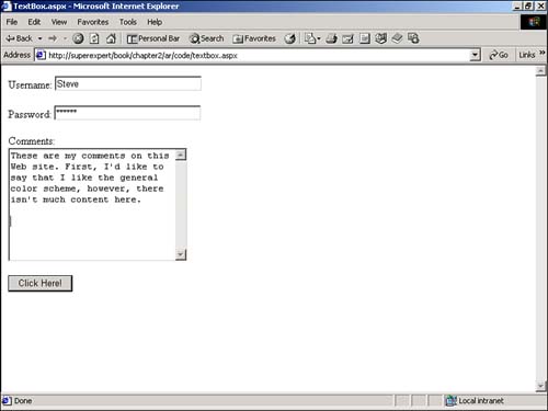
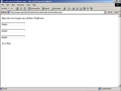
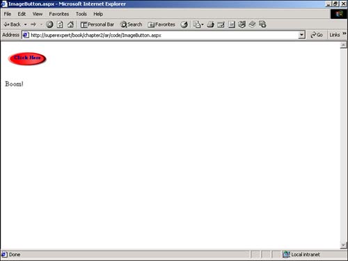
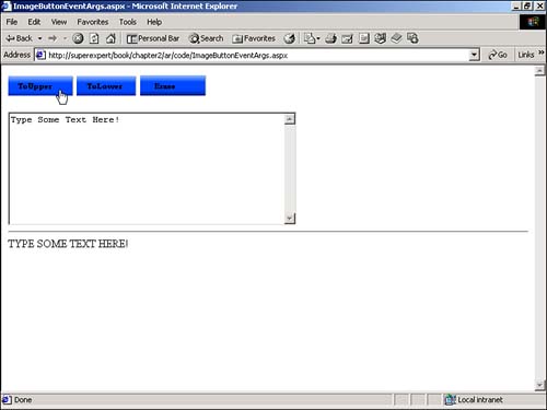
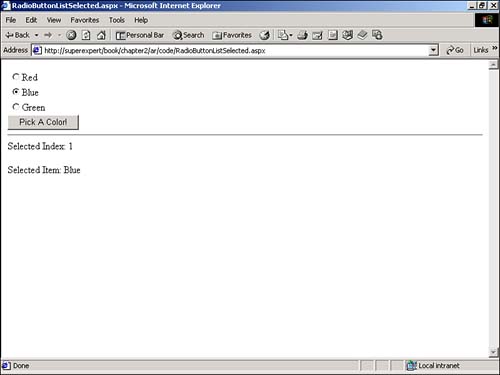
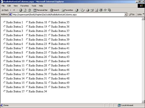
EAN: 2147483647
Pages: 263