Why Worry About the Graphical Interface Appearance?
| In our culture, image counts for a loteven in software. People are often more impressed by what a program looks like on the screen than how it actually works. I can think of at least a few reasons why you would want to polish and improve your graphical user interface (GUI): 1) To impress and convince someone else (your supervisor, customers, spouse) about the quality of your software and its goals; 2) To make your software more intuitive, easier, and fun to use for the end user (yes, having fun is important!); 3) It's easier than doing actual work (why can't you have a little fun, too?). And therein lies the beauty of LabVIEWeven if you're a novice user, you can put together an impressive graphical interface on the front panel (never mind that it doesn't do anything yet) before a guru C programmer can blink. LabVIEW's front panel objects are already pretty cool-looking: knobs, slides, LEDs, tree controls, tab controls, splitter bars, and so on. But this chapter will teach you a few more tricks for organizing and putting your objects on the front panel in such a way to create an even better interface. You will also see how to add online help so that the end user can figure out what each control does without a manual. Making a good GUI is not just about aestheticsit's also about saving the user time and effort. Look at the VI shown in Figure 17.1, Temperature System Monitor. It doesn't look too bad. But almost anybody would agree that this same VI with the interface depicted in Figure 17.2 would be easier to work with and certainly have greater visual appeal. Figure 17.1. A user interface that doesn't look too bad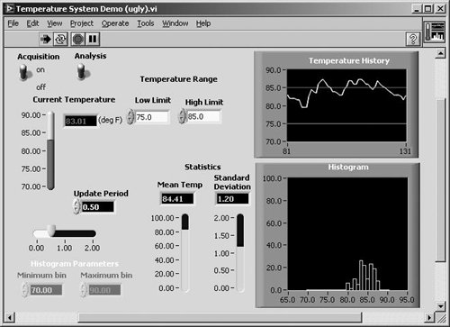 Figure 17.2. A user interface that looks better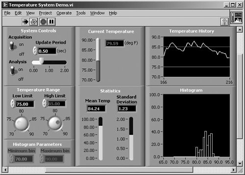 |
EAN: 2147483647
Pages: 294
- Chapter IV How Consumers Think About Interactive Aspects of Web Advertising
- Chapter VI Web Site Quality and Usability in E-Commerce
- Chapter XIV Product Catalog and Shopping Cart Effective Design
- Chapter XVI Turning Web Surfers into Loyal Customers: Cognitive Lock-In Through Interface Design and Web Site Usability
- Chapter XVIII Web Systems Design, Litigation, and Online Consumer Behavior